


Android应用界面相关知识
文章目录
目录
1. View视图
Android所有的UI元素都是通过View与ViewGroup构建的,对于一个Android应用的用户界面来说,ViewGroup作 为容器盛装界面中的控件,它可以包含普通的View控件,也可以包含ViewGroup
注:Android应用的每个界面的根元素必须有且只有一个ViewGroup容器
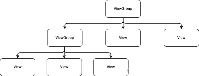
图一:ViewGroup和View控件的包含关系
2. 界面布局编写方式
2.1 在XML文件中编写布局
Android可以使用XML布局文件控制界面布局,从而有效地将界面中布局的代码和Java代码隔离,使程序的结构更加清晰,因此多数Android程序采用这种方式编写布局。
布局文件通常放在res/layout文件夹中
<?xml version="1.0" encoding="utf-8"?>
<RelativeLayout xmlns:android="http://schemas.android.com/apk/res/android"
    xmlns:tools="http://schemas.android.com/tools"
    android:id="@+id/RelativeLayout01"
    android:layout_width="wrap_content"
    android:layout_height="wrap_content" >
<EditText android:id="@+id/date"
    android:layout_width="280dip"
    android:layout_height="wrap_content"
    android:layout_alignParentRight="true"
    android:layout_marginLeft="10dip">
</EditText>

</RelativeLayout>
上述代码中,定义了一个相对布局RelativeLayout,在该布局中定义了一个EditText控件,其中RelativeLayout继承自ViewGroup, TextView继承 自View。
2.2 在Java代码中编写布局
Android程序的布局不仅可以在XML布局文件中编写,还可以在Java代码中编写,在Android中所有布局和控件的对象都可以通过new关键字创建出来,将创建的View控件添加到ViewGroup布局中,从而实现View控件在布局界面中显示
RelativeLayout relativeLayout = new RelativeLayout(this);
RelativeLayout.LayoutParams Params1 = new RelativeLayout.LayoutParams(RelativeLayout.LayoutParams.WRAP_CONTENT,RelativeLayout.LayoutParams.WRAP_CONTENT);
Params1.addRule(RelativeLayout.CENTER_IN_PARENT);//addRule参数对应XML布局中的属性,设置居中显示
TextView textView = new TextView(this);
textView.setText ("Keep kind");//设置文字内容
textView.setTextColor(Color.RED);//设置文字颜色
textView.setTextSize(20);//设置字号
relativeLayout.addView(textView,Params1);
setContentView(relativeLayout);设置在Activaty中显示
常用代码解释:
创建RelativeLayout对象
首先创建LayoutParams对象,接着定义RelativeLayout的宽和高,并令RelativeLayout中的空间居中显示
创建TextView对象,分别调用相应方法设置文本信息
通过addView()方法将TextView对象和LayoutParams对象添加到RelativeLayout布局中
通过setContentView()方法将RelativeLayout布局添加到Activity界面中
注:无论是哪种方式编写布局,它们控制Android用户界面行为的本质是完全一样的,大多数时候,控制UI元素的XML属性都有相应的方法
3. 常见界面布局
为了适应不同的界面风格,Android系统提供了五种常用布局,分别为RelativeLayout (相对布局)、LinearLayout (线性布局)、FrameLayout (帧布局)、TableLayout (表格布局)、ConstraintLayout (约束布局)
3.1 布局的通用性
Android系统提供的五种常用布局直接或者间接继承自ViewGroup,因此五种常用的布局也支持在ViewGroup中定义的属性,这些属性可以看作布局的通用属性
(1)android:id
用于设置当前布局的唯一标识,在XML文件中它的属性值通过 "@+id/属性名称"定义,为布局指定id后,在R.java文件中会自动生成对应的int值,Java代码通过为findViewById()方法传入该int值来获取该布局的对象
(2)android:layout_width
用于设置布局的宽度,其值可以是具体的尺寸,如50dp, 也可以是系统定义的值,具体如下:
- fll parent: 表示该布局的宽度与父容器(从根元素讲是屏幕)的宽度相同
- match_ parent: 与fill parent的 作用相同,从Android 2.2开始推荐使用match _parent
- wrap_ content: 表示该布局的宽度恰好能包裹它的内容
(3)android:layout_height
用于设置布局的高度,其值可以是具体的尺寸,如50dp, 也可以是系统定义的值,具体与android:layout_width相似
(4)android:background
用于设置布局背景,其值可以引用图片资源或颜色资源
(5)android:layout_margin
用于设置当前布局与屏幕边界、周围布局或控件的距离,属性值为具体的尺寸,与之相似的还有android:layout_marginTop/Bottom/Left/Right,分别用于设置当前布局与屏幕、周围布局或者控件的上下左右边界的距离
(6)android:padding
用于设置当前布局内控件与该布局的距离,与之相似的还有android:paddingTop/Bottom/Left/Right,分别用于设置当前布局中控件与该布局上下左右的距离
注:Android系统提供的五种常用布局必须设置android:layout_width和android:layout_height,其他属性可以根据需求设置
3.2 RelativeLayout相对布局
RelativeLayout(相对布局)通过相对定位的方式指定子控件的位置,在XML布局文件中定义相对布局时使用标签,通过父容器或其他子控件为参照物,指定布局中子控件的位置。
子控件属性说明:
相对于父元素给控件布局
android:layout_centerHrizontal 水平居中
android:layout_centerVertical 垂直居中
android:layout_centerInparent 相对于父元素完全居中
android:layout_alignParentBottom 位于父元素的下边缘
android:layout_alignParentLeft 位于父元素的左边缘
android:layout_alignParentRight 位于父元素的右边缘
android:layout_alignParentTop 位于父元素的上边缘
android:layout_alignWithParentIfMissing 如果对应的兄弟元素找不到的话就以父元素做参照物
相对于元素给控件布局
android:layout_below 位于元素的下方
android:layout_above 位于元素的的上方
android:layout_toLeftOf 位于元素的左边
android:layout_toRightOf 位于元素的右边
android:layout_alignTop 该元素的上边缘和某元素的的上边缘对齐
android:layout_alignLeft 该元素的左边缘和某元素的的左边缘对齐
android:layout_alignBottom 该元素的下边缘和某元素的的下边缘对齐
android:layout_alignRight 该元素的右边缘和某元素的的右边缘对齐
给属性赋予像素值
android:layout_marginBottom 底边缘的距离
android:layout_marginLeft 左边缘的距离
android:layout_marginRight 右边缘的距离
android:layout_marginTop 上边缘的距离
典例:在相对布局中指定元素的位置
布局和控件的宽高:
为了让Android程序拥有更好的屏幕适配能力,在设置控件和布局宽高时最好使用“match_parent”或“wrap_ content” ,尽量避免将控件的宽高设置为固定值因为控件在很多情况下会相互挤压,从而导致控件变形
但特殊情况下需要使用指定宽高值时,可以选择使用px,pt,dp,sp,dip(可自适应)四种单位
3.3 LinearLayout线性布局
LinearLayout(线性布局)通常指定布局内的子控件水平或竖直排列,常用属性:
(1)android:orientation属性,用于设置LinearLayout布局中控件的排列顺序,可选其值为vertical和horizontal(分别表示从上到下竖直排列和从左到右水平排列)
(2)android:layout_weight属性:通过设置该属性值,使布局内的空间按照权重比显示大小,在进行屏幕适配时有关键作用
典例:android:orientation属性和android:layout_weight属性的使用
注:只有将起始宽度设置为0才有权重分配效果
3.4 TableLayout表格布局
TableLayout (表格布局)采用行、列的形式来管理控件,它不需要明确声明包含多少行、多少列,而是通过在TableLayout布局中添加TableRow布局或控件来控制表格的行数,可以在TableRow布局中添加控件来控制表格的列数
TableLayout 继承自LinearLayout,因此它完全支持LinearLayout所支持的属性,它还有其他常用属性:
TableLayout 布局的常用属性:
- android:collapseColumns:设置需要被隐藏的列的序号,从o开始
- android:stretchColumns:设置允许被拉伸的列的列序号,从o开始
- android:shrinkColumns:设置允许被收缩的列的列序号,从o开始
TableLayout 布局中控件的常用属性:
- android:layout_column:显示在第几列
- android:layout_span:横向跨几列(占据几列)。
注意:列的宽度由最宽的单元格(控件)觉得,整个表格布局的宽度取决于父容器的宽度
典例:三行三列表格布局
<TableLayout xmlns:android="http://schemas.android.com/apk/res/android"
    xmlns:app="http://schemas.android.com/apk/res-auto"
    xmlns:tools="http://schemas.android.com/tools"
    android:layout_width="match_parent"
    android:layout_height="match_parent"
    tools:context=".TableLayoutActivity">
    <!--    整体采用表格布局的方式-->
    <TextView
        android:id="@+id/text1"
        android:layout_width="match_parent"
        android:layout_height="60dp"
        android:text="表格布局"
        android:gravity="center"
        android:textSize="50dp"
        />
<!--    默认一个控件为一行-->
    <Button
        android:layout_height="wrap_content"
        android:background="@color/teal_700">
    </Button>
    <Button
        android:layout_height="wrap_content"
        android:background="@color/purple_200">
    </Button>
    <TextView
        android:id="@+id/text2"
        android:layout_width="match_parent"
        android:layout_height="70dp"
        android:text="TableRow"
        android:gravity="center"
        android:textSize="30dp"
        />
    <TableLayout
        android:layout_width="wrap_content"
        android:layout_height="400px"
        android:stretchColumns="2"
        >
    <TableRow>
        <Button
            android:layout_width="wrap_content"
            android:layout_height="wrap_content"
            android:layout_column="0"
            android:text="1"
            ></Button>
        <Button
            android:layout_width="wrap_content"
            android:layout_height="wrap_content"
            android:layout_column="1"
            android:text="2"
            ></Button>
        <Button
            android:layout_width="wrap_content"
            android:layout_height="wrap_content"
            android:layout_column="2"
            android:text="3"
            ></Button>
    </TableRow>
    <TableRow>
        <Button
            android:layout_width="wrap_content"
            android:layout_height="wrap_content"
            android:layout_column="1"
            android:text="4"
            ></Button>
    </TableRow>
    <TableRow>
            <Button
                android:layout_width="wrap_content"
                android:layout_height="wrap_content"
                android:layout_column="2"
                android:text="5"
                ></Button>
    </TableRow>
    </TableLayout>
    <TextView
        android:id="@+id/text3"
        android:layout_width="match_parent"
        android:layout_height="70dp"
        android:text="隐藏第一列"
        android:gravity="center"
        android:textSize="30dp"
        />
    <TableLayout
        android:layout_width="wrap_content"
        android:layout_height="400px"
        android:collapseColumns="0"
        android:stretchColumns="2"
        >
        <TableRow>
            <Button
                android:layout_width="wrap_content"
                android:layout_height="wrap_content"
                android:layout_column="0"
                android:text="1"
                ></Button>
            <Button
                android:layout_width="wrap_content"
                android:layout_height="wrap_content"
                android:layout_column="1"
                android:text="2"
                ></Button>
            <Button
                android:layout_width="wrap_content"
                android:layout_height="wrap_content"
                android:layout_column="2"
                android:text="3"
                ></Button>
        </TableRow>
        <TableRow>
            <Button
                android:layout_width="wrap_content"
                android:layout_height="wrap_content"
                android:layout_column="1"
                android:text="4"
                ></Button>
        </TableRow>
        <TableRow>
            <Button
                android:layout_width="wrap_content"
                android:layout_height="wrap_content"
                android:layout_column="2"
                android:text="5"
                ></Button>
        </TableRow>
    </TableLayout>
</TableLayout>
3.5 FrameLayout帧布局
FrameLayout (帧布局)用于在屏幕上创建一块空白区域, 添加到该区域中的每个子控件占一帧,这些帧会一个一个叠加在-起,后加入的控件会叠加在上-一个控件上层。默认情况下,帧布局中的所有控件会与左上角对齐
- 布局特点:放入其中的所有元素都被放置在最左上的区域,而且无法为这些元素指定一个确切的位置,下一个子元素会重叠覆盖上一个子元素
- 应用场景:适合浏览单张图片。
3.6 AbsoluteLayout绝对布局
绝对布局:需要指定子元素的 x,y 精确坐标的布局。
缺点:绝对布局缺乏灵活性,在没有绝对定位的情况下相比其他类型的布局更难维护,不建议使用。
因为绝对布局,我们开发的应用需要在很多的机型上面进行一个适配,如果使用了这个绝对布局的话,比如你在4寸的手机上是显示正常的,而换成5寸的手机,就可能出现偏移和变形。
常用属性:
| 属性 | 作用 |
|---|---|
| android:layout_width | 组件宽度 |
| android:layout_height | 组件高度 |
| android:layout_x | 设置组件的X坐标 |
| android:layout_y | 设置组件的Y坐标 |
这些属性比较简单,使用起来也比较简单易懂。
<AbsoluteLayout android:id="@+id/layout02"
    android:layout_width="fill_parent"
    android:layout_height="fill_parent"
    xmlns:android="http://schemas.android.com/apk/res/android"
    xmlns:tools="http://schemas.android.com/tools"
    tools:ignore="Deprecated">

    <TextView
        android:id="@+id/label"
        android:layout_width="wrap_content"
        android:layout_height="wrap_content"
        android:layout_x="3dp"
        android:layout_y="6dp"
        android:text="用户名:" />

    <EditText
        android:id="@+id/entry"
        android:layout_width="240dp"
        android:layout_height="58dp"
        android:layout_x="84dp"
        android:layout_y="38dp"
        tools:ignore="SpeakableTextPresentCheck"/>

    <Button
        android:id="@+id/confirm"
        android:layout_width="wrap_content"
        android:layout_height="wrap_content"
        android:layout_x="58dp"
        android:layout_y="108dp"
        android:text="确认" />

    <Button
        android:id="@+id/cancel"
        android:layout_width="wrap_content"
        android:layout_height="wrap_content"
        android:layout_x="264dp"
        android:layout_y="108dp"
        android:text="取消" />
</AbsoluteLayout>


 扫一扫
扫一扫


 被折叠的 条评论
为什么被折叠?
被折叠的 条评论
为什么被折叠?
 到【灌水乐园】发言


