


前面
本篇内容开头两个是关于两个CSS的小技巧,其余部分都是关于弹性盒的使用及内部元素的安排;
内容
第一个是关于CSS部分的内容,用来设置当浏览器页面宽度小于一个数值是用什么用的样式或者页面宽度大于一个数值用什么样的样式。
<style>
	@media (max-width: 100px){
		p{
			font-size:100px;
		}
	}
</style>
<p>看看我的不同变化
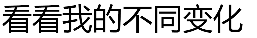
当最大宽度超过100px时显示下面的效果,小于100px时显示上面的效果。
下一实现的让一张图片最页面大小变化而变化。
设置图片最大宽度为100%且高度为自动即可。
<style>
	img{
	width: 600px;
	}
	.img-s{
	 max-width: 100%;
     height: auto;
	}
</style>
<img class="img-s" src="https://images.pexels.com/photos/8647586/pexels-photo-8647586.jpeg?auto=compress&cs=tinysrgb&dpr=2&h=650&w=940" alt="">

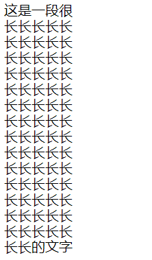
下面介绍几个单位 vw(百分比宽度) vh( 百分比高度) vmax(浏览器宽度或高度较大的那个) vmin(浏览器高度或宽度最小的那个)
<style>
	p{
	width:50vw;
	}
</style>
<p>这是一段很长长长长长长长长长长长长长长长长长长长长长长长长长长长长长长长长长长长长长长长长长长长长长长长长长长长长长长长长长长长长长长长长长长长长长长长长的文字

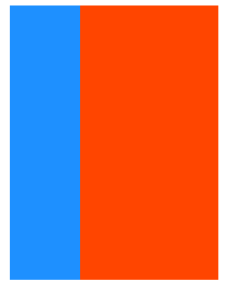
下一个是创建一个弹性容器,用来承载它所有的子标签,对我来说弹性容器就是一个 div 标签,将div所有的东西都装到这个容器里。
<style>
  #box-container {
    height: 500px;
    display:flex;
  }

  #box-1 {
    background-color: dodgerblue;
    width: 50%;
    height: 50%;
  }

  #box-2 {
    background-color: orangered;
    width: 50%;
    height: 50%;
  }
</style>
<div id="box-container">
  <div id="box-1"></div>
  <div id="box-2"></div>
</div>

弹性容器大约如红框所示那么大,两个框高度占一半,宽度各占一半。
下一个属性是 flex-direction,他有两个备选值row-reverse、column-reverse
默认是第一个横式排列,第二个是竖式排列;
<style>
  #box-container {
    display: flex;
    height: 500px;
	flex-direction:column-reverse;
  }
  #box-1 {
    background-color: dodgerblue;
    width: 50%;
    height: 50%;
  }

  #box-2 {
    background-color: orangered;
    width: 50%;
    height: 50%;
  }
</style>

<div id="box-container">
  <div id="box-1"></div>
  <div id="box-2"></div>
</div>

下面的属性是 justify-content,它用来控制容器内元素的布局,备选属性有:center,flex-start,flex-end,space-between,space-around,
space-evenly;
第一种:沿着容器的水平线的中间布局;
第二种:从水平线的开始(左边)开始布局;
第三种:从水平线的结束(右边)开始布局;
第四种:第一块和最后一块放在边缘中间空出布局;
第五种:均匀分块,每个内容都占据相同大小的布局;
第六种:除去内容外的部分均匀划分。
<style>
  .test-1 {
    background: gray;
    display: flex;
    height: 50px;
    justify-content:center;
  }
  .test-2 {
    background: gray;
    display: flex;
    height: 50px;
    justify-content:flex-start;
  }
  .test-3 {
    background: gray;
    display: flex;
    height: 50px;
    justify-content:flex-end;
  }
  .test-4 {
    background: gray;
    display: flex;
    height: 50px;
    justify-content:space-between;
  }
  .test-5 {
    background: gray;
    display: flex;
    height: 50px;
    justify-content:space-around;
  }
  .test-6 {
    background: gray;
    display: flex;
    height: 50px;
    justify-content:space-evenly;
  }
  #box-1 {
    background-color: dodgerblue;
    width: 25%;
    height: 100%;
  }

  #box-2 {
    background-color: orangered;
    width: 25%;
    height: 100%;
  }
</style>
<div class="test-1">
  <div id="box-1"></div>
  <div id="box-2"></div>
</div>
<br>
<div class="test-2">
  <div id="box-1"></div>
  <div id="box-2"></div>
</div>
<br>
<div class="test-3">
  <div id="box-1"></div>
  <div id="box-2"></div>
</div>
<br>
<div class="test-4">
  <div id="box-1"></div>
  <div id="box-2"></div>
</div>
<br>
<div class="test-5">
  <div id="box-1"></div>
  <div id="box-2"></div>
</div>
<br>
<div class="test-6">
  <div id="box-1"></div>
  <div id="box-2"></div>
</div>

一共六行,对应六种效果。
上面的效果对应的是横轴,对于竖轴也可以实现类似的布局。
使用的属性是 align-items,他有以下几个备选值:center,flex-start,
flex-end,stretch,baseline.
第一种:沿着容器的竖直线的中间布局;
第二种:从竖直线的开始(左边)开始布局;
第三种:从竖直线的结束(右边)开始布局;
第四种:自动适应拉伸,也是默认模式
第五种:按字的水平线对齐。
<style>
  .test-1 {
    background: gray;
    display: flex;
    height: 100px;
    align-items:center;
  }
  .test-2 {
    background: gray;
    display: flex;
    height: 100px;
    align-items:flex-start;
  }
  .test-3 {
    background: gray;
    display: flex;
    height: 100px;
    align-items:flex-end;
  }
  .test-4 {
    background: gray;
    display: flex;
    height: 100px;
    align-items:stretch;
  }
  .test-5 {
    background: gray;
    display: flex;
    height: 100px;
    align-items:baseline;
  }
  .test-6 {
    background: gray;
    display: flex;
    height: 100px;
  }
  #box-1 {
    background-color: dodgerblue;
    width: 200px;
    font-size: 10px;
  }

  #box-2 {
    background-color: orangered;
    width: 200px;
    font-size: 15px;
  }
</style>

<div class="test-1">
  <div id="box-1"><p>Hello</p></div>
  <div id="box-2"><p>Goodbye</p></div>
</div>
<br>
<div class="test-2">
  <div id="box-1"><p>Hello</p></div>
  <div id="box-2"><p>Goodbye</p></div>
</div>
<br>
<div class="test-3">
  <div id="box-1"><p>Hello</p></div>
  <div id="box-2"><p>Goodbye</p></div>
</div>
<br>
<div class="test-4">
  <div id="box-1"><p>Hello</p></div>
  <div id="box-2"><p>Goodbye</p></div>
</div>
<br>
<div class="test-5">
  <div id="box-1"><p>Hello</p></div>
  <div id="box-2"><p>Goodbye</p></div>
</div>
<br>
<div class="test-6">
  <div id="box-1"><p>Hello</p></div>
  <div id="box-2"><p>Goodbye</p></div>
</div>

第六个没有设置属性,使用的是默认属性。
下一个属性是 flex-wrap,它有三个可选项:nowrap,wrap,wrap-reverse
第一种:默认模式,默然放在一行或一列。
第二种:从开头开始,填满整行或者填不下一个元素换行,另起一行放。
第三种:从最底下一行开始开始,剩下和上面的一样。
<style>
  .test-1 {
    background: gray;
    display: flex;
    height: 50px;
    flex-wrap:nowrap;
  }
  .test-2 {
    background: gray;
    display: flex;
    height: 50px;
    flex-wrap:wrap;
  }
  .test-3 {
    background: gray;
    display: flex;
    height: 50px;
    flex-wrap:wrap-reverse;
  }
  #box-1 {
    background-color: dodgerblue;
    width: 25%;
    height: 50%;
  }

  #box-2 {
    background-color: orangered;
    width: 25%;
    height: 50%;
  }
  #box-3 {
    background-color: violet;
    width: 25%;
    height: 50%;
  }
  #box-4 {
    background-color: yellow;
    width: 25%;
    height: 50%;
  }
  #box-5 {
    background-color: green;
    width: 25%;
    height: 50%;
  }
  #box-6 {
    background-color: black;
    width: 25%;
    height: 50%;
  }
</style>

<div class="test-1">
  <div id="box-1"></div>
  <div id="box-2"></div>
  <div id="box-3"></div>
  <div id="box-4"></div>
  <div id="box-5"></div>
  <div id="box-6"></div>
</div>
<br>
<div class="test-2">
  <div id="box-1"></div>
  <div id="box-2"></div>
  <div id="box-3"></div>
  <div id="box-4"></div>
  <div id="box-5"></div>
  <div id="box-6"></div>
</div>
<br>
<div class="test-3">
  <div id="box-1"></div>
  <div id="box-2"></div>
  <div id="box-3"></div>
  <div id="box-4"></div>
  <div id="box-5"></div>
  <div id="box-6"></div>
</div>

下一个属性是 flex-shrink,它用来规定元素与元素之间的比率。
打个比方,第一个元素宽度为100%,第二个元素宽度也为100%,这时他们处在同一行中就各占一半,当给第二个元素的 flex-shrink 设置为2,那么第一个元素就变成占66.6%,第二个元素占33.3%。设置为3的话那就第一个占75%,第二个占25%;
<style>
  #box-container {
    display: flex;
    height: 100px;
  }
  #box-1 {
    background-color: dodgerblue;
    width: 100%;
  }
  #box-2 {
    background-color: orangered;
    width: 100%;
    flex-shrink:2;
  }
</style>
<div id="box-container">
  <div id="box-1"></div>
  <div id="box-2"></div>
</div>

下一个属性是 flex-grow,他的作用和上面那个属性相反,值越大,面积越大。
<style>
  #box-container {
    display: flex;
    height: 100px;
  }

  #box-1 {
    background-color: dodgerblue;
    flex-grow:1;
  }

  #box-2 {
    background-color: orangered;
    flex-grow:2;
  }
</style>

<div id="box-container">
  <div id="box-1"></div>
  <div id="box-2"></div>
</div>

上一个有默认值为1,这个没有默认值,需要自己设置。
下一个属性用来设置沿弹性容器主轴方向的长度:flex-basis;
<style>
  #box-container {
    display: flex;
    height: 500px;
  }

  #box-1 {
    background-color: dodgerblue;
    height: 200px;
    flex-basis:10%;
  }

  #box-2 {
    background-color: orangered;
    height: 200px;
    flex-basis:50%;
  }
</style>

<div id="box-container">
  <div id="box-1"></div>
  <div id="box-2"></div>
</div>

之前我们说过 padding 和 margin 属性都有四个值,可以快速设置,上面三个属性也可以快速设置 第一个是 flex-grow;第二个是flex-shrink;第三个是
flex-basis;
<style>
  #box-container {
    display: flex;
    height: 500px;
  }
  #box-1 {
    background-color: dodgerblue;
    flex:1 2 150px;
    height: 200px;
  }
  #box-2 {
    background-color: orangered;
    flex:2 1 150px;
    height: 200px;
  }
</style>
<div id="box-container">
  <div id="box-1"></div>
  <div id="box-2"></div>
</div>
上面的所有的子元素都是按照出现的顺序来显示的,也可以给他们分配一定的数级,用来控制显示。使用的是 order 属性;
<style>
  #box-container {
    display: flex;
    height: 500px;
  }
  #box-1 {
    background-color: dodgerblue;
	order:2;
    height: 200px;
    width: 200px;
  }
  #box-2 {
    background-color: orangered;
	order:1;
    height: 200px;
    width: 200px;
  }
</style>
<div id="box-container">
  <div id="box-1"></div>
  <div id="box-2"></div>
</div>

之前在学CSS时可以通过覆盖来消除掉父标签的一些属性,在弹性框中同样可以,在子样式表中加入 align-self;他的可选值与 flex-items 相同;
<style>
  #box-container {
    display: flex;
    height: 500px;
  }
  #box-1 {
    background-color: dodgerblue;
    align-self:center;
    height: 200px;
    width: 200px;
  }
  #box-2 {
    background-color: orangered;
    height: 200px;
    width: 200px;
  }
</style>
<div id="box-container">
  <div id="box-1"></div>
  <div id="box-2"></div>
</div>

在这里附上一张弹性框的图,有利于理解。

关于 flex-grow 和 flex-shrink;前者是当父元素大于子元素的宽度时,内部子元素所占的比;后者时当父元素宽度小于子元素之和时,内部子元素如何分配。
关于 flex-basis 和 width 同样是用来显示宽度,当前者出现,后者便失效。
结语
本篇内容到这里就结束了,最后还有一部分内容,freecodecamp关于网站设计的内容就全部结束了。
如有错误,还望能够在评论批评指正。


 8568
8568


 被折叠的 条评论
为什么被折叠?
被折叠的 条评论
为什么被折叠?
 到【灌水乐园】发言


