


一.配置信息
pages.js 添加 "custom": true 属性

二. 定义TabBar组件

<template>
	<view class="tabbar-container">
		<view v-for="(item,index) in tabbarList" :class="[item.centerItem && 'center-item'  ,'tabbar-item']"
			@click="changeItem(item)" :key="item.id">
			<view class="item-top">
				<image v-if="item.id!==2" :src="activeTab===item.path?item.selectIcon:item.icon"
					:class="[activeTab===item.path&&'active']"></image>
				<text v-else class="iconfont icon-add"></text>
			</view>
			<view :class="[activeTab===item.path ? 'item-active' : '','item-bottom']">
				<text class="text">{{item.text}}</text>
			</view>
		</view>

		<u-action-sheet class="action-sheet" round="20" :show="sheetShow" title="添加" @close="handleClose">
			<view class="gutter">

			</view>
		</u-action-sheet>
	</view>
</template>

<script>
	import {
		mapGetters
	} from "vuex"
	export default {
		data() {
			return {
				currentItem: 0,
				tabbarList: [{
					id: 0,
					path: "/pages/home/index",
					icon: "/static/img/home.png",
					selectIcon: "/static/img/home_fill.png",
					text: "首页",
					centerItem: false
				}, {
					id: 1,
					path: "/pages/monitor/index",
					icon: "/static/img/playon.png",
					selectIcon: "/static/img/playon_fill.png",
					text: "监控",
					centerItem: false
				}, {
					id: 2,
					icon: "/static/img/playon.png",
					selectIcon: "/static/img/playon_fill.png",
					text: "",
					centerItem: true
				}, {
					id: 3,
					path: "/pages/notice/index",
					icon: "/static/img/message.png",
					selectIcon: "/static/img/message_fill.png",
					text: "通知",
					centerItem: false
				}, {
					id: 4,
					path: "/pages/member/index",
					icon: "/static/img/mine.png",
					selectIcon: "/static/img/mine_fill.png",
					text: "我的",
					centerItem: false
				}],
				sheetShow: false,
			};
		},
		computed: mapGetters(['activeTab']),
		created() {
			let routes = getCurrentPages(); // 获取当前打开过的页面路由数组
			let curRoute = routes[routes.length - 1].route //获取当前页面路由
			this.$store.commit('setActiveTab', '/' + curRoute);
		},
		mounted() {
			uni.hideTabBar();
		},
		methods: {
			changeItem(item) {
				if (item?.path) {
					var pages = getCurrentPages();
					var page = pages[pages.length - 1].route;
					if (item.path == '/' + page) return
					this.$store.commit('setActiveTab', item.path);
					uni.switchTab({
						url: item.path,
					})
				} else {
					this.sheetShow = !this.sheetShow;
				}
			},

			//关闭快捷操作
			handleClose() {
				this.sheetShow = false;
			},
		},
	}
</script>
<style lang="scss" scoped>
	.tabbar-container {
		position: fixed;
		bottom: 0;
		left: 0;
		width: 100%;
		height: 100rpx;
		// box-shadow: 0px 3px 20px rgba(0, 0, 0, 0.16);
		border-top: 4rpx solid #e4e4e4;
		display: flex;
		align-items: center;
		color: #999999;
		z-index: 200;
		background-color: #fff;


		.tabbar-item {
			width: 20%;
			height: 100%;
			display: flex;
			flex-direction: column;
			justify-content: space-around;
			align-items: center;
			text-align: center;

			.item-top {
				width: 50rpx;
				height: 50rpx;

				>image {
					width: 100%;
					height: 100%;
				}

				.active {
					animation: mymove 1s 1;
				}

				@keyframes mymove {
					0% {
						transform: scale(1);
						/*开始为原始大小*/
					}

					10% {
						transform: scale(0.8);
					}

					30% {
						transform: scale(1.1);
						/*放大1.1倍*/
					}

					50% {
						transform: scale(0.9);
						/*放大1.1倍*/
					}

					70% {
						transform: scale(1.05);
					}

					90% {
						transform: scale(1);
					}
				}
			}

			.item-bottom {
				font-size: 26rpx;
				width: 100%;
			}
		}

		.center-item {
			display: block;
			position: relative;

			.item-top {
				flex-shrink: 0;
				width: 100rpx;
				height: 100rpx;
				position: absolute;
				top: -50rpx;
				left: calc(50% - 50rpx);
				border-radius: 50%;
				box-shadow: 0px 3px 20px rgba(0, 0, 0, 0.16);
				background-color: #ff6a00;

				.iconfont {
					position: absolute;
					left: 50%;
					top: 50%;
					transform: translate(-50%, -50%);
					font-size: 70rpx;
					font-weight: 500;
					color: #fffefd;
				}
			}

			.item-bottom {
				position: absolute;
				bottom: 5rpx;
			}
		}

		.item-active {
			color: #ff6a00;
		}


		.action-sheet {
			.gutter {
				display: flex;
				margin-top: 20rpx;
				margin-bottom: 40rpx;

				.item {
					flex: 1;

					&:last-child {
						margin-right: 0;
					}

					.iconfont {
						font-size: 56rpx;
					}

					.yellow {
						color: #F1C40F;
					}

					.purple {
						color: #9B59B6;
					}

					.turquoise {
						color: #1ABC9C;
					}

					.disabled {
						color: #ccc;
					}
				}
			}
		}
	}
</style>
三. 把tabbar url地址存在vuex
export default {
	state: {
		activeTab: "", // 底部tabbar url地址
	},
	mutations: {
		setActiveTab(state, url) {
			state.activeTab = url;
		},
	},
	getters: {
		activeTab: state => state.activeTab,
	}
}
四. 在页面引入
<template>
	<view>
		我的
		<TabBar />
	</view>
</template>

<script>
	import TabBar from '@/components/Tabbar/Tabbar.vue'
	export default {
		components: {
			TabBar,
		},
	}
</script>
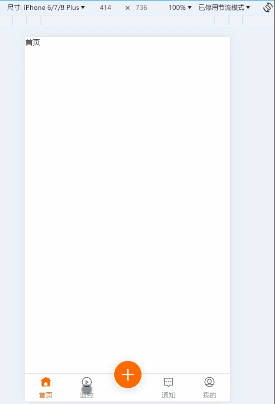
效果图


 1万+
1万+


 被折叠的 条评论
为什么被折叠?
被折叠的 条评论
为什么被折叠?
 到【灌水乐园】发言


