


一、用HTML和CSS制作太极图
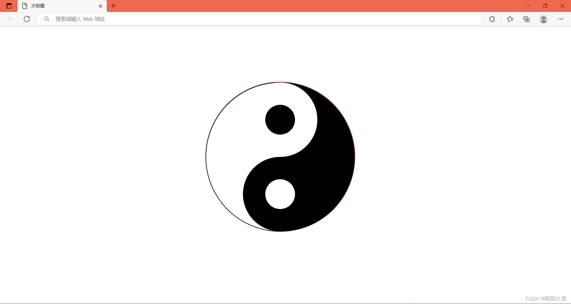
思路 :
1、画出两个长方形
2、把两个长方形,拼成一个正方形
3、把拼成的正方形放到一个与之匹配的正方形中
4、把正方形的边角,锐化成圆
5、把左边‘长方形’背景设为白色,把边‘右长方形’背景设为黑色,
6、取‘长方形’宽为直径画圆,并把圆背景设为白色放到正方形的对称轴上,圆的上边与正方形的上边相切
7、取‘长方形’宽为直径画圆,并把圆背景设为黑色放到正方形的对称轴上,圆的上边与正方形的下边相切
8、取两个小圆,一黑一白,补全太极图
二、代码展示
<!doctype html>
<html lang="en">
<head>
    <meta charset="UTF-8">
    <meta name="viewport"
          content="width=device-width, user-scalable=no, initial-scale=1.0, maximum-scale=1.0, minimum-scale=1.0">
    <meta http-equiv="X-UA-Compatible" content="ie=edge">
    <title>太极图</title>
    <style>
        .tj {
            width: 400px;
            height: 400px;
            position: absolute;
            border: 1px solid #000000;
            border-radius: 50%;
            background-color: #c42929;
            transform-origin: center;
            left: 36%;
            top: 20%;
            /*animation: rotate .9s linear infinite;*/
        }

        @keyframes rotate {
            to {
                transform: rotate(360deg);
            }
        }

        .lf {
            position: absolute;
            width: 200px;
            height: 400px;
            border: 1px solid #000;
            box-sizing: border-box;
            border-radius: 200px 0 0 200px;
            background-color: #fff;
        }

        .rf {
            position: absolute;
            width: 200px;
            height: 400px;
            border: 1px solid #000;
            box-sizing: border-box;
            border-radius: 0 200px 200px 0;
            left: 200px;
            background-color: black;
        }

        .a1 {
            position: absolute;
            width: 200px;
            height: 200px;
            background-color: #fff;
            left: 100px;
            border-radius: 50%;
        }

        .a2 {
            position: absolute;
            width: 200px;
            height: 200px;
            background-color: #000;
            left: 100px;
            top: 200px;
            border-radius: 50%;

        }

        .tj .b1 {
            position: absolute;
            width: 80px;
            height: 80px;
            background-color: #000;
            left: 60px;
            top: 60px;
            border-radius: 50%;
        }

        .tj .b2 {
            position: absolute;
            width: 80px;
            height: 80px;

            left: 60px;
            top: 60px;
            border-radius: 50%;
            background-color: #fff;
        }
    </style>
</head>
<body>

<div class="tj">
    <div class="lf"></div>
    <div class="rf"></div>

    <div class="a1">
        <div class="b1"></div>
    </div>
    <div class="a2">
        <div class="b2"></div>
    </div>


</div>

</body>
</html>
三、效果图展示


 371
371


 被折叠的 条评论
为什么被折叠?
被折叠的 条评论
为什么被折叠?
 到【灌水乐园】发言


