


目录
卡片式布局
虽然现在MaterialTest中已经应用了非常多的Material Design效果,不过界面上最主要的一块区域还处于空白状态。这块区域通常用来放置应用的主体内容,准备使用一些精美的水果图片来填充这部分区域
为了要让水果图片也能Material化,会使用卡片式布局的效果。卡片式布局也是Materials Design中提出的一个新概念,它可以让页面中的元素看起来就像在卡片中一样,并且还能拥有圆角和投影
卡片式布局效果的重要控件:MaterialCardView
MaterialCardView是用于实现卡片式布局效果的重要控件,由Material库提供
实际上,MaterialCardView也是一个FrameLayout,只是额外提供了圆角和阴影等效果,看上去会有
立体的感觉
使用之前需要添加一个Glide库的依赖,在app/build.gradle文件中dependencies闭包声明:
implementation 'com.github.bumptech.glide:glide:4.9.0'
Glide是一个超级强大的开源图片加载库,它不仅可以用于加载本地图片,还可以加载网络图片、GIF图片甚至是本地视频。最重要的是,Glide的用法非常简单,只需几行代码就能轻松实现复杂的图片加载功能,因此这里准备用它来加载水果图片
修改activity_main.xml中的代码:
<androidx.drawerlayout.widget.DrawerLayout
	 xmlns:android="http://schemas.android.com/apk/res/android"
	 xmlns:app="http://schemas.android.com/apk/res-auto"
	 android:id="@+id/drawerLayout"
	 android:layout_width="match_parent"
	 android:layout_height="match_parent">

	 <androidx.coordinatorlayout.widget.CoordinatorLayout
		 android:layout_width="match_parent"
		 android:layout_height="match_parent">

		 <androidx.appcompat.widget.Toolbar
			 android:id="@+id/toolbar"
			 android:layout_width="match_parent"
			 android:layout_height="?attr/actionBarSize"
			 android:background="@color/colorPrimary"
			 android:theme="@style/ThemeOverlay.AppCompat.Dark.ActionBar"
			 app:popupTheme="@style/ThemeOverlay.AppCompat.Light" />

		 <androidx.recyclerview.widget.RecyclerView
			 android:id="@+id/recyclerView"
			 android:layout_width="match_parent"
			 android:layout_height="match_parent" />

		 <com.google.android.material.floatingactionbutton.FloatingActionButton
			 android:id="@+id/fab"
			 android:layout_width="wrap_content"
			 android:layout_height="wrap_content"
			 android:layout_gravity="bottom|end"
			 android:layout_margin="16dp"
			 android:src="@drawable/ic_done" />

	 </androidx.coordinatorlayout.widget.CoordinatorLayout>
	 ...
</androidx.drawerlayout.widget.DrawerLayout>
这里在CoordinatorLayout中添加了一个RecyclerView,给它指定一个id,然后将宽度和高度都设置为match_parent,这样RecyclerView就占满了整个布局的空间
接着定义一个实体类Fruit,Fruit类中只有两个字段:name表示水果的名字,imageId表示水果对应图片的资源id
class Fruit(val name: String, val imageId: Int)
然后需要为RecyclerView的子项指定一个自定义的布局,在layout目录下新建fruit_item.xm
<com.google.android.material.card.MaterialCardView
	 xmlns:android="http://schemas.android.com/apk/res/android"
	 xmlns:app="http://schemas.android.com/apk/res-auto"
	 android:layout_width="match_parent"
	 android:layout_height="wrap_content"
	 android:layout_margin="5dp"
	 app:cardCornerRadius="4dp">

	 <LinearLayout
		 android:orientation="vertical"
		 android:layout_width="match_parent"
		 android:layout_height="wrap_content">

	 <ImageView
		 android:id="@+id/fruitImage"
		 android:layout_width="match_parent"
		 android:layout_height="100dp"
		 android:scaleType="centerCrop" />

	 <TextView
		 android:id="@+id/fruitName"
		 android:layout_width="wrap_content"
		 android:layout_height="wrap_content"
		 android:layout_gravity="center_horizontal"
		 android:layout_margin="5dp"
		 android:textSize="16sp" />
	 </LinearLayout>

</com.google.android.material.card.MaterialCardView>
这里先定义了一个MaterialCardView布局来作为子项的最外层布局,可以通过app:cardCornerRadius属性指定卡片圆角的弧度,数值越大,圆角的弧度也越大
另外,还可以通过app:elevation属性指定卡片的高度:高度值越大,投影范围也越大,但是投影效果越淡;高度值越小,投影范围也越小,但是投影效果越浓。这一点和FloatingActionButton是一致的
由于MaterialCardView是一个FrameLayout,因此它没有什么方便的定位方式,这里只好在MaterialCardView中再嵌套一个LinearLayout,然后在LinearLayout中放置具体的内容。
LinearLayout中定义了一个ImageView用于显示水果的图片,又定义了一个TextView用于显示水果的名称,并让TextView在水平方向上居中显示
注意,在ImageView中我们使用了一个scaleType属性,这个属性可以指定图片的缩放模式。由于各张
水果图片的长宽比例可能会不一致,为了让所有的图片都能填充满整个ImageView,这里使用了centerCrop模式,它可以让图片保持原有比例填充满ImageView,并将超出屏幕的部分裁剪掉
接下来需要为RecyclerView准备一个适配器,新建FruitAdapter类,让这个适配器继承自
RecyclerView.Adapter,并将泛型指定为FruitAdapter.ViewHolder
class FruitAdapter(val context: Context, val fruitList: List<Fruit>) :
 		RecyclerView.Adapter<FruitAdapter.ViewHolder>() {
	 inner class ViewHolder(view: View) : RecyclerView.ViewHolder(view) {
		 val fruitImage: ImageView = view.findViewById(R.id.fruitImage)
		 val fruitName: TextView = view.findViewById(R.id.fruitName)
	 }

	 override fun onCreateViewHolder(parent: ViewGroup, viewType: Int): ViewHolder {
		 val view = LayoutInflater.from(context).inflate(R.layout.fruit_item, parent, false)
		 return ViewHolder(view)
	 }

	 override fun onBindViewHolder(holder: ViewHolder, position: Int) {
		 val fruit = fruitList[position]
		 holder.fruitName.text = fruit.name
		 Glide.with(context).load(fruit.imageId).into(holder.fruitImage)
	 }

	 override fun getItemCount() = fruitList.size
}
这些代码代码大部分是RecyclerView布局中的内容,具体内容看这里
唯一需要注意的是,在onBindViewHolder()方法中我们使用了Glide来加载水果图片
首先调用Glide.with()方法并传入一个Context、Activity或Fragment参数,然后调用load()方法加载图片,可以是一个URL地址,也可以是一个本地路径,或者是一个资源id,最后调用into()方法将图片设置到具体某一个ImageView中就可以了
由于网上找的这些水果图片像素非常高,如果不进行压缩就直接展示的话,很容易引起内存溢出。而使用Glide就完全不需要担心这回事,Glide在内部做了许多非常复杂的逻辑操作,其中就包括了图片压缩
最后修改MainActivity中的代码
class MainActivity : AppCompatActivity() {
	 val fruits = mutableListOf(Fruit("Apple", R.drawable.apple), Fruit("Banana",
	 R.drawable.banana), Fruit("Orange", R.drawable.orange), Fruit("Watermelon",
	 R.drawable.watermelon), Fruit("Pear", R.drawable.pear), Fruit("Grape",
	 R.drawable.grape), Fruit("Pineapple", R.drawable.pineapple), Fruit("Strawberry",
	 R.drawable.strawberry), Fruit("Cherry", R.drawable.cherry), Fruit("Mango",
	 R.drawable.mango))

	 val fruitList = ArrayList<Fruit>()

	 override fun onCreate(savedInstanceState: Bundle?) {
		 super.onCreate(savedInstanceState)
		 setContentView(R.layout.activity_main)
		 ...
		 initFruits()
		 val layoutManager = GridLayoutManager(this, 2)
		 recyclerView.layoutManager = layoutManager
		 val adapter = FruitAdapter(this, fruitList)
		 recyclerView.adapter = adapter
	 }

	 private fun initFruits() {
		 fruitList.clear()
		 repeat(50) {
			 val index = (0 until fruits.size).random()
			 fruitList.add(fruits[index])
		 }
	 }
	 ...
}
在MainActivity中,首先定义了一个水果集合,集合里面存放了很多个Fruit的实例,每个实例都代表一种水果
然后在initFruits()方法中,先是清空了一下fruitList中的数据,接着使用一个随机函数,从刚才定义的Fruit数组中随机挑选一个水果放入fruitList当中,这样每次打开程序看到的水果数据都会是不同的
另外,为了让界面上的数据多一些,这里使用了repeat()函数,随机挑选50个水果
之后的用法就是RecyclerView的标准用法了,这里使用了GridLayoutManager这种布局方式,它的构造函数接收两个参数:第一个是Context,第二个是列数。这里希望每一行中会有两列数据
运行程序
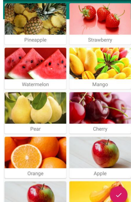
精美的水果图片成功展示出来了。每个水果都是在一张单独的卡片当中的,并且还拥有圆角和投影。另外,由于是使用随机的方式来获取水果数据的,因此界面上会有一些重复的水果出现,这属于正常现象
垂直方向的LinearLayout:AppBarLayout
从上图中可以看到,RecyclerView会把Toolbar给遮挡住。这是由于RecyclerView和Toolbar都是放置在CoordinatorLayout中的,而前面已经说过,CoordinatorLayout就是一个加强版的FrameLayout,那么FrameLayout中的所有控件在不进行明确定位的情况下,默认都会摆放在布局的左上角,从而产生了遮挡的现象
可以使用Material库中提供的另外一个工具——AppBarLayout来解决这个问题。AppBarLayout实际上是一个垂直方向的LinearLayout,它在内部做了很多滚动事件的封装,并应用了一些Material Design的设计理念
使用AppBarLayout只需要两步就可以了,第一步将Toolbar嵌套到AppBarLayout中,第二步给RecyclerView指定一个布局行为
修改activity_main.xml中的代码
<androidx.drawerlayout.widget.DrawerLayout
	 xmlns:android="http://schemas.android.com/apk/res/android"
	 xmlns:app="http://schemas.android.com/apk/res-auto"
	 android:id="@+id/drawerLayout"
	 android:layout_width="match_parent"
	 android:layout_height="match_parent">

	 <androidx.coordinatorlayout.widget.CoordinatorLayout
		 android:layout_width="match_parent"
		 android:layout_height="match_parent">

		 <com.google.android.material.appbar.AppBarLayout
			 android:layout_width="match_parent"
			 android:layout_height="wrap_content">

		 <androidx.appcompat.widget.Toolbar
			 android:id="@+id/toolbar"
			 android:layout_width="match_parent"
			 android:layout_height="?attr/actionBarSize"
			 android:background="@color/colorPrimary"
			 android:theme="@style/ThemeOverlay.AppCompat.Dark.ActionBar"
			 app:popupTheme="@style/ThemeOverlay.AppCompat.Light" />

		 </com.google.android.material.appbar.AppBarLayout>

		 <androidx.recyclerview.widget.RecyclerView
			 android:id="@+id/recyclerView"
			 android:layout_width="match_parent"
			 android:layout_height="match_parent"
			 app:layout_behavior="@string/appbar_scrolling_view_behavior" />

		 ...
	 </androidx.coordinatorlayout.widget.CoordinatorLayout>
	 ...
</androidx.drawerlayout.widget.DrawerLayout>
可以看到,布局文件并没有什么太大的变化。首先定义了一个AppBarLayout,并将Toolbar放置在了AppBarLayout里面,然后在RecyclerView中使用app:layout_behavior属性指定了一个布局行为。其中appbar_scrolling_view_behavior这个字符串也是由Material库提供的
运行一下程序,就会发现正常了
使用AppBarLayout实现Material Design效果
当AppBarLayout接收到滚动事件的时候,它内部的子控件其实是可以指定如何去响应这些事件的,通过app:layout_scrollFlags属性就能实现。修改activity_main.xml中的代码
<androidx.drawerlayout.widget.DrawerLayout
	 xmlns:android="http://schemas.android.com/apk/res/android"
	 xmlns:app="http://schemas.android.com/apk/res-auto"
	 android:id="@+id/drawerLayout"
	 android:layout_width="match_parent"
	 android:layout_height="match_parent">

	 <androidx.coordinatorlayout.widget.CoordinatorLayout
		 android:layout_width="match_parent"
		 android:layout_height="match_parent">

		 <com.google.android.material.appbar.AppBarLayout
			 android:layout_width="match_parent"
			 android:layout_height="wrap_content">

		 <androidx.appcompat.widget.Toolbar
			 android:id="@+id/toolbar"
			 android:layout_width="match_parent"
			 android:layout_height="?attr/actionBarSize"
			 android:background="@color/colorPrimary"
			 android:theme="@style/ThemeOverlay.AppCompat.Dark.ActionBar"
			 app:popupTheme="@style/ThemeOverlay.AppCompat.Light"
			 app:layout_scrollFlags="scroll|enterAlways|snap" />

		 </com.google.android.material.appbar.AppBarLayout>
		 ...
	 </androidx.coordinatorlayout.widget.CoordinatorLayout>
	 ...
</androidx.drawerlayout.widget.DrawerLayout>
这里在Toolbar中添加了一个app:layout_scrollFlags属性,并将这个属性的值指定成了scroll|enterAlways|snap
其中,
- scroll表示当RecyclerView向上滚动的时候,Toolbar会跟着一起向上滚动并实现隐藏;
- enterAlways表示当RecyclerView向下滚动的时候,Toolbar会跟着一起向下滚动并重新显示;
- snap表示当Toolbar还没有完全隐藏或显示的时候,会根据当前滚动的距离,自动选择是隐藏还是显示
重新运行一下程序,并向上滚动RecyclerView,随着我们向上滚动RecyclerView,Toolbar竟然消失了!而向下滚动RecyclerView,Toolbar又会重新出现。


 907
907


 被折叠的 条评论
为什么被折叠?
被折叠的 条评论
为什么被折叠?
 到【灌水乐园】发言


