


CSS围绕中心点2D旋转效果
<!DOCTYPE html>
<html lang="en">
<head>
<meta charset="UTF-8">
<meta http-equiv="X-UA-Compatible" content="IE=edge">
<meta name="viewport" content="width=device-width, initial-scale=1.0">
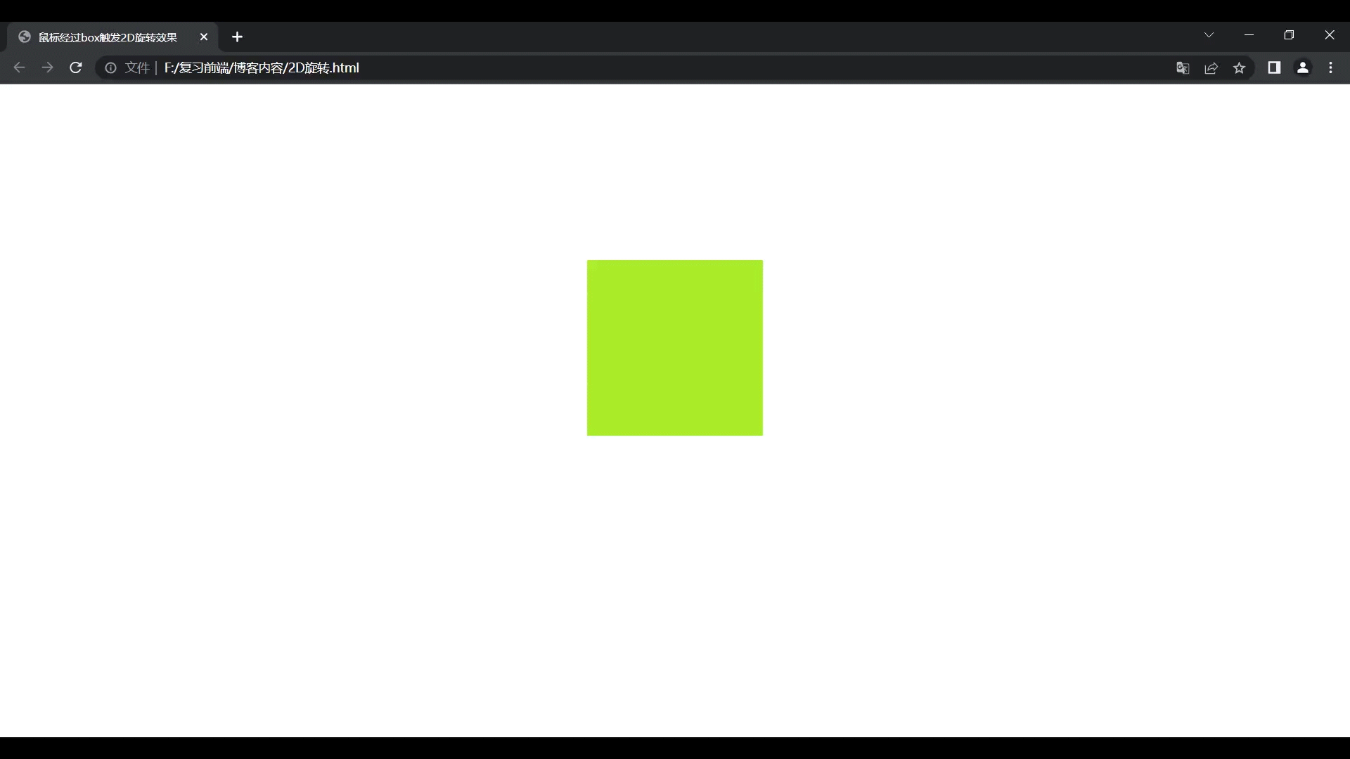
<title>鼠标经过box触发2D旋转效果</title>
<style>
* {
margin: 0;
padding: 0;
}
.box {
width: 200px;
height: 200px;
background-color: greenyellow;
margin: 200px auto;
transition: transform 2s;
}
.box:hover {
transform: rotate(360deg);
}
</style>
</head>
<body>
<div class="box"></div>
</body>
</html>效果预览:
CSS指定旋转中心点(盒子的四个顶点)
<!DOCTYPE html>
<html lang="en">
<head>
<meta charset="UTF-8">
<meta http-equiv="X-UA-Compatible" content="IE=edge">
<meta name="viewport" content="width=device-width, initial-scale=1.0">
<title>鼠标经过box触发2D旋转效果</title>
<style>
* {
margin: 0;
padding: 0;
}
div {
margin: 400px auto;
width: 200px;
height: 200px;
background-color: greenyellow;
transition: transform 2s;
}
div:hover {
transform: rotate(360deg);
}
.box1 {
transform-origin: left bottom;
}
.box2 {
transform-origin: right bottom;
}
.box3 {
transform-origin: left top;
}
.box4 {
transform-origin: right top;
}
</style>
</head>
<body>
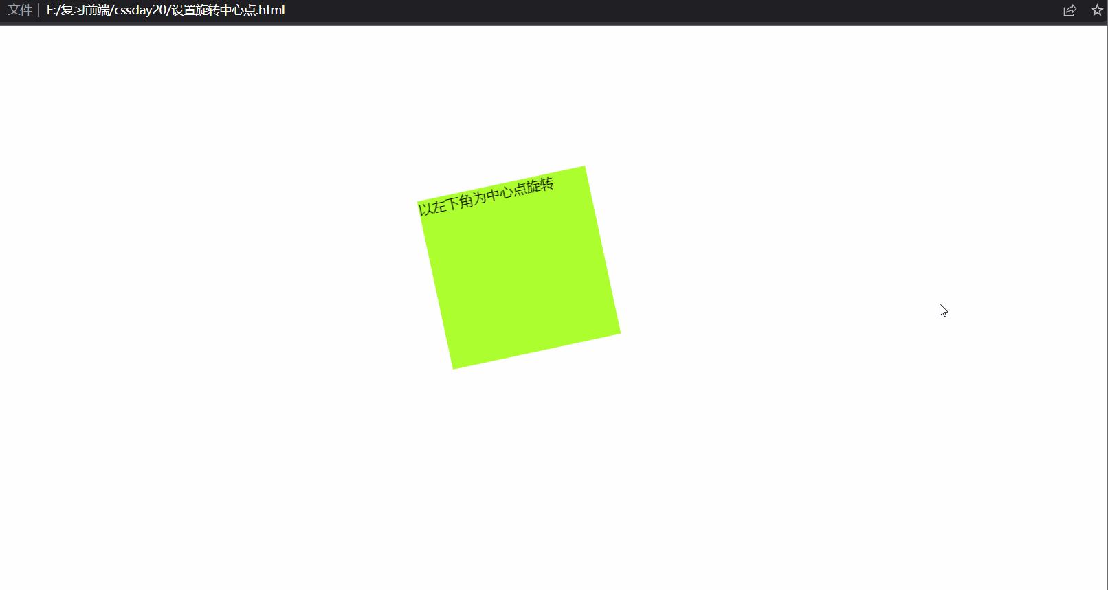
<div class="box1">以左下角为中心点旋转</div>
<div class="box2">以右下角为中心点旋转</div>
<div class="box3">以左上角为中心点旋转</div>
<div class="box4">以右上角为中心点旋转</div>
</body>
</html>效果预览:


 4万+
4万+


 被折叠的 条评论
为什么被折叠?
被折叠的 条评论
为什么被折叠?
 到【灌水乐园】发言


