CSS div垂直水平居中(五种方法)面试题
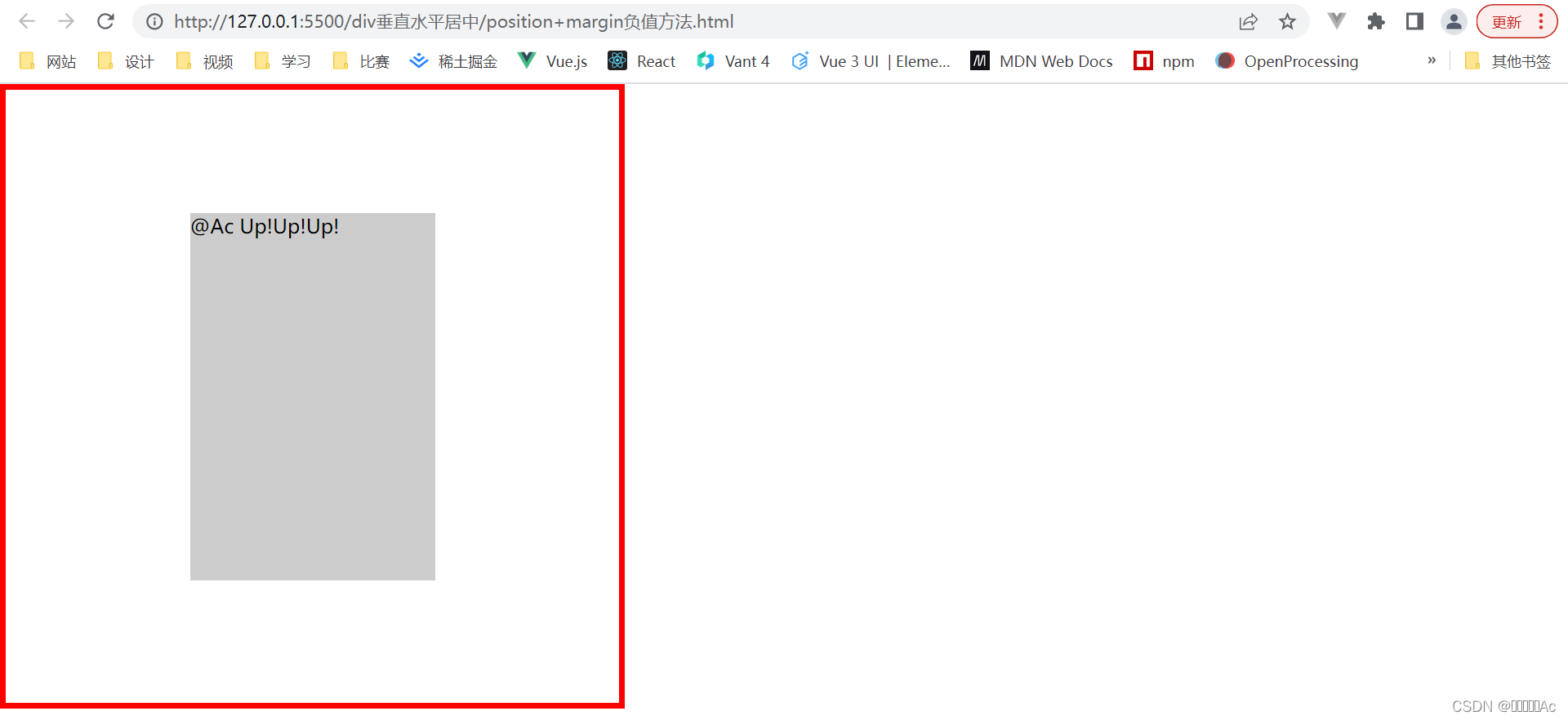
1-position+margin负值方法(宽高固定)
<!DOCTYPE html>
<html lang="en">
<head>
    <meta charset="UTF-8">
    <meta http-equiv="X-UA-Compatible" content="IE=edge">
    <meta name="viewport" content="width=device-width, initial-scale=1.0">
    <title>position+margin负值方法</title>
</head>
<style>
    *{
        margin: 0;
        padding: 0;
    }
    .box{
        position: relative;
        width: 500px;
        height: 500px;
        border: 5px solid red;
    }
    .item{
        position: absolute;
        left: 50%;
        top: 50%;
        margin-left: -100px;
        margin-top: -150px;
        width: 200px;
        height: 300px;
        background: #ccc;
    }
</style>
<body>
    <div class="box">
        <div class="item">@Ac Up!Up!Up!</div>
    </div>
</body>
</html>
2-position+margin auto方法(宽高固定)
<!DOCTYPE html>
<html lang="en">
<head>
    <meta charset="UTF-8">
    <meta http-equiv="X-UA-Compatible" content="IE=edge">
    <meta name="viewport" content="width=device-width, initial-scale=1.0">
    <title>position+margin auto方法</title>
</head>
<style>
    *{
        margin: 0;
        padding: 0;
    }
    .box{
        position: relative;
        width: 500px;
        height: 500px;
        border: 5px solid red;
    }
    .item{
        position: absolute;
        left: 0;
        right: 0;
        top: 0;
        bottom: 0;
        margin: auto;
        width: 200px;
        height: 300px;
        background: #ccc;
    }
</style>
<body>
    <div class="box">
        <div class="item">@Ac Up!Up!Up!</div>
    </div>
</body>
</html>
3-display加vartical-align(宽度固定) (不常用)
<!DOCTYPE html>
<html lang="en">
<head>
    <meta charset="UTF-8">
    <meta http-equiv="X-UA-Compatible" content="IE=edge">
    <meta name="viewport" content="width=device-width, initial-scale=1.0">
    <title>display加vartical-align</title>
</head>
<style>
    *{
        margin: 0;
        padding: 0;
    }
    .box{
        display: table-cell;
        vertical-align: middle;
        width: 500px;
        height: 500px;
        border: 5px solid red;
    }
    .item{
        margin: auto;
        width: 200px;
        height: 300px;
        background: #ccc;
    }
</style>
<body>
    <div class="box">
        <div class="item">@Ac Up!Up!Up!</div>
    </div>
</body>
</html>
4-position+transform方法(不需要宽高固定)(非常Easy且常用)
<!DOCTYPE html>
<html lang="en">
<head>
    <meta charset="UTF-8">
    <meta http-equiv="X-UA-Compatible" content="IE=edge">
    <meta name="viewport" content="width=device-width, initial-scale=1.0">
    <title>position+transform</title>
</head>
<style>
    *{
        margin: 0;
        padding: 0;
    }
    .box{
        position: relative;
        width: 500px;
        height: 500px;
        border: 5px solid red;
    }
    .item{
        position: absolute;
        left: 50%;
        top: 50%;
        transform: translate(-50%,-50%);
        width: 200px;
        height: 300px;
        background: #ccc;
    }
</style>
<body>
    <div class="box">
        <div class="item">@Ac Up!Up!Up!</div>
    </div>
</body>
</html>
5-display方法(不需要宽高固定)(非常Easy且常用)
<!DOCTYPE html>
<html lang="en">
<head>
    <meta charset="UTF-8">
    <meta http-equiv="X-UA-Compatible" content="IE=edge">
    <meta name="viewport" content="width=device-width, initial-scale=1.0">
    <title>flex布局</title>
</head>
<style>
    *{
        margin: 0;
        padding: 0;
    }
    .box{
        display: flex;
        justify-content: center;
        align-items: center;
        width: 500px;
        height: 500px;
        border: 5px solid red;
    }
    .item{
        width: 200px;
        height: 300px;
        background: #ccc;
    }
</style>
<body>
    <div class="box">
        <div class="item">@Ac Up!Up!Up!</div>
    </div>
</body>
</html>


 391
391


 被折叠的 条评论
为什么被折叠?
被折叠的 条评论
为什么被折叠?
 到【灌水乐园】发言


