目录
1、画第一个图形
第一个图形从简单的开始。
1.1 代码
| 1 2 3 4 5 6 7 8 9 10 11 12 13 14 15 16 17 18 19 20 21 22 23 24 25 26 27 28 29 30 31 32 33 34 35 36 37 38 39 40 41 | # importing the required module
import matplotlib.pyplot as plt
# x axis values
x = [1,2,3]
# corresponding y axis values
y = [2,4,1]
# plotting the points
plt.plot(x, y)
# naming the x axis
plt.xlabel('x - axis')
# naming the y axis
plt.ylabel('y - axis')
# giving a title to my graph
plt.title('My first graph!')
# function to show the plot
plt.show()
|
1.2 输出

1.3 代码的部分解释
- 1)将 x 轴和相应的 y 轴值定义为列表。
- 2)使用 .plot() 函数在画布上绘制它们。
- 3)使用 .xlabel() 和 .ylabel() 函数为 x 轴和 y 轴命名。
- 4)使用 .title() 函数为绘图命名。
- 5)使用 .show() 函数查看绘图。
- 2、在同一图上绘制两条或多条线
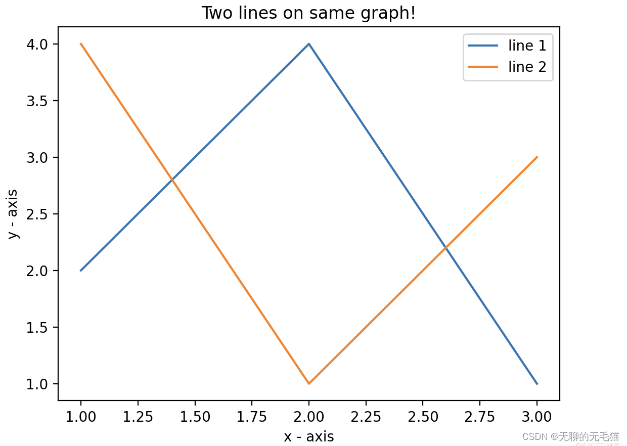
2、在同一图上绘制两条或多条线
如果想在同一张图上再绘制多条线,可反复使用.plot()函数。
2.1 代码
| 1 2 3 4 5 6 7 8 9 10 11 12 13 14 15 16 17 18 19 20 21 22 23 24 25 26 27 28 29 30 31 32 33 34 35 36 37 38 39 40 41 42 43 44 45 46 47 48 49 50 51 | import matplotlib.pyplot as plt
# line 1 points
x1 = [1,2,3]
y1 = [2,4,1]
# plotting the line 1 points
plt.plot(x1, y1, label = "line 1")
# line 2 points
x2 = [1,2,3]
y2 = [4,1,3]
# plotting the line 2 points
plt.plot(x2, y2, label = "line 2")
# naming the x axis
plt.xlabel('x - axis')
# naming the y axis
plt.ylabel('y - axis')
# giving a title to my graph
plt.title('Two lines on same graph!')
# show a legend on the plot
plt.legend()
# function to show the plot
plt.show()
|
2.2 输出
2.3 代码的部分解释
- 1)在同一张图上绘制两条线。 通过给它们一个名称(label)来区分它们,该名称作为 .plot() 函数的参数传递。
- 2)提供有关线条类型及其颜色信息的小矩形框称为图例。 可以使用 .legend() 函数为绘图添加图例。
3、自定义绘图
下面将讨论适用于几乎所有场景的一些基本自定义。
3.1 代码
| 1 2 3 4 5 6 7 8 9 10 11 12 13 14 15 16 17 18 19 20 21 22 23 24 25 26 27 28 29 30 31 32 33 34 35 36 37 38 39 40 41 42 43 44 45 46 47 | import matplotlib.pyplot as plt
# x axis values
x = [1,2,3,4,5,6]
# corresponding y axis values
y = [2,4,1,5,2,6]
# plotting the points
plt.plot(x, y, color='green', linestyle='dashed', linewidth = 3,marker='o', markerfacecolor='blue', markersize=12)
# setting x and y axis range
plt.ylim(1,8)
plt.xlim(1,8)
# naming the x axis
plt.xlabel('x - axis')
# naming the y axis
plt.ylabel('y - axis')
# giving a title to my graph
plt.title('Some cool customizations!')
# function to show the plot
plt.show()
|
3.2 输出
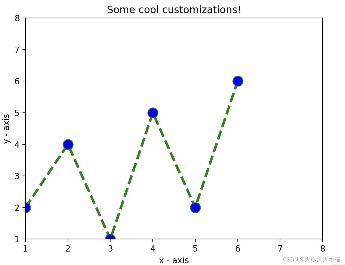
3.3 代码的部分解释
如上面代码所示,我们进行了一些自定义的改变:
- 1)设定线的宽度、样式以及颜色。
- 2)设定了标记的形状、颜色和尺寸。
- 3)覆盖 x 和 y 轴范围。如果未完成覆盖,
pyplot 模块使用自动缩放功能来设置轴范围和比例。


 6254
6254


 被折叠的 条评论
为什么被折叠?
被折叠的 条评论
为什么被折叠?
 到【灌水乐园】发言


