


每个组件库都有它们自己的文档。所以当我们开发完成我们自己的组件库必须也需要一个组件库文档。,所以下面就以element-plus作为示例来搭建一个文档吧。
vitepress中文官网:https://process1024.github.io/vitepress/
安装vitepress
首先新建文件夹就叫kittydocs,执行pnpm init初始化,然后安装vitepress
pnpm add vitepress -D在 package.json添加一些script
"scripts": {
    "docs:dev": "vitepress dev docs",
    "docs:build": "vitepress build docs",
    "docs:serve": "vitepress serve docs"
  }
安装组件库element-plus
安装组件库element-plus目录结构
新建kittydocs目录,其中文件结构如下图
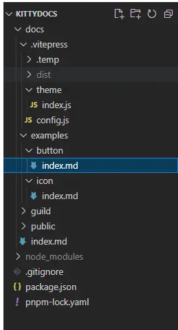
.vitepress/config.js为配置文件
.vitepress/theme/index.js为自定义主题
examples作为为组件示例目录
public是公共文件目录
index.md则是组件库文档的首页
gulild放我们组件指南文档
文档首页
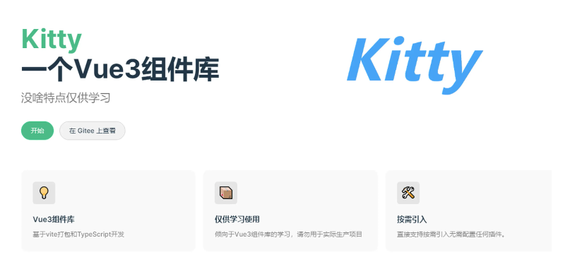
首先我们按照官网的样式给我们组件库整个首页,在index.md文件中写入
layout: home

title: Kitty
titleTemplate: 一个Vue3组件库

hero:
  name: Vue3组件库
  text: 一个Vue3组件库
  tagline: 没啥特点仅供学习
  image:
    src: /logo.png
    alt: Kitty
  actions:
    - theme: brand
      text: 开始
      link: /guide/
    - theme: alt
      text: 在 Gitee 上查看
      link: https://gitee.com/geeksdidi/kittyui

features:
  - icon: 💡
    title: Vue3组件库
    details: 基于vite打包和TypeScript开发
  - icon: 📦
    title: 仅供学习使用
    details: 倾向于Vue3组件库的学习,请勿用于实际生产项目
  - icon: 🛠️
    title: 按需引入
    details: 直接支持按需引入无需配置任何插件。
---
然后pnpm run docs:dev启动我们的项目,我们就可以看到这样的画面

是不是感觉已经有点组件库文档的意思了。接下来对导航栏以及我们们文档的侧边栏进行一个配置。
导航栏配置
export default {
  themeConfig: {
    siteTitle: false,
    logo: "/logo.png",
    nav: [
      { text: "指南", link: "/guild/installation" },
      { text: "组件", link: "/examples/button/" },
    ],
    socialLinks: [{ icon: "github", link: "https://gitee.com/geeksdidi" }],
  },
}
我们在config.js中配置我们的logo、导航栏以及社交链接。此时我们的导航栏便配置完成

侧边栏
首先我们对指南的侧边栏做一个配置
    sidebar: {
      "/guild/": [
        {
          text: "基础",
          items: [
            {
              text: "安装",
              link: "/guild/installation",
            },
            {
              text: "快速开始",
              link: "/guild/quickstart",
            },
          ],
        },
        {
          text: "进阶",
          items: [
            {
              text: "xx",
              link: "/xx",
            },
          ],
        },
      ],
    },
同时我们在guild目录下新建installation.md和quickstart.md文件。接下来分别在这两个文件中介绍我们组件库的安装以及使用(这里将Element Plus当作我们自己的组件KittyUI)
installation.md
# 安装
## 环境支持
由于 Vue 3 不再支持 IE11,KittyUI 也不再支持 IE11 浏览器。
## 版本
Element Plus 目前还在开发迭代中
## 使用包管理器
建议您使用包管理器 (NPM, Yarn, pnpm) 安装 KittyUI, 然后您就可以使用打包工具,例如 Vite 和 webpack
# 选择一个你喜欢的包管理器
# NPM
$ npm install kitty-ui --save
# Yarn
$ yarn add kitty-ui
# pnpm
$ pnpm install kitty-ui
## 浏览器直接引入
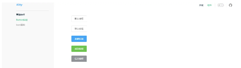
暂不支持quickstart.md
# 快速开始

本节将介绍如何在项目中使用 KittyUI

## 用法

...
<template>
  <Button>按钮</Button>
</template>

<script setup>
    import { Button } from 'kitty-ui'
</script>
...
这时候我们文档的效果如下

接下来我们对组件的侧边栏做一个配置,和指南一样,我们只需要在sidebar下再加个/examples/路径即可
    "/examples/": [
        {
          text: "基础组件",
          items: [
            {
              text: "Button按钮",
              link: "/examples/button/",
            },
            {
              text: "Icon图标",
              link: "/examples/Icon/",
            },
          ],
        },
      ],
vitepress中markdown文件中是可以直接使用vue组件的,我们先在theme/index全局引入element-plus
// .vitepress/theme/index.js

import DefaultTheme from "vitepress/theme";
import "element-plus/dist/index.css";
import elementplus from "element-plus"
export default {
  ...DefaultTheme,
  enhanceApp: async ({ app, router, siteData }) => {
    // app is the Vue 3 app instance from `createApp()`. router is VitePress'
    // custom router. `siteData`` is a `ref`` of current site-level metadata.
      app.use(elementplus);

  },
};
这里我们拿Button做一个演示,在button/index.md中我们可以直接这样使用Button组件
<el-button>默认按钮</el-button>
<br/><br/>
<el-button>默认按钮</el-button>
<br/><br/>
<el-button type="primary">主要按钮</el-button>
<br/><br/>
<el-button type="success">成功按钮</el-button>
<br/><br/>
<el-button type="info">信息按钮</el-button>
此时我们页面即可展示我们的Button按钮
基于此,我们便可以轻松使用markdown文件的形式来编写我们的组件使用文档了。代码有点长,这里就贴一部分代码展示与隐藏的实现部分

完整的md文档你可以点击 index.md 直接查看。最后展示效果如下
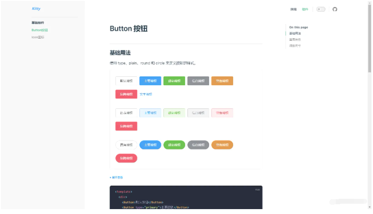
其它组件实现方法基本一致,这里就不再一一实现了


 1107
1107

 被折叠的 条评论
为什么被折叠?
被折叠的 条评论
为什么被折叠?
 到【灌水乐园】发言


