


1.练习
假设大家在30岁的时候,根据自己的实际情况,统计出来了你和你同桌各自从11岁到30岁每年交的女(男)朋友的数量如列表a和b,请在一个图中绘制出该数据的折线图,以便比较自己和同桌20年间的差异,同时分析每年交女(男)朋友的数量走势
a = [1,0,1,1,2,4,3,2,3,4,4,5,6,5,4,3,3,1,1,1]
b = [1,0,3,1,2,2,3,3,2,1 ,2,1,1,1,1,1,1,1,1,1]
要求:
y轴表示个数
x轴表示岁数,比如11岁,12岁等
from matplotlib import pyplot as plt
from matplotlib import  font_manager
my_font=font_manager.FontProperties(fname=r"c:\windows\Fonts\simhei.ttf")
y_1 = [1,0,1,1,2,4,3,2,3,4,4,5,6,5,4,3,3,1,1,1]
y_2 = [1,0,3,1,2,2,3,3,2,1 ,2,1,1,1,1,1,1,1,1,1]
x=range(11,31)
##设置图形大小
plt.figure(figsize=(20,8),dpi=80)
plt.plot(x,y_1,label='自己',color='orange',linestyle=':')
plt.plot(x,y_2,label='同桌',color='cyan',linestyle='-.')
##设置x轴刻度
_xtick_labels=['{}岁'.format(i) for i in x]
plt.xticks(x,_xtick_labels,fontproperties=my_font)
plt.yticks(range(0,9))
##绘制网格,alpha设置透明度,(0,1)
plt.grid(alpha=0.4)
##添加图例
plt.legend(prop=my_font,loc="upper left")  ##只有这里这么显示中文,位置可以调节
##展示
plt.show()
2.绘制条形图
假设你获取到了2017年内地电影票房前20的电影(列表a)和电影票房数据(列表b),那么如何更加直观的展示该数据?
a = [“战狼2”,“速度与激情8”,“功夫瑜伽”,“西游伏妖篇”,“变形金刚5:最后的骑士”,“摔跤吧!爸爸”,“加勒比海盗5:死无对证”,“金刚:骷髅岛”,“极限特工:终极回归”,“生化危机6:终章”,“乘风破浪”,“神偷奶爸3”,“智取威虎山”,“大闹天竺”,“金刚狼3:殊死一战”,“蜘蛛侠:英雄归来”,“悟空传”,“银河护卫队2”,“情圣”,“新木乃伊”,]
b=[56.01,26.94,17.53,16.49,15.45,12.96,11.8,11.61,11.28,11.12,10.49,10.3,8.75,7.55,7.32,6.99,6.88,6.86,6.58,6.23] 单位:亿
from matplotlib import pyplot as plt
from matplotlib import font_manager
my_font=font_manager.FontProperties(fname=r"c:\windows\Fonts\simhei.ttf")
b=[56.01,26.94,17.53,16.49,15.45,12.96,11.8,11.61,11.28,11.12,10.49,10.3,8.75,7.55,7.32,6.99,6.88,6.86,6.58,6.23]

##名字太长,\n 换行
a = ["战狼2","速度与激情8","功夫瑜伽","西游伏妖篇","变形金刚5:最后的骑士","摔跤吧!爸爸","加勒比海盗5:\n死无对证","金刚:骷髅岛","极限特工:终极回归","生化危机6:终章","乘风破浪","神偷奶爸3","智取威虎山","大闹天竺","金刚狼3:殊死一战","蜘蛛侠:英雄归来","悟空传","银河护卫队2","情圣","新木乃伊",]
##设置图形大小

plt.figure(figsize=(15,8),dpi=80)
##绘制竖着的条形图
#plt.bar(range(len(a)),b,width=0.3)
#plt.xticks(range(len(a)),a,fontproperties=my_font,rotation=90)


##绘制横着的条形图
plt.barh(range(len(a)),b,height=0.3,color='orange')
##设置字符串x轴
plt.yticks(range(len(a)),a,fontproperties=my_font)

##添加网格

plt.grid(alpha=0.3)

plt.show()
练习
绘制多次条形图
a = [“猩球崛起3:终极之战”,“敦刻尔克”,“蜘蛛侠:英雄归来”,“战狼2”]
b_16 = [15746,312,4497,319]
b_15 = [12357,156,2045,168]
b_14 = [2358,399,2358,362]
from matplotlib import pyplot as plt
from matplotlib import font_manager
my_font=font_manager.FontProperties(fname=r"c:\windows\Fonts\simhei.ttf")
a = ["猩球崛起3:终极之战","敦刻尔克","蜘蛛侠:英雄归来","战狼2"]
b_16 = [15746,312,4497,319]
b_15 = [12357,156,2045,168]
b_14 = [2358,399,2358,362]
bar_width=0.2
x_14=list(range(len(a)))
x_15=[i+bar_width for i in x_14]
x_16=[i+bar_width*2 for i in x_14]

plt.figure(figsize=(20,8),dpi=80)

##绘制横着的条形图
plt.bar(range(len(a)),b_14,width=bar_width,label='9月14日')
plt.bar(x_15,b_15,width=bar_width,label='9月15日')
plt.bar(x_16,b_16,width=bar_width,label='9月16日')
##设置字符串x轴
plt.xticks(x_15,a,fontproperties=my_font)
##设置图例
plt.legend(prop=my_font)

plt.show()
假设你获取了250部电影的时长(列表a中),希望统计出这些电影时长的分布状态(比如时长为100分钟到120分钟电影的数量,出现的频率)等信息,你应该如何呈现这些数据?
a=[131, 98, 125, 131, 124, 139, 131, 117, 128, 108, 135, 138, 131, 102, 107, 114, 119, 128, 121, 142, 127, 130, 124, 101, 110, 116, 117, 110, 128, 128, 115, 99, 136, 126, 134, 95, 138, 117, 111,78, 132, 124, 113, 150, 110, 117, 86, 95, 144, 105, 126, 130,126, 130, 126, 116, 123, 106, 112, 138, 123, 86, 101, 99, 136,123, 117, 119, 105, 137, 123, 128, 125, 104, 109, 134, 125, 127,105, 120, 107, 129, 116, 108, 132, 103, 136, 118, 102, 120, 114,105, 115, 132, 145, 119, 121, 112, 139, 125, 138, 109, 132, 134,156, 106, 117, 127, 144, 139, 139, 119, 140, 83, 110, 102,123,107, 143, 115, 136, 118, 139, 123, 112, 118, 125, 109, 119, 133,112, 114, 122, 109, 106, 123, 116, 131, 127, 115, 118, 112, 135,115, 146, 137, 116, 103, 144, 83, 123, 111, 110, 111, 100, 154,136, 100, 118, 119, 133, 134, 106, 129, 126, 110, 111, 109, 141,120, 117, 106, 149, 122, 122, 110, 118, 127, 121, 114, 125, 126,114, 140, 103, 130, 141, 117, 106, 114, 121, 114, 133, 137, 92,121, 112, 146, 97, 137, 105, 98, 117, 112, 81, 97, 139, 113,134, 106, 144, 110, 137, 137, 111, 104, 117, 100, 111, 101, 110,105, 129, 137, 112, 120, 113, 133, 112, 83, 94, 146, 133, 101,131, 116, 111, 84, 137, 115, 122, 106, 144, 109, 123, 116, 111,111, 133, 150]

from matplotlib import pyplot as plt
from matplotlib import font_manager
a=[131,  98, 125, 131, 124, 139, 131, 117, 128, 108, 135, 138, 131, 102, 107, 114, 119, 128, 121, 142, 127, 130, 124, 101, 110, 116, 117, 110, 128, 128, 115,  99, 136, 126, 134,  95, 138, 117, 111,78, 132, 124, 113, 150, 110, 117,  86,  95, 144, 105, 126, 130,126, 130, 126, 116, 123, 106, 112, 138, 123,  86, 101,  99, 136,123, 117, 119, 105, 137, 123, 128, 125, 104, 109, 134, 125, 127,105, 120, 107, 129, 116, 108, 132, 103, 136, 118, 102, 120, 114,105, 115, 132, 145, 119, 121, 112, 139, 125, 138, 109, 132, 134,156, 106, 117, 127, 144, 139, 139, 119, 140,  83, 110, 102,123,107, 143, 115, 136, 118, 139, 123, 112, 118, 125, 109, 119, 133,112, 114, 122, 109, 106, 123, 116, 131, 127, 115, 118, 112, 135,115, 146, 137, 116, 103, 144,  83, 123, 111, 110, 111, 100, 154,136, 100, 118, 119, 133, 134, 106, 129, 126, 110, 111, 109, 141,120, 117, 106, 149, 122, 122, 110, 118, 127, 121, 114, 125, 126,114, 140, 103, 130, 141, 117, 106, 114, 121, 114, 133, 137,  92,121, 112, 146,  97, 137, 105,  98, 117, 112,  81,  97, 139, 113,134, 106, 144, 110, 137, 137, 111, 104, 117, 100, 111, 101, 110,105, 129, 137, 112, 120, 113, 133, 112,  83,  94, 146, 133, 101,131, 116, 111,  84, 137, 115, 122, 106, 144, 109, 123, 116, 111,111, 133, 150]
##直方图
##计算组数
d=3   ##组距
num_bins=(max(a)-min(a))//d
print(max(a),min(a),max(a)-min(a))
plt.figure(figsize=(20,8))
##频数分布直方图
#plt.hist(a,num_bins)
##频率分布直方图
plt.hist(a,num_bins,normed=1)##也可以等于normed=True
#设置x轴刻度
plt.xticks(range(min(a),max(a)+d,d))

plt.grid()
plt.show()
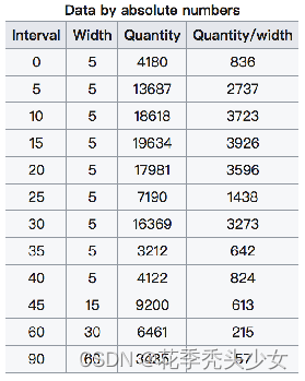
在美国2004年人口普查发现有124 million的人在离家相对较远的地方工作。根据他们从家到上班地点所需要的时间,通过抽样统计(最后一列)出了下表的数据,这些数据能够绘制成直方图么?
interval = [0,5,10,15,20,25,30,35,40,45,60,90]
width = [5,5,5,5,5,5,5,5,5,15,30,60]
quantity = [836,2737,3723,3926,3596,1438,3273,642,824,613,215,47]
import matplotlib.pyplot as plt

interval = [0,5,10,15,20,25,30,35,40,45,60,90]  ##x轴
width = [5,5,5,5,5,5,5,5,5,15,30,60]           ##组距
quantity = [836,2737,3723,3926,3596,1438,3273,642,824,613,215,47]   ##统计的数量,y轴
plt.figure(figsize=(20,8),dpi=80)
plt.bar(range(len(interval)),quantity,width=1)


print(len(interval),len(quantity),len(width))

_x=[i-0.5 for i in range(12)]
_xtick_labels=interval+[150]
plt.xticks(_x,_xtick_labels)
plt.grid()
plt.show()
没有经过统计的原始的数据才能利用hist绘制直方图,经过统计的,最好利用条形图
二、matplotlib常见问题总结
matplotlib.plot(x,y)
matplotlib.bar(x,y)
matplotlib.scatter(x,y)
matplotlib.hist(data,bins,normed)
xticks和yticks的设置
绘图的大小和保存图片
三、前端画图框架


 747
747


 被折叠的 条评论
为什么被折叠?
被折叠的 条评论
为什么被折叠?
 到【灌水乐园】发言


