


使用场景:一些介绍性的东西需要在气泡中显示 ,然后用箭头指出来,箭头一般为三角形
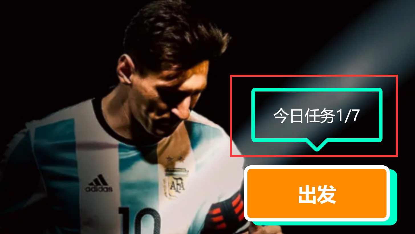
如上图中气泡一样
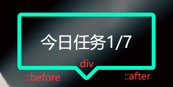
方法:使用伪元素
::after + ::before + div
::after 的元素是一条直线
::before 的元素也是一条直线
div 的元素是一个方块,隐藏了一部分的 border ,使用旋转让尖角朝底
使用绝对定位将上面的东西结合在一起
代码:
html部分:
<div class="message">
      <div class="angle"></div>
       今日任务1/7
</div>
css部分:
.message {
        height: 14vh;
        width: 18vw;
        position: absolute;
        top: 30vh;
        left: 61vw;
        box-sizing: border-box;
        border: #00ffc8 solid 1vh;
        border-radius: 1vh;
        font-size: 4vh;
        font-weight: 500;
        color: white;
        display: flex;
        align-items: center;
        justify-content: center;
        border-bottom-color: transparent;

        .angle {
            position: absolute;
            height: 3vh;
            width: 3vh;
            border: #00ffc8 solid 1vh;
            border-top-color: transparent;
            border-left-color: transparent;
            transform: rotate(45deg);
            border-radius: 1vh;
            top: 9.8vh;
        }

        &::after {
            content: "";
            position: absolute;
            height: 1vh;
            width: 7.7vw;
            border-radius: 10vh;
            top: 12vh;
            background-color: #00ffc8;
            right: -0.4vw;
        }

        &::before {
            content: "";
            position: absolute;
            height: 1vh;
            width: 7.7vw;
            border-radius: 10vh;
            top: 12vh;
            background-color: #00ffc8;
            left: -0.4vw;
        }

    }


 扫一扫
扫一扫


 966
966

 被折叠的 条评论
为什么被折叠?
被折叠的 条评论
为什么被折叠?
 到【灌水乐园】发言


