


1、下载
npm install echarts --save
2.引入
在mainjs里面通过原型全局挂载 (通过this.$echarts就可以获取到对象)
//引入echarts
import echarts from 'echarts'
Vue.prototype.$echarts = echarts;
或者 局部组件
import * as echarts from "echarts";
div 设置宽高 获取 id
<template>
    <div>
        <!-- 333333333 -->
        <div id="charts1" style = "width: 600px;height:400px;" ></div>
    </div>
</template>
<script>

import * as echarts from "echarts";
export default {
    data() {
        return {}
    },
    mounted() {
        this.drawLine()
    },
    methods: {
        drawLine() {
            // 基于准备好的dom,初始化echarts实例
            let myChart =echarts.init(document.getElementById('charts1'))
            let dateArr = ['乡镇-01', '乡镇-02', '乡镇-03', '乡镇-04', '乡镇-05']
            let wzArr = [20, 30, 40, 50, 60, 70]
            let gzhArr = [88, 99, 100, 110, 120, 122]
            var option = {
                // backgroundColor:"#010407",
                grid: {
                    left: '12%',
                    right: '12%',
                    top: '12%'
                },
                legend: {
                    show: true,
                    itemWidth: 8.63,
                    itemHeight: 2.05,
                    // 		itemGap:50,
                    left: 'center',
                    // 		top: 10,
                    textStyle: {
                        // 			color: '#fff',
                        fontSize: 16
                    }
                },
                xAxis: {
                    type: 'value',
                    // "max": max,
                    splitLine: {
                        show: true,
                        lineStyle: {
                            color: '#232e32'
                        }
                    },
                    axisLine: {
                        show: false
                    },
                    axisLabel: {
                        show: true,
                        textStyle: {
                            // 				"color": "#fff",
                            fontSize: 16
                        }
                    },
                    axisTick: {
                        show: false
                    }
                },
                yAxis: [
                    {
                        type: 'category',
                        inverse: true,
                        data: dateArr,
                        axisLine: {
                            show: false
                        },
                        axisTick: {
                            show: false
                        },
                        axisLabel: {
                            // "margin": 10,
                            textStyle: {
                                // 				"color": "#fff",
                                fontSize: 16
                            }
                        }
                    }
                ],
                series: [
                    {
                        //内
                        type: 'bar',
                        barWidth: '16px',
                        barGap: 0.5,
                        name: '常住人口',
                        label: {
                            show: true,
                            position: 'right',
                            textStyle: {
                                color: '#fff',
                                fontSize: 16,
                                padding: [0, 10],
                                rich: {
                                    a: {
                                        // 	color: '#fff',
                                        fontSize: 36
                                    }
                                }
                            }
                        },
                        legendHoverLink: false,
                        silent: true,
                        itemStyle: {
                            //这里设置柱形图圆角 [左上角,右上角,右下角,左下角]

                            color: {
                                type: 'linear',
                                x: 0,
                                y: 0,
                                x2: 1,
                                y2: 0,
                                colorStops: [
                                    {
                                        offset: 0,
                                        color: '#a8cdff' // 0% 处的颜色
                                    },
                                    {
                                        offset: 1,
                                        color: '#6ea8ff' // 100% 处的颜色
                                    }
                                ],
                                globalCoord: false // 缺省为 false
                            } //底色
                        },
                        data: wzArr
                    },
                    {
                        //内2
                        type: 'bar',
                        barWidth: '16px',
                        name: '流动人口',
                        legendHoverLink: false,
                        silent: true,
                        label: {
                            show: true,
                            position: 'right',
                            textStyle: {
                                // 					color: '#fff',
                                padding: [0, 10],
                                fontSize: 16,
                                rich: {
                                    a: {
                                        // 	color: '#fff',
                                        fontSize: 36
                                    }
                                }
                            }
                        },
                        itemStyle: {
                            color: {
                                type: 'linear',
                                x: 0,
                                y: 0,
                                x2: 1,
                                y2: 0,

                                colorStops: [
                                    {
                                        offset: 0,
                                        color: '#c6f7fd' // 0% 处的颜色
                                    },
                                    {
                                        offset: 1,
                                        color: '#69e8fd' // 100% 处的颜色
                                    }
                                ],
                                globalCoord: false // 缺省为 false
                            } //底色
                        },
                        data: gzhArr
                    }
                ]
            }
            // 绘制图表
            myChart.setOption(option)
        }
    },

}
</script>
<style lang="less" scoped>

</style>
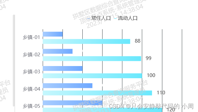
效果:


 4万+
4万+


 被折叠的 条评论
为什么被折叠?
被折叠的 条评论
为什么被折叠?
 到【灌水乐园】发言


