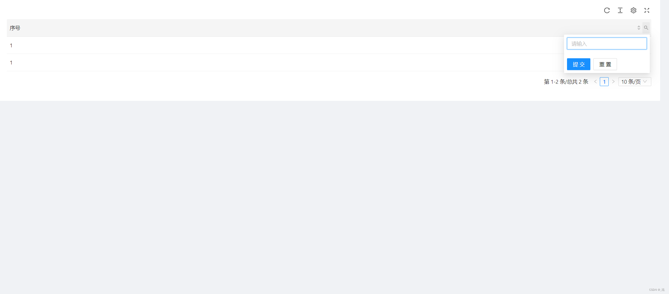
上一章分享了关于ProTable表格组件的封装,这一章我们来分享下针对ProTable组件的 自定义搜索组件
NpTableContext这个方法 在上一章中可以看的比较详细,在这里就不多做注释了。
import { NpTableContext } from '@/components/CustomTable';
import { SearchOutlined } from '@ant-design/icons';
import ProForm, { ProFormText } from '@ant-design/pro-form';
import type { FilterDropdownProps } from 'antd/lib/table/interface';
import { useContext } from 'react';
const ColumnSearchInputProps = <T,>(inputName: string) => {
return {
filterDropdown: ({ setSelectedKeys, confirm }: FilterDropdownProps) => {
// eslint-disable-next-line react-hooks/rules-of-hooks
const onSearhParamsChanged = useContext(NpTableContext).onSearhParamsChanged;
const handleOnReset = async (values = {}) => {
values[inputName] = undefined;
setSelectedKeys([]);
//调用ProTable组件内的onSearhParamsChanged事件 进行重置
onSearhParamsChanged?.(values);
confirm({ closeDropdown: true });
};
return (
<ProForm<T>
onReset={handleOnReset}
autoFocusFirstInput={true}
isKeyPressSubmit={true}
style={{ padding: 8 }}
onFinish={async (values) => {
values[inputName] = values[inputName] ? values[inputName].trim() : undefined;
setSelectedKeys(values[inputName] ? [0] : []);
//调用ProTable组件内的onSearhParamsChanged事件 进行搜索
onSearhParamsChanged?.({ ...values });
confirm({ closeDropdown: true });
}}
>
<ProFormText width="sm" name={inputName} />
</ProForm>
);
},
filterIcon: (filtered: React.ReactNode | ((filtered: boolean) => React.ReactNode)) => (
<SearchOutlined style={{ color: filtered ? '#1890ff' : undefined }} />
),
};
};
export default ColumnSearchInputProps;
使用方法:
引入 ColumnSearchInputProps组件 在Column中使用即可,下一章会分享其他自定义搜索组件,有其他搜索组件可以 以这个例子为模板 扩展其他的搜索方式。
const Column: ProColumnType = [
{
title: '序号',
dataIndex: 'index',
sorter: true//排序
...ColumnSearchInputProps<{ index: string }>('index'),
},
]