


粘性页脚模式是指当页面内容不足以填满视口高度时,页脚会“粘附”在视口底部的一种模式。
粘性页脚模式需要满足以下要求:
- 当内容不足以填满视口时,页脚粘附在视口底部。
- 如果页面内容超过视口底部,页脚会正常地位于内容下方。
弹性盒子
<div class="wrapper">
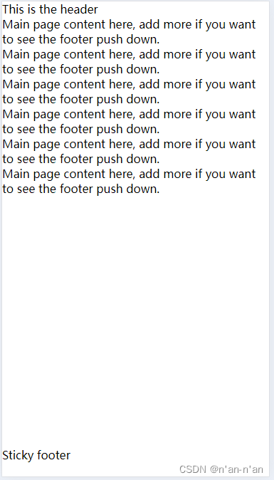
<header class="page-header">This is the header</header>
<main class="page-body">
<p>Main page content here, add more if you want to see the footer push down.</p>
</main>
<footer class="page-footer">Sticky footer</footer>
</div>html, body {
box-sizing: border-box;
height: 100%;
padding: 0;
margin: 0;
}
.wrapper {
box-sizing: border-box;
min-height: 100%;
display: flex;
flex-direction: column;
}
.page-header, .page-footer {
flex-grow: 0;
flex-shrink: 0;
}
.page-body {
flex-grow: 1;
}效果如下:

Grid
grid-template-rows:指定垂直高度怎么划分,这里是从上到下分成三部分。第一部分(页眉)和第三部分(页脚)的高度都为auto,即本来的内容高度;第二部分(内容区)的高度为1fr,即剩余的所有高度,这可以保证页脚始终在容器的底部。
<template>
    <div class="wrapper">
        <header class="page-header">This is the header</header>
        <article class="page-body">
            <p v-for="index in 6">Main page content here, add more if you want to see the footer push down.</p>
        </article>
        <footer class="page-footer">Sticky footer</footer>
    </div>
</template>

<script setup lang="ts">

</script>

<style scoped lang="scss">
.wrapper {
  min-height: 100vh;
  display: grid;
  grid-template-rows: auto 1fr auto;
  .page-footer{
    width: 100%;
    margin-bottom: 20px;
  }
}
</style>
效果如下:


 被折叠的 条评论
为什么被折叠?
被折叠的 条评论
为什么被折叠?
 到【灌水乐园】发言


