


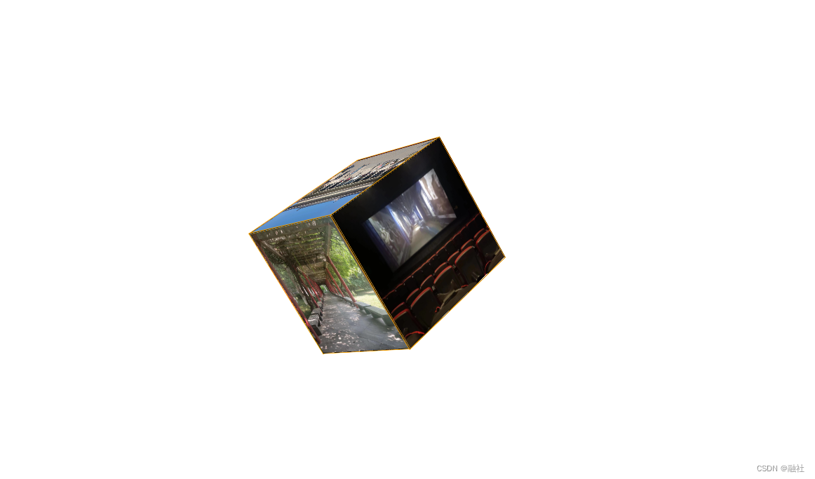
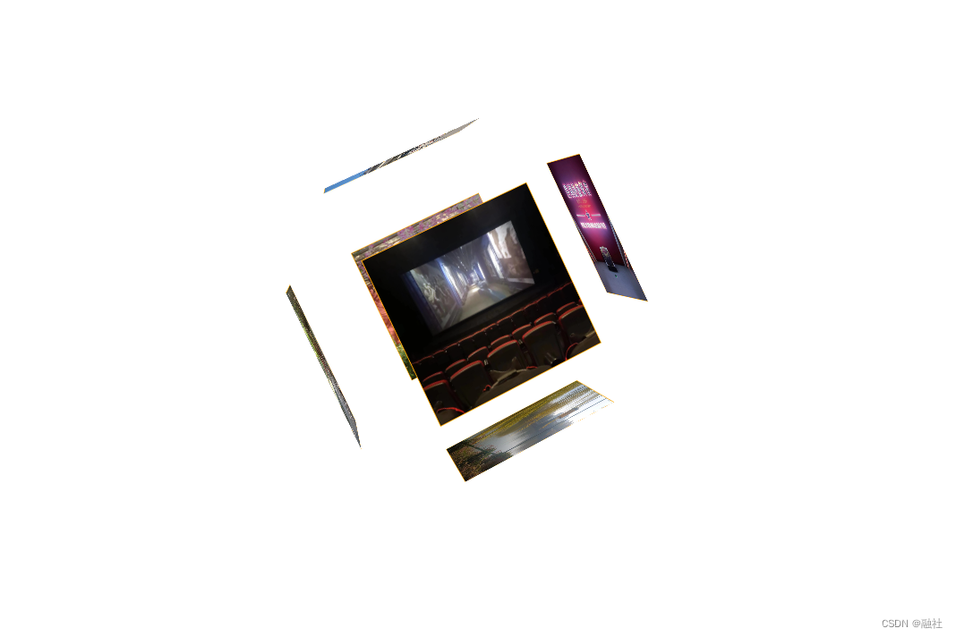
立体相册
<!DOCTYPE html>
<html>
	<head>
		<meta charset="utf-8">
		<title></title>
		<style>
			body{
				perspective: 1000px;
			}
			@keyframes myAnimation{
				from{
					transform: rotateX(0deg) rotateY(0deg) rotateZ(0deg);
				}
				to{
					transform: rotateX(360deg) rotateY(360deg) rotateZ(360deg);
				}
			}
			.container{
				margin: 200px;
				position: relative;
				transform-style: preserve-3d;
				transition: 3s;
				animation: myAnimation 5s linear 0s infinite;
			}
			.container:hover>img:first-child{
				left:-300px;
			}
			.container:hover>img:nth-child(2){
				top: -300px;
			}
			.container:hover>img:nth-child(3){
				left: 300px;
			}
			.container:hover>img:nth-child(4){
				top: 300px;
			}
			.container:hover>img:nth-child(5){
				transform: translateZ(-100px);
			}
			.container:hover>img:nth-child(6){
				transform: translateZ(300px);
			}
			.container>img{
				width: 200px;
				height: 200px;
				position: absolute;
				border: 1px solid orange;
				transition: 3s;
			}
			.container>img:first-child{
				left:-200px;
				transform-origin: right;
				transform: rotateY(90deg);
			}
			.container>img:nth-child(2){
				top:-200px;
				transform-origin: bottom;
				transform: rotateX(-90deg);
			}
			.container>img:nth-child(3){
				left:200px;
				transform-origin: left;
				transform: rotateY(-90deg);
			}
			.container>img:nth-child(4){
				top: 200px;
				transform-origin: top;
				transform: rotateX(90deg);
			}
			.container>img:nth-child(6){
				transform: translateZ(200px);
			}
		</style>
	</head>
	<body>
		<div class="container">
			<img src="图1.jpg" alt="" />
			<img src="图2.jpg" alt="" />
			<img src="图3.jpg" alt="" />
			<img src="图4.jpg" alt="" />
			<img src="图5.jpg" alt="" />
			<img src="图6.jpg" alt="" />
		</div>
	</body>
</html>
默认状态:
鼠标悬停时:
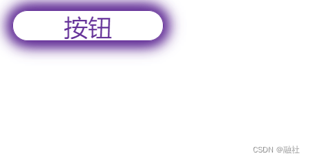
特效按钮
<!DOCTYPE html>
<html>
	<head>
		<meta charset="utf-8">
		<title></title>
		<style>
			div{
				width: 100px;
				height: 20px;
				border: 1px solid rebeccapurple;
				text-align: center;
				border-radius: 10px;
				color: rebeccapurple;
				box-shadow: 2px 2px 10px rebeccapurple,
				-2px 2px 10px rebeccapurple,
				-2px -2px 10px rebeccapurple,
				2px -2px 10px rebeccapurple;
				transition: 3s;
			}
			div:hover{
				box-shadow: none;
				background-color: rebeccapurple;
				color: white;
			}
		</style>
	</head>
	<body>
		<div>按钮</div>
	</body>
</html>
默认状态:
鼠标悬停时:


 5867
5867


 被折叠的 条评论
为什么被折叠?
被折叠的 条评论
为什么被折叠?
 到【灌水乐园】发言


