


CSS3
4、声明的优先级
(1)特殊性
① 结合符是指逗号 ,
② 内敛声明是指html的style属性

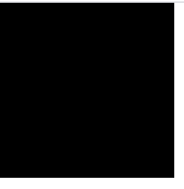
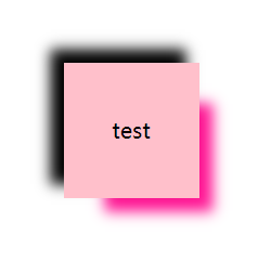
示例: style的特殊性 > test的特殊性 > pink的特殊性,所以最后的背景颜色为黑色
<!DOCTYPE html>
<html>
	<head>
		<meta charset="utf-8">
		<title></title>
		<style type="text/css">
			*{
				margin: 0;
				padding: 0;
			}
			div{
				width: 200px;
				height: 200px;
			}
			#test{
				background: deeppink;
			}
			.pink.pink.pink.pink.pink.pink.pink.pink.pink.pink.pink.pink.pink.pink.pink.pink{
				background: pink;
			}
		</style>
	</head>
	<body>
		<div class="pink" id="test" style="background: black;">

		</div>
	</body>
</html>
效果
(2) 重要声明
① 若重要声明和非重要声明冲突之间不比较特殊性,胜出的是重要声明
② 重要声明和非重要声明的内部冲突需要比较特殊性
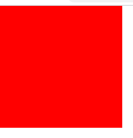
示例: red和yellow被标注为重要声明,且red的特殊性更高,最后呈现红色的背景
<!DOCTYPE html>
<html>
	<head>
		<meta charset="utf-8">
		<title></title>
		<style type="text/css">
			*{
				margin: 0;
				padding: 0;
			}
			div{
				width: 200px;
				height: 200px;
			}
			div[id].pink{
				background: red!important;
			}
			div[id]{
				background: yellow!important;
			}
			#test{
				background: deeppink;
			}
			.pink.pink.pink.pink.pink.pink.pink.pink.pink.pink.pink.pink.pink.pink.pink.pink{
				background: pink;
			}
		</style>
	</head>
	<body>
		<div class="pink" id="test" style="background: black;">

		</div>
	</body>
</html>
效果
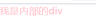
(3) 继承性
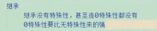
示例: 通配符为0特殊性,而继承没有特殊性,所以最后字体为粉色
<!DOCTYPE html>
<html>
	<head>
		<meta charset="utf-8">
		<title></title>
		<style type="text/css">
			*{
				margin: 0;
				padding: 0;
				color: pink;
			}
			div{
				width: 200px;
				height: 200px;
			}
		</style>
	</head>
	<body>
		<div class="pink" id="test" style="color: black;">
			<div>
				我是内部的div
			</div>
		</div>
	</body>
</html>
效果
(4)层叠
①按来源排序:读者的重要声明 > 创作人员的重要声明 > 创作人员的正常声明 > 读者的正常声明 > 用户代理的声明
②若来源相同,则按选择器的特殊性排序,特殊性更高的优先

二、自定义字体
1.自定义字体
① @font-face 要定义在声明块外部

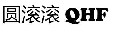
示例: 利用 @font-face,使字体变为 Cooper 黑体
<!DOCTYPE html>
<html>
	<head>
		<meta charset="utf-8">
		<title></title>
		<style type="text/css">
			@font-face {
				font-family:"DAMU";
				src: url(Font/COOPBL.TTF);
			}
			#test{
				font: 50px "DAMU";
			}
		</style>
	</head>
	<body>
		<div id="test">
			圆滚滚 	QHF
		</div>
	</body>
</html>
效果
三、字体图标
① 设计并使用字体图标:将矢量图和不同的字符一 一绑定,通过工具或者站点,将矢量图和字符绑定起来的东西生成出一套字体,最终将自定义字体引用到页面当中,字体就会和矢量图绑定在一块

四、新增UI方案
1.文本新增样式
(1)opacity
① 该属性不是一个可继承的属性,但是它可以影响自己的后代元素
示例: 内部div的背景颜色受到外部divopacity属性的影响,颜色变浅
<!DOCTYPE html>
<html>
	<head>
		<meta charset="utf-8">
		<title></title>
		<style type="text/css">
		*{
			margin: 0;
			padding: 0;
		}
			#wrap{
				width: 300px;
				height: 300px;
				margin: 100px auto;
				background: pink;
				opacity: 0.1;
			}
			#inner{
				width: 100px;
				height: 100px;
				background: deeppink;
			}
		</style>
	</head>
	<body>
		<div id="wrap">
			<div id="inner">
				inner
			</div>
		</div>
	</body>
</html>
效果

(2)rgba
(3)背景透明文字不透明
① 可以通过 rgb 和 rgba 之间的互换,将有颜色的背景或者文字转换为透明的
示例: 背景透明,文字不透明
<!DOCTYPE html>
<html>
	<head>
		<meta charset="utf-8">
		<title></title>
		<style type="text/css">
			*{
				margin: 0;
				padding: 0;
			}
			#wrap{
				width: 300px;
				height: 300px;
				margin: 100px auto;
				background: rgba(0,0,0,.5);
				color: rgb(255,255,255);
				font-size: 30px;
				line-height: 300px;
				text-align: center;
			}
		</style>
	</head>
	<body>
		<div id="wrap">
			我是wrap
		</div>
	</body>
</html>
效果

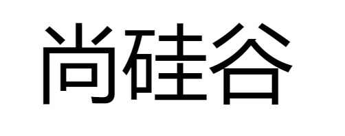
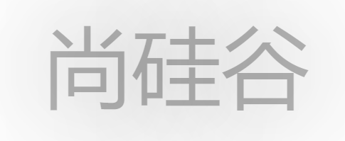
(4)文字阴影
① 格式
text-shadow:color offset-x offset-y blur-radius , color offset-x offset-y blur-radius

示例: 上面阴影颜色为灰色,下面阴影颜色为粉色
<!DOCTYPE html>
<html>
	<head>
		<meta charset="utf-8">
		<title></title>
		<style type="text/css">
			*{
				margin: 0;
				padding: 0;
			}
			h1{
				text-align: center;
				font: 100px/200px "微软雅黑";
				text-shadow: gray 10px 10px 10px,pink 20px 20px 20px;
			}
		</style>
	</head>
	<body>
		<h1>尚硅谷</h1>
	</body>
</html>
效果

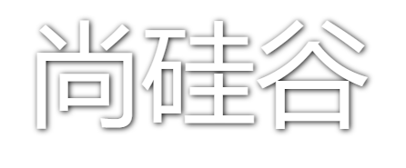
(5)浮雕文字
示例:
<!DOCTYPE html>
<html>
	<head>
		<meta charset="utf-8">
		<title></title>
		<style type="text/css">
			*{
				margin: 0;
				padding: 0;
			}
			h1{
				text-align: center;
				font: 100px/200px "微软雅黑";
				color: white;
				text-shadow: black 1px 1px 5px;
			}
		</style>
	</head>
	<body>
		<h1>尚硅谷</h1>
	</body>
</html>
效果
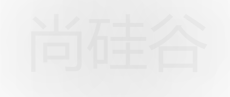
(6)文字模糊
示例:
<!DOCTYPE html>
<html>
	<head>
		<meta charset="utf-8">
		<title></title>
		<style type="text/css">
			*{
				margin: 0;
				padding: 0;
			}
			h1{
				text-align: center;
				font: 100px/200px "微软雅黑";
				color:black;
				transition: 1s;
			}
			h1:hover{
				color: rgba(0,0,0,0);
				text-shadow: black 0 0 200px;
			}
		</style>
	</head>
	<body>
		<h1>尚硅谷</h1>
	</body>
</html>
效果
(7)模糊背景
示例: filter过滤器中的 blur函数将整个元素模糊
<!DOCTYPE html>
<html>
	<head>
		<meta charset="utf-8">
		<meta name="viewport" content=""/>
		<title></title>
		<style type="text/css">
			*{
				margin: 0;
				padding: 0;
			}
			#wrap{
				height: 100px;
				background: rgba(0,0,0,.5);
				position: relative;
			}
			#wrap #bg{
				position: absolute;
				left: 0;
				right: 0;
				top: 0;
				bottom: 0;
				background: url(img/avatar.jpg) no-repeat;
				background-size: 100% 100%;
				z-index: -1;
				filter: blur(10px);
			}
			img{
				margin: 24px 0 0 24px;
			}
		</style>
	</head>
	<body>
		<div id="wrap">
			<img src="img/avatar.jpg" width="64px" height="64px" />
			<div id="bg"></div>
		</div>
	</body>
</html>
效果

(8)文字描边
示例:
<!DOCTYPE html>
<html>
	<head>
		<meta charset="utf-8">
		<title></title>
		<style type="text/css">
			h1{
				font: 100px/200px "微软雅黑";
				text-align: center;
				color: white;
				-webkit-text-stroke: pink 4px;
			}
		</style>
	</head>
	<body>
		<h1>尚硅谷</h1>
	</body>
</html>
效果

(9)文字排版
示例:
<!DOCTYPE html>
<html>
	<head>
		<meta charset="utf-8">
		<title></title>
		<style type="text/css">
			div{
				width: 200px;
				height: 200px;
				border: 1px solid;
				margin: 0 auto;
				direction: rtl;
				unicode-bidi: bidi-override;
			}
		</style>
	</head>
	<body>
		<div>尚硅谷</div>
	</body>
</html>
效果

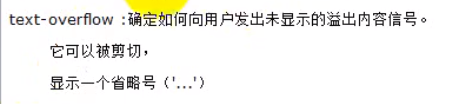
(10)溢出显示省略号
① white-space: nowrap;
overflow: hidden;
text-overflow: ellipsis;
以上三行要同时使用,且该元素不是靠内容撑开的
示例:
<!DOCTYPE html>
<html>
	<head>
		<meta charset="utf-8">
		<title></title>
		<style type="text/css">
			div{
				width: 200px;
				height: 200px;
				border: 1px solid;
				margin: 0 auto;
				white-space: nowrap;
				overflow: hidden;
				text-overflow: ellipsis;
			}
		</style>
	</head>
	<body>
		<div>尚硅谷尚硅谷尚硅谷尚硅谷尚硅谷尚硅谷尚硅谷尚硅谷尚硅谷尚硅谷尚硅谷尚硅谷尚硅谷尚硅谷尚硅谷尚硅谷</div>
	</body>
</html>
效果

2.盒模型新增样式
(1)盒模型阴影


示例:
<!DOCTYPE html>
<html>
	<head>
		<meta charset="utf-8">
		<title></title>
		<style type="text/css">
			*{
				margin: 0;
				padding: 0;
			}
			#test{
				position: absolute;
				left: 0;
				right: 0;
				bottom: 0;
				top: 0;
				margin: auto;
				width: 100px;
				height: 100px;
				background: pink;
				text-align: center;
				line-height: 100px;

				box-shadow: -10px -10px 10px 0px black , 20px 20px 10px -10px deeppink;
			}
		</style>
	</head>
	<body>
		<div id="test">
			test
		</div>
	</body>
</html>
效果
(2)倒影

示例:
<!DOCTYPE html>
<html>
	<head>
		<meta charset="utf-8">
		<title></title>
		<style type="text/css">
			*{
				margin: 0;
				padding: 0;
			}
			html,body{
				height: 100%;
			}
			body{
				text-align: center;
			}
			body::after{
				content: "";
				display: inline-block;
				height: 100%;
				vertical-align: middle;
			}
			img{
				 vertical-align: middle;
				 -webkit-box-reflect: above 10px;
			}
		</style>
	</head>
	<body>
		<img src="img/avatar.jpg" width="200px" height="200px">
	</body>
</html>
效果

(3)resize

示例: 可拖动元素改变其大小
<!DOCTYPE html>
<html>
	<head>
		<meta charset="utf-8">
		<title></title>
		<style type="text/css">
			*{
				margin: 0;
				padding: 0;
			}
			html,body{
				height: 100%;
			}
			body{
				text-align: center;
			}
			body::after{
				content: "";
				height: 100%;
				display: inline-block;
				vertical-align: middle;
			}
			div{
				display: inline-block;
				width: 200px;
				height: 200px;
				background: pink;
				vertical-align: middle;
				resize: both;
				overflow: auto;
			}
		</style>
	</head>
	<body>
		<div></div>
	</body>
</html>
效果


(4)box-sizing
① 值 border-box 使元素的宽高指定为 border-box 的宽高,而非内容区的宽高,若再指定 padding 的宽高,将会把内容区的大小挤小


示例: 指定了一个左右宽度为50px的 padding ,使内容区宽度变小
<!DOCTYPE html>
<html>
	<head>
		<meta charset="utf-8">
		<title></title>
		<style type="text/css">
			*{
				margin: 0;
				padding: 0;
			}
			input{
				width: 200px;
				padding: 0 50px;
				box-sizing: border-box;
			}
		</style>
	</head>
	<body>
		<input type="text" />
	</body>
</html>
效果

3.新增UI样式
(1)圆角
① 在移动端最好使用 px值表示圆角,在pc端 px值和百分比都可以使用


示例:
<!DOCTYPE html>
<html>
	<head>
		<meta charset="utf-8">
		<title></title>
		<style type="text/css">
			*{
				margin: 0;
				padding: 0;
			}
			#test{
				width: 200px;
				height: 200px;
				border: 1px solid;
				position: absolute;
				left: 0;
				right: 0;
				top: 0;
				bottom: 0;
				margin: auto;
				border-radius: 50%;
			}
		</style>
	</head>
	<body>
		<div id="test">
		</div>
	</body>
</html>
效果

(2)风车
示例: 风车顺时针转动120°
<!DOCTYPE html>
<html>
	<head>
		<meta charset="utf-8">
		<title></title>
		<style type="text/css">
			*{
				margin: 0;
				padding: 0;
			}
			html,body{
				height: 100%;
				overflow: hidden;
			}
			#wrap{
				width: 300px;
				height: 300px;
				position: absolute;
				left: 0;
				right: 0;
				bottom: 0;
				top: 0;
				margin: auto;
				transition: 2s;
			}
			#wrap > div{
				margin: 10px;
				width: 130px;
				height: 130px;
				border: 1px solid;
				background: deeppink;
				float: left;
				box-sizing: border-box;
			}
			#wrap > div:nth-child(1),#wrap > div:nth-child(4){
				border-radius: 0 60%;
			}
			#wrap > div:nth-child(2),#wrap > div:nth-child(3){
				border-radius: 60% 0;
			}
			#wrap:hover{
				transform: rotate(120deg);
			}
		</style>
	</head>
	<body>
		<div id="wrap">
			<div></div>
			<div></div>
			<div></div>
			<div></div>
		</div>
	</body>
</html>
效果


(3)对话框
示例:
<!DOCTYPE html>
<html>
	<head>
		<meta charset="utf-8">
		<title></title>
		<style type="text/css">
			*{
				margin: 0;
				padding: 0;
			}
			html,body{
				height: 100%;
				overflow: hidden;
			}
			#test{
				width: 600px;
				height: 400px;
				border: 1px solid;
				border-radius: 50%;
				text-align: center;
				font: 30px helvetica;
				line-height: 400px;
				position: relative;
			}
			#test::after{
				position: absolute;
				display: block;
				content: "";
				width: 80px;
				height: 80px;
				border: 1px solid;
				right: -20px;
				bottom: -20px;
				border-radius: 50%;
			}
			#test::before{
				position: absolute;
				display: block;
				content: "";
				width: 60px;
				height: 60px;
				border: 1px solid;
				right: -100px;
				bottom: -100px;
				border-radius: 50%;
			}
		</style>
	</head>
	<body>
		<div id="test">
			大家好,欢迎入坑前端
		</div>
	</body>
</html>
效果

(4)BFC


 860
860


 被折叠的 条评论
为什么被折叠?
被折叠的 条评论
为什么被折叠?
 到【灌水乐园】发言


