


七、2D变形(变换)
1. 旋转
示例:
<!DOCTYPE html>
<html>
	<head>
		<meta charset="utf-8">
		<title></title>
		<style type="text/css">
			*{
				margin: 0;
				padding: 0;
			}
			html{
				height: 100%;
				overflow: hidden;
			}
			body{
				width: 60%;
				height: 60%;
				border: 1px solid;
				margin: 100px auto 0;
				overflow: hidden;
			}
			#test{
				width: 200px;
				height: 200px;
				border-radius: 50%;
				background: pink;
				text-align: center;
				font: 30px/200px "微软雅黑";

				/* display: block; */

				position: absolute;
				left: 0;
				right: 0;
				bottom: 0;
				top: 0;
				margin: auto;

				transition: 2s;
			}

			body:hover #test{
				transform: rotate(360deg);
			}
		</style>
	</head>
	<body>
		<div id="test">
			hhh
		</div>
	</body>
</html>
2. 平移

示例:
<!DOCTYPE html>
<html>
	<head>
		<meta charset="utf-8">
		<title></title>
		<style type="text/css">
			*{
				margin: 0;
				padding: 0;
			}
			html{
				height: 100%;
				overflow: hidden;
			}
			body{
				width: 60%;
				height: 60%;
				border: 1px solid;
				margin: 100px auto 0;
				overflow: hidden;
			}
			#test{
				width: 200px;
				height: 200px;
				border-radius: 50%;
				background: pink;
				text-align: center;
				font: 30px/200px "微软雅黑";

				/* display: block; */

				position: absolute;
				left: 0;
				right: 0;
				bottom: 0;
				top: 0;
				margin: auto;

				transition: 2s;
			}

			body:hover #test{
				transform: translate(300px,300px);
			}
		</style>
	</head>
	<body>
		<div id="test">
			hhh
		</div>
	</body>
</html>
3. 倾斜

示例:
<!DOCTYPE html>
<html>
	<head>
		<meta charset="utf-8">
		<title></title>
		<style type="text/css">
			*{
				margin: 0;
				padding: 0;
			}
			html{
				height: 100%;
				overflow: hidden;
			}
			body{
				width: 60%;
				height: 60%;
				border: 1px solid;
				margin: 100px auto 0;
				overflow: hidden;
			}
			#test{
				width: 200px;
				height: 200px;
				border-radius: 50%;
				background: pink;
				text-align: center;
				font: 30px/200px "微软雅黑";

				/* display: block; */

				position: absolute;
				left: 0;
				right: 0;
				bottom: 0;
				top: 0;
				margin: auto;

				transition: 2s;
			}

			body:hover #test{
				transform: skew(45deg,45deg);
			}
		</style>
	</head>
	<body>
		<div id="test">
			hhh
		</div>
	</body>
</html>
4. 缩放

示例:
<!DOCTYPE html>
<html>
	<head>
		<meta charset="utf-8">
		<title></title>
		<style type="text/css">
			*{
				margin: 0;
				padding: 0;
			}
			html{
				height: 100%;
				overflow: hidden;
			}
			body{
				width: 60%;
				height: 60%;
				border: 1px solid;
				margin: 100px auto 0;
				overflow: hidden;
			}
			#test{
				width: 200px;
				height: 200px;
				border-radius: 50%;
				background: pink;
				text-align: center;
				font: 30px/200px "微软雅黑";

				/* display: block; */

				position: absolute;
				left: 0;
				right: 0;
				bottom: 0;
				top: 0;
				margin: auto;

				transition: 2s;
			}

			body:hover #test{
				transform: scale(.5,.5);
			}
		</style>
	</head>
	<body>
		<div id="test">
			hhh
		</div>
	</body>
</html>
5. 基点的变换
① 基点的变换只对旋转、倾缩放有效,对平移没有作用
② 基点的位置有一下三种书写方式
- transform-origin: 100% 100%;
- transform-origin: 50px 50px;
- transform-origin: left top;

示例:
<!DOCTYPE html>
<html>
	<head>
		<meta charset="utf-8">
		<title></title>
		<style type="text/css">
			*{
				margin: 0;
				padding: 0;
			}
			html{
				height: 100%;
				overflow: hidden;
			}
			body{
				width: 60%;
				height: 60%;
				border: 1px solid;
				margin: 100px auto 0;
				overflow: hidden;
			}
			#test{
				width: 200px;
				height: 200px;
				background: pink;
				text-align: center;
				font: 30px/200px "微软雅黑";

				/* display: block; */

				position: absolute;
				left: 0;
				right: 0;
				bottom: 0;
				top: 0;
				margin: auto;

				transition: 2s;
				transform-origin: 100% 100%;
				 /* transform-origin: 50px 50px; */
				/* transform-origin: left top; */
			}

			body:hover #test{
				transform: rotate(360deg);
				/* transform: scale(2); */
				/* transform: skew(45deg); */
			}
		</style>
	</head>
	<body>
		<div id="test">
			hhh
		</div>
	</body>
</html>
6. 矩阵

(1)平移

示例:
<!DOCTYPE html>
<html>
	<head>
		<meta charset="utf-8">
		<title></title>
		<style type="text/css">
			*{
				margin: 0;
				padding: 0;
			}
			html{
				height: 100%;
				overflow: hidden;
			}
			body{
				width: 60%;
				height: 60%;
				border: 1px solid;
				margin: 100px auto 0;
				overflow: hidden;
			}
			#test{
				width: 200px;
				height: 200px;
				border-radius: 50%;
				background: pink;
				text-align: center;
				font: 30px/200px "微软雅黑";

				/* display: block; */

				position: absolute;
				left: 0;
				right: 0;
				bottom: 0;
				top: 0;
				margin: auto;

				transition: 2s;
			}

			body:hover #test{
				transform: matrix(1,0,0,1,300,0);
			}
		</style>
	</head>
	<body>
		<div id="test">
			hhh
		</div>
	</body>
</html>
(2)旋转

示例:
<!DOCTYPE html>
<html>
	<head>
		<meta charset="utf-8">
		<title></title>
		<style type="text/css">
			*{
				margin: 0;
				padding: 0;
			}
			html{
				height: 100%;
				overflow: hidden;
			}
			body{
				width: 60%;
				height: 60%;
				border: 1px solid;
				margin: 100px auto 0;
				overflow: hidden;
			}
			#test{
				width: 200px;
				height: 200px;
				background: pink;
				text-align: center;
				font: 30px/200px "微软雅黑";

				/* display: block; */

				position: absolute;
				left: 0;
				right: 0;
				bottom: 0;
				top: 0;
				margin: auto;

				transition: 2s;
			}

			/*
				角度转弧度
					deg*PI/180
			 */

			body:hover #test{
				transform:matrix(0.707167811865476,0.707167811865475,-0.707167811865475,0.707167811865476,0,0);
			}
		</style>
	</head>
	<body>
		<div id="test">
			hhh
		</div>
	</body>
</html>
(3)倾斜

(4)缩放

7. 变换组合
① 变换组合时,计算方向是从右往左进行计算的
示例1:
-
从左往右
1 0 100 50 150
0 1 0 50 50
0 0 1 1 1.5 0 0 150 75
0 .5 0 50 25
0 0 1 1 1 -
从右往左
5 0 0 50 25
0 .5 0 50 25
0 0 1 1 11 0 100 25 125
0 1 0 25 25
0 0 1 1 1
<!DOCTYPE html>
<html>
	<head>
		<meta charset="utf-8">
		<title></title>
		<style type="text/css">
			*{
				margin: 0;
				padding: 0;
			}
			html{
				height: 100%;
				overflow: hidden;
			}
			body{
				width: 60%;
				height: 60%;
				border: 1px solid;
				margin: 100px auto 0;
				overflow: hidden;
			}

			#test1{
				width: 100px;
				height: 100px;
				line-height: 100px;
				background: pink;
				text-align: center;
				transition: 2s;
			}

			#test2{
				margin-top: 50px;
				width: 100px;
				height: 100px;
				line-height: 100px;
				background: pink;
				text-align: center;
				transition: 2s;
			}

			/* (50,50)---->(125,25) */
			body:hover #test1{
				transform: translateX(100px) scale(.5);
			}
			body:hover #test2{
				transform: scale(.5) translateX(100px);
			}
		</style>
	</head>
	<body>
		<div id="test1">
			hhhhhh
		</div>
		<div id="test2">
			哈哈哈哈哈哈
		</div>
	</body>
</html>
示例2:
<!DOCTYPE html>
<html>
	<head>
		<meta charset="utf-8">
		<title></title>
		<style type="text/css">
			*{
				margin: 0;
				padding: 0;
			}
			html{
				height: 100%;
				overflow: hidden;
			}
			body{
				width: 60%;
				height: 60%;
				border: 1px solid;
				margin: 100px auto 0;
			}

			#test1{
				width: 100px;
				height: 100px;
				line-height: 100px;
				background: pink;
				text-align: center;
				transition: 2s;
			}

			#test2{
				margin-top: 50px;
				width: 100px;
				height: 100px;
				line-height: 100px;
				background: pink;
				text-align: center;
				transition: 2s;
			}

			body:hover #test1{
				transform: rotate(180deg) translateX(100px) ;
			}
			body:hover #test2{
				transform:translateX(100px) rotate(180deg);
			}
		</style>
	</head>
	<body>
		<div id="test1">
			hhhhhh
		</div>
		<div id="test2">
			哈哈哈哈哈哈
		</div>
	</body>
</html>
8. 扇形导航
① 在元素首次渲染还没有完成的情况下,是不会出发过渡的
② 在绝大部分变换样式切换时,如果变换函数的位置 个数不相同也不会触发过渡
<!DOCTYPE html>
<html>
	<head>
		<meta charset="utf-8">
		<title></title>
		<style type="text/css">
			*{
				margin: 0;
				padding: 0;
			}
			html,body{
				height: 100%;
				overflow: hidden;
			}
			#wrap{
				position: fixed;
				right: 15px;
				bottom: 15px;
				width: 50px;
				height: 50px;
			}
			#wrap > .inner > img{
				position: absolute;
				left: 0;
				top: 0;
				margin: 3.5px;
				border-radius: 50%;
			}
			#wrap > .home{
				position: absolute;
				left: 0;
				top: 0;
				z-index: 1;
				width: 100%;
				height: 100%;
				background: url(img/home.png) no-repeat;
				border-radius: 50%;
				transition: 1s;
			}
		</style>
	</head>
	<body>
		<div id="wrap">
			<div class="inner">
				<img src="img/close.png" >
				<img src="img/enlarge.png" >
				<img src="img/shrink.png" >
				<img src="img/back.png" >
				<img src="img/refresh.png" >
			</div>
			<div class="home">

			</div>
		</div>
	</body>
	<script type="text/javascript">
		window.onload=function(){
			var homeEle = document.querySelector(".home");
			var imgs = document.querySelectorAll("#wrap > .inner > img");
			var flag =true;
			var c=140;
			// 第二部分
			function fn(){
				this.style.transition="0.3s";
				this.style.transform="rotate(-720deg) scale(1)";
				this.style.opacity=1;

				this.removeEventListener("transitioned",fn);
			}
			for(var i=0;i<imgs.length;i++){
				imgs[i].onclick=function(){
					this.style.transition="0.5s";
					this.style.transform="rotate(-720deg) scale(2)";
					this.style.opacity=0.1;

					this.addEventListener("transitionend",fn)
				}
			}


			// 第一部分
			homeEle.onclick=function(){
				if(flag){
					this.style.transform="rotate(-720deg)";
					for(var i=0;i<imgs.length;i++){
						imgs[i].style.transition="1s "+(i*0.1)+"s";
						imgs[i].style.transform="rotate(-720deg) scale(1)";
						imgs[i].style.left = -getPoint(c,90*i/(imgs.length-1)).left+"px";
						imgs[i].style.top = -getPoint(c,90*i/(imgs.length-1)).top+"px";
					}
				}else{
					this.style.transform="rotate(0deg)";
					for(var i=0;i<imgs.length;i++){
						imgs[i].style.transition="1s "+((imgs.length-1-i)*0.1)+"s";
						imgs[i].style.transform="rotate(0deg) scale(1)";
						imgs[i].style.left = 0+"px";
						imgs[i].style.top = 0+"px";
					}
				}
				flag=!flag;
			}


			// 已知第三边和一个角
			function getPoint(c,deg){
				var x = Math.round(c * Math.sin(deg*Math.PI/180));
				var y = Math.round(c * Math.cos(deg*Math.PI/180));
				return{left:x,top:y};
			}
		}
	</script>
</html>
9. 时钟
<!DOCTYPE html>
<html>
	<head>
		<meta charset="utf-8">
		<title></title>
		<style type="text/css">
			* {
				margin: 0;
				padding: 0;
			}

			ul {
				list-style: none;
			}

			#wrap {
				position: absolute;
				left: 50%;
				top: 50%;
				margin-left: -100px;
				margin-top: -100px;
				width: 200px;
				height: 200px;
				border: 1px solid;
				border-radius: 50%;
			}

			ul>li {
				position: absolute;
				left: 99px;
				top: 0;
				width: 2px;
				height: 10px;
				background: black;
				transform-origin: center 100px;
			}

			ul>li:nth-child(5n+1) {
				height: 15px;
			}

			#wrap>.hour {
				position:  absolute;
				left: 97px;
				top: 70px;
				width: 6px;
				height: 30px;
				background: black;
				transform-origin: center bottom;
			}

			#wrap>.min {
				position:  absolute;
				left: 98px;
				top: 50px;
				width: 4px;
				height: 50px;
				background: gray;
				transform-origin: center bottom;
			}

			#wrap>.sec {
				position:  absolute;
				left: 99px;
				top: 30px;
				width: 2px;
				height: 70px;
				background: red;
				transform-origin: center bottom;
			}

			#wrap>.icon {
				position:  absolute;
				left: 90px;
				top: 90px;
				width: 20px;
				height: 20px;
				border-radius: 50%;
				background: pink;
			}
		</style>
	</head>
	<body>
		<div id="wrap">
			<ul>
			</ul>
			<div class="hour"></div>
			<div class="min"></div>
			<div class="sec"></div>
			<div class="icon"></div>
		</div>
	</body>
	<script type="text/javascript">
		window.onload = function() {
			var hourNode = document.querySelector("#wrap > .hour");
			var minNode = document.querySelector("#wrap > .min");
			var secNode = document.querySelector("#wrap > .sec");
			var ulNode = document.querySelector("#wrap > ul");
			var styleNode = document.createElement("style");
			var liHtml = "";
			var cssText = "";
			for (var i = 0; i < 60; i++) {
				liHtml += "<li></li>";
				cssText += "ul >li:nth-child(" + (i + 1) + "){transform:rotate(" + (i * 6) + "deg);}";
			}
			ulNode.innerHTML = liHtml;
			styleNode.innerHTML = cssText;
			document.head.appendChild(styleNode);

			move();
			setInterval(move,1000)
			function move(){
				var date = new Date();
				var s = date.getSeconds();
				var m = date.getMinutes()+s/60;
				var h = date.getHours()+m/60;

				hourNode.style.transform="rotate("+(30*h)+"deg)";
				minNode.style.transform="rotate("+(6*m)+"deg)";
				secNode.style.transform="rotate("+(6*s)+"deg)";
			}
		}
	</script>
</html>
效果

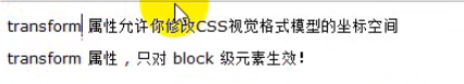
八、3D变换
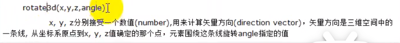
1. 3D旋转

示例:
<!DOCTYPE html>
<html>
	<head>
		<meta charset="utf-8">
		<title></title>
		<style type="text/css">
			*{
				margin: 0;
				padding: 0;
			}
			#wrap{
				width: 400px;
				height: 400px;
				border: 1px solid;
				position: absolute;
				left: 50%;
				top: 50%;
				margin-left: -200px;
				margin-top: -200px;
				perspective: 200px;
			}
			#inner {
				position: absolute;
				left: 50%;
				top: 50%;
				margin-left: -100px;
				margin-top: -100px;
				width: 200px;
				height: 200px;
				border: 1px solid;
				border-radius: 50%;
				background: pink;
				text-align: center;
				font: 50px/200px "微软雅黑";
				transition: 1s;
			}

			#wrap:hover #inner{
				transform: rotate3d(1,1,1,360deg);
			}
		</style>
	</head>
	<body>
		<div id="wrap">
			<div id="inner">
				啊哈哈
			</div>
		</div>
	</body>
</html>
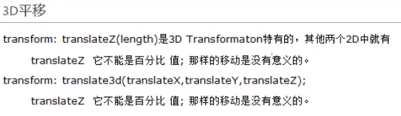
2. 3D平移
示例:
<!DOCTYPE html>
<html>
	<head>
		<meta charset="utf-8">
		<title></title>
		<style type="text/css">
			*{
				margin: 0;
				padding: 0;
			}
			#wrap{
				width: 400px;
				height: 400px;
				border: 1px solid;
				position: absolute;
				left: 50%;
				top: 50%;
				margin-left: -200px;
				margin-top: -200px;
				perspective: 100px;
			}
			#inner {
				position: absolute;
				left: 50%;
				top: 50%;
				margin-left: -100px;
				margin-top: -100px;
				width: 200px;
				height: 200px;
				border: 1px solid;
				border-radius: 50%;
				background: pink;
				text-align: center;
				font: 50px/200px "微软雅黑";
				transition: 1s;
			}

			#wrap:hover #inner{
				transform: translate3d(-50%,-50%,-100px);
			}
		</style>
	</head>
	<body>
		<div id="wrap">
			<div id="inner">
				啊哈哈
			</div>
		</div>
	</body>
</html>
3. 3D缩放

示例:
<!DOCTYPE html>
<html>
	<head>
		<meta charset="utf-8">
		<title></title>
		<style type="text/css">
			*{
				margin: 0;
				padding: 0;
			}
			#wrap{
				width: 400px;
				height: 400px;
				border: 1px solid;
				position: absolute;
				left: 50%;
				top: 50%;
				margin-left: -200px;
				margin-top: -200px;
				perspective: 300px;
			}
			#inner {
				position: absolute;
				left: 50%;
				top: 50%;
				margin-left: -100px;
				margin-top: -100px;
				width: 200px;
				height: 200px;
				border: 1px solid;
				border-radius: 50%;
				background: pink;
				text-align: center;
				font: 50px/200px "微软雅黑";
				transition: 5s;
			}

			#wrap:hover #inner{
				transform: scaleZ(2) translateZ(100px);
			}
		</style>
	</head>
	<body>
		<div id="wrap">
			<div id="inner">
				啊哈哈
			</div>
		</div>
	</body>
</html>


 1125
1125


 被折叠的 条评论
为什么被折叠?
被折叠的 条评论
为什么被折叠?
 到【灌水乐园】发言


