


 本文展示了使用ECharts创建的四种图表:1)基础散点图,2)序列散点图,3)带有涟漪特效的散点图,4)气泡图。这些图表用于展示男性和女性的身高、体重分布,通过颜色、标记和线条描绘数据的差异和趋势。ECharts作为强大的数据可视化库,提供了丰富的交互和自定义选项。
1、散点图
<!DOCTYPE html>
<html lang="en">
<head>
    <meta charset="UTF-8">
    <meta http-equiv="X-UA-Compatible" content="IE=edge">
    <meta name="viewport" content="width=device-width, initial-scale=1.0">
    <title>Document</title>
    <script src="./echarts.js"></script>
</head>
<body>
    <div id="main" style="width: 600px; height: 400px;"></div>
    <script type="text/javascript">
        var myChart=echarts.init(document.getElementById("main"))
        var option={
            title:{x:222,text:'男性和女性身高、体重分布'},
            xAxis:{scale:true, name:'身高(cm)', color:'red'},
            yAxis:{scale:true, name:'体重(kg)'},
            color:['green','blue'],
            series:[{
                type:'scatter',symbolSize:20,
                data:[
                    [167.0,64.6],[177.8,74.8],[159.5,58.0],[169.5,68.0],
                    [163.0,63.6],[157.5,53.2],[164.5,65.0],[163.5,62.0],
                    [171.2,65.1],[161.6,58.9],[167.4,67.7],[167.5,63.0],
                    [181.1,76.0],[165.0,60.2],[174.5,70.0],[171.5,68.0],
                ]
            }]
        };
        myChart.setOption(option);
    </script>
</body>
</html>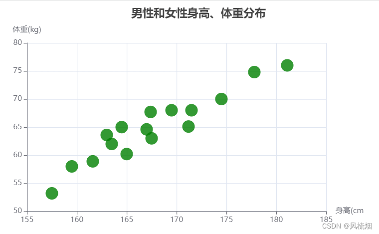
2、序列散点图
<!DOCTYPE html>
<html lang="en">

<head>
    <meta charset="UTF-8">
    <meta http-equiv="X-UA-Compatible" content="IE=edge">
    <meta name="viewport" content="width=device-width, initial-scale=1.0">
    <title>Document</title>
    <script src="./echarts.js"></script>
</head>

<body>
    <div id="main" style="width: 600px; height: 400px;"></div>
    <script type="text/javascript">
        var myChart = echarts.init(document.getElementById("main"))
        var option = {
            title: { x: 33, text: '男性和女性身高、体重分布' },
            xAxis: [{type:'value',scale:true,axisLable:{formatter:'{value}cm'}}],
            yAxis:  [{type:'value',scale:true,axisLable:{formatter:'{value}kg'}}],
            color: ['green', 'blue'],
            series: [
                {
                    name: '男性',
                    type: 'scatter', symbolSize: 20,
                    markPoint: {
                        data: [{ type: 'max', name: '最大值' },
                        { type: 'min', name: '最小值' }
                        ]},
                        markLine:{data:[{type:'average',name:'平均值'}]},
                    data: [
                        [167.0, 64.6], [177.8, 74.8], [159.5, 58.0], [169.5, 68.0],
                        [163.0, 63.6], [157.5, 53.2], [164.5, 65.0], [163.5, 62.0],
                        [171.2, 65.1], [161.6, 58.9], [167.4, 67.7], [167.5, 63.0],
                        [181.1, 76.0], [165.0, 60.2], [174.5, 70.0], [171.5, 68.0],
                    ]
                },
                {
                    name: '女性',
                    type: 'scatter', symbolSize: 20,
                    markPoint: {
                        data: [{ type: 'max', name: '最大值' ,symbol:'arrow'},
                        { type: 'min', name: '最小值' ,symbol:'arrow'}
                        ]},
                        markLine:{data:[{type:'average',name:'平均值'}]},
                    data: [
                        [167.0, 64.6], [157.8, 52.8], [159.5, 58.0], [169.5, 52.0],
                        [163.0, 63.6], [157.5, 53.2], [164.5, 65.0], [163.5, 62.0],
                        [151.2, 65.1], [161.6, 58.9], [167.4, 56.7], [167.5, 43.0],
                        [161.1, 76.0], [165.0, 60.2], [164.5, 61.0], [162.5, 68.0],
                    ]
                }
            ]
        };
        myChart.setOption(option);
    </script>
</body>

</html>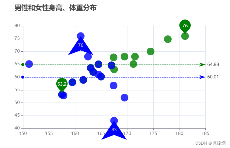
3、涟漪特效散点图
<!DOCTYPE html>
<html>
    <head>
        <meta charset="utf-8">
        <script src="./echarts.js"></script>
    </head>
    <body>
        <div id="main" style="width: 600px; height: 400px;"></div>
        <script type="text/javascript">
            var myChart=echarts.init(document.getElementById("main"));
            var option = {
                legend: {data:['一般值','极值']},
                xAxis: {scale:true},
                yAxis: {scale:true},
                series: [
                    {
                        type:'effectScatter',
                        silent:false,
                        name: '极值',
                        legendHoverLink:false,
                        hoverAnimation:true,
                        effectType:'ripple',
                        showEffectOn:'render',
                        rippleEffect:{
                            period:5,
                            scale:5.5,
                            brushType:'fill',
                        },
                        sybolSize:20,
                        color:'green',
                        data:[[172.7,87.2],[153.4,42]]

                    },
                    {
                        name: '一般值',
                        type:'scatter',
                        color:'#FFCCCC',
                        data: [
                            [167.0, 64.6], [177.8, 74.8], [159.5, 58.0], [169.5, 68.0], [152.0, 45.8],
                            [163.0, 63.6], [157.5, 53.2], [164.5, 65.0], [163.5, 62.0], [166.4, 56.6],
                            [171.2, 65.1], [161.6, 58.9], [167.4, 67.7], [167.5, 63.0], [168.5, 65.2],
                            [181.1, 76.0], [165.0, 60.2], [174.5, 70.0], [171.5, 68.0], [163.0, 72.0],
                            [154.4, 46.2], [162.0, 55.0], [176.5, 83.0], [160.0, 54.4], [164.3, 59.8],
                            [162.1, 53.6], [170.0, 73.2], [160.2, 52.1], [161.3, 67.9], [178.0, 70.6],
                            [168.9, 62.3], [163.8, 58.5], [167.6, 54.5], [160.0, 50.2], [172.7, 87.2],
                            [167.6, 58.3], [165.1, 56.2], [160.0, 50.2], [170.0, 72.9], [157.5, 59.8],
                            [167.6, 61.0], [160.7, 69.1], [163.2, 55.9], [152.4, 46.5], [153.4, 42],
                            [168.3, 54.8], [180.3, 60.7], [165.5, 60.0], [165.0, 62.0], [164.5, 60.3]],
                        }]
                    };
                    myChart.setOption(option);
                </script>
    </body>
</html> 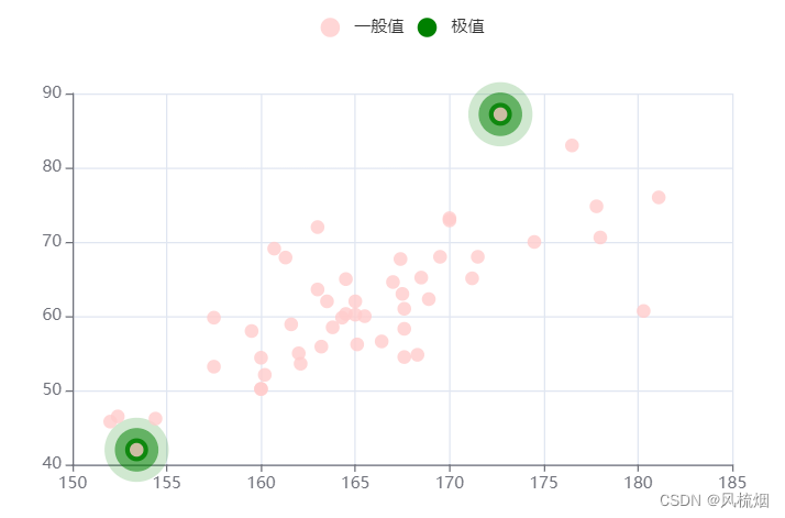
4、气泡图
<!DOCTYPE html>
<html lang="en">

<head>
    <meta charset="UTF-8">
    <meta http-equiv="X-UA-Compatible" content="IE=edge">
    <meta name="viewport" content="width=device-width, initial-scale=1.0">
    <title>Document</title>
    <script src="./echarts.js"></script>
</head>

<body>
    <div id="main" style="width: 700px; height: 600px;"></div>
    <script type="text/javascript">
        var myChart = echarts.init(document.getElementById("main"))
        var option = {
            color: ['#FFCCCC', 'GREEN'],
            title: { x: 40, text: '气泡图' },
            tooltip: {
                trigger: 'zxis',
                showDelay: 0,
                axisPointer: {
                    show: true, type: 'cross',
                    lineStyle: { type: 'dashed', width: 1 }
                }
            },
            legend: { x: 240, data: ['bubble1', 'bubble2'] },
            toolbox: {
                show: true,
                x: 450,
                feature: {
                    mark: { show: true },
                    dataZoom: { show: true },
                    dataView: { show: true, readOnly: false },
                    restore: { show: true },
                    saveAsImage: { show: true },
                }
            },
            xAxis: [{ type: 'value', scale: true, splitNumber: 4 }],
            yAxis: [{ type: 'value', scale: true, splitNumber: 4 }],
            series: [
                {
                    name: 'bubble1',
                    type: 'scatter', symbol: 'circle',
                    symbolSize: function (value) { return Math.round(value[2] / 3) },
                    data: [
                        [167.0, 64.6, 62], [177.8, 74.8, 85], [159.5, 58.0, 52], [169.5, 68.0, 45],
                        [163.0, 63.6, 75], [157.5, 53.2, 85], [164.5, 65.0, 94], [163.5, 62.0, 78],
                        [171.2, 65.1, 95], [161.6, 58.9, 65], [167.4, 67.7, 88], [167.5, 63.0, 68],
                        [181.1, 76.0, 75], [165.0, 60.2, 51], [174.5, 70.0, 95], [171.5, 68.0, 67],
                    ]
                },
                {
                    name: 'bubble2',
                    type: 'scatter', symbol: 'circle',
                    symbolSize: function (value) { return Math.round(value[2] / 5) },
                    data: [
                        [167.0, 64.6, 65], [157.8, 52.8, 49], [159.5, 58.0, 48], [169.5, 52.0, 57],
                        [163.0, 63.6, 84], [157.5, 53.2, 98], [164.5, 65.0, 65], [163.5, 62.0, 85],
                        [151.2, 65.1, 78], [161.6, 58.9, 97], [167.4, 56.7, 65], [167.5, 43.0, 95],
                        [161.1, 76.0, 69], [165.0, 60.2, 49], [164.5, 61.0, 85], [162.5, 68.0, 78],
                    ]
                }
            ]
        };
        myChart.setOption(option);
    </script>
</body>

</html> 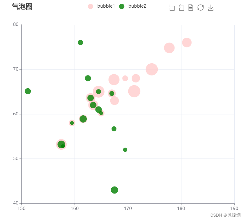


 2843
2843

 被折叠的 条评论
为什么被折叠?
被折叠的 条评论
为什么被折叠?
 到【灌水乐园】发言


