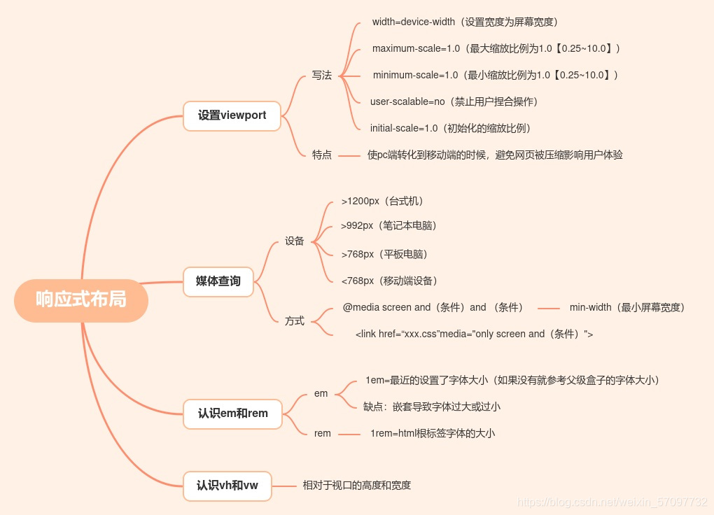
设置viewport
<!DOCTYPE html>
<html lang="en">
<head>
    <meta charset="UTF-8">
    <meta name="viewport" content="width=device-width, initial-scale=0.5, maximum-scale=3.0">
    <title>viewport</title>
    <style>
        div {
            width: 200px;
            height: 200px;
            background-color: gold;
        }
    </style>
</head>
<body>
    <div></div>
    <h1>知了堂 H5+C3 viewport</h1>
</body>
</html>
媒体查询
<!DOCTYPE html>
<html lang="en">
<head>
    <meta charset="UTF-8">
    <meta name="viewport" content="width=device-width, initial-scale=1.0">
    <title>media</title>
    <style>
        body {
            font-size: 20px;
            color: white;
            background-color: gray;
            text-align: center;
        }

        p {
            display: none;
        }

        @media screen and (min-width: 1200px) {
            /*big_pc*/
            #big_pc {
                display: block;
            }
            body {
                background-color: tomato;
            }
        }

        @media screen and (min-width: 992px) and (max-width: 1200px) {
            /*book_pc*/
            #book_pc {
                display: block;
            }
            body {
                background-color: skyblue;
            }
        }
    </style>
    <link rel="stylesheet" href="css/pad.css" media="screen and (min-width: 768px) and (max-width: 992px)">
    <link rel="stylesheet" href="css/phone.css" media="screen and (max-width: 768px)">
</head>
<body>
    <p id="big_pc">big_pc</p>
    <p id="book_pc">book_pc</p>
    <p id="pad">pad</p>
    <p id="phone">phone</p>
</body>
</html>
认识em和rem
<!DOCTYPE html>
<html lang="en">
<head>
    <meta charset="UTF-8">
    <meta name="viewport" content="width=device-width, initial-scale=1.0">
    <title>em & rem</title>
    <style>
        /*#item1 {
            font-size: 20px;
        }

        #item1 p {
            font-size: 1.5em;
            line-height: 1.2em;
            padding: 1.2em;
        }
        #item1 ul {
            font-size: 1.5em;
        }*/

        html {
            font-size: 62.5%;
        }

        /*#item2 {
            font-size: 1.5rem;
        }*/
        #item2 h3 {
            font-size: 1.5rem;
            line-height: 2rem;
            height: 1.5rem;
        }
        #item2 p {
            font-size: 1.1rem;
        }
    </style>
</head>
<body>
    <div id="item1">
        <h3>静夜思</h3>
        <p>床前明月光</p>
        <p>疑是地上霜</p>
        <p>举头望明月</p>
        <p>低头思故乡</p>
        <ul>
            <li>111</li>
            <li>
                222
                <ul>
                    <li>222:666</li>
                    <li>222:777</li>
                    <li>222:888</li>
                </ul>
            </li>
            <li>333</li>
        </ul>
    </div>

    <div id="item2">
        <h3>登鹳雀楼</h3>
        <p>白日依山尽</p>
        <p>黄河入海流</p>
        <p>欲穷千里目</p>
        <p>更上一层楼</p>
    </div>
</body>
</html>
认识vh和vw
<!DOCTYPE html>
<html lang="en">
<head>
    <meta charset="UTF-8">
    <meta name="viewport" content="width=device-width, initial-scale=1.0">
    <title>vh & vw</title>
    <style>
        * {
            margin: 0;
            padding: 0;
        }
        /*html, body {
            height: 100%;
        }*/
        header {
            background-color: #555;
            color: white;
            text-align: center;
            height: 100vh;
            /*height: 100%;*/
            background-image: url(https://api.ixiaowai.cn/gqapi/gqapi.php);
            background-repeat: no-repeat;
            background-size: cover;
            background-position: center center;
        }
        header h1 {
            padding: 5rem;
        }
        header p {
            padding: 0 10rem;
        }
        header a {
            display: block;
            width: 80px;
            height: 30px;
            line-height: 30px;
            background-color: #eee;
            margin: 1rem auto;
            text-decoration: none;
            color: black;
        }

        @media screen and (max-width: 400px) {
            header p {
                padding: 0 .5rem;
            }
        }
    </style>
</head>
<body>
    <header>
        <h1>知了堂</h1>
        <p>成都知了汇智科技有限公司(知了堂)位于成都天府软件园,是天府软件园重点引进和扶持的互联网科技公司,致力于打造IT职业教育生态链,承担着为高新产业园区的1000+家企业提供人才培养及人才输送服务。</p>
        <a href="http://www.zhiliaotang.cn">知了堂</a>
    </header>
    <div>
        <h3>静夜思</h3>
        <p>床前明月光</p>
        <p>疑是地上霜</p>
        <p>举头望明月</p>
        <p>低头思故乡</p>
    </div>
</body>
</html>


 425
425


 被折叠的 条评论
为什么被折叠?
被折叠的 条评论
为什么被折叠?
 到【灌水乐园】发言


