


CSS—两种布局方式
1.flex弹性布局
1.1flex-direction
flex-direction用来控制子项整体布局方向,是从左往右还是从右往左,是从上往下还是从下往上
row:默认值,显示为行。方向为当前文档水平流方向,默认情况下是从左往右。
row-reverse:显示为行。但是方向和row属性值是反的,从右向左。
column:显示为列,从上到下。
column-reverse:显示为列。但方向和column属性值是反的,从下到上。
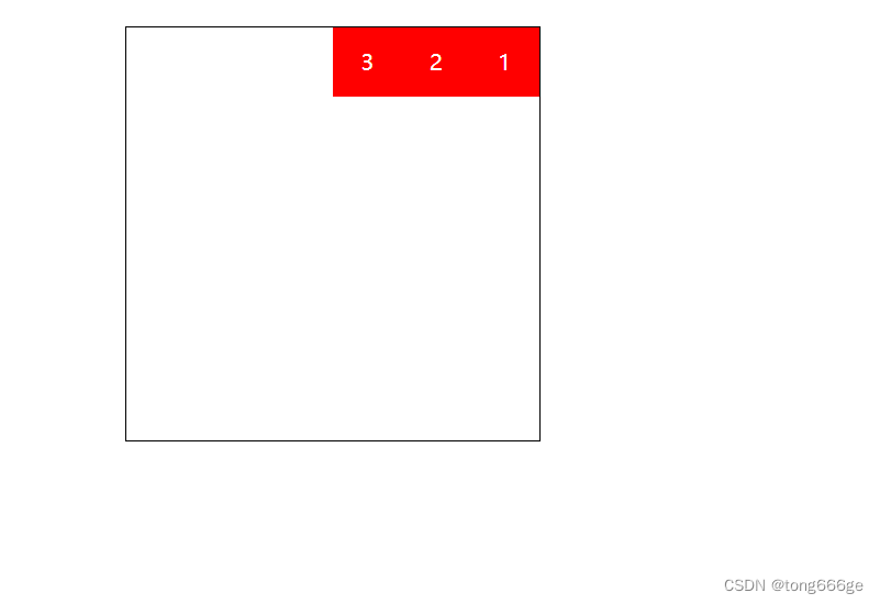
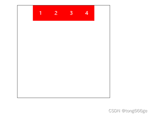
row-reverse
  <style>
    #box{width:300px; height:300px; border:1px black solid; margin:20px auto;
      display:flex; flex-direction:row-reverse;
    }
    #box div{width:50px; height:50px; line-height:50px; color:white; text-align:center; background:red;}
  </style>
</head>
<body>
    <div id="box">
      <div>1</div>
      <div>2</div>
      <div>3</div>
    </div>
</body>
结果:
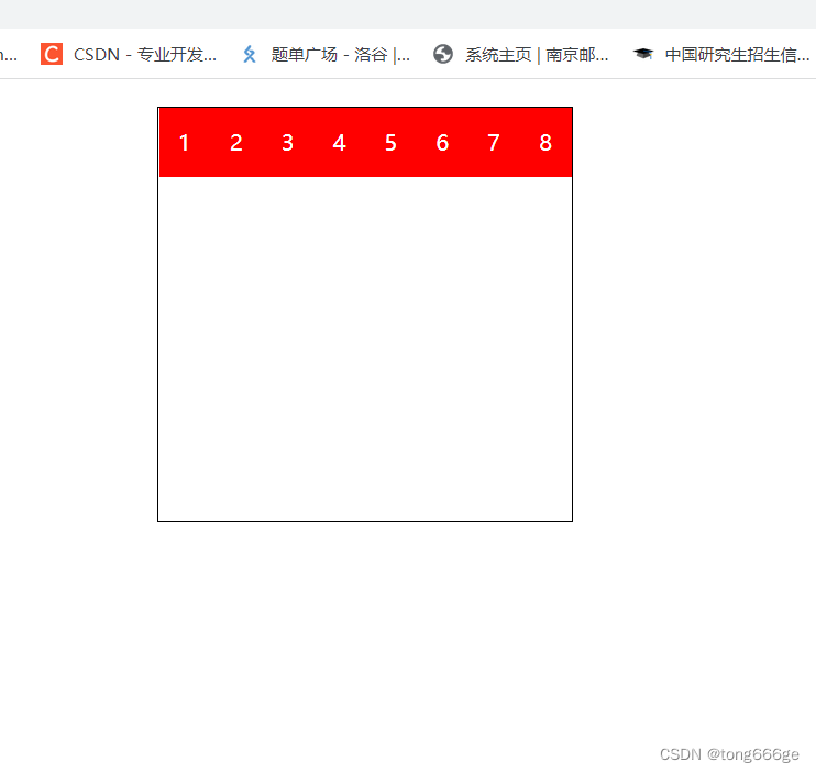
1.2flex-wrap
flex-wrap用来控制子项整体单行显示还是换行显示
代码
      <style>
        #box{width:300px; height:300px; border:1px black solid; margin:20px auto;
          display:flex; flex-wrap:nowrap;
        }
        #box div{width:50px; height:50px; line-height:50px; color:white; text-align:center; background:red;}
      </style>
</head>
<body>
    <div id="box">
        <div>1</div>
        <div>2</div>
        <div>3</div>
        <div>4</div>
        <div>5</div>
        <div>6</div>
        <div>7</div>
        <div>8</div>
    </div>
</body>
结果:
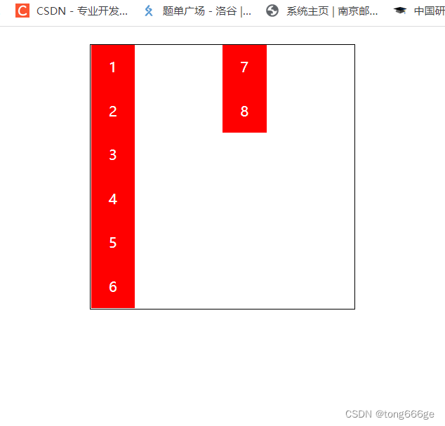
1.3flex-flow
flex-flow属性是flex-direction和flex-wrap的缩写,表示flex布局的flow流动性。
第一个值表示方向,第二个值表示换行,中间用空格隔开
  <style>
    #box{width:300px; height:300px; border:1px black solid; margin:20px auto;
      display:flex; flex-flow:column wrap;
    }
    #box div{width:50px; height:50px; line-height:50px; color:white; text-align:center; background:red;}
  </style>
</head>
<body>
    <div id="box">
      <div>1</div>
      <div>2</div>
      <div>3</div>
      <div>4</div>
      <div>5</div>
      <div>6</div>
      <div>7</div>
      <div>8</div>
    </div>
</body>
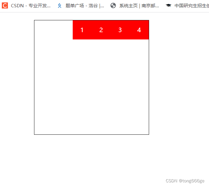
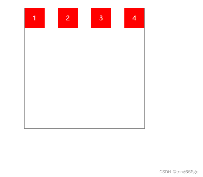
1.4justify-content
justify-content属性决定了主轴方向上子项的对齐和分布方式
  <style>
    #box{width:300px; height:300px; border:1px black solid; margin:20px auto;
      display:flex; justify-content:flex-end;
    }
    #box div{width:50px; height:50px; line-height:50px; color:white; text-align:center; background:red;}
  </style>
</head>
<body>
    <div id="box">
      <div>1</div>
      <div>2</div>
      <div>3</div>
      <div>4</div>
    </div>
</body>
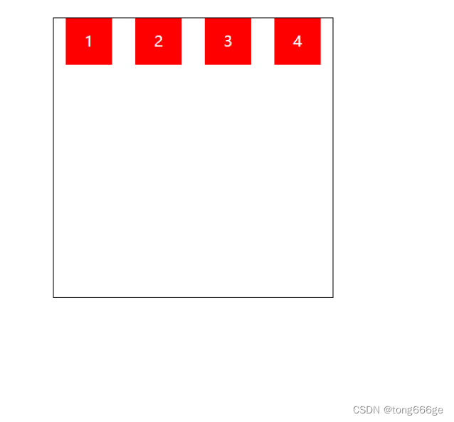
center
display:flex; justify-content:center;
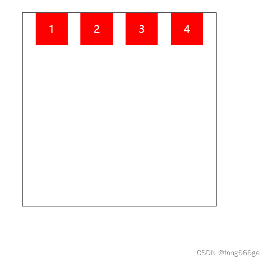
space-between
display:flex; justify-content:space-between;
space-around
display:flex; justify-content:space-around;
space-enenly
display:flex; justify-content:space-evenly;
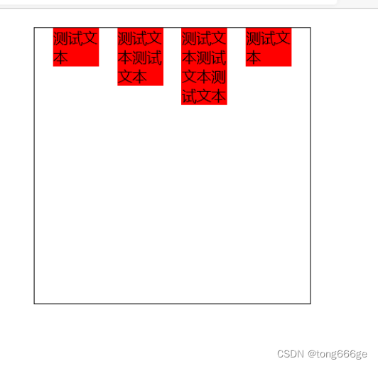
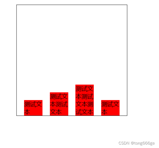
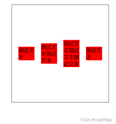
1.5align-items
align-items中的items指的就是flex子项们,因此align-items指的就是flex子项们相对于flex容器在侧轴方向上的对齐方式
flex-start
  <style>
    #box{width:300px; height:300px; border:1px black solid; margin:20px auto;
      display:flex; justify-content:space-evenly; align-items:flex-start;
    }
    #box div{width:50px; background:red;}
  </style>
</head>
<body>
    <div id="box">
      <div>测试文本</div>
      <div>测试文本测试文本</div>
      <div>测试文本测试文本测试文本</div>
      <div>测试文本</div>
    </div>
</body>
flex-end
display:flex; justify-content:space-evenly; align-items:flex-end;
center
display:flex; justify-content:space-evenly; align-items:center;
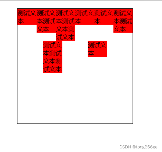
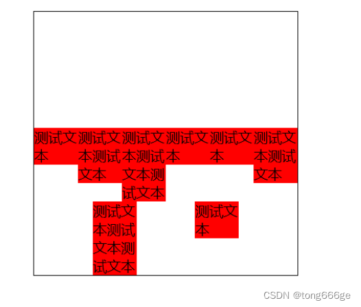
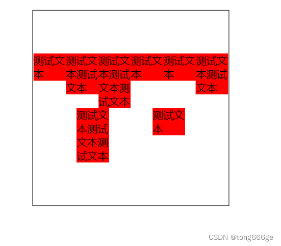
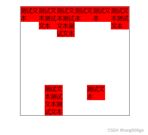
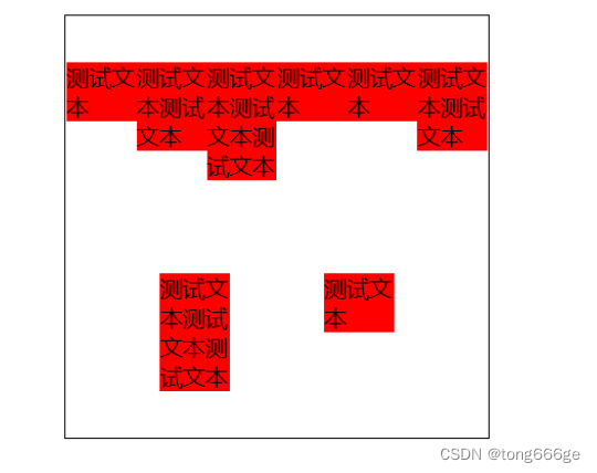
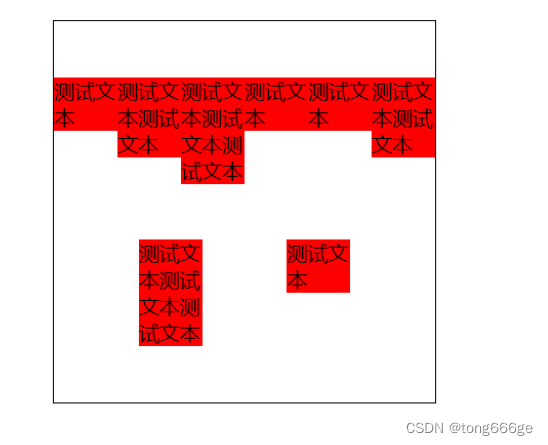
1.6align-content
align-content可以看成和justify-content是相似且对立的属性,如果所有flex子项只有一行,则align-content属性是没有任何效果的
strech:默认值。每一行flex子元素都等比例拉伸。例如,如果共两行flex子元素,则每一行拉伸高度是50%。
flex-start:表示为起始位置对齐
flex-end:表示为结束位置对齐
center:表示为居中对齐
space-between:表示为两端对齐
space-around:每一行元素上下都享有独立不重叠的空白空间。
space-enenly:每一行元素都完全上下等分。
flex-start
  <style>
    #box{width:300px; height:300px; border:1px black solid; margin:20px auto;
      display:flex; justify-content:space-evenly; flex-wrap:wrap;
      align-items:flex-start; align-content:flex-start;
    }
    #box div{width:50px; background:red;}
  </style>
</head>
<body>
    <div id="box">
      <div>测试文本</div>
      <div>测试文本测试文本</div>
      <div>测试文本测试文本测试文本</div>
      <div>测试文本</div>
      <div>测试文本</div>
      <div>测试文本测试文本</div>
      <div>测试文本测试文本测试文本</div>
      <div>测试文本</div>
    </div>
</body>
flex-end
      display:flex; justify-content:space-evenly; flex-wrap:wrap;
      align-items:flex-start; align-content:flex-end;
center
      display:flex; justify-content:space-evenly; flex-wrap:wrap;
      align-items:flex-start; align-content:center;
space-between
      display:flex; justify-content:space-evenly; flex-wrap:wrap;
      align-items:flex-start; align-content:space-between;
space-around
      display:flex; justify-content:space-evenly; flex-wrap:wrap;
      align-items:flex-start; align-content:space-around;
space-evenly
      display:flex; justify-content:space-evenly; flex-wrap:wrap;
      align-items:flex-start; align-content:space-evenly;
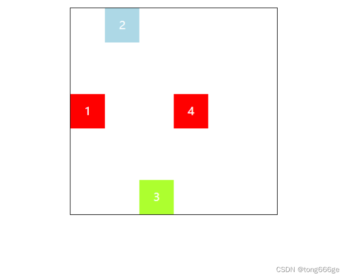
1.7作用在flex子项上的CSS属性
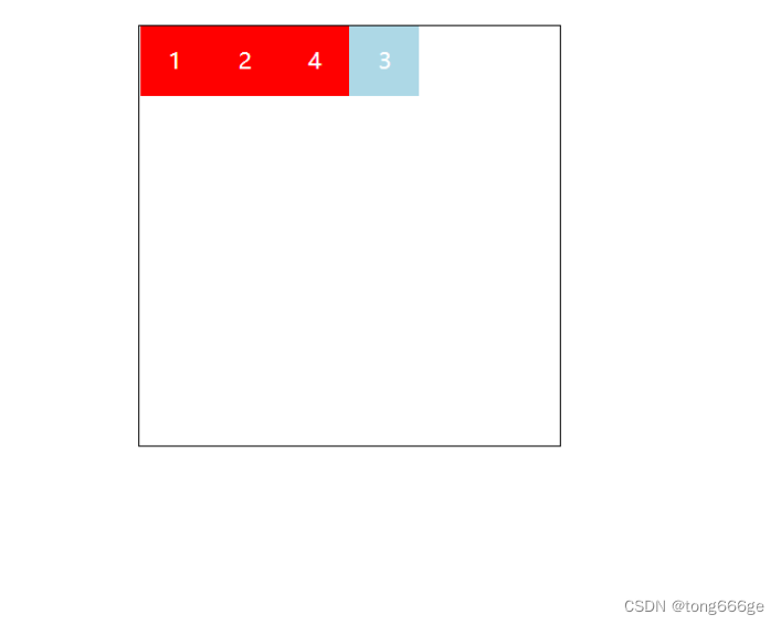
1.7.1order
可以通过设置order改变某一个flex子项的排序位置。所有flex子项的默认order属性值是0。数值越大,越靠后
  <style>
    #box{width:300px; height:300px; border:1px black solid; margin:20px auto; display:flex;
    }
    #box div{width:50px; height:50px; line-height:50px; color:white; text-align:center; background:red;}
    #box div:nth-child(3){order:1; background:lightblue; }
  </style>
</head>
<body>
    <div id="box">
      <div>1</div>
      <div>2</div>
      <div>3</div>
      <div>4</div>
    </div>
</body>
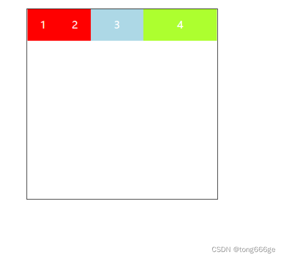
1.7.2flex-grow
属性中的grow是扩展的意思,扩展的就是flex子项所占据的宽度,扩展所侵占的空间就是除去元素外的剩余的空白间隙。默认值为0。数值1就是占满整个空白区域,大于1的也是如此。如果一个子项flex-grow为1.另一个为2,那么第一个子项占空白区域1/3,另一个2/3
    #box div:nth-child(3){flex-grow:1; background:lightblue; }
    #box div:nth-child(4){flex-grow:2; background:greenyellow; }
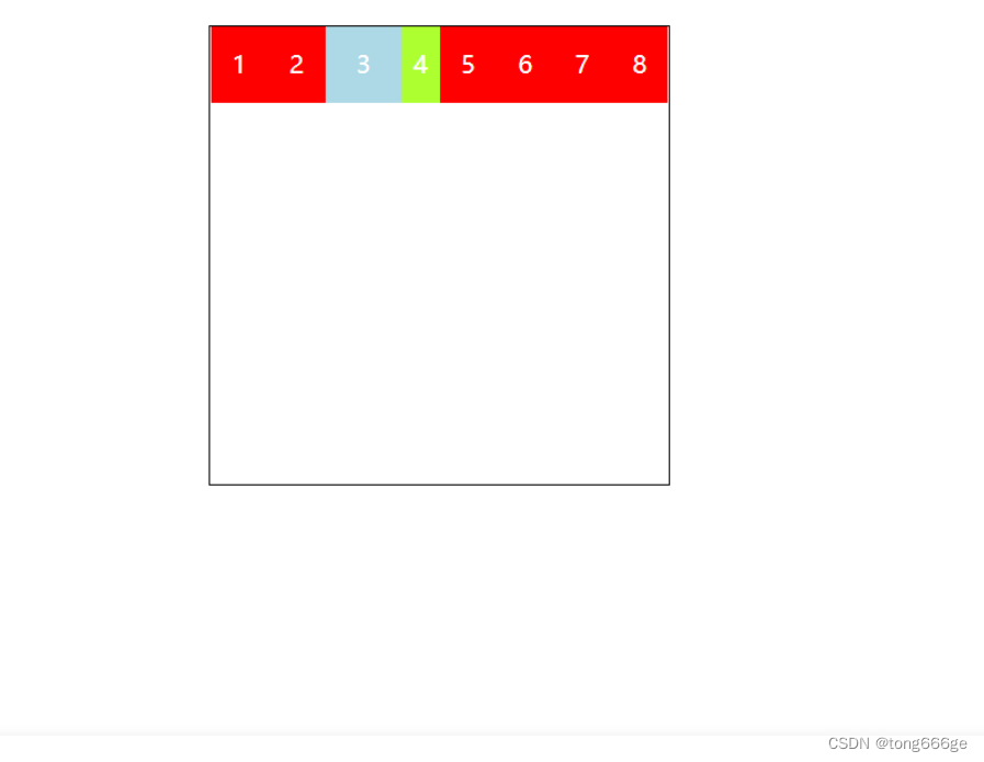
1.7.3flex-shrink
属性中的shrink是“收缩”的意思,flex-shrink主要处理当flex容器空间不足时候,单个元素的收缩比例。默认值是1。数值为0时,不收缩。数值越大,收缩越严重。
  <style>
    #box{width:300px; height:300px; border:1px black solid; margin:20px auto; display:flex;
    }
    #box div{width:50px; height:50px; line-height:50px; color:white; text-align:center; background:red;}
    #box div:nth-child(3){flex-shrink:0; background:lightblue; }
    #box div:nth-child(4){flex-shrink:2 ; background:greenyellow; }
  </style>
</head>
<body>
<div id="box">
  <div>1</div>
  <div>2</div>
  <div>3</div>
  <div>4</div>
  <div>5</div>
  <div>6</div>
  <div>7</div>
  <div>8</div>
</div>
</body>
1.7.4flex-basis
flex-basis定义了在分配剩余空间之前元素的默认大小。优先级比width高
1.7.5flex
flex属性是flex-grow,flex-shrink和flex-basis的缩写。复合样式比单一样式的优先级高
1.7.6align-self
align-self指控制单独某一个flex子项的垂直对齐方式
  <style>
    #box{width:300px; height:300px; border:1px black solid; margin:20px auto;
      display:flex; align-items:center;
    }
    #box div{width:50px; height:50px; line-height:50px; color:white; text-align:center; background:red;}
    #box div:nth-child(2){align-self:flex-start; background:lightblue; }
    #box div:nth-child(3){align-self:flex-end; background:greenyellow; }
  </style>
</head>
<body>
<div id="box">
  <div>1</div>
  <div>2</div>
  <div>3</div>
  <div>4</div>
</div>
</body>
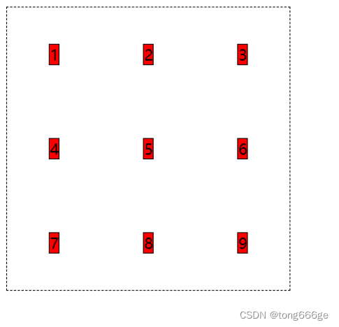
2.Grid网格布局
Grid布局是一个二维的布局方法,纵横两个方向总是同时存在
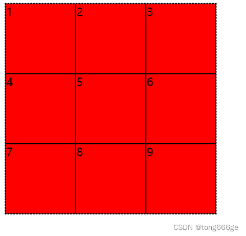
2.1grid-template-columns和grid-template-rows
- 对网格进行横纵划分,形成二维布局。单位可以是像素,百分比,自适应以及fr单位(网格剩余空间比例单位)
- 有时候,我们网格的划分是很规律的,如果需要添加多个横纵网络时,可以利用repeat()语法进行简化操作
  <style>
    .box{width:300px; height:300px; border:1px black dashed;
      display:grid;
      grid-template-row:repeat(3,1fr);
      grid-template-columns:repeat(3,1fr);
    }
    .box div{background:red; border:1px black solid;}
  </style>
</head>
<body>
    <div class="box">
      <div>1</div>
      <div>2</div>
      <div>3</div>
      <div>4</div>
      <div>5</div>
      <div>6</div>
      <div>7</div>
      <div>8</div>
      <div>9</div>
    </div>
</body>
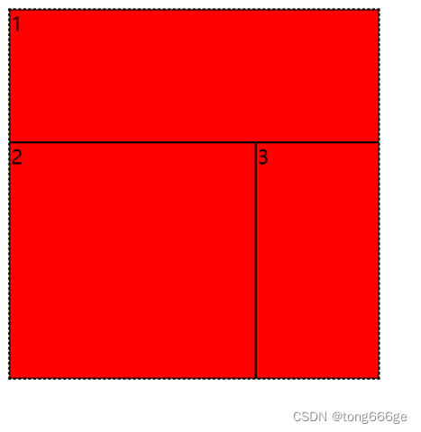
2.2grid-template-areas和grid-template
- area是区域的意思,grid-template-areas就是给我们的网格划分区域的。,此时grid子项只要使用grid-area属性指定其隶属于那个区
- grid-template是grid-template-rows,grid-template-columns和grid-template-areas属性的缩写
  <style>
    .box{width:300px; height:300px; border:1px black dashed;
      display:grid;
      grid-template-row:repeat(3,1fr);
      grid-template-columns:repeat(3,1fr);
      grid-template-areas:
      "a1 a1 a1"
      "a2 a2 a3"
      "a2 a2 a3";
    }
    .box div{background:red; border:1px black solid;}
    .box div:nth-of-type(1){grid-area:a1;}
    .box div:nth-of-type(2){grid-area:a2;}
    .box div:nth-of-type(3){grid-area:a3;}
  </style>
</head>
<body>
    <div class="box">
      <div>1</div>
      <div>2</div>
      <div>3</div>
    </div>
</body>
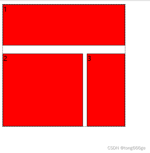
2.3grid-column-gap和grid-row-gap
- grid-column-gap和grid-row-gap属性用来定义网格中网格间隙的尺寸
- CSS grid-gap属性是grid-column-gap和grid-row-gap属性的缩写
  <style>
    .box{width:300px; height:300px; border:1px black dashed;
      display:grid;
      grid-template-row:repeat(3,1fr);
      grid-template-columns:repeat(3,1fr);
      grid-template-areas:
      "a1 a1 a1"
      "a2 a2 a3"
      "a2 a2 a3";
      grid-column-gap:10px;
      grid-row-gap:20px;
    }
    .box div{background:red; border:1px black solid;}
    .box div:nth-of-type(1){grid-area:a1;}
    .box div:nth-of-type(2){grid-area:a2;}
    .box div:nth-of-type(3){grid-area:a3;}
  </style>
</head>
<body>
    <div class="box">
      <div>1</div>
      <div>2</div>
      <div>3</div>
    </div>
</body>
2.4justify-items和align-items
- justify-items指定了网络元素的水平呈现方式,是水平拉伸显示,还是左中右对齐。
- align-items指定了网络元素的垂直呈现方式,是垂直拉伸显示,还是上中下对齐。
- place-items可以让align-items和justify-items属性写在单个声明中
  <style>
    .box{width:300px; height:300px; border:1px black dashed;
      display:grid;
      grid-template-row:repeat(3,1fr);
      grid-template-columns:repeat(3,1fr);
      justify-items:center;
      align-items:center;
    }
    .box div{background:red; border:1px black solid;}
  </style>
</head>
<body>
  <div class="box">
    <div>1</div>
    <div>2</div>
    <div>3</div>
    <div>4</div>
    <div>5</div>
    <div>6</div>
    <div>7</div>
    <div>8</div>
    <div>9</div>
  </div>
</body>
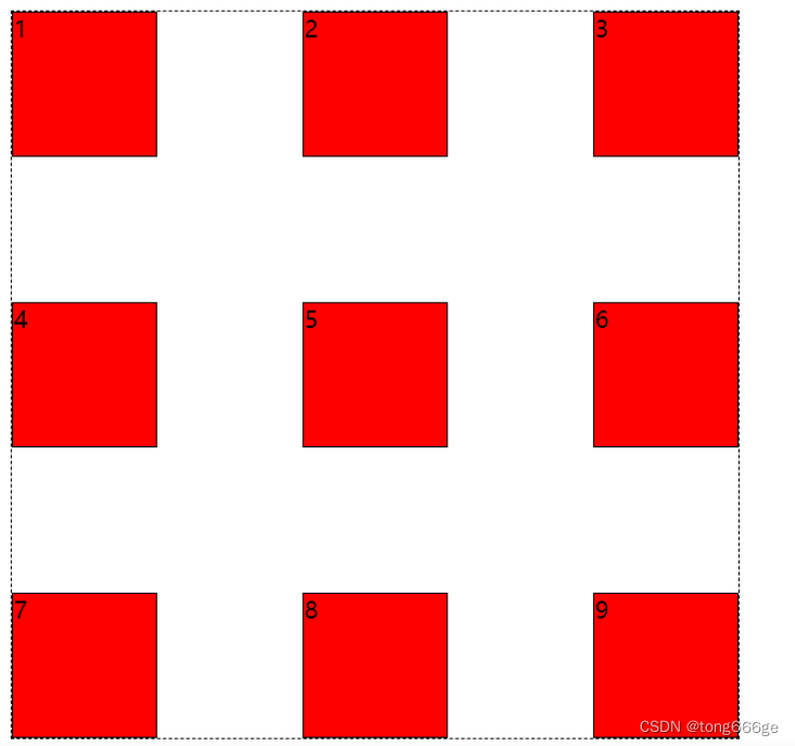
2.5justify-content和align-content
justify-content指定了网格元素的水平分布方式。align-content指定了网格元素的垂直分布方式。
place-content可以让align-content和justify-content属性写在一个CSS声明中。前一个属性值规定垂直呈现方式,后一个属性值规定水平呈现方式。
属性值
strech:默认值,拉伸。表现为水平或垂直填充。
strat:表现为容器左侧或顶部对齐。
end:表现为容器右侧或底部对齐。
center:表现为水平或垂直居中对齐。
space-between:表现为两端对齐
space-around:享有独立不重叠的空白空间
space-evenly:平均分配空白空间
  <style>
    .box{width:500px; height:500px; border:1px black dashed;
      display:grid;
      grid-template-rows:repeat(3,100px);
      grid-template-columns:repeat(3,100px);
      justify-content:space-between;
      align-content:space-between;
    }
    .box div{background:red; border:1px black solid;}
  </style>
</head>
<body>
    <div class="box">
      <div>1</div>
      <div>2</div>
      <div>3</div>
      <div>4</div>
      <div>5</div>
      <div>6</div>
      <div>7</div>
      <div>8</div>
      <div>9</div>
    </div>
</body>
2.5作用在grid子项上的CSS属性
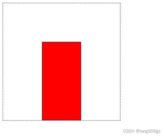
2.5.1位置属性
grid-column-start:水平方向上占据的起始位置。1是起始位置。
grid-column-end:水平方向上占据的结束位置。1是起始位置。(span属性,表示占据一个格子)
grid-row-start:垂直方向上占据的起始位置。1是起始位置。
grid-row-end:垂直方向上占据的结束位置。1是起始位置。(span属性,表示占据一个格子)
grid-column:grid-column-start + grid-column-end的缩写。1是起始位置。
grid-row:grid-row-start + grid-row-end的缩写。1是起始位置。
  <style>
    .box{width:300px; height:300px; border:1px black dashed;
      display:grid;
      grid-template-row:repeat(3,1fr);
      grid-template-columns:repeat(3,1fr);
    }
    .box div{background:red; border:1px black solid;
      /*单一样式写法*/
      /*grid-column-start:2;*/
      /*grid-column-end:3;*/
      /*grid-row-start:2;*/
      /*grid-row-end:span 2;*/
      /*复合样式写法*/
      grid-column:2 / 3;
      grid-row:2 / span 2;
    }
  </style>
</head>
<body>
  <div class="box">
    <div></div>
  </div>
</body>
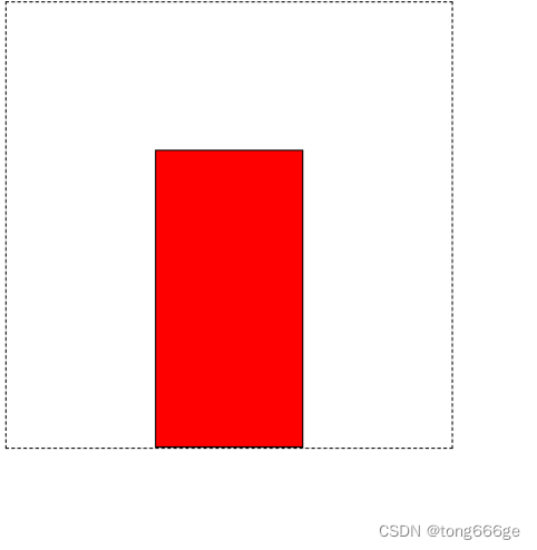
2.5.2gird-area
表示当前网格所占用的区域,名字和位置两种表示方法
  <style>
    .box{width:300px; height:300px; border:1px black dashed;
      display:grid;
      grid-template-row:repeat(3,1fr);
      grid-template-columns:repeat(3,1fr);
    }
    .box div{background:red; border:1px black solid;
     /*
     第一个值是水平的起始位置
     第二个值是垂直的起始位置
     第三个值是水平的结束位置
     第四个值是垂直的结束位置
     */
      grid-area:2 / 2 / 4 / 3;
    }
  </style>
</head>
<body>
<div class="box">
  <div></div>
</div>
</body>
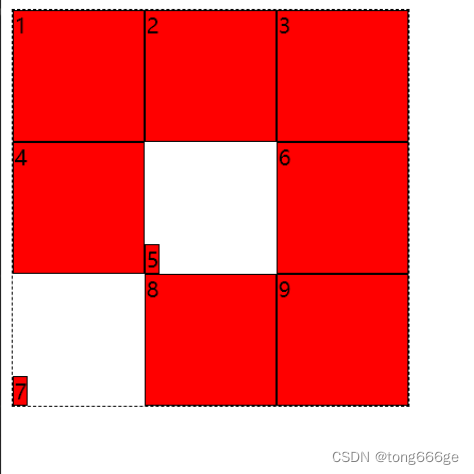
2.5.3对齐方式
justify-self:单个网格元素的水平对齐方式。
align-self:单个网格元素的垂直对齐方式。
place-self:align-self和justify-self的缩写。第一个值是align-self,在前面。第二个值是justufy-self,在后面。
  <style>
    .box{width:300px; height:300px; border:1px black dashed;
      display:grid;
      grid-template-row:repeat(3,1fr);
      grid-template-columns:repeat(3,1fr);
    }
    .box div{background:red; border:1px black solid;}
    .box div:nth-child(5){justify-self:start; align-self:end;}
    .box div:nth-child(7){place-self:end start;}
  </style>
</head>
<body>
    <div class="box">
      <div>1</div>
      <div>2</div>
      <div>3</div>
      <div>4</div>
      <div>5</div>
      <div>6</div>
      <div>7</div>
      <div>8</div>
      <div>9</div>
    </div>
</body>


 182
182


 被折叠的 条评论
为什么被折叠?
被折叠的 条评论
为什么被折叠?
 到【灌水乐园】发言


