


前言
在做大屏的时候,遇到的一个小的需求:
两个按钮,要求鼠标悬停一个按钮,动态显示一个组件
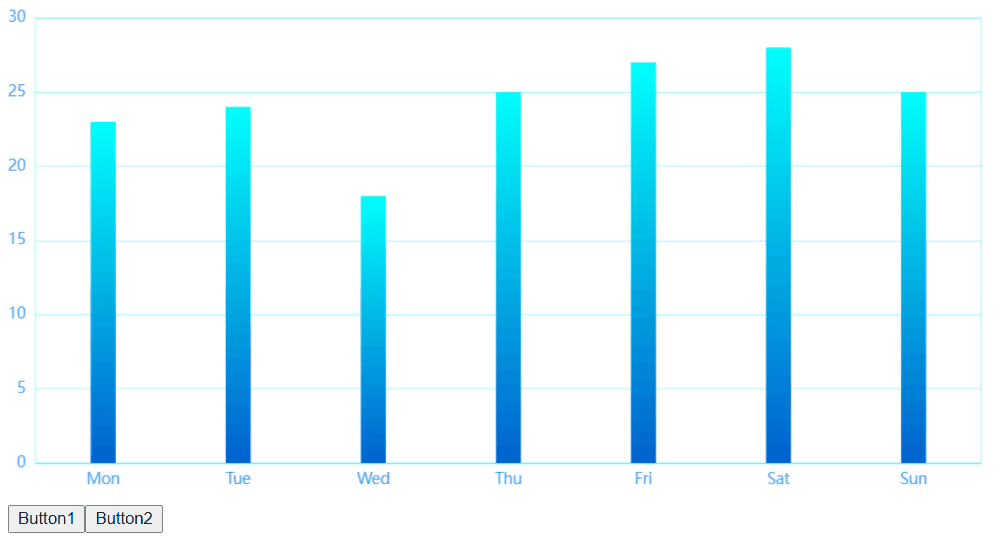
示例的成图是这样的
当然,实际的大屏不是这样的,另一个图也是一个热力图,但是现在接口还没写完,所以先拿这个例子展示了
做法
动态渲染组件
其实我个人知道的有两种方式
v-if以及is属性
但是我更推荐大家用is属性,配合component标签来达到效果,废话不多说
上教学,我们要有三个东西
- component标签,在这里是类似于占位符一样的东西,它里面有个is属性,这个属性值在data里的值就是我们想要显示的组件
- 一个button按钮,以及用来触发我们行为的事件,onclick之类的,这里我的需求是悬停,所以我用的是mouseenter
- 写在下面的逻辑:组件、data值、以及我们事件的逻辑
上代码!
代码
APP.vue
<template>
  <div>
    <component :is="map"></component>
    <button @mouseenter="hand1">Button1</button>
    <button @mouseenter="hand2">Button2</button>
  </div>
</template>

<script>
import heat from './components/heat.vue'
import bar from './components/bar.vue'
export default {
  components: {
    heat,
    bar,
  },
  data() {
    return {
      heat,
      bar,
      map: 'heat',
    }
  },
  methods: {
    hand1() {
      this.map = this.map === 'heat' ? 'bar' : 'heat'
    },
    hand2() {
      this.map = this.map === 'bar' ? 'heat' : 'bar'
    },
  },
  computed: {},
}
</script>

<style>
</style>
bar.vue这里我的柱状图加了渐变的效果,注释我也写在上面啦
<template>
  <div class="echart" id="mychart" :style="myChartStyle"></div>
</template>

<script>
import * as echarts from 'echarts'

export default {
  data() {
    return {
      xData: ['Mon', 'Tue', 'Wed', 'Thu', 'Fri', 'Sat', 'Sun'], //横坐标
      yData: [23, 24, 18, 25, 27, 28, 25], //数据
      myChartStyle: { float: 'left', width: '100%', height: '400px' }, //图表样式
    }
  },
  mounted() {
    this.initEcharts()
  },
  methods: {
    initEcharts() {
      // 基本柱状图
      const option = {
        color: new echarts.graphic.LinearGradient(0, 0, 0, 1, [
          { offset: 0, color: '#00fffb' }, //0 起始颜色
          { offset: 1, color: '#0061ce' }, //1 结束颜色
        ]),
        tooltip: {
          trigger: 'item',
        },
        grid: {
          left: '0%',
          right: '3%',
          bottom: '3%',
          top: '3%',
          //  图表位置紧贴画布边缘是否显示刻度以及label文字 防止坐标轴标签溢出跟grid 区域有关
          containLabel: true,
          //是否显示直角坐标系网络
          show: true,
          //grid 四条边框的颜色
          borderColor: 'rgba(0, 240, 255, 0.3)',
        },
        xAxis: {
          type: 'category',
          data: this.xData,
          axisTick: {
            alignWithLabel: false,
            // 把x轴的刻度隐藏起来
            show: false,
          },
          axisLabel: {
            color: '#4c9bfd',
          },
          // x轴这条线的颜色样式
          axisLine: {
            lineStyle: {
              color: 'rgba(0, 240, 255, 0.3)',
              // width: 3
            },
          },
        },
        yAxis: [
          {
            type: 'value',
            axisTick: {
              alignWithLabel: false,
              // 把y轴的刻度隐藏起来
              show: false,
            },
            axisLabel: {
              color: '#4c9bfd',
            },
            // y轴这条线的颜色样式
            axisLine: {
              lineStyle: {
                color: 'rgba(0, 240, 255, 0.3)',
                // width: 3
              },
            },
            // y轴分割线的颜色样式
            splitLine: {
              lineStyle: {
                color: 'rgba(0, 240, 255, 0.3)',
              },
            },
          },
        ],
        legend: {
          itemWidth: 14,
          itemHeight: 10,
        },
        series: [
          {
            type: 'bar', //形状为柱状图
            data: this.yData,
            barWidth: 20,
          },
        ],
      }
      const myChart = echarts.init(document.getElementById('mychart'))
      myChart.setOption(option)
      //随着屏幕大小调节图表
      window.addEventListener('resize', () => {
        myChart.resize()
      })
    },
  },
}
</script>
heat.vue
<template>
  <div class="echart" id="mychart" :style="myChartStyle"></div>
</template>

<script>
import * as echarts from 'echarts'

export default {
  data() {
    return {
      xData: ['Mon', 'Tue', 'Wed', 'Thu', 'Fri', 'Sat', 'Sun'], //横坐标
      yData: [23, 24, 18, 25, 27, 28, 25], //人数数据
      taskDate: [10, 11, 9, 17, 14, 13, 14],
      myChartStyle: { float: 'left', width: '100%', height: '400px' }, //图表样式
    }
  },
  mounted() {
    this.initEcharts()
  },
  methods: {
    initEcharts() {
      // 多列柱状图
      const mulColumnZZTData = {
        xAxis: {
          data: this.xData,
        },
        // 图例
        legend: {
          data: ['人数', '任务数'],
          top: '0%',
        },
        yAxis: {},
        series: [
          {
            type: 'bar', //形状为柱状图
            data: this.yData,
            name: '人数', // legend属性
            label: {
              // 柱状图上方文本标签,默认展示数值信息
              show: true,
              position: 'top',
            },
          },
          {
            type: 'bar', //形状为柱状图
            data: this.taskDate,
            name: '任务数', // legend属性
            label: {
              // 柱状图上方文本标签,默认展示数值信息
              show: true,
              position: 'top',
            },
          },
        ],
      }
      const myChart = echarts.init(document.getElementById('mychart'))
      myChart.setOption(mulColumnZZTData)
      //随着屏幕大小调节图表
      window.addEventListener('resize', () => {
        myChart.resize()
      })
    },
  },
}
</script>
这样就达到了我想要的效果
结尾
我这里是采用的methods的方式,其实也很推荐用computed的方式来做,因为计算属性是有缓存的,我在后面在此文中会补充这种方式的,加油吧!希望本文对你有用


 1360
1360


 被折叠的 条评论
为什么被折叠?
被折叠的 条评论
为什么被折叠?
 到【灌水乐园】发言


