


vue
<template>
<div>
<!-- 导航栏(PC端) -->
<div class="header">
<div class="navigation">
<a href="#">首页</a>
<a href="#">产品</a>
<a href="#">关于我们</a>
<a href="#">联系我们</a>
</div>
<!-- 移动端导航图标 -->
<div class="nav-icon" @click="toggleMobileNav">☰</div>
<!-- Logo(共享) -->
<div class="logo">
<img src="../little.com/images/logo.jpg" alt="Logo" class="lg">
</div>
<!-- 搜索和购物车(共享) -->
<div class="SearchCart">
<input type="text" placeholder="搜索" class="search" id="search">
<div class="cart" @mouseover="showCartContent" @mouseout="hideCartContent" @click="toggleCartContent">
<span class="cart-icon">🛒</span>
<span class="cart-badge" id="cartBadge">0</span>
<div class="cart-content" id="cartContent"></div>
</div>
</div>
</div>
<div class="header2">
<div class="navigat">
<a href="#">首页</a>
<a href="#">产品</a>
<a href="#">关于我们</a>
<a href="#">联系我们</a>
</div>
</div>
<div class="mobile-nav" id="mobileNav">
<div class="mobaleC">
<img src="../323/closeBtnPic.svg" alt="" class="mobileClose" id="mobileClose" @click="mobileCloseBtnFn">
</div>
<a href="#">首页</a>
<a href="#" @click="menuSecondshowFn">产品 <span class="Collapsible__Plus" :text="menuPlus">+</span></a>
<ul class="menuSecond" id="menuSecond">
<li>TOOLS</li>
<li>LEATHER</li>
<li>CRAETING SUPPLIES</li>
<li>ACRYLIC TEMPLATES</li>
<li>DOWNLOADABLE DIGITAL PATTERNS</li>
</ul>
<a href="#">关于我们</a>
<a href="#">联系我们</a>
</div>
</div>
</template>
<script>
export default {
data() {
return {
menuPlus: '+',
};
},
methods: {
toggleMobileNav() {
const mobileNav = document.getElementById('mobileNav');
if (mobileNav.style.left === '-100%' || mobileNav.style.left === '') {
mobileNav.style.left = '0';
} else {
mobileNav.style.left = '-100%';
}
},
mobileCloseBtnFn() {
const mobileNav = document.getElementById('mobileNav');
mobileNav.style.left = '-100%';
},
showCartContent() {
const cartContent = document.getElementById('cartContent');
cartContent.style.display = 'block';
},
hideCartContent() {
const cartContent = document.getElementById('cartContent');
cartContent.style.display = 'none';
},
menuSecondshowFn() {
const menuSecond = document.getElementById('menuSecond');
if (menuSecond.style.display === 'none' || menuSecond.style.display === '') {
menuSecond.style.display = 'block';
this.menuPlus = '-';
} else {
menuSecond.style.display = 'none';
this.menuPlus = '+';
}
},
},
};
</script>
<style scoped>
/* Your CSS styles here */
/* 基本样式 */
body {
font-family: Arial, sans-serif;
margin: 0;
padding: 0;
}
/* 共享头部样式 */
.header {
background-color: #1c1b1b;
color: white;
padding: 10px;
display: flex;
align-items: center;
}
.header2 {
width: auto;
background-color: #1c1b1b;
color: white;
padding: 10px;
display: flex;
align-items: center;
margin: 0 auto;
display: none;
}
.navigation a {
color: white;
text-decoration: none;
margin: 0 15px;
}
.navigat a {
color: white;
text-decoration: none;
margin: 0 15px;
}
.logo {
width: auto;
/* 将宽度设置为自动 */
height: 85px;
/* 使其水平居中 */
display: block;
/* 添加此行 */
.lg {
margin: 0 auto;
}
}
/* 移动端nav */
.mobile-nav {
display: none;
position: fixed;
top: 0;
left: -100%;
/* Initially hidden off the left side of the viewport */
width: 60%;
/* Adjust the width as needed */
height: 100%;
background-color: #1c1b1b;
color: white;
z-index: 2;
flex-direction: column;
align-items: center;
justify-content: center;
transition: left 0.3s ease-in-out;
/* Add smooth transition */
padding-left: 18px;
padding-right: 24px;
}
.mobaleC {
display: block;
height: 60px;
}
.mobileClose {
width: 20%;
margin-left: -30px;
}
.mobile-nav a {
display: block;
color: white;
text-decoration: none;
position: relative;
width: 100%;
padding: 20px 0;
text-align: left;
cursor: pointer;
border-bottom: 1px solid #818181;
}
.mobile-nav a span {
float: right;
padding: 0px 10px;
font-size: 22px;
color: #d1d1d1;
}
/* 移动端二级菜单默认隐藏 */
#menuSecond{
display: none;
}
#menuSecond li{
height: 60px;
line-height: 60px;
font-size: 14px;
color: #FFFFFF80;
list-style-type: none;
}
#menuSecond li:hover{
color: white;
}
.SearchCart {
display: flex;
}
.cart {
margin-left: auto;
display: flex;
align-items: center;
position: relative;
}
.cart-icon {
font-size: 24px;
margin-right: 5px;
cursor: pointer;
}
/* 购物车小红点 */
.cart-badge {
background-color: red;
color: white;
padding: 4px 8px;
border-radius: 50%;
position: absolute;
top: -8px;
right: -8px;
font-size: 14px;
}
/* 购物车内容展示 */
#cartContent {
position: absolute;
top: 30px;
right: 0;
background-color: deeppink;
border: 1px solid #ccc;
padding: 10px;
display: none;
width: 280px;
max-width: 500px;
overflow-y: auto;
}
/* PC端样式 */
@media screen and (min-width: 1025px) {
.nav-icon {
display: none;
}
.navigation {
flex-grow: 1;
display: flex;
justify-content: flex-start;
/* 最左侧导航栏 */
}
/* 在 PC 端中心对齐 logo */
.logo {
flex-grow: 12;
display: flex;
justify-content: center;
/* 最左侧导航栏 */
}
}
/* 平板端样式 */
@media screen and (max-width: 1024px) {
/* 第一行 */
.nav-icon,
.navigation {
display: none;
}
.header {
flex-direction: row;
/* 横向排列 */
justify-content: space-between;
/* 水平分散对齐 */
}
/* 第二行(导航栏) */
/* 居中对齐 */
.header2 {
display: block;
display: flex;
justify-content: center;
}
/* 在平板端中心对齐 logo */
.logo {
flex-grow: 1;
display: flex;
justify-content: center;
/* 最左侧导航栏 */
}
}
/* 移动端样式 */
@media screen and (max-width: 768px) {
.navigation,
.search,
.header2 {
display: none;
}
.header {
flex-direction: row;
justify-content: space-between;
}
.lg {
width: 70px;
height: 60px;
}
/* 移动端导航图标 */
.nav-icon {
display: block;
font-size: 24px;
cursor: pointer;
}
.mobile-nav {
display: block;
}
}
</style>
原生写法
<!DOCTYPE html>
<html lang="en">
<head>
<meta charset="UTF-8">
<meta name="viewport" content="width=device-width, initial-scale=1.0">
<title>适配页面示例</title>
<style lang="scss">
/* 基本样式 */
body {
font-family: Arial, sans-serif;
margin: 0;
padding: 0;
}
/* 共享头部样式 */
.header {
background-color: #1c1b1b;
color: white;
padding: 10px;
display: flex;
align-items: center;
}
.header2 {
width: auto;
background-color: #1c1b1b;
color: white;
padding: 10px;
display: flex;
align-items: center;
margin: 0 auto;
display: none;
}
.navigation a {
color: white;
text-decoration: none;
margin: 0 15px;
}
.navigat a {
color: white;
text-decoration: none;
margin: 0 15px;
}
.logo {
width: auto;
/* 将宽度设置为自动 */
height: 85px;
/* 使其水平居中 */
display: block;
/* 添加此行 */
.lg {
margin: 0 auto;
}
}
/* 移动端nav */
.mobile-nav {
display: none;
position: fixed;
top: 0;
left: -100%;
/* Initially hidden off the left side of the viewport */
width: 60%;
/* Adjust the width as needed */
height: 100%;
background-color: #1c1b1b;
color: white;
z-index: 2;
flex-direction: column;
align-items: center;
justify-content: center;
transition: left 0.3s ease-in-out;
/* Add smooth transition */
padding-left: 18px;
padding-right: 24px;
}
.mobaleC {
display: block;
height: 60px;
}
.mobileClose {
width: 20%;
margin-left: -30px;
}
.mobile-nav a {
display: block;
color: white;
text-decoration: none;
position: relative;
width: 100%;
padding: 20px 0;
text-align: left;
cursor: pointer;
border-bottom: 1px solid #818181;
}
.mobile-nav a span {
float: right;
padding: 0px 10px;
font-size: 22px;
color: #d1d1d1;
}
/* 移动端二级菜单默认隐藏 */
#menuSecond{
display: none;
}
#menuSecond li{
height: 60px;
line-height: 60px;
font-size: 14px;
color: #FFFFFF80;
list-style-type: none;
}
#menuSecond li:hover{
color: white;
}
.SearchCart {
display: flex;
}
.cart {
margin-left: auto;
display: flex;
align-items: center;
position: relative;
}
.cart-icon {
font-size: 24px;
margin-right: 5px;
cursor: pointer;
}
/* 购物车小红点 */
.cart-badge {
background-color: red;
color: white;
padding: 4px 8px;
border-radius: 50%;
position: absolute;
top: -8px;
right: -8px;
font-size: 14px;
}
/* 购物车内容展示 */
#cartContent {
position: absolute;
top: 30px;
right: 0;
background-color: deeppink;
border: 1px solid #ccc;
padding: 10px;
display: none;
width: 280px;
max-width: 500px;
overflow-y: auto;
}
/* PC端样式 */
@media screen and (min-width: 1025px) {
.nav-icon {
display: none;
}
.navigation {
flex-grow: 1;
display: flex;
justify-content: flex-start;
/* 最左侧导航栏 */
}
/* 在 PC 端中心对齐 logo */
.logo {
flex-grow: 12;
display: flex;
justify-content: center;
/* 最左侧导航栏 */
}
}
/* 平板端样式 */
@media screen and (max-width: 1024px) {
/* 第一行 */
.nav-icon,
.navigation {
display: none;
}
.header {
flex-direction: row;
/* 横向排列 */
justify-content: space-between;
/* 水平分散对齐 */
}
/* 第二行(导航栏) */
/* 居中对齐 */
.header2 {
display: block;
display: flex;
justify-content: center;
}
/* 在平板端中心对齐 logo */
.logo {
flex-grow: 1;
display: flex;
justify-content: center;
/* 最左侧导航栏 */
}
}
/* 移动端样式 */
@media screen and (max-width: 768px) {
.navigation,
.search,
.header2 {
display: none;
}
.header {
flex-direction: row;
justify-content: space-between;
}
.lg {
width: 70px;
height: 60px;
}
/* 移动端导航图标 */
.nav-icon {
display: block;
font-size: 24px;
cursor: pointer;
}
.mobile-nav {
display: block;
}
}
</style>
</head>
<body>
<div class="header">
<!-- 导航栏(PC端) -->
<div class="navigation">
<a href="#">首页</a>
<a href="#">产品</a>
<a href="#">关于我们</a>
<a href="#">联系我们</a>
</div>
<!-- 移动端导航图标 -->
<div class="nav-icon" onclick="toggleMobileNav()">☰</div>
<!-- Logo(共享) -->
<div class="logo">
<img src="../little.com/images/logo.jpg" alt="Logo" class="lg">
</div>
<!-- 搜索和购物车(共享) -->
<div class="SearchCart">
<input type="text" placeholder="搜索" class="search" id="search">
<div class="cart" onmouseover="showCartContent()" onmouseout="hideCartContent()"
onclick="toggleCartContent()">
<span class="cart-icon">🛒</span>
<span class="cart-badge" id="cartBadge">0</span>
<div class="cart-content" id="cartContent">
</div>
</div>
</div>
</div>
<div class="header2">
<div class="navigat">
<a href="#">首页</a>
<a href="#">产品</a>
<a href="#">关于我们</a>
<a href="#">联系我们</a>
</div>
</div>
<div class="mobile-nav" id="mobileNav">
<div class="mobaleC">
<img src="../323/closeBtnPic.svg" alt="" class="mobileClose" id="mobileClose" onclick="mobileCloseBtnFn()">
</div>
<a href="#">首页</a>
<a href="#" onclick="menuSecondshowFn()">产品 <span class="Collapsible__Plus" id="Collapsible__Plus">+</span></a>
<ul class="menuSecond" id="menuSecond">
<li>TOOLS</li>
<li>LEATHER</li>
<li>CRAETING SUPPLIES</li>
<li>ACRYLIC TEMPLATES</li>
<li>DOWNLOADABLE DIGITAL PATTERNS</li>
</ul>
<a href="#">关于我们</a>
<a href="#">联系我们</a>
</div>
<script>
var mobileNav = document.getElementById('mobileNav');
var menuSecond = document.getElementById('menuSecond');//移动端二级菜单点击
var menuPlus = document.getElementById('Collapsible__Plus');//移动端+号变化
function toggleMobileNav() {
if (mobileNav.style.left === '-100%' || mobileNav.style.left === '') {
mobileNav.style.left = '0';
} else {
mobileNav.style.left = '-100%';
}
}
function mobileCloseBtnFn() {
mobileNav.style.left = '-100%';
}
function showCartContent() {
cartContent.style.display = "block";
}
function hideCartContent() {
cartContent.style.display = "none";
}
function menuSecondshowFn() {
if (menuSecond.style.display === 'none' || menuSecond.style.display === '') {
menuSecond.style.display = 'block';
menuPlus.textContent = '-';
} else {
menuSecond.style.display = 'none';
menuPlus.textContent = '+';
}
}
</script>
</body>
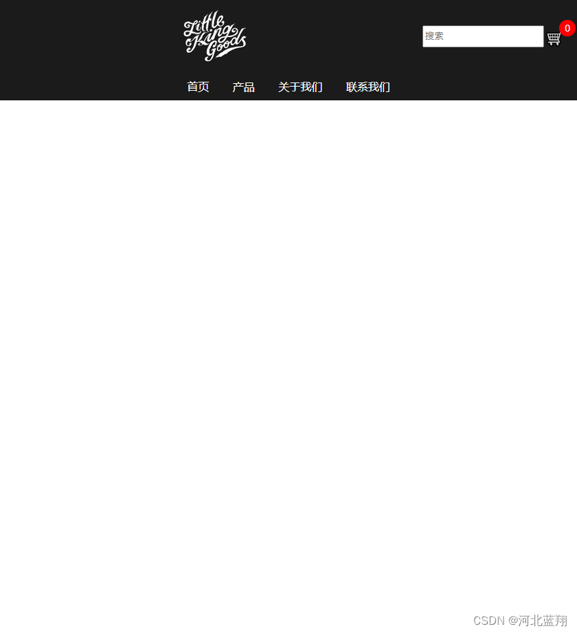
</html>页面展示


 286
286


 被折叠的 条评论
为什么被折叠?
被折叠的 条评论
为什么被折叠?
 到【灌水乐园】发言


