


一、svg图标分为两种
一种是element-plus自带的el-icon图标,
另一种是第三方库的图标,我这里使用的阿里图标
二、封装成全局组件使用
1.下载安装
(1)element-plus的icon图标,目前是2.1.0版本
npm install @element-plus/icons-vue(2)阿里的svg图标,我这里使用的2.0.1版本
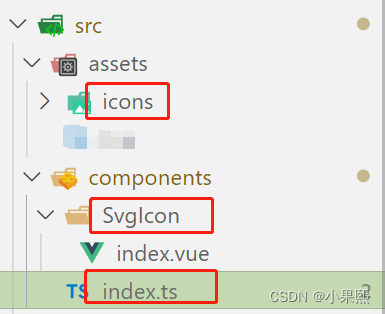
npm i vite-plugin-svg-icons2.目录结构,此时components中的组件均为全局组件
3. vite.config.ts
//引入阿里的svg需要用到插件
import path from "path";
import { createSvgIconsPlugin } from "vite-plugin-svg-icons";
plugins: [
    createSvgIconsPlugin({
      iconDirs: [path.resolve(process.cwd(), "src/assets/icons")],
      symbolId: "icon-[dir]-[name]",
    }),
]
4.svgIcon的index.vue文件
<template>
  <!-- svg:图标外层容器节点,内部需要与use标签结合使用 -->
  <svg :style="{ width, height }">
    <!-- xlink:href执行用哪一个图标,属性值务必#icon-图标名字 -->
    <!-- use标签fill属性可以设置图标的颜色 -->
    <use :xlink:href="prefix + name" :fill="color"></use>
  </svg>
</template>

<script setup lang="ts">
//接受父组件传递过来的参数
defineProps({
  //xlink:href属性值前缀
  prefix: {
    type: String,
    default: "#icon-",
  },
  //提供使用的图标名字
  name: String,
  //接受父组件传递颜色
  color: {
    type: String,
    default: "",
  },
  //接受父组件传递过来的图标的宽度
  width: {
    type: String,
    default: "16px",
  },
  //接受父组件传递过来的图标的高度
  height: {
    type: String,
    default: "16px",
  },
});
</script>
5.components的index.vue文件,将components中的文件遍历注册为全局组件
//引入项目中全部的全局组件
import SvgIcon from "./SvgIcon/index.vue";
//引入element-plus提供全部图标组件
import * as ElementPlusIconsVue from "@element-plus/icons-vue";
//全局对象
const allGloablComponent: any = { SvgIcon };
//对外暴露插件对象
export default {
  //务必叫做install方法
  install(app: any) {
    //注册项目全部的全局组件
    Object.keys(allGloablComponent).forEach((key) => {
      //注册为全局组件
      app.component(key, allGloablComponent[key]);
    });
    //将element-plus提供图标注册为全局组件
    for (const [key, component] of Object.entries(ElementPlusIconsVue)) {
      app.component(key, component);
    }
  },
};
6.main.ts
//svg插件需要配置代码
import "virtual:svg-icons-register";
//引入自定义插件对象:注册整个项目全局组件
import gloalComponent from "@/components";
//安装自定义插件
app.use(gloalComponent);
7.使用
    <el-icon><Plus /></el-icon>
    <svg-icon name="home" width="16px" height="16px" color="red"></svg-icon>


 扫一扫
扫一扫


 7797
7797

 被折叠的 条评论
为什么被折叠?
被折叠的 条评论
为什么被折叠?
 到【灌水乐园】发言


