


目录
I. 传统网页布局的方式*3

❀标准流 (普通流/文档流)

II. 浮动
①需要浮动的原因

②什么是浮动

❀左右盒子
※※左盒子在前

代码:
<!DOCTYPE html>
<html lang="en">

<head>
    <meta charset="UTF-8">
    <meta http-equiv="X-UA-Compatible" content="IE=edge">
    <meta name="viewport" content="width=device-width, initial-scale=1.0">
    <title>Document</title>
    <style>
        * {
            margin: 0;
            padding: 0;
        }

        div {
            height: 200px;
            width: 200px;
            background-color: burlywood;
            padding: 10px;
        }

        .left {
            float: left;
        }

        .left1 {
            width: 100px;
            height: 100px;
            background-color: blueviolet;
            float: left;
        }

        .right {
            float: right;
        }

        .right1 {
            width: 150px;
            height: 150px;
            background-color: aquamarine;
        }
    </style>
</head>

<body>
    <div class="left">
        <div class="left1">1</div>
        <div class="right1">测试一下</div>
    </div>
    <div class="left">2</div>
    <div class="right">3</div>
</body>

</html>
※※右盒子在前

代码:
<!DOCTYPE html>
<html lang="en">

<head>
    <meta charset="UTF-8">
    <meta http-equiv="X-UA-Compatible" content="IE=edge">
    <meta name="viewport" content="width=device-width, initial-scale=1.0">
    <title>Document</title>
    <style>
        * {
            margin: 0;
            padding: 0;
        }

        div {
            height: 200px;
            width: 200px;
            background-color: burlywood;
            padding: 10px;
        }

        .left {
            float: left;
        }

        .left1 {
            width: 100px;
            height: 100px;
            background-color: blueviolet;
            float: left;
        }

        .right {
            float: right;
        }

        .right1 {
            width: 150px;
            height: 150px;
            background-color: aquamarine;
        }
    </style>
</head>

<body>
    <div class="left">
        <div class="right1">测试一下</div>
        <div class="left1">1</div>

    </div>
    <div class="left">2</div>
    <div class="right">3</div>
</body>

</html>
※※※疑惑→为什么right1盒子会被覆盖掉?
③浮动特性※
❀浮动元素会脱离标准流 (脱标)※
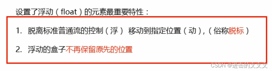
※※图解

代码:
<!DOCTYPE html>
<html lang="en">

<head>
    <meta charset="UTF-8">
    <meta http-equiv="X-UA-Compatible" content="IE=edge">
    <meta name="viewport" content="width=device-width, initial-scale=1.0">
    <title>Document</title>
    <style>
        * {
            margin: 0;
            padding: 0;
        }

        div {
            height: 300px;
            width: 200px;
            background-color: burlywood;
            padding: 10px;
        }

        .left {
            width: 100px;
            height: 100px;
            background-color: blueviolet;
            float: left;
        }
    </style>
</head>

<body>
    <div class="left">1</div>
    <div>2</div>
</body>

</html>
❀浮动的元素会一行内显示并且元素顶部对齐

※※图解

缩小后↓

代码:
<!DOCTYPE html>
<html lang="en">

<head>
    <meta charset="UTF-8">
    <meta http-equiv="X-UA-Compatible" content="IE=edge">
    <meta name="viewport" content="width=device-width, initial-scale=1.0">
    <title>Document</title>
    <style>
        * {
            margin: 0;
            padding: 0;
        }

        div {
            height: 300px;
            width: 200px;
            background-color: burlywood;
            padding: 10px;
        }

        .left {
            width: 100px;
            height: 100px;
            background-color: blueviolet;
            float: left;
        }

        .left1 {
            width: 230px;
            height: 230px;
            background-color: aquamarine;
            float: left;
        }
    </style>
</head>

<body>
    <div class="left">1</div>
    <div class="left1">2</div>
    <div class="left">3</div>
    <div class="left1">4</div>
    <div>5</div>
</body>

</html>
※※※疑惑→为什么div里的5会跟着浮动的盒子移动?
❀浮动的元素会具有行内块元素的特性

※※图解
※※※※p不浮动

※※※※p右浮动


代码:
<!DOCTYPE html>
<html lang="en">

<head>
    <meta charset="UTF-8">
    <meta http-equiv="X-UA-Compatible" content="IE=edge">
    <meta name="viewport" content="width=device-width, initial-scale=1.0">
    <title>Document</title>
    <style>
        * {
            margin: 0;
            padding: 0;
        }

        div {
            height: 300px;
            width: 200px;
            background-color: burlywood;
            padding: 10px;
        }

        .left {
            width: 100px;
            height: 100px;
            background-color: blueviolet;
            float: left;
        }

        .left1 {
            width: 230px;
            height: 230px;
            background-color: aquamarine;
            float: left;
        }

        p {
            height: 300px;
            background-color: cornflowerblue;
            /* 第一张不打float即可 */
            float: right;
        }
    </style>
</head>

<body>
    <div class="left">1</div>
    <div class="left1">2</div>
    <!--第二张图 <p>就一个3有点太小了,<br />多打几个字更明显doge</p> -->
    <p>就一个3有点太小了,多打几个字更明显doge</p>
    <div>5</div>
</body>

</html>
④浮动元素经常和标准流父级搭配使用

eg.
代码:
<!DOCTYPE html>
<html lang="en">

<head>
    <meta charset="UTF-8">
    <meta http-equiv="X-UA-Compatible" content="IE=edge">
    <meta name="viewport" content="width=device-width, initial-scale=1.0">
    <title>Document</title>
    <style>
        * {
            margin: 0;
            padding: 0;
        }

        div {
            height: 500px;
            width: 500px;
            background-color: burlywood;
            padding: 10px;
            margin: 100px auto;
        }

        .left {
            width: 100px;
            height: 100px;
            background-color: blueviolet;
            float: left;
        }

        .left1 {
            width: 230px;
            height: 230px;
            background-color: aquamarine;
            float: left;
        }

        p {
            height: 300px;
            width: 50px;
            float: right;
            background-color: chartreuse;
        }
    </style>
</head>

<body>
    <div>
        <div class="left">1</div>
        <div class="left1">2</div>
        <p>3</p>
    </div>
</body>

</html>

⑤练习
其实是把pink老师的练习改了一下hhh
✿一大四小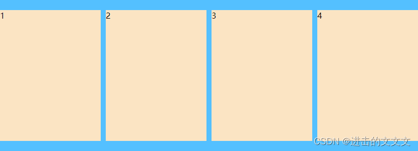
代码:
<!DOCTYPE html>
<html lang="en">

<head>
    <meta charset="UTF-8">
    <meta http-equiv="X-UA-Compatible" content="IE=edge">
    <meta name="viewport" content="width=device-width, initial-scale=1.0">
    <title>Document</title>
    <style>
        * {
            margin: 0;
            padding: 0;
        }

        .box {
            width: 830px;
            height: 300px;
            background-color: deepskyblue;
            margin: 100px auto;
        }

        li {
            list-style: none;
        }

        .box li {
            float: left;
            width: 200px;
            height: 260px;
            margin-top: 20px;
            margin-right: 10px;
            background-color: bisque;
        }

        .box .last {
            margin-right: 0;
        }
    </style>
</head>

<body>
    <ul class="box">
        <li>1</li>
        <li>2</li>
        <li>3</li>
        <li class="last">4</li>
    </ul>
</body>

</html>
✿左小右大

代码:
<!DOCTYPE html>
<html lang="en">

<head>
    <meta charset="UTF-8">
    <meta http-equiv="X-UA-Compatible" content="IE=edge">
    <meta name="viewport" content="width=device-width, initial-scale=1.0">
    <title>Document</title>
    <style>
        * {
            margin: 0;
            padding: 0;
        }

        .box {
            width: 800px;
            height: 300px;
            background-color: deepskyblue;
            margin: 100px auto;
            line-height: 300px;
            font-size: 30px;
            text-align: center;
            color: aliceblue;
        }

        .left {
            float: left;
            width: 200px;
            height: 300px;
            background-color: dimgray;
        }

        .right {
            /* 这里left和right的效果是一样的 */
            float: left;
            width: 600px;
            height: 300px;
            background-color: darkorange;
        }
    </style>
</head>

<body>
    <div class="box">
        <div class="left">左 边 盒 子</div>
        <div class="right">右 边 盒 子</div>
    </div>
</body>

</html>
✿左一右二
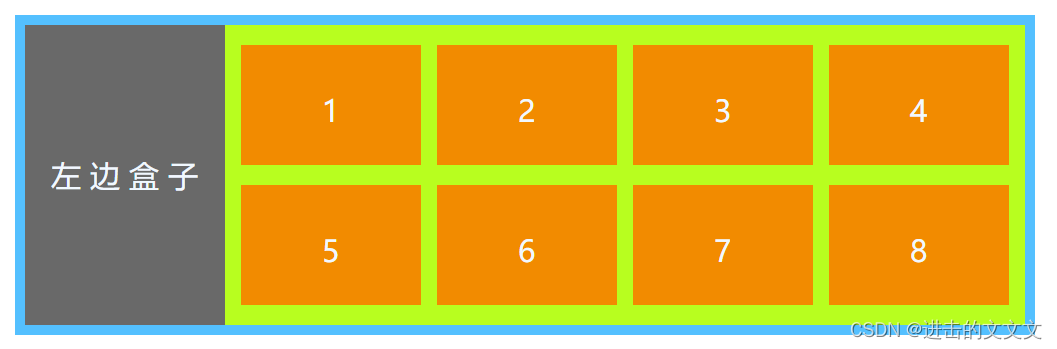
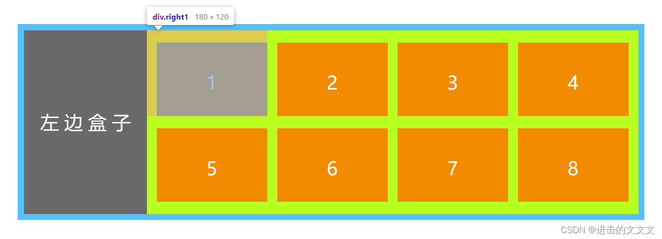
代码:
<!DOCTYPE html>
<html lang="en">

<head>
    <meta charset="UTF-8">
    <meta http-equiv="X-UA-Compatible" content="IE=edge">
    <meta name="viewport" content="width=device-width, initial-scale=1.0">
    <title>Document</title>
    <style>
        * {
            margin: 0;
            padding: 0;
        }

        .box {
            width: 1000px;
            height: 300px;
            background-color: deepskyblue;
            margin: 100px auto;
            font-size: 30px;
            text-align: center;
            color: aliceblue;
            padding: 10px;
        }

        .left {
            float: left;
            width: 200px;
            height: 300px;
            line-height: 300px;
            background-color: dimgray;
        }

        .right {
            float: left;
            width: 800px;
            height: 300px;
            background-color: greenyellow;
        }

        .right .right1 {
            float: left;
            width: 180px;
            height: 120px;
            line-height: 130px;
            background-color: darkorange;
            /* 一定要记住四个数的顺序是 上 右 下 左!!! */
            /* 写成margin-top: 20px  */
            /* margin-left: 16px 也行*/
            margin: 20px 0 0 16px;
        }
    </style>
</head>

<body>
    <div class="box">
        <div class="left">左 边 盒 子</div>
        <div class="right">
            <div class="right1">1</div>
            <div class="right1">2</div>
            <div class="right1">3</div>
            <div class="right1">4</div>
            <div class="right1">5</div>
            <div class="right1">6</div>
            <div class="right1">7</div>
            <div class="right1">8</div>
        </div>
    </div>
</body>

</html>
⑥常见页面布局
✿最基础款

✿升级款
top、footer 和浏览器一样宽→没有设置宽度 width!
※※效果
 ※※代码
※※代码
<!DOCTYPE html>
<html lang="en">

<head>
    <meta charset="UTF-8">
    <meta http-equiv="X-UA-Compatible" content="IE=edge">
    <meta name="viewport" content="width=device-width, initial-scale=1.0">
    <title>Document</title>
    <style>
        * {
            margin: 0;
            padding: 0;
        }

        div {
            margin-bottom: 20px;
            font-size: 30px;
            color: aliceblue;
            font-weight: 700;
            text-align: center;
        }

        .top {
            height: 50px;
            line-height: 50px;
            background-color: coral;
        }

        .banner {
            margin-left: auto;
            margin-right: auto;
            width: 1000px;
            height: 100px;
            line-height: 100px;
            background-color: dimgray;
        }

        .box {
            width: 1000px;
            height: 500px;
            margin-left: auto;
            margin-right: auto;
            background-color: deepskyblue;
            margin-left: auto;
            margin-right: auto;
        }

        li {
            list-style: none;
        }

        .box li {
            float: left;
            width: 235px;
            height: 180px;
            line-height: 180px;
            margin-right: 20px;
            margin-bottom: 20px;
            background-color: lightsalmon;
        }

        .box .last {
            margin-right: 0;
        }

        .box div {
            float: left;
            width: 235px;
            height: 300px;
            line-height: 300px;
            margin-right: 20px;
            background-color: seagreen;
        }

        .box .final {
            margin-right: 0;
        }

        .footer {
            height: 150px;
            line-height: 150px;
            background-color: coral;
        }
    </style>
</head>

<body>
    <div class="top">t o p</div>
    <div class="banner">b a n n e r</div>
    <div class="box">
        <ul>
            <li>小 盒 子 区1</li>
            <li>2</li>
            <li>3</li>
            <li class="last">4</li>
        </ul>
        <div>大 盒 子 区1</div>
        <div>2</div>
        <div>3</div>
        <div class="final">4</div>
    </div>
    <div class="footer">f o o t e r</div>
</body>

</html>
⑦注意点

✿图解
※※两浮一标

※※※※代码
<!DOCTYPE html>
<html lang="en">

<head>
    <meta charset="UTF-8">
    <meta http-equiv="X-UA-Compatible" content="IE=edge">
    <meta name="viewport" content="width=device-width, initial-scale=1.0">
    <title>Document</title>
    <style>
        * {
            margin: 0;
            padding: 0;
        }

        div {
            width: 1000px;
            height: 1000px;
            margin: 100px auto;
            background-color: blanchedalmond;
        }

        div div {
            font-size: 30px;
            font-weight: 700;
            color: aliceblue;
            margin: 0;
        }

        .box {
            width: 450px;
            height: 450px;
            background-color: aquamarine;
        }

        .box1 {
            float: left;
            width: 300px;
            height: 150px;
            background-color: coral;
        }

        .box2 {
            float: left;
            width: 200px;
            height: 300px;
            background-color: blueviolet;
        }
    </style>
</head>

<body>
    <div>
        <div class="box1">浮 动</div>

        <div class="box2">浮 动</div>
        <div class="box">标 准</div>

    </div>

</body>

</html>
※※浮标浮

※※※※代码→上一个浮标换位置即可
<div>
    <div class="box1">浮 动</div>
    <div class="box">标 准</div>
    <div class="box2">浮 动</div>
</div>
III. 清除浮动
①原因
图看不明白的话这个建议看视频w→为什么清除浮动

②本质

③方法*4

❀额外标签法→也叫隔墙法(W3C推荐)

※常见块级元素→盒子div、段落p、标题h1~h6、无列ul、有列ol、自定义列表里的dt、dd

❀父级添加overflow 属性

❀父级添加after 伪元素

❀父级添加双伪元素

总结

IV. PS 切图
①常见图片格式
PSD不能直接放到页面里!
 ②图层切图
②图层切图

③切片切图

④PS插件切图→cutterman相关
✿安装

※※流程
双击exe文件→安装后重启ps→在窗口,扩展功能里能看到
✿使用
直接看视频吧,感觉不太好总结orz→使用技巧
V. 案例的知识点
因为没有案例的那些图,所以没做←其实就是懒吧啊喂!!!
①CSS属性的书写顺序

②页面布局整体思路

恭喜看到这的小伙伴,你已经完成 CSS第五天的学习了嗷呜 ~!
下面进入第六天的学习吧(★ ω ★)→第六天!
有用的话就点赞评论收藏嗷!!
这一篇真的写了好久的qwq!


 扫一扫
扫一扫
 804
804

 被折叠的 条评论
为什么被折叠?
被折叠的 条评论
为什么被折叠?
 到【灌水乐园】发言


