


超市电商数据分析(下)
数据分析
分析新老顾客数
新老客户的定义:将只要消费过的客户定义为老客户,否则就是新客户
根据Customer ID列数据进行重复行的删除, 保证数据集中所有的客户ID都是唯一的,根据此数据再通过年、月进行分组,通过透视表分析新老客户数
# 分析新老顾客数

# 删除重复的Customer ID
unique_customers = df.drop_duplicates(subset='Customer ID')
# 将'Order Date'列转换为datetime类型
unique_customers['Order Date'] = pd.to_datetime(unique_customers['Order Date'])
# 标识新老客户
unique_customers['Customer Type'] = unique_customers['Order Date'].notna().astype('str')
unique_customers['Customer Type'] = unique_customers['Customer Type'].replace({'False': 'New Customer', 'True': 'Old Customer'})
# 提取年份和月份
unique_customers['Order-Year'] = unique_customers['Order Date'].dt.year
unique_customers['Order-Month'] = unique_customers['Order Date'].dt.month

# 仅保留包含购买日期的记录,因为新客户没有购买日期
customers_with_purchases = unique_customers.dropna(subset=['Order Date'])
# 创建透视表
pivot_table = pd.pivot_table(
    customers_with_purchases,
    values='Customer ID',
    index='Order-Month',
    columns='Order-Year',
    aggfunc='count',
    fill_value=0
)
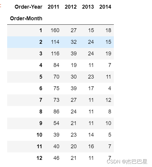
由于上述透视表的人数和远远小于总的记录数,说明超市对保持老客户较为有效 ,也间接说明了超市的运营状况较为稳定;还可以发现,2011-2014年每年的新增客户数呈逐年减少的趋势,新客户获取率比较低,因此,可以进行主动推广营销,从而增加新客户数;
用户数据分析
- 客户类型占比分析
绘制饼图查看不同客户的类型占比,其中,'Segment’字段代表客户类别
# 计算不同客户类型的数量
customer_type_counts = df['Segment'].value_counts()

# 绘制饼图
plt.figure(figsize=(6, 6))
plt.pie(customer_type_counts, labels=customer_type_counts.index, autopct='%1.2f%%', startangle=140)
plt.axis('equal')  # 使饼图比例相等
plt.title('Customer Type Distribution')
plt.show()
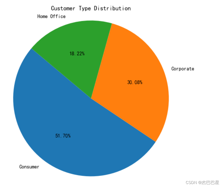
可知:Consumer类型的消费者的客户占比最多,达51.7%,Home Office占比最小,可加强对该类型的客户进行营销宣传。
- 各年不同类型消费者数量分析
# 按年份和消费者类型分组,并计算数量
# 按照客户种类和年份分组,并计算每组的用户数量
grouped = df.groupby(['Segment', 'Order-year'])['Customer ID'].count().unstack()

# 绘制条形图
fig, ax = plt.subplots(figsize=(12, 6))
bar_width = 0.2
index = np.arange(len(grouped.index))

for i, year in enumerate(grouped.columns):
    ax.bar(index + i * bar_width, grouped[year], width=bar_width, label=year)

ax.set_xticks(index + 1.5 * bar_width)
ax.set_xticklabels(grouped.index)
ax.set_xlabel('Customer Type')
ax.set_ylabel('User Count')
ax.set_title('User Count by Customer Type and Year')
ax.legend(title='Year')
plt.show()
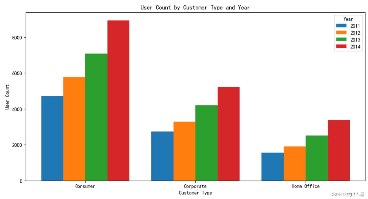
由上面可分析出,每种类型的客户数量在逐年增长,说明客户的结构类型趋于良好
- 不同类型的客户每年的销售额分析
# 按照客户种类和年份分组,并计算每组的销售额之和
grouped = df.groupby(['Segment', 'Order-year'])['Sales'].sum().unstack()

# 绘制条形图
fig, ax = plt.subplots(figsize=(12, 6))
bar_width = 0.2
index = np.arange(len(grouped.index))

for i, year in enumerate(grouped.columns):
    ax.bar(index + i * bar_width, grouped[year], width=bar_width, label=year)

ax.set_xticks(index + 1.5 * bar_width)
ax.set_xticklabels(grouped.index)
ax.set_xlabel('Customer Type')
ax.set_ylabel('Total Sales')
ax.set_title('Total Sales by Customer Type and Year')
ax.legend(title='Year')
plt.show()
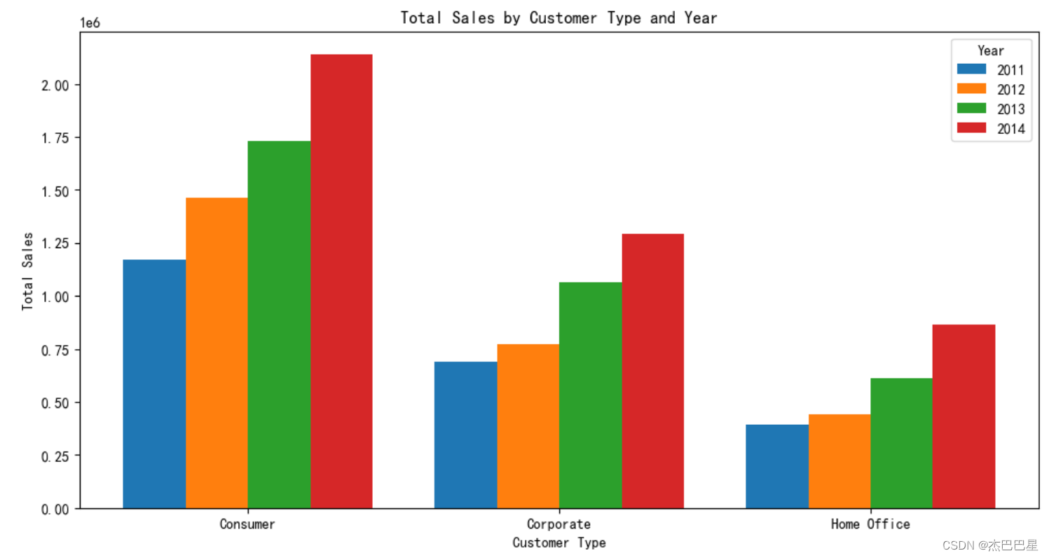
由上面可知,各类型的消费者的销售额在逐步上升,其中以普
通消费者的销售额最多, 可能是因为普通消费者最多的缘故。
用户价值度RFM模型分析
RFM是一个经典的客户分群模型,含义如下: R——Recency:客户最近一次消费时间 F——Frequency:客户消费的频次 M——Monetary:消费金额
客户价值类型:
- 重要价值客户:RFM3个值都很高,是平台重点维护的客户
- 重要保持客户:最近一次消费时间较远,消费金额和消费频次比较高
- 重要发展客户:最近有消费,且整体消费金额高,但是购买不频繁
- 重要挽留客户:消费金额较高,消费频次偏低,而且已经很久没有消费行为了
- 一般价值客户:多次频繁购买,但是购买的商品价格都较低
- 一般保持客户:频繁浏览,但是很久没有成交了
- 一般发展客户:有近期购买行为,但购买商品利润低而且不活跃
- 一般挽留客户:RFM3个值都低,已经是流失的客户
根据客户对平台的贡献度的排序是:重要价值客户 > 重要保持客户 > 重要发展客户 > 重要挽留客户 > 一般价值客户 > 一般保持客户 > 一般发展客户 > 一般挽留客户
以2014年的消费数据为例(其他年份类似)提取出2014年的订单数据后,分别添加F、M、R三个维度的数据列,然后再分别对三个维度划定评级,添加三个列,并将每条记录的三个维度的评分进行0、1标记(大于平均分记为1,小于平均分的记为0),最后对每个客户进行价值类型标记;对不同价值的客户类型进行占比分析
不同价值的客户类型进行占比分析
import pandas as pd
import numpy as np

# 读取数据
data=pd.read_csv('market_cleaned.csv')

# 提取2014年的订单数据
data['Order Date'] = pd.to_datetime(data['Order Date'])
data_2014 = data[data['Order Date'].dt.year == 2014]

# 计算RFM值
current_date = data_2014['Order Date'].max() + pd.Timedelta(days=1)

# R值(最近一次消费时间)
recency = data_2014.groupby('Customer ID')['Order Date'].apply(lambda x: (current_date - x.max()).days).reset_index()
recency.columns = ['Customer ID', 'Recency']

# F值(消费频次)
frequency = data_2014.groupby('Customer ID')['Order ID'].count().reset_index()
frequency.columns = ['Customer ID', 'Frequency']

# M值(消费金额)
monetary = data_2014.groupby('Customer ID')['Sales'].sum().reset_index()
monetary.columns = ['Customer ID', 'Monetary']

# 合并R、F、M值
rfm = recency.merge(frequency, on='Customer ID').merge(monetary, on='Customer ID')

# RFM值评级(大于平均值记为1,小于等于平均值记为0)
rfm['R_Score'] = (rfm['Recency'] <= rfm['Recency'].mean()).astype(int)
rfm['F_Score'] = (rfm['Frequency'] > rfm['Frequency'].mean()).astype(int)
rfm['M_Score'] = (rfm['Monetary'] > rfm['Monetary'].mean()).astype(int)

# 客户价值类型标记
def rfm_segment(row):
    if row['R_Score'] == 1 and row['F_Score'] == 1 and row['M_Score'] == 1:
        return '重要价值客户'
    elif row['R_Score'] == 0 and row['F_Score'] == 1 and row['M_Score'] == 1:
        return '重要保持客户'
    elif row['R_Score'] == 1 and row['F_Score'] == 0 and row['M_Score'] == 1:
        return '重要发展客户'
    elif row['R_Score'] == 0 and row['F_Score'] == 0 and row['M_Score'] == 1:
        return '重要挽留客户'
    elif row['R_Score'] == 1 and row['F_Score'] == 1 and row['M_Score'] == 0:
        return '一般价值客户'
    elif row['R_Score'] == 0 and row['F_Score'] == 1 and row['M_Score'] == 0:
        return '一般保持客户'
    elif row['R_Score'] == 1 and row['F_Score'] == 0 and row['M_Score'] == 0:
        return '一般发展客户'
    elif row['R_Score'] == 0 and row['F_Score'] == 0 and row['M_Score'] == 0:
        return '一般挽留客户'
    else:
        return '未知'
rfm['Customer_Segment'] = rfm.apply(rfm_segment, axis=1) # 客户类型占比分析
segment_counts = rfm['Customer_Segment'].value_counts(normalize=True) * 100 # 输出结果
print(segment_counts)

# 绘制客户类型占比分析图
import matplotlib.pyplot as plt
plt.figure(figsize=(8, 8))
segment_counts.plot.pie(autopct='%1.1f%%', startangle=90)
plt.title('2014年客户价值类型占比分析')
plt.ylabel(' ')
plt.show()
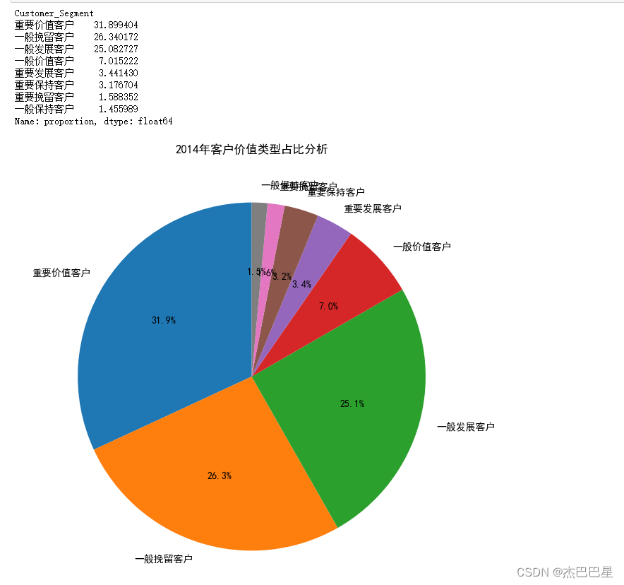
由上面的分析可知:对于该超市来说,重要价值客户和重要保持客户的总和已经超过45%;但是一般发展客户的比例也很高,这种客户很可能是刚注册的客户或者接近流失的客户,针对刚注册的用户可以采取各种新人优惠福利,提高新客户了解平台的动力,针对接近流失的客户应该追溯客户过去不满的原因,对平台进一步完善。
客户群体与产品种类的关系分析
通过客户群体类别(Segment字段)与产品类别(Category字段)分组,对销售额数据进行分析
df['Segment'] = df['Segment'].astype('category')
df['Category'] = df['Category'].astype('category')
grouped_data = df.groupby(['Category','Segment'])['Sales'].sum().reset_index()
# 创建 catplot
cat_plot = sns.catplot(x='Segment', y='Sales', hue='Category', kind='bar', data=grouped_data, dodge=True)

# 显示图形
plt.show()
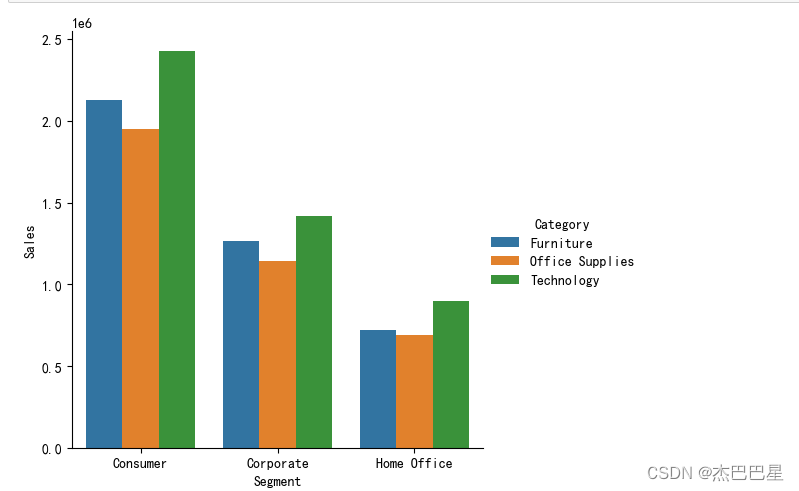
通过上图展示的结果可以看出,不同客户群体对各种产品的消费额次序由高到低是: 科技产品(Technology)> 家具产品(Furniture)>办公用品产品(Office Supplies)。因此,可以2加大对科技产品的推广;在三种客户类型中,个人消费者(Consumer)对各种产品的消费都是最高的,因此,可以保持对个人消费者群体的策略;而居家办公群体(Home Office)在三种产品的销售额较低,可以针对该用户群体进行更好的营销推广
发货时间与发货成本分析
提取发货日期字段(Ship Date字段)的年、月信息,并整理发货年、发货月的销售总额,分析发货成本,并预测进货成本
temp = pd.to_datetime(df['Ship Date'], format='%m/%d/%Y',errors='coerce').fillna(
    pd.to_datetime(df['Ship Date'], format='%d-%m-%Y',errors='coerce'))
df['Ship Date']  = temp.dt.date
df['Ship Date']
df['Ship-year'] = temp.dt.year
df['Ship-month'] = temp.dt.month
df[['Ship-year','Ship-month']]
sales_by_year_month = df.groupby(['Ship-year', 'Ship-month'])['Sales'].sum().reset_index()
shipping_costs = df.groupby(['Ship-year', 'Ship-month'])['Shipping Cost'].sum().reset_index()
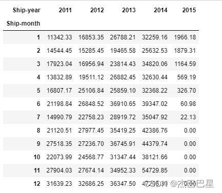
# 创建透视表
pivot_table = pd.pivot_table(
    merged_data,
    values='Shipping Cost',
    index='Ship-month',
    columns='Ship-year',
    fill_value=0
)
pivot_table
import matplotlib.pyplot as plt

# 合并销售额和运输成本数据
merged_data = pd.merge(sales_by_year_month, shipping_costs, on=['Ship-year', 'Ship-month'], suffixes=('_sales', '_shipping'))

# 创建一个折线图
plt.figure(figsize=(12, 6))
years = merged_data['Ship-year'].unique()

for year in years:
    data_year = merged_data[merged_data['Ship-year'] == year]
    plt.plot(data_year['Ship-month'], data_year['Shipping Cost'], label=str(year))

plt.xlabel('Month')
plt.ylabel('Shipping Cost')
plt.title('Shipping Cost by Month and Year')
plt.legend()
plt.show()
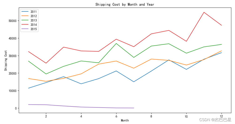
由上面的透视表和折线图可以看出,2011-2014年的发货成本逐年上升,而且每年的各个月份的发货成本也呈上升趋势;但是2015年出现了新的情况!2015年只有7个月的统计数据,但是这7个月的发货成本逐月降低,而且远远小于前4年的发货成本,这很可能是由于2015年物流业的飞速发展使得发货成本大大降低,所以,之后的进货成本也极有可能大大降低!
至此!生产实习结束!


 920
920

 被折叠的 条评论
为什么被折叠?
被折叠的 条评论
为什么被折叠?
 到【灌水乐园】发言


