


首先定义一个边框 让其位于页面中间
html,body{
				height: 100%;
				display: flex;
				justify-content: center;
				align-items: center;
			}
			#flower{
				width: 400px;
				height: 400px;
				border: 1px solid blue;
				position: relative;
			}
然后画出第一个花瓣
z-index:元素的堆叠顺序 越大 元素的层级越大 当元素发生层叠时,层级高的元素会覆盖在层级低的元素上面,使层级低的元素的重叠部分被覆盖 与父元素比较
.f1{
width: 200px;
height: 200px;
background-color: red;
position: absolute;
right: 0;
top: 100px;
border-radius: 85% 15% 61% 39% /76% 0% 100% 24% ;
z-index: 20;
border: 1px solid black;
}
紧接着在第一片花瓣的基础上画出整个花瓣 通过旋转
.f2{
				transform-origin: left bottom;
				z-index: 19;

				transform: rotate(-45deg);
			}
			.f3{
				transform: rotate(-30deg);
				z-index: 18;
				transform-origin: left bottom;
			}
			.f4{
				transform: rotate(-10deg) ;
					z-index: 17;
					transform-origin: left bottom;
				}
			.f5{
		   transform: rotate(-20deg) ;
		   	z-index: 16;
		   	transform-origin: left bottom;

			}
在画出两片绿叶 同样在第一片花瓣的基础上截取一部分 并将background-color设置为绿色
第二片绿叶在第一片的基础上进行旋转
.f6{
				background-color: green;
				width: 80px;
				height: 80px;
				top: 270px;
				right: 200px;
				z-index: 15;
				transform-origin: right top;
				transform: rotate(60deg);
			}
			.r{
				transform: rotate(-110deg);

			}
继续画出根 并通过定位将根放在合适的位置
.root{
				position: absolute;
				width: 10px;
				height: 300px;
				background-color: green;
				border-radius: 10%;
				right: 190px;
				top: 250px;
			}
设置动画 一个一个步骤来
先定义一个关键帧
@keyframes paint{
				from{
					scale: 0;

				}
				to{
					scale: 1;
				}
			}
然后在每一个选择其中 加入它 并将延迟时间改为不一致的 会在视觉上产生先后
整体代码为
<!DOCTYPE html>
<html>
<head>
<meta charset="utf-8">
<title>rose</title>
<style>
*{
border: 0;
padding: 0;
}
html,body{
height: 100%;
display: flex;
justify-content: center;
align-items: center;
}
@keyframes paint{
from{
scale: 0;
}
to{
scale: 1;
}
}
#flower{
width: 500px;
height: 500px;
/* border: 1px solid blue; */
position: relative;
}
.f1{
width: 200px;
height: 200px;
background-color: red;
position: absolute;
right: 0;
top: 100px;
border-radius: 85% 15% 61% 39% /76% 0% 100% 24% ;
z-index: 20;
border: 1px solid black;
animation: paint 3s linear 1;
}
.f2{
transform-origin: left bottom;
z-index: 19;
animation: paint 6s linear 1;
transform: rotate(-45deg);
}
.f3{
transform: rotate(-30deg);
z-index: 18;
transform-origin: left bottom;
animation: paint 7s linear 1;
}
.f4{
transform: rotate(-10deg) ;
z-index: 17;
transform-origin: left bottom;
animation: paint 8s linear 1;
}
.f5{
transform: rotate(-20deg) ;
z-index: 16;
transform-origin: left bottom;
animation: paint 9s linear 1;
}
.f6{
animation: paint 9s linear 1;
background-color: green;
width: 80px;
height: 80px;
top: 270px;
right: 200px;
z-index: 15;
transform-origin: right top;
transform: rotate(60deg);
}
.r{
transform: rotate(-110deg);
animation: paint 9s linear 1;
}
.root{
animation: paint 10s linear 1;
position: absolute;
width: 10px;
height: 300px;
background-color: green;
border-radius: 10%;
right: 190px;
top: 250px;
}
</style>
</head>
<body>
<div id="flower">
<div class="f1">
</div>
<div class="f1 f2">
</div>
<div class="f1 f3">
</div>
<div class="f1 f4">
</div>
<div class="f1 f5">
</div>
<div class="f1 f6">
</div>
<div class="f1 f6 r">
</div>
<div class="root">
</div>
</div>
</body>
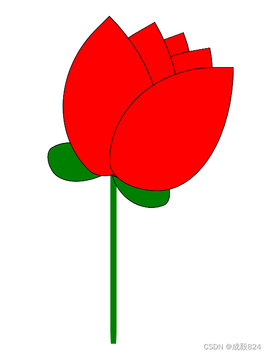
</html>效果图为:


 141
141


 被折叠的 条评论
为什么被折叠?
被折叠的 条评论
为什么被折叠?
 到【灌水乐园】发言


