


使用 hue-rotate 实现动态渐变背景动画。
这种方法应该是实现渐变背景动画的比较好的方法。
只使用一个动画,短短几行代码实现动态渐变背景动画
<link rel="stylesheet" type="text/css" href="./背景图动态渐变.css">

<div class="bg1" style="width: 200px;height: 150px;"></div>
@-webkit-keyframes hueRotate {
  100% {
    filter: hue-rotate(360deg);
  }
}

@keyframes hueRotate {
  100% {
    filter: hue-rotate(360deg);
  }
}
.bg1 {
  width: 100vw;
  height: 100vh;
  margin: auto;
  background: linear-gradient(30deg, #ffcc00, deeppink, #9c27b0);
  -webkit-animation: hueRotate 5s infinite alternate;
          animation: hueRotate 5s infinite alternate;
}
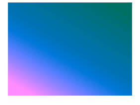
效果如下:


 扫一扫
扫一扫


 3630
3630

 被折叠的 条评论
为什么被折叠?
被折叠的 条评论
为什么被折叠?
 到【灌水乐园】发言


