


嗨喽!大家好!今天我们来认识一下bootstrap(前端开发框架)
先看知识导图:(今天用到的工具为HBuilder X)

一、WWW
指的是(what是什么、why为什么、where在哪用)
1.1 What?
(Bootstrap是什么?)
Bootstrap是美国Twitter公司的设计师Mark Otto和Jacob Thornton合作基于HTML、CSS、JavaScript 开发的简洁、直观、强悍的前端开发框架,使得 Web 开发更加快捷。Bootstrap提供了优雅的HTML和CSS规范,它即是由动态CSS语言Less写成。Bootstrap一经推出后颇受欢迎,一直是GitHub上的热门开源项目,包括NASA的MSNBC(微软全国广播公司)的Breaking News都使用了该项目。 [1] 国内一些移动开发者较为熟悉的框架,如WeX5前端开源框架等,也是基于Bootstrap源码进行性能优化而来。
- 诞生于2011年,来自Twitter公司,是目前最受欢迎的前端框架
- 是一个用于快速开发Web应用程序和网站的前端框架
- Bootstrap是基于HTML、CSS、JS的,简洁灵活,使得Web开发更加快捷
- 概述:Bootstrap是一个建立一个页面,就可以在三个终端(PC端、平板、手机)上完美展示的响应式前端框架
1.2 Why?
(为啥用它?)
①.响应式设计(Bootstrap的响应式CSS能够自适应台式机、平板电脑和手机)
②.移动设备优先
③.浏览器支持
④.容易上手
1.3 Where?
(在哪用?)
- 企业网站、博客、网站后台之类的网站
- 电商(电商网站分类太多)
二、环境安装
2.1 下载bootstrap库
 https://v4.bootcss.com/
进入官网后直接点击下载,下载bootstrap源码那个即可
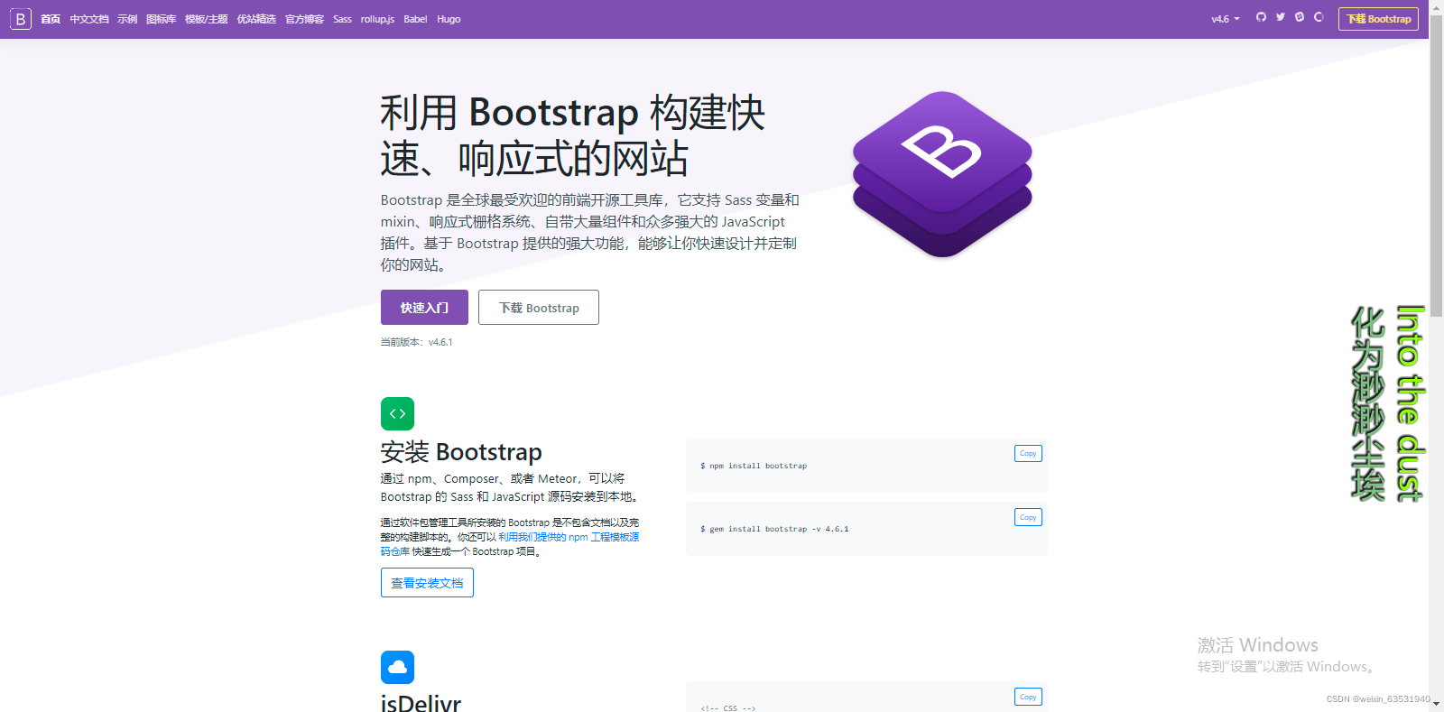
下载完之后就可以引入bootstrap的图标样式和其css
我们可以进入其网址点击中文文档,取其中的样式和框架!(网址在上面)
2.2 页面中引入库
- bootstrap.css:Bootstrap核心样式【添加到head标签中】
- jquery-3.3.1.js:jQuery库【注意:必须在Bootstrap核心库引入之前引入jQuery库】
- bootstrap.js:Bootstrap核心库
这些都添加到</body>之前
案例:
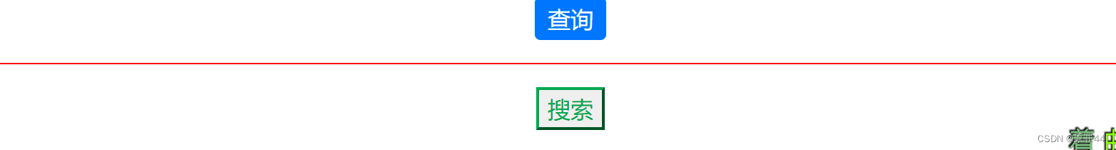
案例1:查询按钮原生态实现对比Bootstrap方式实现
代码如下:
<!DOCTYPE html>
<html>
	<head>
		<meta charset="utf-8" />
		<title>案例1:查询按钮原生态实现对比</title>
		<!-- 支持手机端 -->
		<meta name="viewport" content="width=device-width,initial-scale=1,minimum-scale=1,maximum-scale=1,user-scalable=no" />

		<style type="text/css">
		.aa{
			color:white;/* 字体颜色 */
			background-color:#0073FF;/* 背景颜色 */
			border: 0px;/* 去除边框 */
			width: 50px;/* ,宽度 */
			height: 30px;/* 高度 */
			border-radius: 4px;/* 设置边框圆角 */
		}
		</style>
		<!-- 引入外部css(层叠样式表) -->
		<link rel="stylesheet" type="text/css" href="css/bootstrap.css" />
	</head>
	<body style="text-align: center;">
		<button class="aa">查询</button>
		<hr color="red"/>
		<!-- bootstrap的按钮 -->
		<button class="btn-outline-success">搜索</button>

		<!-- 引入jquery的类库 -->
		<script src="js/jquery-3.3.1.js" type="text/javascript" charset="UTF-8"></script>
		<!-- 引入bootstrap的类库 -->
		<script src="js/bootstrap.js" type="text/javascript" charset="UTF-8"></script>
	</body>
</html>
效果如下:
案例2:演示Bootstrap页面在手机浏览器中展示效果

效果也在案例一里面代码上面也有哦:

案例3:首页导航&搜索区域原生态实现(div+css)
<!DOCTYPE html>
<html>
	<head>
		<meta charset="utf-8">
		<title>案例3:首页导航&搜索区域原生态实现(div+css)</title>
		<style type="text/css">
			.dh{
				height: 50px;/* 高度 */
				background-color: #F8F9FA;/* 背景颜色 */
				line-height: 50px;/* 行高 垂直居中 */
			}
			.bt{
				float: left;/* 左飘 */
				margin-left: 50px;
			}
			.lj{
				float: right;/* 右飘 */
				margin-right: 50px;/* 右间距 */
			}
			.lj a{
				margin-left:10px ;/* 每个间隔10个像素 */
			}
			.ss{
				background-color: #DCDCDC;/* 背景颜色 */
				height: 100px;/* 高度 */
				margin: 20px 50px 0px 50px;
				text-align: center;/* 水平居中 */
				line-height: 100px;
			}
			.ss button{
				color:white;/* 字体颜色 */
				background-color:#0073FF;/* 背景颜色 */
				border: 0px;/* 去除边框 */
				width: 50px;/* 宽度 */
				height: 30px;/* 高度 */
				border-radius: 4px;/* 设置边框圆角 */
			}
			.ss input{
				border: 0px;/* 去除边框 */
				width: 200px;/* 宽度 */
				height: 25px;/* 高度 */
			}
		</style>
	</head>
	<body>
		<!-- 导航区域 -->
		<div class="dh">
			<div class="bt">哈哈</div>
			<div class="lj">
				<a>首页</a>
				<a>登录</a>
				<a>注册</a>
				<a>我的购物车</a>
			</div>
		</div>
		<!-- 搜索区域 -->
		<div class="ss">
			<input type="text" />
			<button>查询</button>
		</div>
	</body>
</html>

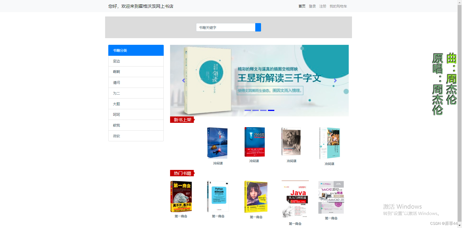
案例4:首页导航&搜索区域Bootstrap实现&搭首页框架

代码如下:
<!DOCTYPE html>
<html>
<head>
<meta charset="utf-8">
<title>案例4:图标组件的使用</title>
<!-- 支持手机端 -->
<meta name="viewport"
content="width=device-width,initial-scale=1,minimum-scale=1,maximum-scale=1,user-scalable=no" />
<!-- 先引入Bootstrap的CSS -->
<link rel="stylesheet" type="text/css" href="css/bootstrap.css" />
<!-- 引入bootstrap的图标样式 -->
<link rel="stylesheet" type="text/css" href="css/bootstrap.css"/>
<style type="text/css">
.navbar-collapse {
flex-grow: 0;
/* 1代表弹性自动占用父容器剩余空间 0代表不占用 */
}
.ss{
height: 100px;
background-color: #DCDCDC;
margin-top: 20px;/* 上间距 */
}
.form-group{
width: 300px;
margin-left: auto;/* 左间距 自适应 */
margin-right: auto;/* 右间距 自适应 */
margin-top: 31px;/* (100-38)/2 */
}
/* 画像 */
.figure{
text-align: center;/* 水平居中 */
margin-top:20px ;/* 上间距 */
}
/* 列表组 轮播图*/
.list-group,#carouselExampleIndicators{
margin-top:30px ;/* 上间距 */
}
/* 指示灯样式 */
.carousel-indicators li{
background-color: blue;
}
/* 新书上架=热门书籍 */
.xxx{
background-image: url(img/title_bj.png);/* 背景效果 */
background-repeat: no-repeat;/* 不平铺 */
color: white;/* 字体颜色 */
font-size: 20px;/* 上间距 */
padding-left: 18px;/* 左内间距 */
}
</style>
</head>
<body>
<!-- 导航条助件 -->
<nav class="navbar navbar-expand-lg navbar-light bg-light">
<div class="container">
<!-- 固定容器 -->
<a class="navbar-brand" href="#">您好,欢迎来到霍格沃茨网上书店</a>
<button class="navbar-toggler" type="button" data-toggle="collapse" data-target="#navbarNav"
aria-controls="navbarNav" aria-expanded="false" aria-label="Toggle navigation">
<span class="navbar-toggler-icon"></span>
</button>
<div class="collapse navbar-collapse" id="navbarNav">
<ul class="navbar-nav">
<li class="nav-item active">
<a class="nav-link" href="#">首页 <span class="sr-only">(current)</span></a>
</li>
<li class="nav-item">
<a class="nav-link" href="#">登录</a>
</li>
<li class="nav-item">
<a class="nav-link" href="#">注册</a>
</li>
<li class="nav-item">
<!-- disabled禁用-->
<a class="nav-link" href="#">我的购物车</a>
</li>
</ul>
</div>
</div>
</nav>
<!-- 栅格系统实现首页框架 -->
<div class="container">
<!-- 第一行:搜索区域 -->
<div class="row ss">
<div class="col" >
<!-- 搜索区域 -->
<form>
<div class="form-group">
<div class="input-group mb-3">
<input type="text" class="form-control" placeholder="书籍关键字"
aria-label="Recipient's username" aria-describedby="button-addon2">
<div class="input-group-append">
<button class="btn btn-primary" type="button"
id="button-addon2"><i class="bi bi-search text-white"></i></button>
</div>
</div>
</div>
</form>
</div>
</div>
<!-- 第二行-->
<div class="row">
<div class="col-3">
<!-- 左3-书籍分类 -->
<div class="list-group">
<a href="#" class="list-group-item list-group-item-action active" aria-current="true">
书籍分类
</a>
<a href="#" class="list-group-item list-group-item-action">变边</a>
<a href="#" class="list-group-item list-group-item-action">啊啊</a>
<a href="#" class="list-group-item list-group-item-action">请问</a>
<a class="list-group-item list-group-item-action disabled">为二</a>
<a href="#" class="list-group-item list-group-item-action">大胆</a>
<a href="#" class="list-group-item list-group-item-action">呵呵</a>
<a href="#" class="list-group-item list-group-item-action">欸我</a>
<a class="list-group-item list-group-item-action disabled">微软</a>
</div>
</div>
<div class="col-9" style="background-color: white ">
<!-- 右9-轮播图&新书上架&热门书籍 -->
<div class="row">
<div class="col">
<!-- 右9中第一行轮播图 -->
<div id="carouselExampleIndicators" class="carousel slide" data-ride="carousel">
<!-- 指示灯部分-->
<ol class="carousel-indicators">
<li data-target="#carouselExampleIndicators" data-slide-to="0" class="active"></li>
<li data-target="#carouselExampleIndicators" data-slide-to="1"></li>
<li data-target="#carouselExampleIndicators" data-slide-to="2"></li>
<li data-target="#carouselExampleIndicators" data-slide-to="3"></li>
</ol>
<!-- 主图部分 -->
<div class="carousel-inner">
<div class="carousel-item active">
<img src="img/lb1.png" class="d-block w-100" alt="...">
</div>
<div class="carousel-item">
<img src="img/lb2.jpg" class="d-block w-100" alt="...">
</div>
<div class="carousel-item">
<img src="img/lb3.jpg" class="d-block w-100" alt="...">
</div>
<div class="carousel-item">
<img src="img/lb4.jpeg" class="d-block w-100" alt="...">
</div>
</div>
<!-- 左右箭头-->
<button class="carousel-control-prev" type="button" data-target="#carouselExampleIndicators" data-slide="prev">
<span class="carousel-control-prev-icon" aria-hidden="true"></span>
<span class="sr-only">Previous</span>
</button>
<button class="carousel-control-next" type="button" data-target="#carouselExampleIndicators" data-slide="next">
<span class="carousel-control-next-icon" aria-hidden="true"></span>
<span class="sr-only">Next</span>
</button>
</div>
</div>
</div>
<div class="xxx">
新书上架
</div>
<div class="row">
<!-- 右9中第二行新书上架 -->
<div class="col" >
</div>
<div class="col" >
<figure class="figure">
<img src="../Bootstrap02/img/3.png" class="figure-img img-fluid rounded" alt="...">
<figcaption class="figure-caption"><b>冷间谍</b><i class="bi bi-cart2"></i></figcaption>
</figure>
</div>
<div class="col" >
<figure class="figure">
<img src="../Bootstrap02/img/1.png" class="figure-img img-fluid rounded" alt="...">
<figcaption class="figure-caption"><b>冷间谍</b> <i class="bi bi-cart2"></i>
</figcaption>
</figure>
</div>
<div class="col" >
<figure class="figure">
<img src="../Bootstrap02/img/4.png" class="figure-img img-fluid rounded" alt="...">
<figcaption class="figure-caption"><b>冷间谍</b></figcaption>
</figure>
</div>
<div class="col" >
<figure class="figure">
<img src="../Bootstrap02/img/9.png" class="figure-img img-fluid rounded" alt="...">
<figcaption class="figure-caption"><b>冷间谍</b></figcaption>
</figure>
</div>
</div>
<div class="xxx">
热门书籍
</div>
<div class="row">
<!-- 右9中第三行热门书籍 -->
<div class="col" >
<figure class="figure">
<img src="../Bootstrap02/img/2.png" class="figure-img img-fluid rounded" alt="...">
<figcaption class="figure-caption"><b>第一商会</b></figcaption>
</figure>
</div>
<div class="col" >
<figure class="figure">
<img src="../Bootstrap02/img/5.png" class="figure-img img-fluid rounded" alt="...">
<figcaption class="figure-caption"><b>第一商会</b></figcaption>
</figure>
</div>
<div class="col" >
<figure class="figure">
<img src="../Bootstrap02/img/8.png" class="figure-img img-fluid rounded" alt="...">
<figcaption class="figure-caption"><b>第一商会</b></figcaption>
</figure>
</div>
<div class="col" >
<figure class="figure">
<img src="../Bootstrap02/img/6.png" class="figure-img img-fluid rounded" alt="...">
<figcaption class="figure-caption"><b>第一商会</b></figcaption>
</figure>
</div>
<div class="col" >
<figure class="figure">
<img src="../Bootstrap02/img/7.png" class="figure-img img-fluid rounded" alt="...">
<figcaption class="figure-caption"><b>第一商会</b></figcaption>
</figure>
</div>
</div>
</div>
</div>
</div>
<!-- 引入jQuery类库 -->
<script src="js/jquery-3.3.1.js" type="text/javascript" charset="UTF-8"></script>
<!-- 引入Bootstrap类库 -->
<script src="js/bootstrap.js" type="text/javascript" charset="utf-8"></script>
</body>
</html>
效果如下:
好啦!今天分享的知识就到这里啦,咱们有空再见哈哈!


 559
559


 被折叠的 条评论
为什么被折叠?
被折叠的 条评论
为什么被折叠?
 到【灌水乐园】发言


