


uni-app的基本使用
课程介绍
基础部分:
- 环境搭建
- 页面外观配置
- uni-app的生命周期
- 组件的使用
- 条件注释跨端兼容
- uni中的事件
- 导航跳转
- 组件创建和通讯
项目:黑马商城项目
环境搭建
安装编辑器HbuilderX
安装微信开发者工具
利用HbuilderX初始化项目
运行项目
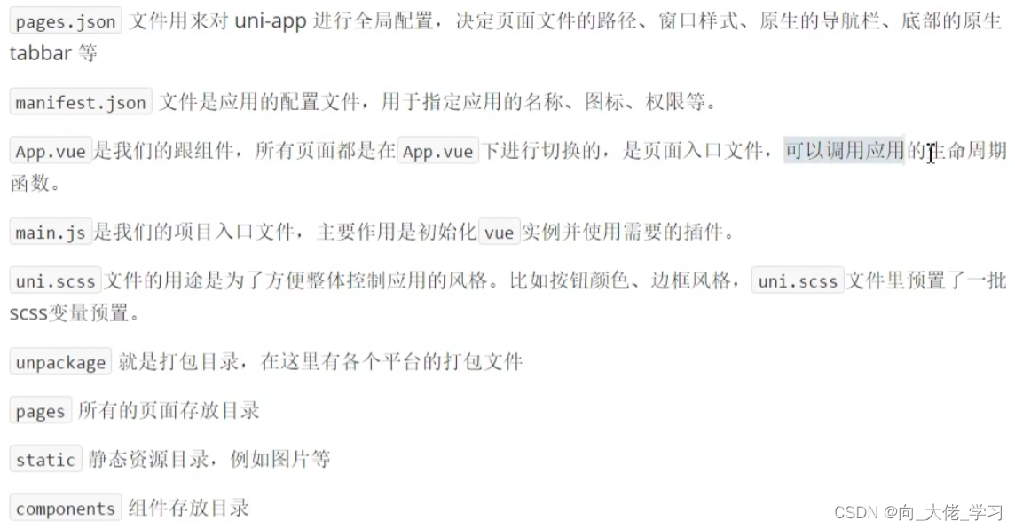
介绍项目目录和文件作用
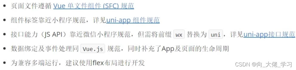
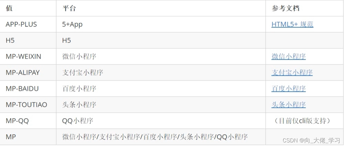
为了实现多端兼容,综合考虑编译速度、运行性能等因素,uni-app约定了如下开发规范:
全局配置和页面配置
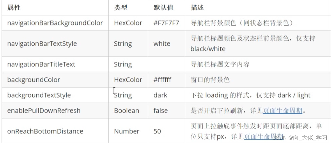
1.通过globalStyle进行全局配置
用于设置应用的状态栏、导航条、标题、窗口背景色等。
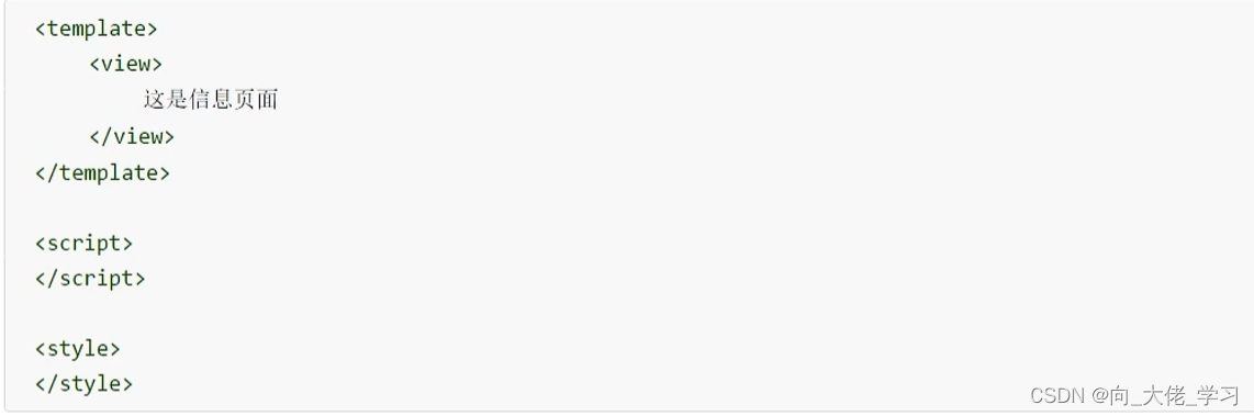
2.创建新的message页面
右键pages新建message目录,在message目录下右键新建.vue文件,并选择基本模板
通过pages来配置页面
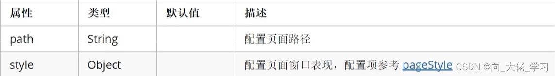
pages数组中第一项表示应用启动页
//单独页面样式可以覆盖全局页面样式
{
	"pages": [ //pages数组中第一项表示应用启动页,参考:https://uniapp.dcloud.io/collocation/pages
	{
		"path": "pages/message/message",
		"style": {
			"navigationBarTitleText": "信息页",
			"navigationBarBackgroundColor": "#007AFF",
			"h5": {
				"pullToRefresh": {
					"color": "#7D26CD"
				}
			}
		}
	},
		{
			"path": "pages/index/index"
		}
	],
	"globalStyle": {
		"navigationBarTextStyle": "black",
		"navigationBarTitleText": "uni-app",
		"navigationBarBackgroundColor": "#7FFF00",
		"backgroundColor": "#F8F8F8",
		"enablePullDownRefresh": true,
		"backgroundTextStyle": "light"
	},
	"uniIdRouter": {}
}
3.配置tabbar
如果应用是一个多tab应用,可以通过tabBar配置项指定tab栏的表现,以及tab切换时显示的对应页
Tips:
- 当设置position为top时,将不会显示icon
- tabBar中的list是一个数组,只能配置最少2个,最多5个tab,tab按数组的顺序排序
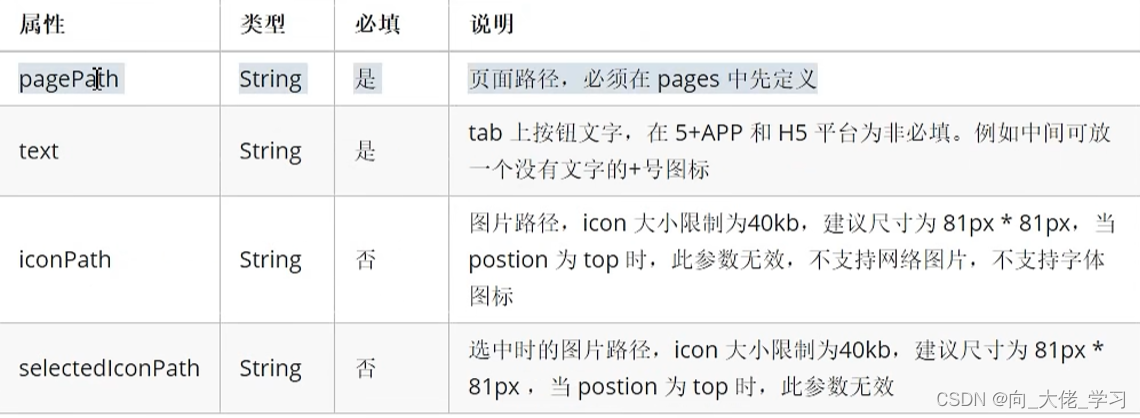
属性说明:
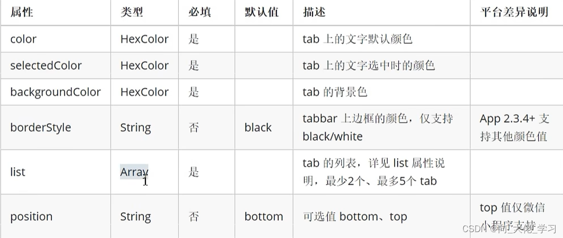
其中list接收一个数组,数组中的每个项都是一个对象,其属性值如下:
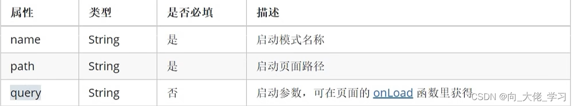
4.condition启动模式配置
启动模式配置,仅开发期间生效,用于模拟直达页面的场景,如:小程序转发后,用户点击所打开的页面。
属性说明:
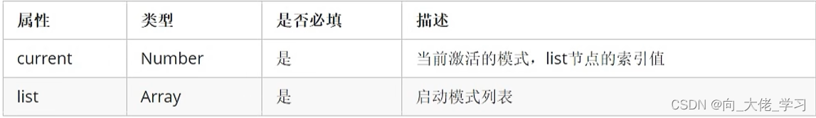
list说明:
{
	"pages": [ //pages数组中第一项表示应用启动页,参考:https://uniapp.dcloud.io/collocation/pages
	{
		"path": "pages/message/message",
		"style": {
			"navigationBarTitleText": "信息页",
			"navigationBarBackgroundColor": "#007AFF",
			"h5": {
				"pullToRefresh": {
					"color": "#7D26CD"
				}
			}
		}
	},
		{
			"path": "pages/index/index"
		},
		{
			"path": "pages/contact/contact"
		},
		{
			"path": "pages/detail/detail"
		}
	],
	"globalStyle": {
		"navigationBarTextStyle": "black",
		"navigationBarTitleText": "uni-app",
		"navigationBarBackgroundColor": "#7FFF00",
		"backgroundColor": "#F8F8F8",
		"enablePullDownRefresh": true,
		"backgroundTextStyle": "light"
	},
	"tabBar": {
		"color": "#A0522D",
		"selectedColor": "#B3EE3A",
		"backgroundColor": "#ffffff",
		"borderStyle": "white",
		// "position": "top",
		"list": [
		  {
			 "text": "首页",
			  "pagePath": "pages/index/index",
			  "iconPath": "static/tabs/home.png",
			  "selectedIconPath": "static/tabs/home-active.png"
		  },
		  {
		  	 "text": "信息",
		  	  "pagePath": "pages/message/message",
		  	  "iconPath": "static/tabs/message.png",
		  	  "selectedIconPath": "static/tabs/message-active.png"
		  },
		  {
		  	 "text": "我们",
		  	  "pagePath": "pages/contact/contact",
		  	  "iconPath": "static/tabs/contact.png",
		  	  "selectedIconPath": "static/tabs/contact-active.png"
		  }
		]
	},
	"condition": {
		"current": 0,
		"list": [
			{
				"name": "详情页",
				"path": "pages/detail/detail",
				"query": "id=80"//参数值
			}
		]
	},
	"uniIdRouter": {}
}
组件的基本使用
1.text文本组件的属性
001-text组件的属性
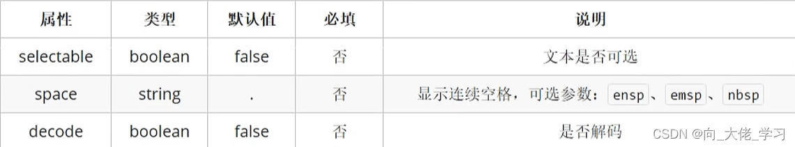
- text组件相当于行内标签,在同一行显示
- 除了文本节点以外的其他节点都无法长按选中
002-代码案例
<template>
	<view>
		<view>
			<text>唱歌跳舞打篮球</text>
		</view>
		<view>
			<text  selectable>唱歌跳舞打篮球</text>
		</view>
	</view>
</template>

<script>
</script>

<style>
</style>
2.view视图容器组件的用法
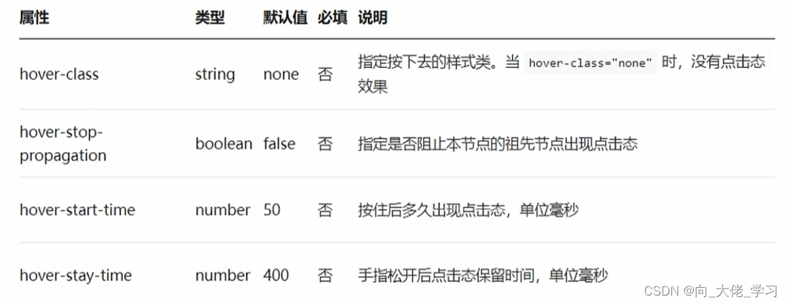
001-组件的属性
002-代码案例
<template>
<!-- <view>
<view>
<text>唱歌跳舞打篮球</text>
</view>
<view>
<text selectable>唱歌跳舞打篮球</text>
</view>
</view> -->
<view>
<view class="box2" hover-class="box2-active">
<view class="box" :hover-start-time="2000" hover-class="box-active" hover-stop-propagation>我是一个大盒子</view>//注意冒泡问题
</view>
</view>
</template>
<script>
</script>
<style>
.box{
width:100px;
height:100px;
background:green;
}
.box-active{
background: red;
}
.box2{
width:200px;
height:200px;
background:grey;
}
.box2-active{
background: pink;
}
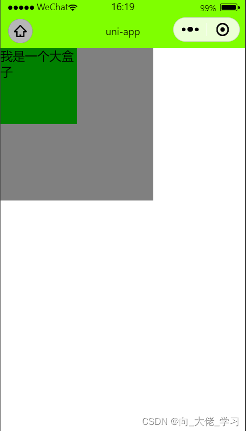
</style>003-效果展示
3.button按钮组件的用法
001-组件的属性
002-案例代码
略
4.image组件的使用
image
uni-app中的样式
- rpx即响应式px,一种根据屏幕宽度自适应的动态单位。以750宽为基准,750rpx恰好为屏幕宽度。屏幕变宽,rpx实际显示效果会等比放大。
- 使用@import语句可以导入外联样式表,@import后跟需要导入的外联样式表的相对路径,用;结束。
- 支持基本常用的选择器class、id、element等
- 不能使用*选择器
- page相当于body节点
- 定义在App.vue中的样式为全局样式,作用于每一个页面。在pages目录下的vue文件中定义的样式为局部样式,只作用于对应的页面,并覆盖相同选择器。
- uni-app支持使用字体图标,注意:
字体文件的引用路径推荐以~@开头的绝对路径。
@font-face{
font-family:test1-icon;
src:url('~@/static/iconfont.ttf');
}//比如导入一个css文件
- 如何使用scss或者less
uni-app中的数据绑定
ps:学过vue应该对这些很熟悉
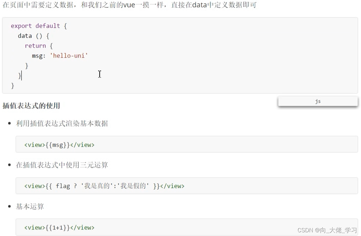
//v-bind动态绑定属性
//v-for的使用
//事件绑定
//事件传参

<template>
	<view>
		<view>数据绑定的学习</view>
		<view>{{msg}}</view>
		<image :src="imgUrl"></image>
		<view v-for="(item,index) in arr">
			序号:{{index}},名字:{{item.name}},年龄:{{item.age}}
		</view>
		<button type="primary" @click="clickHandle(20,$event)">按钮</button>
	</view>
</template>

<script>
	export default {
		data() {
			return {
				msg:"hello",
				flag:false,
				imgUrl: 'http://destiny001.gitee.io/image/monkey_02.jpg',
				arr:[
					{
						name:'宋小宝',
						age:20,
						id:1
					},
					{
						name:'刘能',
						age:20,
						id: 2
					},
					{
						name:'赵四',
						age: 30,
						id: 3
					},
					{
						name:'小沈阳',
						age:22,
						id:4
					}
				]
			}
		},


	methods: {
		clickHandle(num,e){
			console.log(num,e);
		}
	},
	}
</script>

<style>
</style>
uni的生命周期
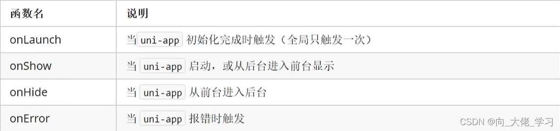
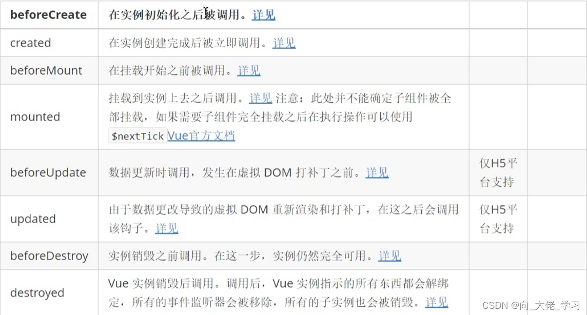
生命周期概念:一个对象从创建、运行、销毁的整个过程被称为生命周期。
生命周期函数:在生命周期中的每个阶段会伴随着每一个函数的触发。
uni-app支持如下应用生命周期函数:
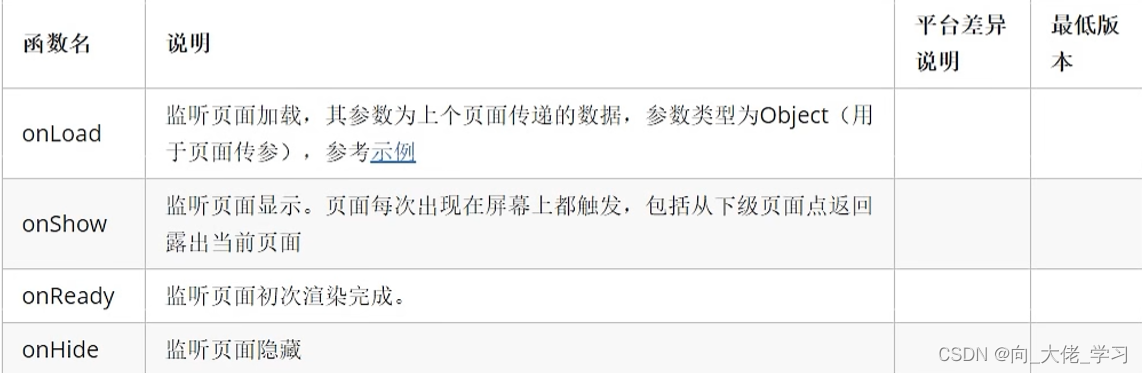
页面的生命周期
uni-app支持如下页面生命周期函数:
//演示代码
<template>
	<view class="content">
		<image class="logo" src="/static/logo.png"></image>
		<view class="text-area">
			<text class="title">{{title}}</text>
		</view>
	</view>
</template>

<script>
	export default {
		data() {
			return {
				title: 'Hello'
			}
		},
		onLoad(options) {
console.log('页面加载了',options)
		},
		onshow() {
			console.log('页面显示了')//会多次触发
		},
		onReady() {
			console.log('页面初次渲染完成了')
		},
		onHide() {
		console.log('页面隐藏了')
		},
		methods: {

		}
	}
</script>

<style>
	.content {
		display: flex;
		flex-direction: column;
		align-items: center;
		justify-content: center;
	}

	.logo {
		height: 200rpx;
		width: 200rpx;
		margin-top: 200rpx;
		margin-left: auto;
		margin-right: auto;
		margin-bottom: 50rpx;
	}

	.text-area {
		display: flex;
		justify-content: center;
	}

	.title {
		font-size: 36rpx;
		color: #8f8f94;
	}
</style>
下拉刷新
<template>
	<view>
		<view>这是列表页</view>
		<view v-for="item in list">
			{{item}}
		</view>
		<button @click="pullDown">下拉刷新</button>
	</view>
</template>

<script>
	export default {
		data() {
			return {
				list:['前端','java','ui','大数据']
			}
		},
		onPullDownRefresh() {
			console.log('触发了下拉刷新')
			setTimeout(() =>{
				this.list = ['前端','java']
				uni.stopPullDownRefresh()
			},2000)
		},
		methods: {
			pullDown() {
				uni.startPullDownRefresh()
			}
		}
	}
</script>

<style>
</style>


//页面触底...
网络请求
在uni中可以调用uni.request方法进行网络请求
1.发送get请求
get() {
				uni.request({
					url:"http://localhost:8082/api/getlunbo",
					success (res) {
						console.log(res)
					}
				})
			}
2.发送post请求
数据缓存
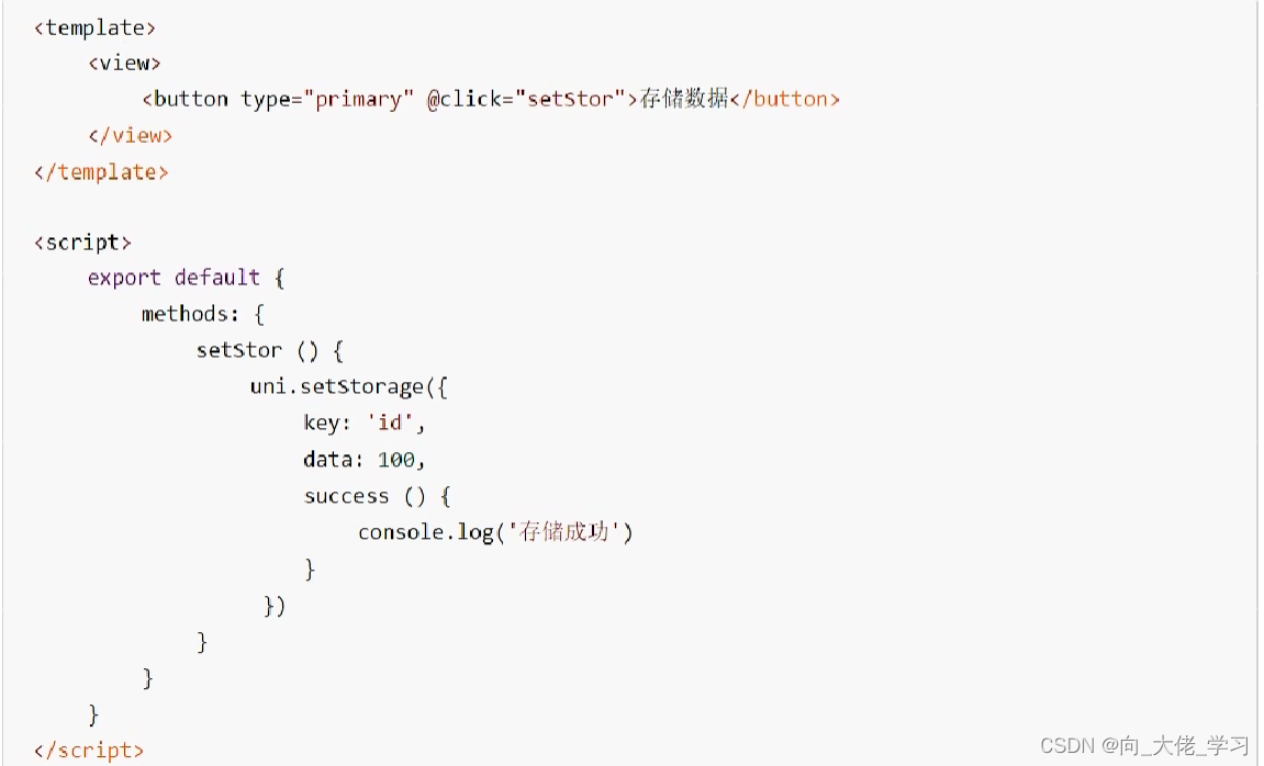
uni.setStorage
将数据存储在本地缓存中指定的key中,会覆盖掉原来key对应的内容,是一个异步接口。
uni.setStorageSync
将data存储在本地缓存中指定的key中,会覆盖掉原来key对应的内容,是一个同步接口。
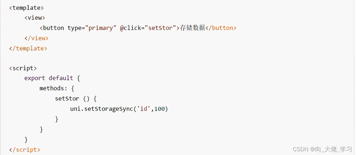
uni.getStorage
uni.getStorageSync
uni.removeStorage
uni.removeStorageSync
上传图片、预览图片
上传图片
uni.chooseImage方法从本地相册选择图片或使用相机拍照。
//图片预览效果存在bug还未解决


<template>
	<view>
		<button type="primary" @click="chooseImg">上传图片</button>
		<image v-for="item in imgArr" :src="item" @click="previewImg(item)" :key="item"></image>
	</view>
</template>

<script>
	export default {
		data() {
			return {
				imgArr:[]
			}
		},
		methods: {
			chooseImg() {
				uni.chooseImage({
					count:5,
					success: res=> {
						this.imgArr = res.tempFilePaths
					}
				})
			},
			previewImg (current) {
				uni.previewImage({
					urls:this.imgArr,
					current
				})
			}
		}
	}
</script>

<style>
</style>
条件注释实现跨端兼容
条件编译是用特殊的注释作为标记,在编译时根据这些特殊的注释,将注释里面的代码编译到不同平台。
写法:以#ifdef加平台标识开头,以#endif结尾。
uni中的导航跳转
1.利用navigator进行跳转
2.利用编程式导航进行跳转
3.利用navigateTo进行导航跳转
4.通过switchTab跳转到tabbar页面
5.导航跳转传递参数
<template>
	<view>
		<view>导航跳转的学习</view>
		<navigator url="/pages/detail/detail?id=80&age=19">跳转至详情页</navigator>
//页面传参
		<navigator url="/pages/message/message" open-type="switchTab">跳转至信息页</navigator>
//跳转到tab页要用switchTab
		<navigator url="/pages/detail/detail" open-type="redirect">跳转至详情页</navigator>
	    <button @click="goDetail">跳转至详情页</button>
		 <button @click="goMessage">跳转至信息页</button>
		 <button type="primary" @click="redirectDetail">跳转到详情页并关闭当前页面</button>
	</view>
</template>

<script>
	export default {
		onUnload() {
			console.log('导航页面卸载了')
		},
		methods: {
			goDetail() {
				uni.navigateTo({
					url:'/pages/detail/detail'
				})
			},
			goMessage() {
				uni.switchTab({
					url:'/pages/message/message'
				})
			},
			redirectDetail() {
				uni.redirectTo({
					url:'/pages/detail/detail'
				})
			}
		}
	}
</script>

<style>
</style>
uni-app中组件的创建
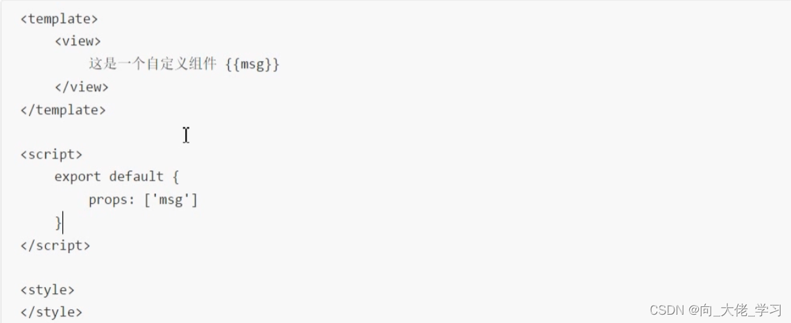
在uni-app中,可以通过创建一个后缀名为vue的文件,即创建一个组件成功,其他组件可以将该组件通过import的方式导入,再通过components进行注册即可。
- 创建login组件,在component中创建login目录,然后新建login.vue文件
- 在其他组件中导入该组件并注册
- 注册组件
组件的生命周期函数
组件的通讯
1.父组件给子组件传值
通过props来接受外界传递到组件内部的值
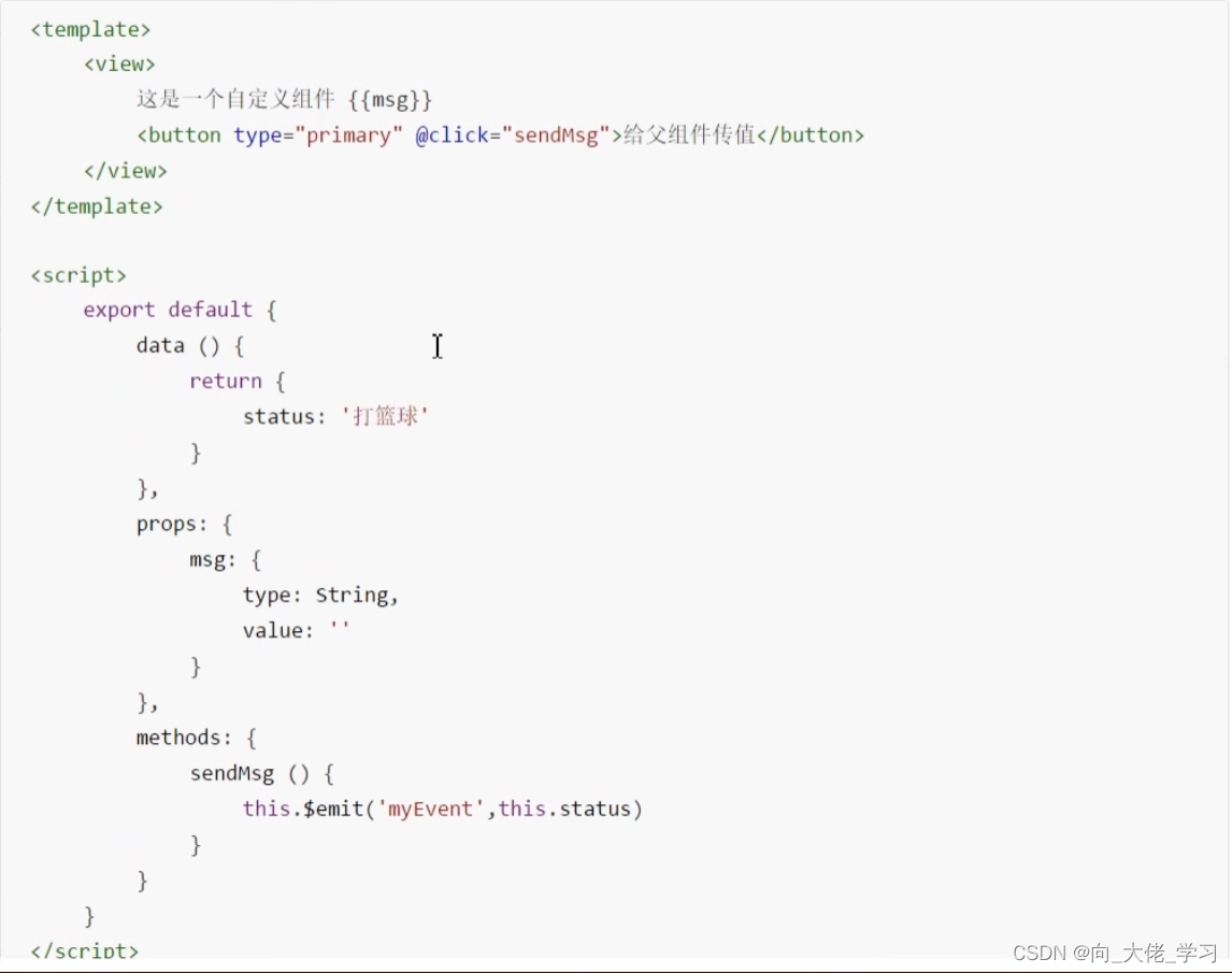
2.子组件给父组件传值
通过$emit触发事件进行传递参数
3.兄弟组件通讯
PS:本篇用来记录学习uniapp的笔记以便寻找,学过vue对这些基础知识都应该很熟悉。
接下来会进行项目练习。


 424
424


 被折叠的 条评论
为什么被折叠?
被折叠的 条评论
为什么被折叠?
 到【灌水乐园】发言


