


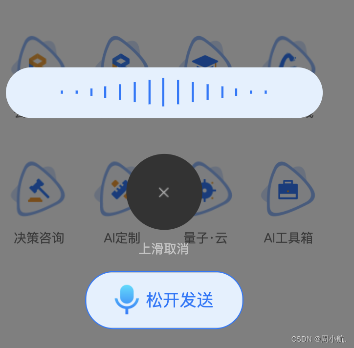
实现效果:一般用于发送语音的时候,出现动画效果
//模版部分
<view  class="musical-scale">
		  <view class="scale">
		    <view class="em" v-for="(item,index) in 15" :key="index"></view>
		  </view>
</view>


//css样式+动画
.musical-scale {
	  position: absolute;
	  bottom: 50%;
	  width: 80%;
	  height: 96rpx;
	  background-color: #E2F0FF;
	  border-radius: 48rpx;
	  z-index: 1;
	  text-align: center;
	  display: flex;
	  flex-direction: column;
	  align-items: center;
	  justify-content: center;

	  .scale {
	    width: 65%;
	    height: 56rpx;
	    display: flex;
	    align-items: center;
	    justify-content: space-between;

	    .em {
	      display: block;
	      background: #007AFF;
	      width: 4rpx;
	      height: 10%;
	      float: left;

	      &:last-child {
	        margin-right: 0px;
	      }

	      &:nth-child(1),
	      &:nth-child(15) {
	        animation: load 2.5s 1.4s infinite linear;
	      }

	      &:nth-child(2),
	      &:nth-child(14) {
	        animation: load 2.5s 1.2s infinite linear;
	      }

	      &:nth-child(3),
	      &:nth-child(13) {
	        animation: load 2.5s 1s infinite linear;
	      }

	      &:nth-child(4),
	      &:nth-child(12) {
	        animation: load 2.5s 0.8s infinite linear;
	      }

	      &:nth-child(5),
	      &:nth-child(11) {
	        animation: load 2.5s 0.6s infinite linear;
	      }

	      &:nth-child(6),
	      &:nth-child(10) {
	        animation: load 2.5s 0.4s infinite linear;
	      }

	      &:nth-child(7),
	      &:nth-child(9) {
	        animation: load 2.5s 0.2s infinite linear;
	      }

	      &:nth-child(8) {
	        animation: load 2.5s 0s infinite linear;
	      }

	      @keyframes load {
	        0% {
	          height: 10%;
	        }

	        50% {
	          height: 100%;
	        }

	        100% {
	          height: 10%;
	        }

	      }
	    }
	  }
	}
在模板中,该区域具有 musical-scale 类,以设置其样式属性。在该区域内部,有一个 scale 类的容器,容器内部通过 v-for 遍历生成了15个 em 元素,每个 em 元素都会应用动画效果。通过 @keyframes 定义的 load 动画,控制了 em 元素的高度从10%到100%再到10%的变化过程,形成了录音的动画效果。
总结起来,这段代码实现了一个简单的录音动画效果,通过 CSS 的样式定义和动画关键帧的设置,使得一组垂直排列的短竖条在高度上呈现周期性的变化,形成了类似声音震动的效果。


 1万+
1万+


 被折叠的 条评论
为什么被折叠?
被折叠的 条评论
为什么被折叠?
 到【灌水乐园】发言


