


前言:简单实现水波进度样式,简单好看。
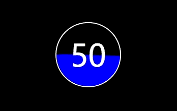
效果图:
代码实现:
<!DOCTYPE html>
<html lang="en">
  <head>
    <meta charset="utf-8" />
    <meta http-equiv="X-UA-Compatible" content="IE=edge" />
    <meta
      name="viewport"
      content="initial-scale=1.0, user-scalable=no, width=device-width"
    />
    <title>document</title>
    <style>
      body {
        background: #000;
      }
      .indicator {
        display: flex;
        align-items: center;
        justify-content: center;
        font-size: 3em;
        margin: 200px auto;
        width: 100px;
        height: 100px;
        border-radius: 50%;
        border: 2px solid #fff;
        position: relative;
        overflow: hidden;
        color: #fff;
      }
      .indicator span {
        position: absolute;
        z-index: 999;
      }
      .indicator::after {
        content: "";
        width: 200px;
        height: 200px;
        border-radius: 60px;
        position: absolute;
        left: -50%;
        top: 50px;
        background: blue;
        animation: rotate 5s linear 0s infinite;
      }
      @keyframes rotate {
        from {
          transform: rotateZ(0deg);
        }
        to {
          transform: rotateZ(359deg);
        }
      }
    </style>
  </head>
  <body>
    <div>
      <div class="indicator">
        <span>50</span>
      </div>
    </div>
    <script></script>
  </body>
</html>


 950
950


 被折叠的 条评论
为什么被折叠?
被折叠的 条评论
为什么被折叠?
 到【灌水乐园】发言


