


版本说明
当前版本号[20231024]。
| 20231024 | 初版 |
本课程的笔记已经更新完毕,各位可以通过点击《黑马程序员2023新版前端Web开发HTML5+CSS3+移动web视频教程,前端web入门首选》学习笔记总目录查看所有知识点,同时也能免费下载学习笔记和配套资料。
目录
文章目录
Flex布局
01-标准流
标准流也叫文档流,指的是标签在页面中默认的排布规则,例如:块元素独占一行,行内元素可以一行显示多个。
02-浮动
基本使用
作用:让块元素水平排列。
属性名:float
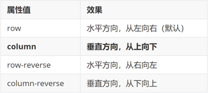
属性值
- left:左对齐
- right:右对齐
float: left;
特点:
- 浮动后的盒子顶对齐
- 浮动后的盒子具备行内块特点
- 浮动后的盒子脱标,不占用标准流的位置
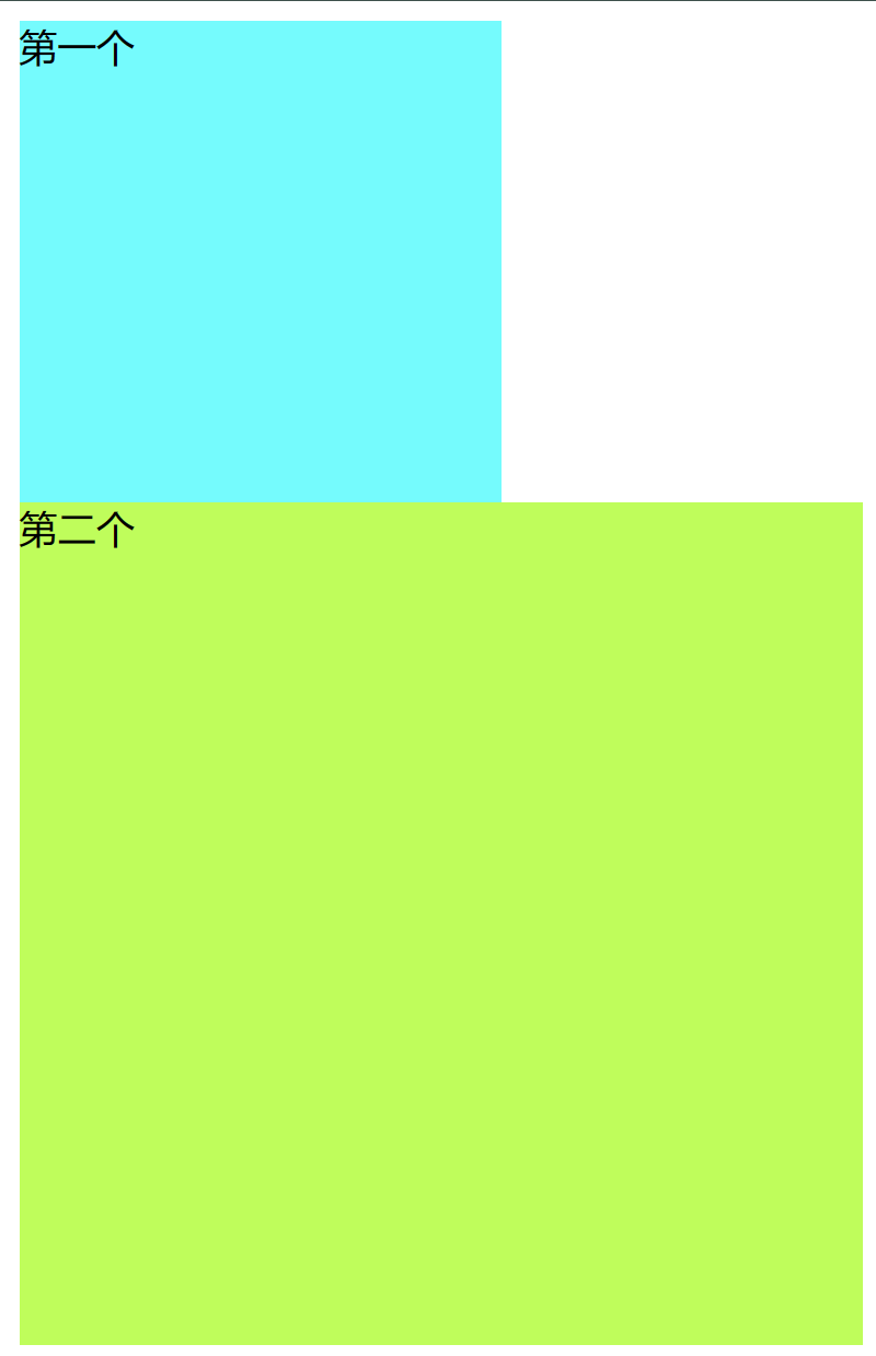
首先我们先设计两个盒子,代码如下:
<!DOCTYPE html>
<html>
	<head>
		<meta charset="utf-8">
		<title></title>
	</head>
	<style>

		.a{
			width: 200px;
			height: 200px;
			background-color: aqua;
		}

		.b{
			width: 350px;
			height: 350px;
			background-color: greenyellow;
		}

	</style>
	<body>
		<div class="a">第一个</div>
		<div class="b">第二个</div>
	</body>
</html>
得出下面这两个模型:
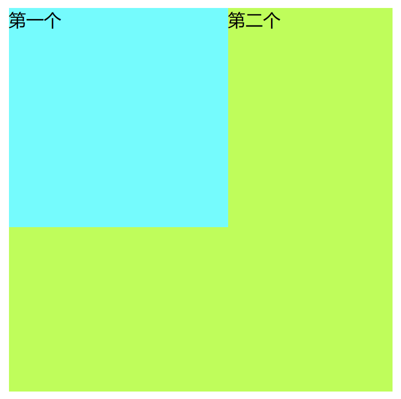
那么首先我们先给第一个模型加上浮动:
.a{
			width: 200px;
			height: 200px;
			background-color: aqua;
			float: left;
		}
可以看到,第一个就像浮起来的方块,占据在了第二个盒子模型的上方:
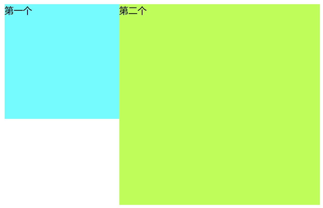
而一旦给第二个模型加上浮动的话:
.b{
			width: 350px;
			height: 350px;
			background-color: greenyellow;
			float: left;
		}
就可以看到,第一个第二个模型并在了一起,且第一个模型在第二个的左边:
产品区域布局
仿照某商城的网页进行设计:
左边一个大的div,右边一个div中要包含四个小模型
<!DOCTYPE html>
<html>
	<head>
		<meta charset="utf-8">
		<title>产品区域布局</title>
		<style>
			*{
				margin: 0;
				padding: 0;
			}

			li{
				list-style: none;
			}

			.product{
				margin: 50px auto;
				width: 1226px;
				height: 628px;
				background-color:pink;
			}

			.left{
				width: 234px;
				height: 628px;
				background-color: green;
			}

			.right{
				width: 992px;
				height: 628px;
				background-color: aqua;
			}

		</style>
	</head>
	<body>
		<div class="product">
			<div class="left"></div>
			<div class="right"></div>
		</div>
	</body>
</html>

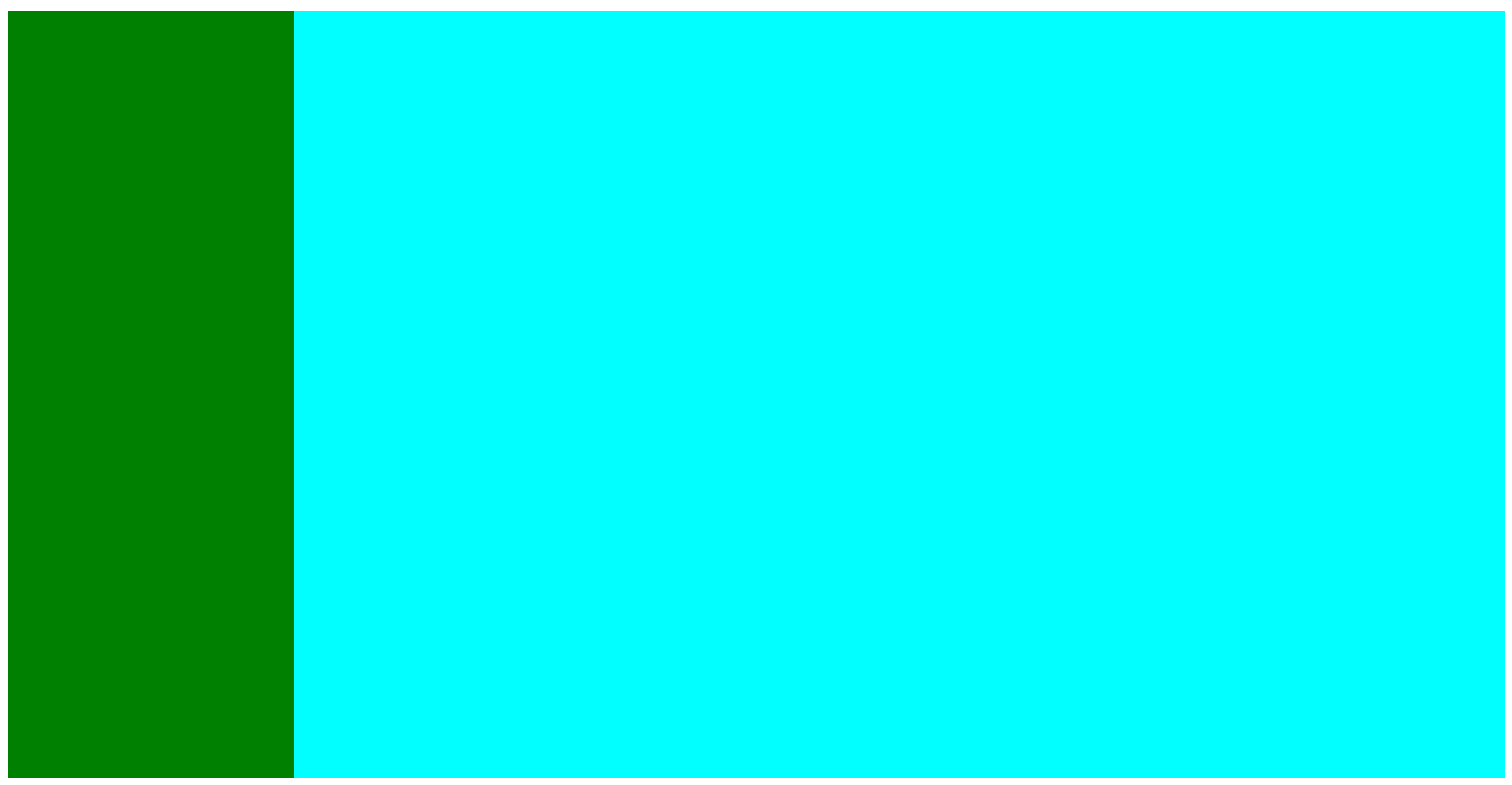
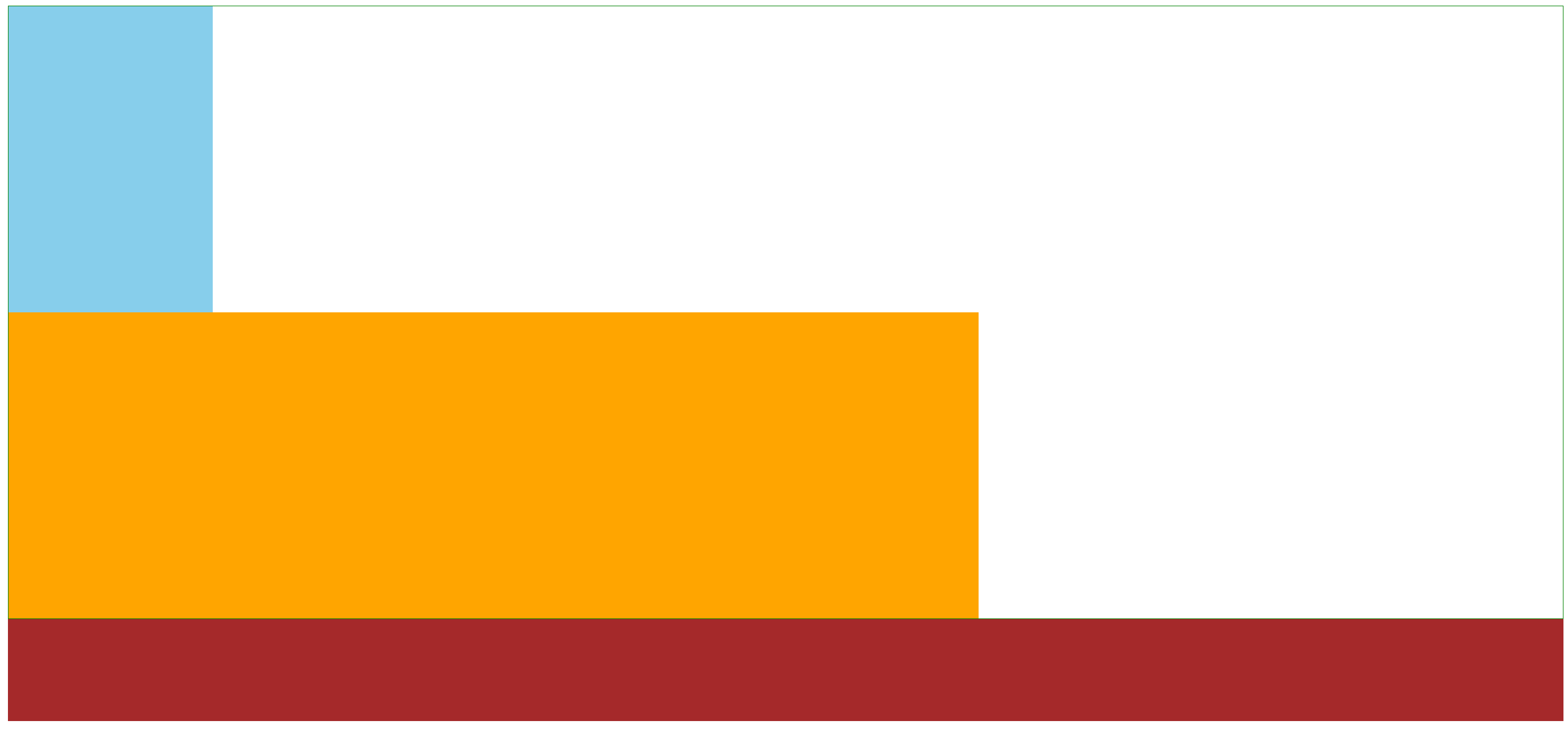
由于粉色的是父容器div,第一个div(绿色)把父容器高度占满了,下面的div(蓝色)要独占一行容纳不下就跑到外父容器外面了。
.left{
				width: 234px;
				height: 628px;
				background-color: green;
				float: left;
			}

			.right{
				width: 992px;
				height: 628px;
				background-color: aqua;
				float: right;
			}
那么开始设置右边的八个li了
<!DOCTYPE html>
<html>
	<head>
		<meta charset="utf-8">
		<title>产品区域布局</title>
		<style>
			*{
				margin: 0;
				padding: 0;
			}

			li{
				list-style: none;
			}

			.product{
				margin: 50px auto;
				width: 1226px;
				height: 628px;
				background-color:pink;
			}

			.left{
				width: 234px;
				height: 628px;
				background-color: green;
				float: left;
			}

			.right{
				width: 992px;
				height: 628px;
				background-color: aqua;
				float: right;
			}

			.right li{
				width: 234px;
				height: 300px;
				background-color: orange;
			}

		</style>
	</head>
	<body>
		<div class="product">
			<div class="left"></div>
			<div class="right">
			 <ul>
				 <li></li>
				 <li></li>
				 <li></li>
				 <li></li>
				 <li></li>
				 <li></li>
				 <li></li>
				 <li></li>
			 </ul>
			</div>
		</div>
	</body>
</html>
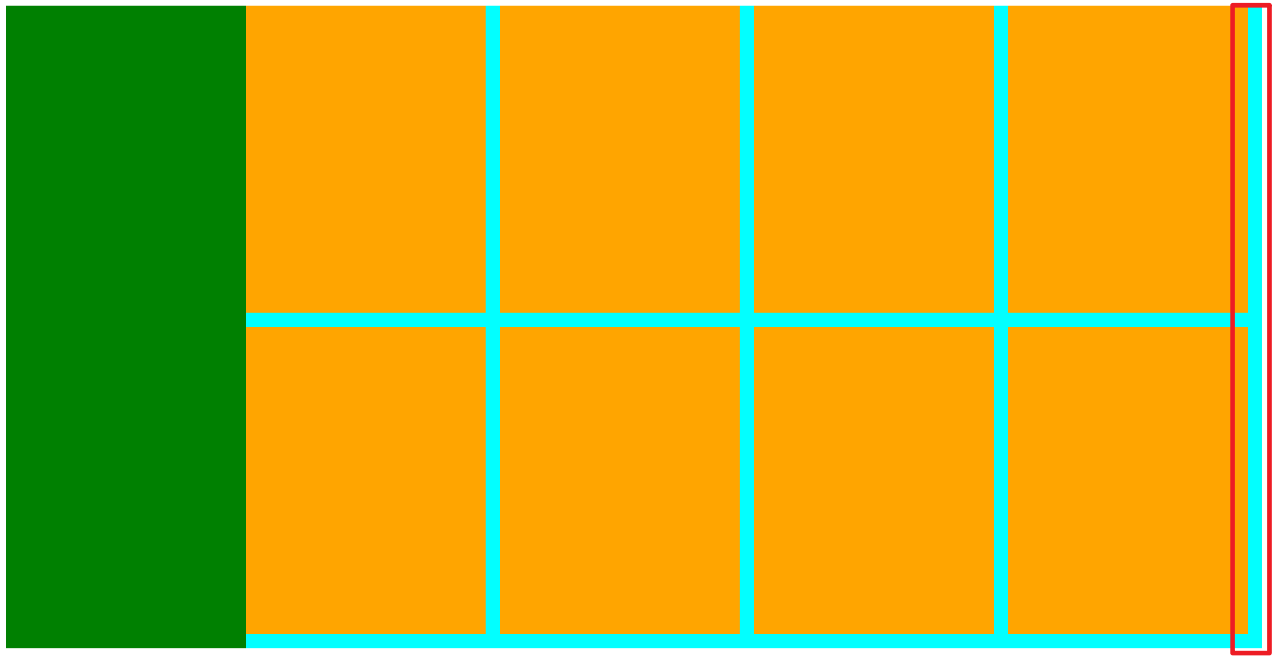
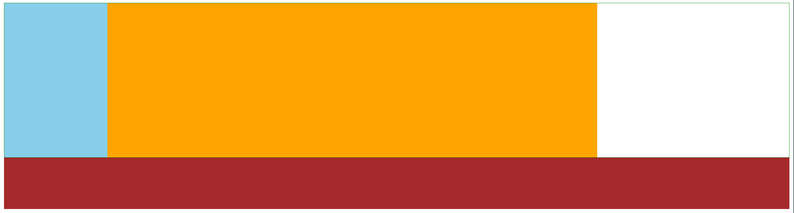
由于橙色中包含着八个li,li是块级的,独占一行,我们如果不加任何边距就一行显示了,想像上面商城那样呈现八个内容出来就要加浮动

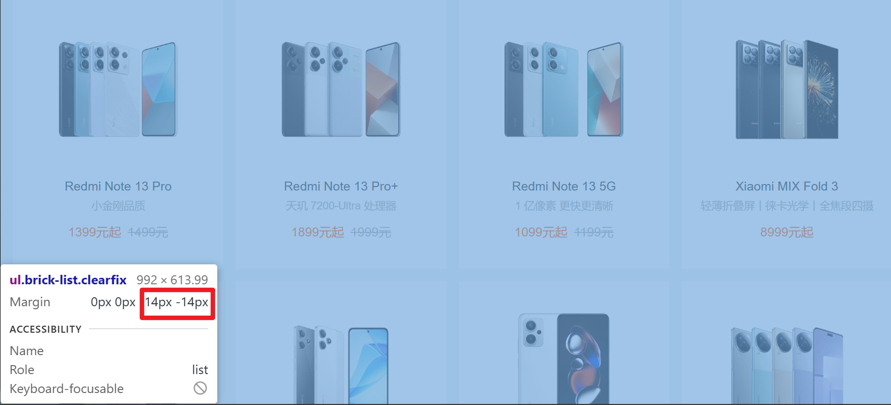
加完浮动,发现li标签没有完全覆盖,是因为每个li的右边和顶部都有边距

在商城中,这个边距为14px,我们要把其完善到我们的代码里面
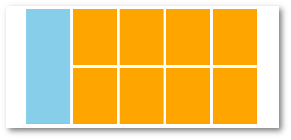
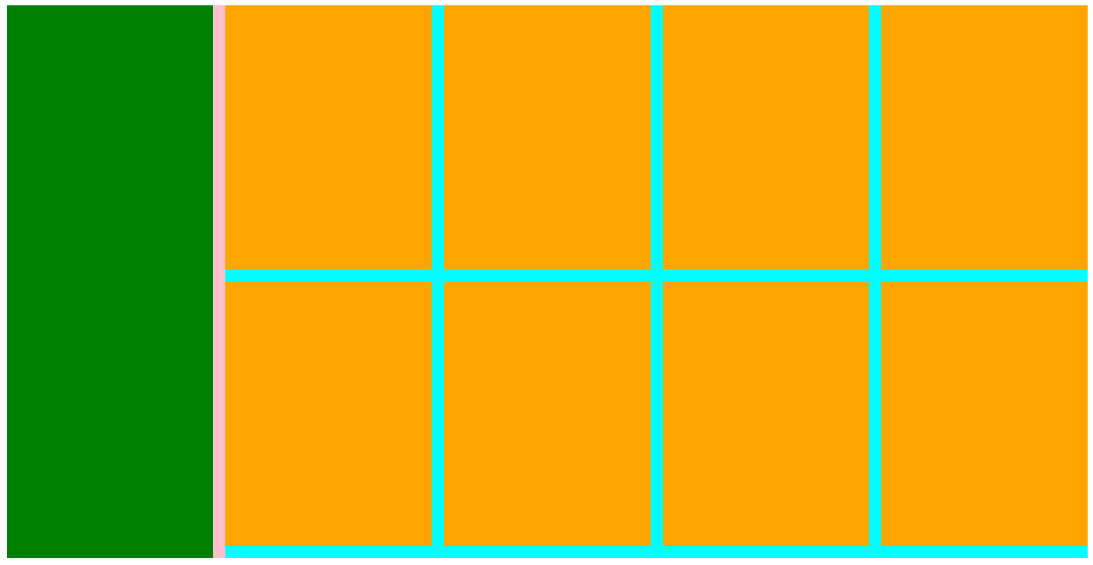
加入边框后我们发现,在原本的商城中最后边的一列是不需要加右边距的,加完之后可能会在以后运行里li标签跑到下面去
修改了最后边的一列取消掉右边距,同时修改了些尺寸,使得中间粉色出了一点,后续也会进行处理:
<!DOCTYPE html>
<html>
	<head>
		<meta charset="utf-8">
		<title>产品区域布局</title>
		<style>
			*{
				margin: 0;
				padding: 0;
			}

			li{
				list-style: none;
			}

			.product{
				margin: 50px auto;
				width: 1226px;
				height: 628px;
				background-color:pink;
			}

			.left{
				width: 234px;
				height: 628px;
				background-color: green;
				float: left;
			}

			.right{
				width: 978px;
				height: 628px;
				background-color: aqua;
				float: right;
			}

			.right li{
				width: 234px;
				height: 300px;
				margin-right: 14px;
				margin-bottom: 14px;
				background-color: orange;
				float: left;
			}

			.right li:nth-child(4n){
				margin-right: 0;
			}

		</style>
	</head>
	<body>
		<div class="product">
			<div class="left"></div>
			<div class="right">
			 <ul>
				 <li></li>
				 <li></li>
				 <li></li>
				 <li></li>
				 <li></li>
				 <li></li>
				 <li></li>
				 <li></li>
			 </ul>
			</div>
		</div>
	</body>
</html>
输出结果如下:
HTML标签
<!-- 版心:左右,右面:8个产品 → 8个 li -->
<div class="product">
  <div class="left"></div>
  <div class="right">
    <ul>
      <li></li>
      <li></li>
      <li></li>
      <li></li>
      <li></li>
      <li></li>
      <li></li>
      <li></li>
    </ul>
  </div>
</div>
CSS样式
<style>
  * {
    margin: 0;
    padding: 0;
  }

  li {
    list-style: none;
  }

  .product {
    margin: 50px auto;
    width: 1226px;
    height: 628px;
    background-color: pink;
  }

  .left {
    float: left;
    width: 234px;
    height: 628px;
    background-color: skyblue;
  }

  .right {
    float: right;
    width: 978px;
    height: 628px;
    background-color: brown;
  }

  .right li {
    float: left;
    margin-right: 14px;
    margin-bottom: 14px;
    width: 234px;
    height: 300px;
    background-color: orange;
  }

  /* 第四个li和第八个li 去掉右侧的margin */
  .right li:nth-child(4n) {
    margin-right: 0;
  }

  /* 细节:如果父级宽度不够,浮动的盒子会掉下来 */
</style>
清除浮动
场景:浮动元素会脱标,如果父级没有高度,子级无法撑开父级高度(可能导致页面布局错乱)
解决方法:清除浮动(清除浮动带来的影响)
场景搭建
<style>
  .top {
    margin: 10px auto;
    width: 1200px;
    /* height: 300px; */
    background-color: pink;
  }

  .left {
    float: left;
    width: 200px;
    height: 300px;
    background-color: skyblue;
  }

  .right {
    float: right;
    width: 950px;
    height: 300px;
    background-color: orange;
  }

  .bottom {
    height: 100px;
    background-color: brown;
  }

</style>

<div class="top">
  <div class="left"></div>
  <div class="right"></div>
</div>
<div class="bottom"></div>
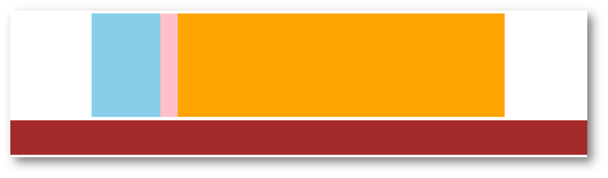
通过这段代码,可以知道目前已经发生了浮动,使得页面变得混乱:

额外标签法
在父元素内容的最后添加一个块级元素,设置 CSS 属性 clear: both
缺点是加多了一个标签,在书写的时候会感觉到标签太多,会有些混乱。
<style>
.clearfix {
  clear: both;
}
</style>

<div class="father">
  <div class="left"></div>
  <div class="right"></div>
  <div class="clearfix"></div>
</div>
直到能得到我们想要的答案:

单伪元素法
- 准备 after 伪元素
.clearfix::after {
  content: "";
  display: block;
  clear: both;
}
- 父级使用 clearfix 类
<div class="father clearfix"></div>
双伪元素法
- 准备 after 和 before 伪元素
- 在其中,before的功能是解决外边距塌陷的问题,而after的功能便是清除浮动。
/* before 解决外边距塌陷问题 */
/* 双伪元素法 */
.clearfix::before,
.clearfix::after {
  content: "";
  display: table;
}

/* after 清除浮动 */
.clearfix::after {
  clear: both;
}
- 再让父级使用 clearfix 类,使得双伪元素法生效,从而清除浮动。
<div class="father clearfix"></div>
overfow法
.top {
    margin: 10px auto;
    width: 1200px;
    /* height: 300px; */
    background-color: pink;
	overflow: hidden;
  }
03-Flex布局
Flex 布局也叫弹性布局,是浏览器提倡的布局模型,非常适合结构化布局,提供了强大的空间分布和对齐能力。
Flex 模型不会产生浮动布局中脱标现象,布局网页更简单、更灵活。
Flex组成
设置方式:给父元素设置 display: flex,子元素可以自动挤压或拉伸
组成部分:
- 弹性容器
- 弹性盒子
- 主轴:默认在水平方向
- 侧轴 / 交叉轴:默认在垂直方向
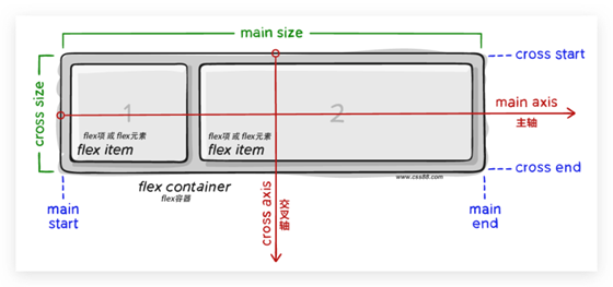
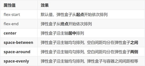
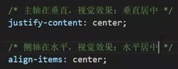
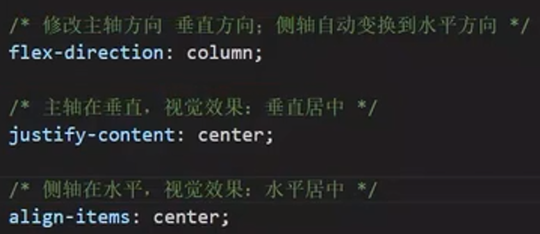
主轴对齐方式
属性名:justify-content
代码:
<style>
  .top {
    display: flex;
	justify-content: center;
	border: 1px solid green;
  }

  .left {
    width: 200px;
    height: 300px;
    background-color: skyblue;
  }

  .right {
    width: 950px;
    height: 300px;
    background-color: orange;
  }

  .bottom {
    height: 100px;
    background-color: brown;
  }

</style>

<div class="top">
  <div class="left"></div>
  <div class="right"></div>
</div>
<div class="bottom"></div>
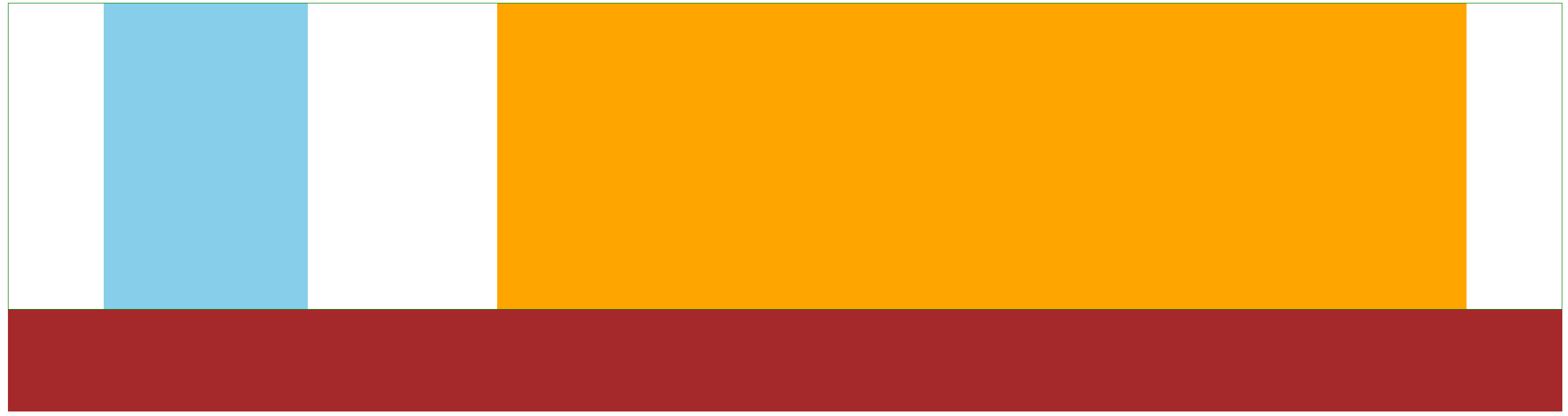
justify-content: center;效果:
justify-content: space-between;的形成原因是:父级会把剩余的尺寸分配成间距
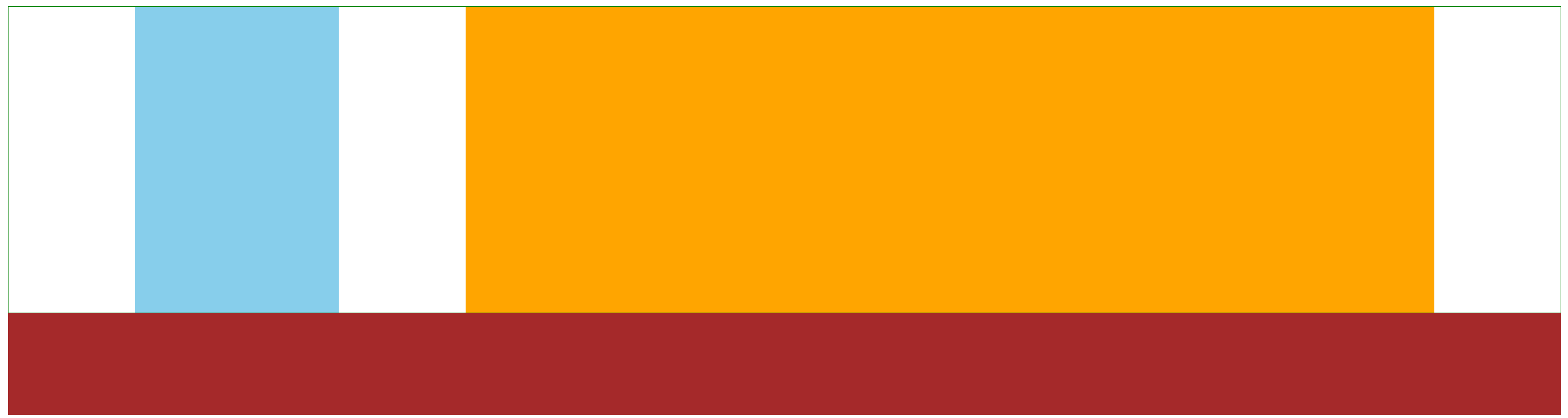
justify-content: space-between;效果:
justify-content: space-around;效果:其三个空白的间隔,中间距离过大,两边距离一样
justify-content: space-evenly;效果:其三个空白的间隔,距离都是一样的
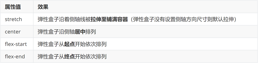
侧轴对齐方式
- align-items:当前弹性容器内所有弹性盒子的侧轴对齐方式(给弹性容器设置)
- align-self:单独控制某个弹性盒子的侧轴对齐方式(给弹性盒子设置)
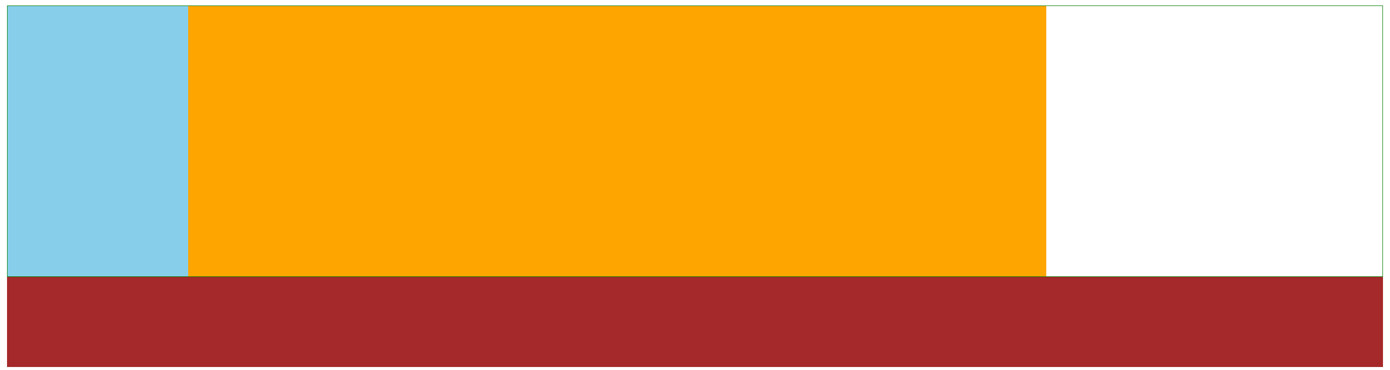
align-items: stretch;效果:
align-items: center;效果:

修改主轴方向
主轴默认在水平方向,侧轴默认在垂直方向
属性名:flex-direction
flex-direction: column;效果:
代码注释:
弹性伸缩比
作用:控制弹性盒子的主轴方向的尺寸。
属性名:flex
属性值:整数数字,表示占用父级剩余尺寸的份数。
在默认情况下,主轴方向尺寸是靠内容撑开;而侧轴默认拉伸
弹性盒子换行
弹性盒子可以自动挤压或拉伸,默认情况下,所有弹性盒子都在一行显示。
属性名:flex-wrap
属性值
- wrap:换行
- nowrap:不换行(默认)
flex-wrap: wrap;效果:
行内对齐方式
属性名:align-content

注意:该属性对单行弹性盒子模型无效。
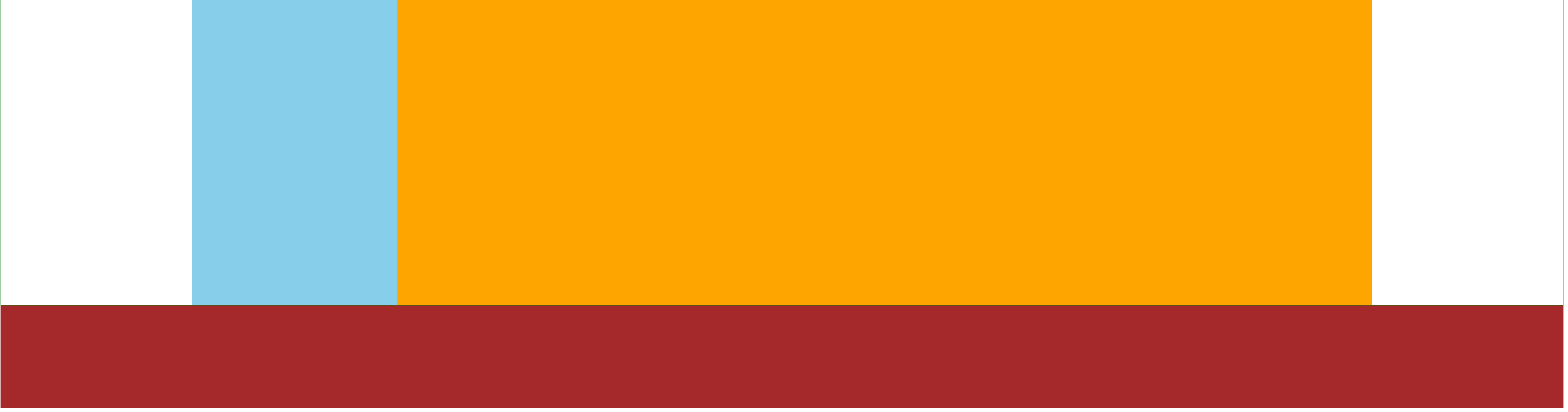
04-综合案例 – 某音解决方案
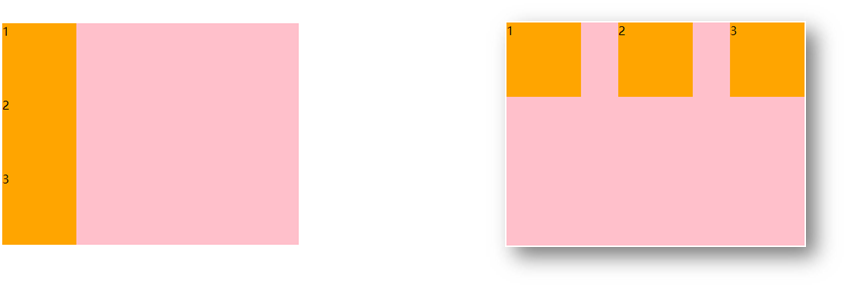
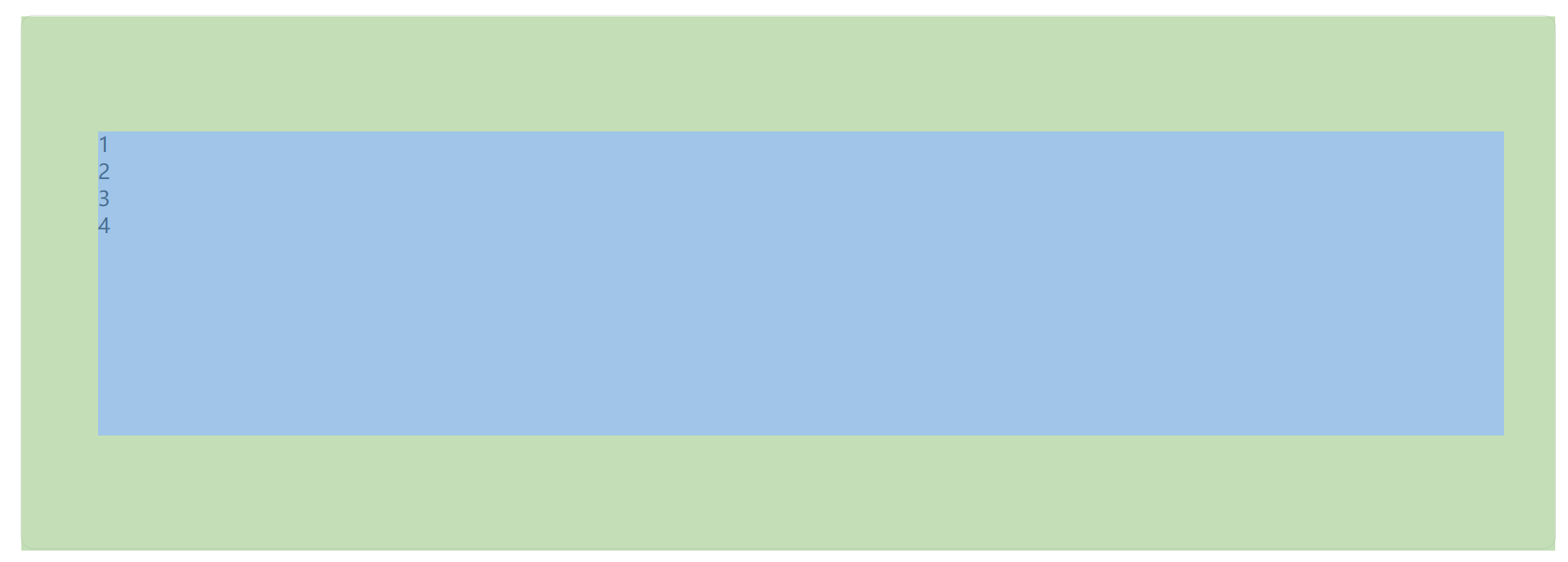
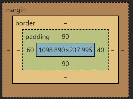
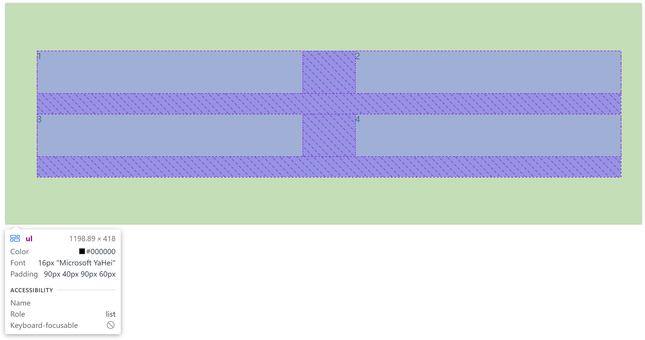
先制作一个简单的框,预留 **ul 对应的盒子模型的位置 **(即四个图形所在的盒子模型里面的位置) :
<!DOCTYPE html>
<html>
	<head>
		<meta charset="utf-8">
		<title></title>
		<style>
			*{
				margin: 0;
				padding: 0;
				box-sizing: border-box;
			}

			li{
				list-style: none;
			}

			.box{
				margin: 50px auto;
				width: 1200px;
				height: 418px;
				border: 1px solid #ddd;
				border-radius: 10px;
			}

			/* ul对应的盒子模型,即四个图形所在的盒子模型里面 */
			.box ul{
				padding: 90px 40px 90px 60px;
				height: 418px;
			}

		</style>
	</head>
	<body>
		<div class="box">
			 <ul>
				<li>1</li>
				<li>2</li>
				<li>3</li>
				<li>4</li>
			 </ul>
		 </div>
	</body>
</html>
然后可以看到我们已经建好了4个 li 模型,并且四周的 padding 的尺寸也是正确的:
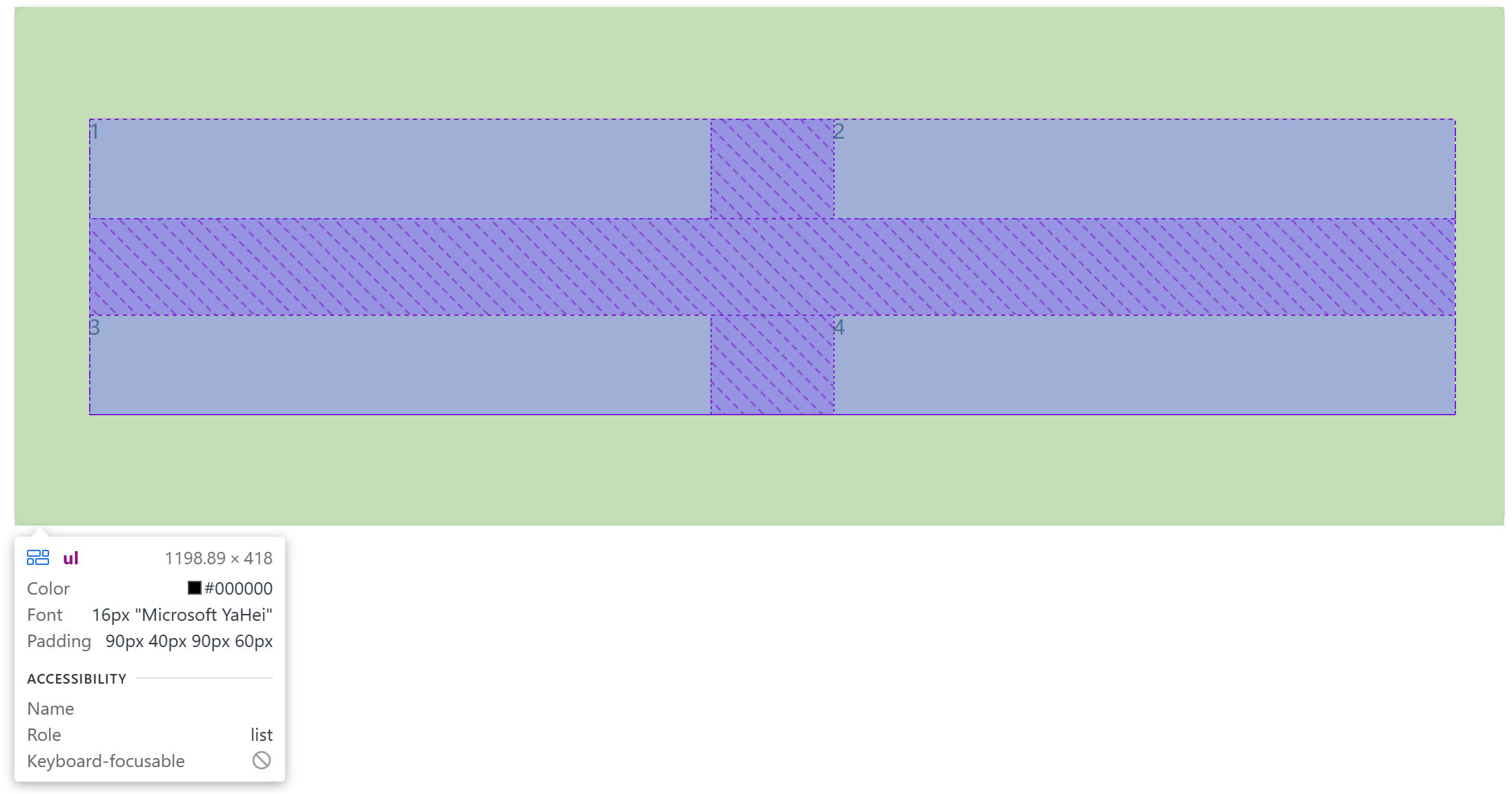
然后,让弹性盒子换行:
flex-wrap: wrap;
使主轴对齐,在一行之中,让 li 之间有距离:
justify-content: space-between;
输出如下:
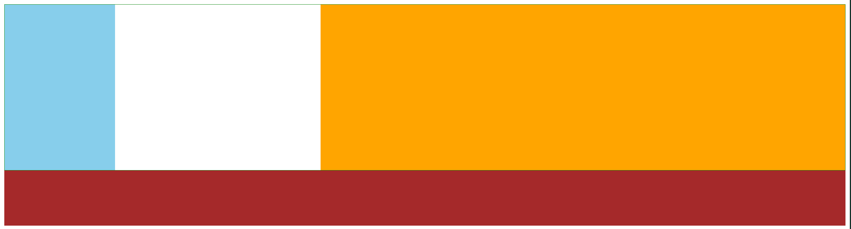
可见,底部存在一行的距离,中间的距离也太低。于是我们进行行内对齐,实现两行之间有距离:
align-content: space-between;
输出如下:
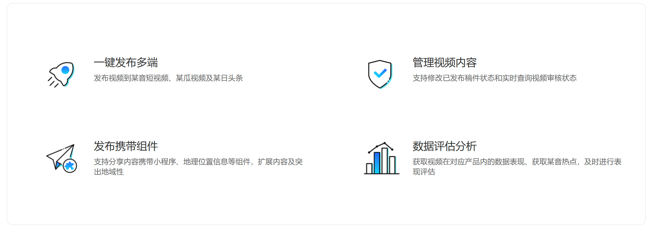
给每一个li标签里面给补充好信息,并且分好图片和文字对应的类,相对应进行调整:
<ul>
				<li>
					<div class="pic">
					 <img src="../img/1.svg" alt="">
					</div>
					<div class="text">
						<h4>一键发布多端</h4>
						<p>发布视频到某音短视频、某瓜视频及某日头条</p>
					</div>
				</li>
				<li>
					<div class="pic">
					 <img src="../img/2.svg" alt="">
					</div>
					<div class="text">
						<h4>管理视频内容</h4>
						<p>支持修改已发布稿件状态和实时查询视频审核状态</p>
					</div>
				</li>
				<li>
					<div class="pic">
					 <img src="../img/3.svg" alt="">
					</div>
					<div class="text">
						<h4>发布携带组件</h4>
						<p>支持分享内容携带小程序、地理位置信息等组件,扩展内容及突出地域性</p>
					</div>
				</li>
				<li>
					<div class="pic">
					 <img src="../img/4.svg" alt="">
					</div>
					<div class="text">
						<h4>数据评估分析</h4>
						<p>获取视频在对应产品内的数据表现、获取某音热点,及时进行表现评估</p>
					</div>
				</li>
			 </ul>
输出如下:
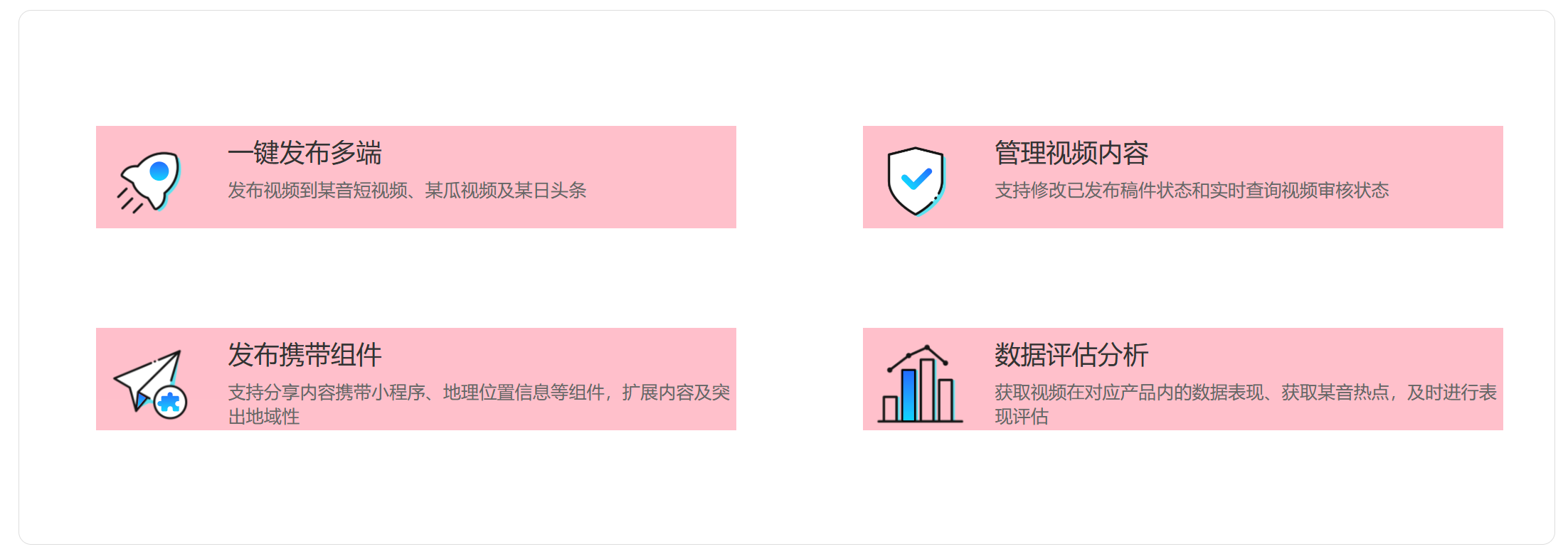
最后,只需要把 li 中的粉色背景色去掉即可完成本次案例。


 扫一扫
扫一扫


 被折叠的 条评论
为什么被折叠?
被折叠的 条评论
为什么被折叠?
 到【灌水乐园】发言


