


 文章展示了一个使用HTML和CSS创建的动态气泡效果。通过CSS的径向渐变背景、动画关键帧以及角度旋转,实现了不同颜色的气泡上下浮动,营造出视觉动感。
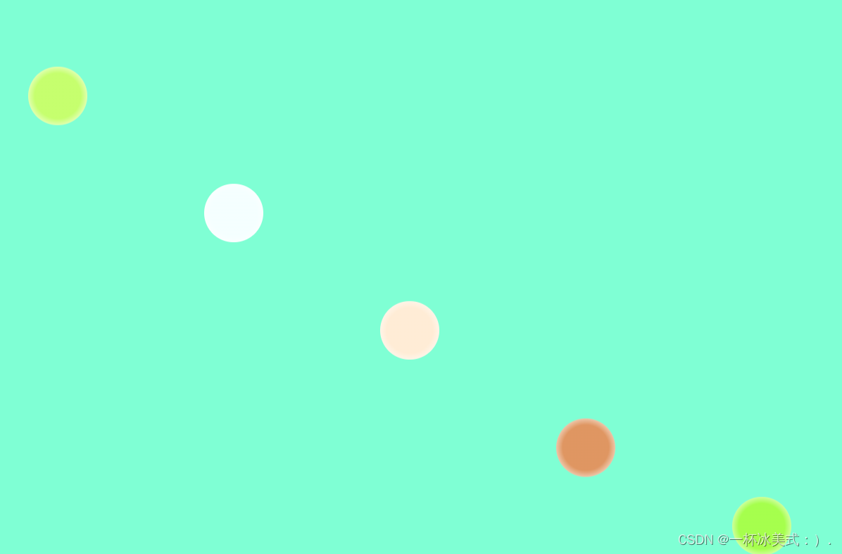
以上是效果静态图(代码在下面)
<!DOCTYPE html>
<html>
<head>
<meta charset="utf-8" />
<title>运动气泡</title>
<style type="text/css">
body{
background-color: aquamarine;
overflow: hidden;
}
ul{
list-style: none;
display: flex;
}
li{
width: 100px;
height: 100px;
border-radius: 50%;
background-image: radial-gradient(rgba(255,255,255,0.3)55% ,rgba(255,255,255,0.8) 80%);
margin: 400px 100px;
}
ul li:nth-child(1){
background-color: #ADFF2F;
animation:name 3s 0.5s linear infinite;
}
ul li:nth-child(2){
background-color: azure;
animation:name 3s 0.7s linear infinite;
}
ul li:nth-child(3){
background-color: bisque;
animation:name 3s 0.9s linear infinite;
}
ul li:nth-child(4){
background-color: chocolate;
animation:name 3s 1.1s linear infinite;
}
ul li:nth-child(5){
background-color: chartreuse;
animation:name 3s 1.3s linear infinite;
}
ul li:nth-child(6){
animation:name 3s 1.5s linear infinite;
}
@keyframes name{
0%{
transform: translateY(0px);
}
50%{
transform: translateY(500px);
}
75%{
transform: translateY(-250px);
}
100%{
transform: translateY(0px);
}
}
li::after{
width: 33%;
height: 33%;
border: 3px solid greenyellow;
border-radius: 50%;
border-color: rgba(255,255,255,0.8) transparent transparent;
transform: rotate(45deg);/* 角度旋转 */
position: absolute;
top:20%;
right: 25%;
}
</style>
</head>
<body>
<ul>
<li></li>
<li></li>
<li></li>
<li></li>
<li></li>
<li></li>
</ul>
</body>
</html>


 1267
1267


 被折叠的 条评论
为什么被折叠?
被折叠的 条评论
为什么被折叠?
 到【灌水乐园】发言


