


Steps步骤条修改样式,圆圈大小修改和背景色,线的位置修改
先上效果:
修改后:

默认样式: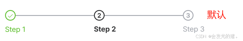
基础用法
简单的步骤条。
设置 active 属性,接受一个 Number,表明步骤的 index,从 0 开始。 需要定宽的步骤条时,设置 space 属性即可,它接受 Number, 单位为 px, 如果不设置,则为自适应。 设置 finish-status 属性可以改变已经完成的步骤的状态。
代码:
  <el-dialog
      :title="title"
      :width="dialogWidth"
      v-model="open"
      append-to-body
    >
// 步骤条
      <el-steps :active="activeStep" finish-status="success" align-center>
        <el-step
          v-for="(step, index) in steps"
          :key="index"
          :title="step.title"
        ></el-step>
      </el-steps>
 </el-dialog>
/* 步骤条 */
.steps {
width: 80%;
margin: 0px auto 0;
}
:deep(.el-step__icon.is-text) {
width: 40px;
height: 40px;
border-radius: 50%; // 保持圆形
}
:deep(.el-step__head.is-process) {
border-color: #409eff; // 当前步骤边框颜色
color: #409eff;
font-weight: bold; // 当前步骤字体加粗
}
:deep(.el-step__line) {
background-color: #dcdfe6; // 步骤之间的线颜色
height: 2px; // 线的高度
width: 50px;
margin-top: 14px; // 线与圆圈的间距
left: 80% !important;
position: absolute;
}
/* 进行中状态:圈内 */
:deep(.el-step__head.is-process > .el-step__icon) {
background: #409eff;
color: #fff;
}
/* 完成状态:圈线 */
.el-step__head.is-success {
color: #409eff;
border-color: #0076F6;
}
/* 完成状态:圈内 */
.el-step__head.is-success > .el-step__icon {
background: #ECF5FF;
color: #409eff;
}
/* 完成状态:title(文字) */
.el-step__title.is-success {
color: #409eff;
font-size: 18px;
}
Steps 属性
| 属性名 | 说明 | 类型 | 默认 |
|---|---|---|---|
| space | 每个 step 的间距,不填写将自适应间距。 支持百分比。 | number / string | '' |
| direction | 显示方向 | enum | horizontal |
| active | 设置当前激活步骤 | number | 0 |
| process-status | 设置当前步骤的状态 | enum | process |
| finish-status | 设置结束步骤的状态 | enum | finish |
| align-center | 进行居中对齐 | boolean | — |
| simple | 是否应用简洁风格 | boolean | — |
Steps 插槽
| 插槽名 | 说明 | 子标签 |
|---|---|---|
| default | 默认插槽 | Step |
Step API
Step 属性
| 属性名 | 说明 | 类型 | 默认 |
|---|---|---|---|
| title | 标题 | string | '' |
| description | 描述文案 | string | '' |
| icon | Step 组件的自定义图标。 也支持 slot 方式写入 | string / Component | — |
| status | 设置当前步骤的状态, 不设置则根据 steps 确定状态 | enum | '' |
Step 插槽
| 插槽名 | 说明 |
|---|---|
| icon | 自定义图标 |
| title | 自定义标题 |
| description | 自定义描述文案 |


 扫一扫
扫一扫


 1173
1173

 被折叠的 条评论
为什么被折叠?
被折叠的 条评论
为什么被折叠?
 到【灌水乐园】发言


