


文章目录
线性布局(LinearLayout)是开发中最常用的布局,通过线性容器Row和Column构建。线性布局是其他布局的基础,其子元素在线性方向上(水平方向和垂直方向)依次排列。线性布局的排列方向由所选容器组件决定,Column容器内子元素按照垂直方向排列,Row容器内子元素按照水平方向排列。根据不同的排列方向,开发者可选择使用Row或Column容器创建线性布局。
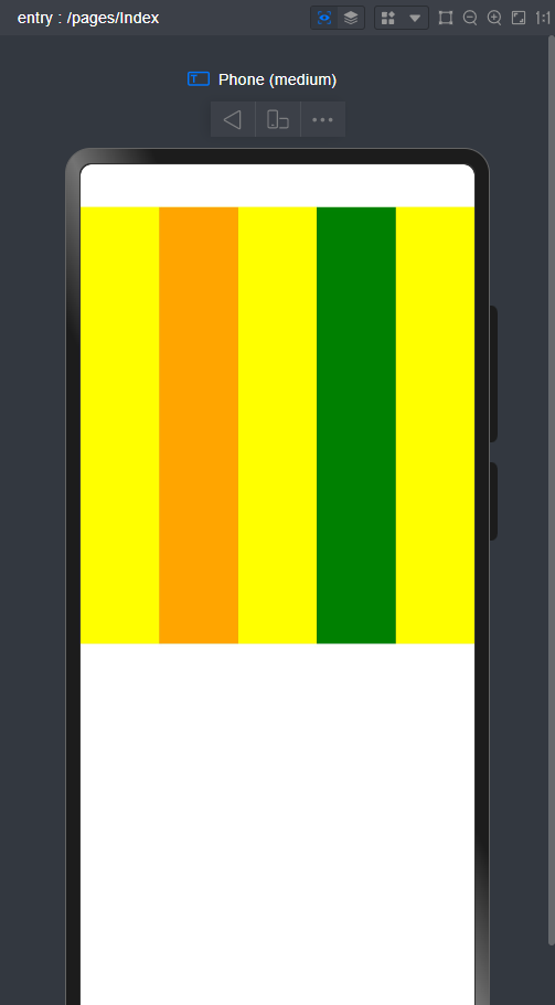
1.Row子元素布局
- 注意:如果使用的是最新版的IDE开发工具,那么预览器上方有一块白色的空白属于正常。这是手机的挖孔,大家正常开发即可。
@Entry
@Component
struct Index {
  @State message: string = 'Hello World';

  build() {
    Row(){
      Row(){
        Row().width('20%').height(400).backgroundColor(Color.Yellow)
        Row().width('20%').height(400).backgroundColor(Color.Orange)
        Row().width('20%').height(400).backgroundColor(Color.Yellow)
        Row().width('20%').height(400).backgroundColor(Color.Green)
        Row().width('20%').height(400).backgroundColor(Color.Yellow)

      }
    }

  }
}
我们首先来看Row().width()。整个水平排列方向的宽度为100%,这里我将每个设为百分之20,那么他在预览结果中现实的就是水平方向上高度为400的长方形块。
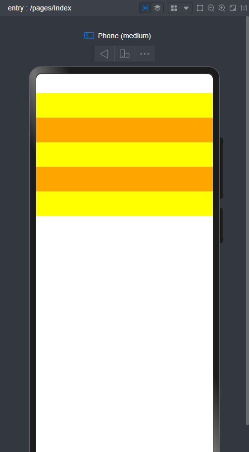
2.Column子元素布局
@Entry
@Component
struct Index {
  @State message: string = 'Hello World';

  build() {
    Column(){
      Column(){
        Column().width('100%').height(50).backgroundColor(Color.Yellow)
        Column().width('100%').height(50).backgroundColor(Color.Orange)
        Column().width('100%').height(50).backgroundColor(Color.Yellow)
        Column().width('100%').height(50).backgroundColor(Color.Orange)
        Column().width('100%').height(50).backgroundColor(Color.Yellow)
      }
    }

  }
}
这里我将每个元素的宽度设为100%(即横向铺满整个屏幕),高度设为50。那会从上到下呈现出五个铺满屏幕的元素
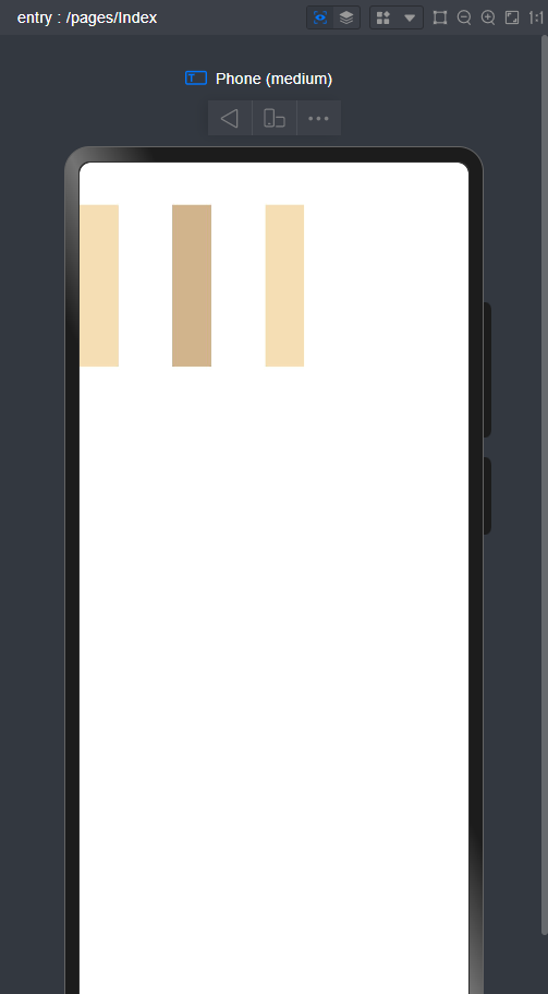
3.Row容器排列方向上的间距
@Entry
@Component
struct Index {
  @State message: string = 'Hello World';

  build() {
      Row({ space: 50 }) {

        Row().width('10%').height(150).backgroundColor(0xF5DEB3)
        Row().width('10%').height(150).backgroundColor(0xD2B48C)
        Row().width('10%').height(150).backgroundColor(0xF5DEB3)
      }.width('100%')
    }

  }
在Row容器中,如果想将几个元素之间有间隔,我们只需要在Row()中添加{space:距离}即可
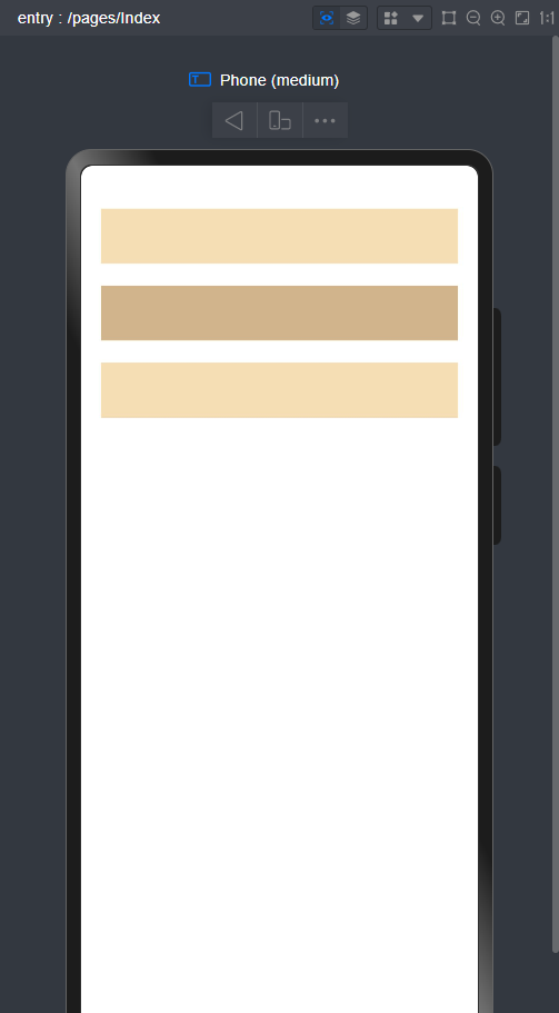
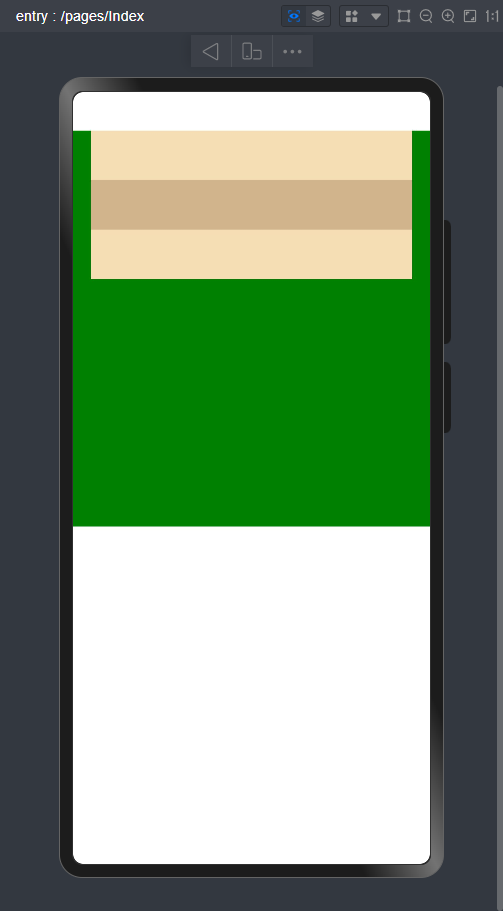
4. Column容器排列方向上的间距
@Entry
@Component
struct Index {
  @State message: string = 'Hello World';

  build() {
    Column({ space: 20 }) {

      Row().width('90%').height(50).backgroundColor(0xF5DEB3)
      Row().width('90%').height(50).backgroundColor(0xD2B48C)
      Row().width('90%').height(50).backgroundColor(0xF5DEB3)
    }.width('100%')

  }
}
在Column容器中,如果想将几个元素之间有间隔,我们只需要在Cloumn()中添加{space:距离}即可
5.Column在水平方向上的对齐方式
@Entry
@Component
struct Index {
  @State message: string = 'Hello World';

  build() {
    Column() {

      Row().width('90%').height(50).backgroundColor(0xF5DEB3)
      Row().width('90%').height(50).backgroundColor(0xD2B48C)
      Row().width('90%').height(50).backgroundColor(0xF5DEB3)
      //水平方向剧中对齐
    }.width('100%').height(400).alignItems(HorizontalAlign.Center).backgroundColor(Color.Green)

  }
}
HorizontalAlign的几个参数(基于水平方向)
Start:左对齐
Center:居中对齐
End:右对齐
这里我将整个容器的高度设置为400,背景颜色设置为绿色。可以有一个参考。
6.Row在竖直方向上的对齐方式
@Entry
@Component
struct Index {
  @State message: string = 'Hello World';

  build() {
    Row() {

      Column().width('90%').height(50).backgroundColor(0xF5DEB3)
      Column().width('90%').height(50).backgroundColor(0xD2B48C)
      Column().width('90%').height(50).backgroundColor(0xF5DEB3)
    }.width('20%').alignItems(VerticalAlign.Top)

  }
}
VerticalAlign的参数(基于垂直方向)
Top:顶部对齐
Center:居中对齐
Bottom:底部对齐
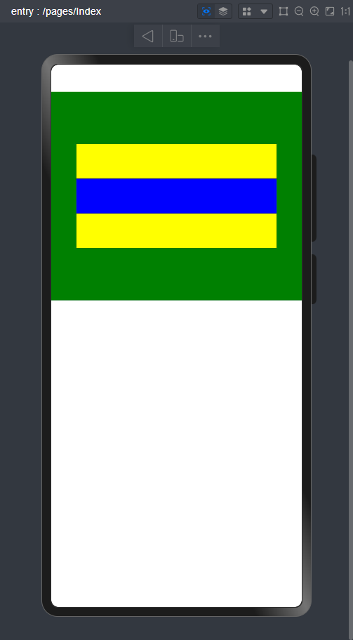
7.Column在主轴上的排列
@Entry
@Component
struct Index {
  @State message: string = 'Hello World';

  build() {
    Column({}) {
      Column() {
      }.width('80%').height(50).backgroundColor(Color.Yellow)

      Column() {
      }.width('80%').height(50).backgroundColor(Color.Blue)

      Column() {
      }.width('80%').height(50).backgroundColor(Color.Yellow)
    }.width('100%').height(300).backgroundColor(Color.Green).justifyContent(FlexAlign.Center)

  }
}
justifyContent参数
Start:元素在垂直方向方向首端对齐,第一个元素与行首对齐
Center:中心对齐
End:元素在垂直方向方向尾部对齐,最后一个元素与行尾对齐
SpaceBetween:垂直方向均匀分配元素,相邻元素之间距离相同,第一个元素与行首对齐,最后一个元素与行尾对齐。(平均分配)
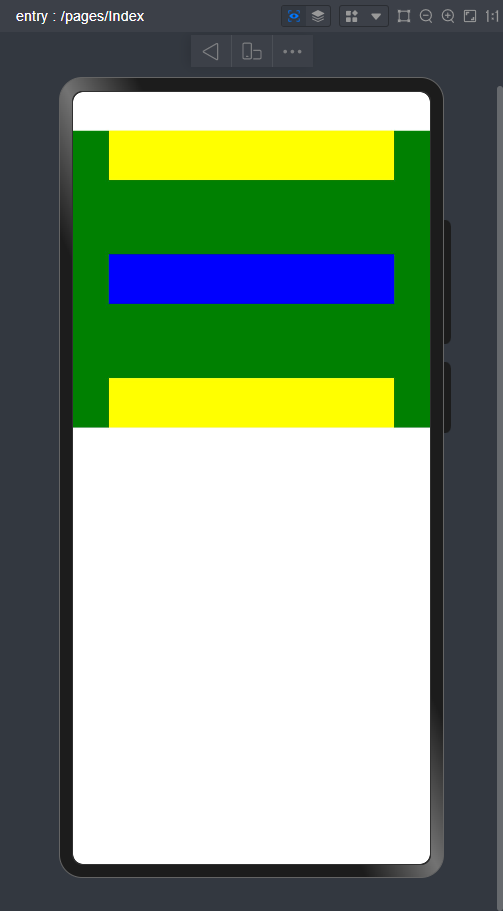
SpaceAround:垂直方向均匀分配元素,相邻元素之间距离相同。第一个元素到行首的距离和最后一个元素到行尾的距离是相邻元素之间距离的一半。
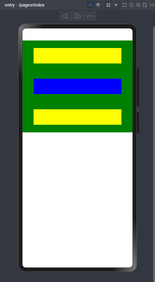
SpaceEvenly:垂直方向均匀分配元素,相邻元素之间的距离、第一个元素与行首的间距、最后一个元素到行尾的间距都完全一样。(平均分配)
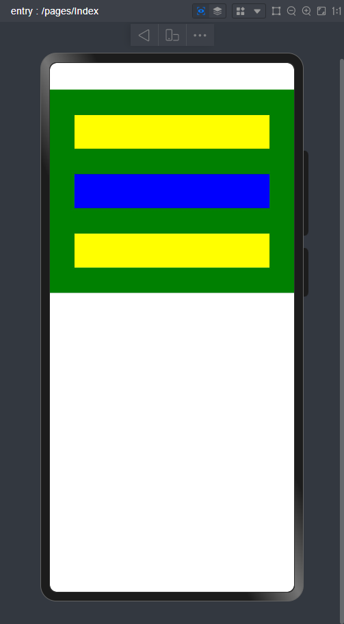
这里我将整个容器的高度设置为300,背景为绿色,参数设置为Center。能有一个更直观的视觉效果。
8.Row在主轴上的排列
这里将测试代码粘贴给大家,FlexAlign的参数与Column的类似,只是排列方式不同
@Entry
@Component
struct Index {
  @State message: string = 'Hello World';

  build() {
    Row() {
      Row() {
      }.width('30%').height(50).backgroundColor(Color.Yellow)

      Row() {
      }.width('30%').height(50).backgroundColor(Color.Blue)

      Row() {
      }.width('30%').height(50).backgroundColor(Color.Yellow)
    }.width('100%').height(200).backgroundColor(Color.Green).justifyContent(FlexAlign.Start)

  }
}
9.自适应拉伸
大家在到一个新地方的时候是不是都要连接Wifi,那我们来想一下,是不是文字在最左边,然后按钮在最右边,但实际我们开发的过程中,他的最初形态是如下图:
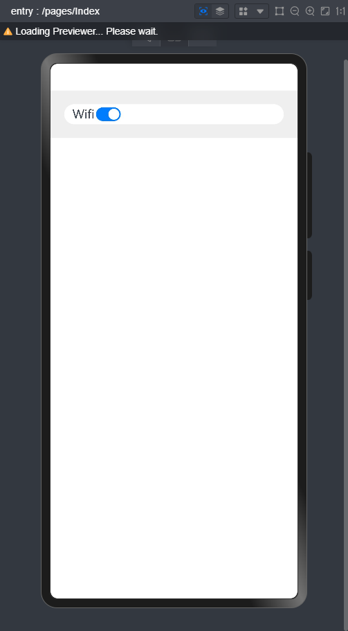
但是这样看,属实影响美观,我们要怎么改变呢?
@Entry
@Component
struct Index{
  build() {
    Column() {
      Row() {
        Text('Wifi').fontSize(18)
        Blank() //自适应拉伸
        //按钮组件,isOn,默认是开启/关闭装填
        Toggle({ type: ToggleType.Switch, isOn: true })
      }.backgroundColor(Color.White).borderRadius(15).padding({ left: 12 }).width('100%')
    }.backgroundColor(Color.Gray).padding(20).width('100%')
  }
}
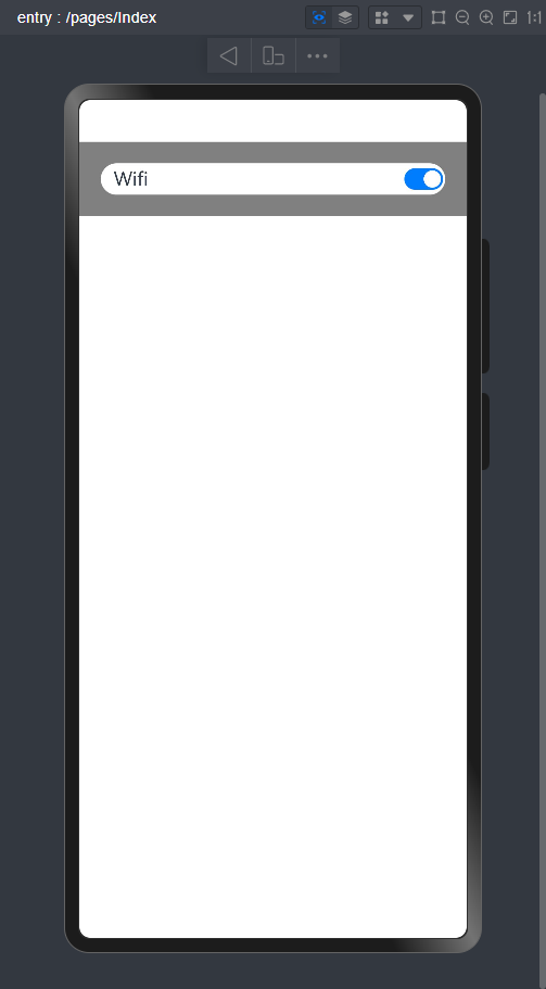
我们在按钮上方的代码加上Blank(),就可以自适应拉伸了,效果如下图
10. 自适应延伸
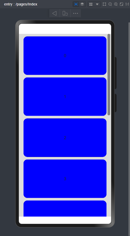
大家在网上购物的时候,是不是物品太多了,一页没法展示,那我们是不是u就会往下滑,这就是自适应延伸。
@Entry
@Component
struct Index{
  scroller: Scroller = new Scroller();
  private arr: number[] = [0, 1, 2, 3, 4, 5, 6, 7, 8, 9];

  build() {

    Scroll(this.scroller) {
      Column() {

        ForEach(this.arr, (item:string) => {
          Text(item.toString())
            .width('90%')
            .height(150)
            .backgroundColor(Color.Blue)
            .borderRadius(15)
            .fontSize(16)
            .textAlign(TextAlign.Center)
            .margin({ top: 10 })
        })
      }.width('100%')
    }
    .backgroundColor(0xDCDCDC)
    .scrollable(ScrollDirection.Vertical) // 滚动方向为垂直方向
    .scrollBar(BarState.On) // 滚动条常驻显示
    .scrollBarColor(Color.Gray) // 滚动条颜色
    .scrollBarWidth(10) // 滚动条宽度
    .edgeEffect(EdgeEffect.Spring) // 滚动到边沿后回弹
  }
}
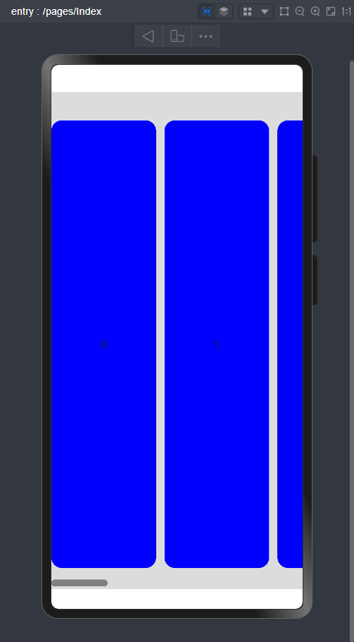
有竖直方向,当然还有水平方向了!
@Entry
@Component
struct Index{
  scroller: Scroller = new Scroller();
  private arr: number[] = [0, 1, 2, 3, 4, 5, 6, 7, 8, 9];

  build() {

    Scroll(this.scroller) {
      Row({space:12}) {

        ForEach(this.arr, (item:string) => {
          Text(item.toString())
            .height('90%')
            .width(150)
            .backgroundColor(Color.Blue)
            .borderRadius(15)
            .fontSize(16)
            .textAlign(TextAlign.Center)
            .margin({ top: 10 })
        })
      }.height('100%')
    }
    .backgroundColor(0xDCDCDC)
    .scrollable(ScrollDirection.Horizontal) // 滚动方向为垂直方向
    .scrollBar(BarState.On) // 滚动条常驻显示
    .scrollBarColor(Color.Gray) // 滚动条颜色
    .scrollBarWidth(10) // 滚动条宽度
    .edgeEffect(EdgeEffect.Spring) // 滚动到边沿后回弹
  }
}


 324
324

 被折叠的 条评论
为什么被折叠?
被折叠的 条评论
为什么被折叠?
 到【灌水乐园】发言


