


在我们页面布局中,经常会碰见高度塌陷问题,如何解决呢?以下会为你解答
目录
3.给所有的浮动元素后面加一个空的标签。给添加的这个空标签添加声明 clear: both;
4.给子元素开启相对定位,用top,right,left,botton来调整布局
高度塌陷的两种情况
高度塌陷也分为“兄弟关系”之间的塌陷以及“父子关系”之间的塌陷
兄弟关系的高度塌陷
举例:两者外边距都为正数时
.box1{
width: 200px;
height: 200px;
background-color: red;
margin-bottom: 10px;
}
.box2 {
width: 200px;
height: 200px;
background-color: skyblue;
margin-top: 20px;
}
<div class="box1">我是大哥red</div>
<div class="box2">我是小弟skyblue</div>

现在请问两者之间的外边距是多少?
A:10px B:20px C:30px
你会选择哪个答案呢?
正确答案是B 20px
造成这种原因就是因为兄弟关系之间的高度塌陷
所以由此得出,当两个兄弟元素垂直相接外边距值都为正时,那么实际的外边距为两者中较大那个
解决方法也很简单,想要多少外边距直接给其中一个添加即可,两者中外边距最大的为实际外边距
举例:两者外边距为一正一负时
.box1{
width: 200px;
height: 200px;
background-color: red;
margin-bottom: -10px;
}
.box2 {
width: 200px;
height: 200px;
background-color: skyblue;
margin-top: 20px;
}
<div class="box1">我是大哥red</div>
<div class="box2">我是小弟skyblue</div>

由此得出:出现两者外边距一正一负时,两者外边距相加即为实际外边距
举例:两者外边距都为负数时
.box1{
width: 200px;
height: 200px;
background-color: red;
margin-bottom: -10px;
}
.box2 {
width: 200px;
height: 200px;
background-color: skyblue;
margin-top: -20px;
}
<div class="box1">我是大哥red</div>
<div class="box2">我是小弟skyblue</div>

此时两者高度总和是多少呢?
A:400px B:390px C:380px
你会选择哪一个呢?
答案是C 高度总和为380px

这种情况也是因为高度塌陷造成的
由此得出:两个兄弟元素垂直相接外边距值都为负,那么实际的外边距为两者中绝对值较大那个
父子关系的高度塌陷
造成父子塌陷问题的原因
当父元素未设置高度时,所有子元素浮动后,造成子元素脱离文档流进而无法把父元素撑开,父元素高度为0产生高度塌陷
举例:
.box {
border: 5px solid green;
}
.box1{
width: 200px;
height: 200px;
background-color: red;
}
.box2 {
width: 200px;
height: 200px;
background-color: skyblue;
}
<div class="box">
<div class="box1">我是大儿子red</div>
<div class="box2">我是小儿子skyblue</div>
</div>
由代码可知,我们并未给父元素box设置高度,父盒子的高度是被子盒子撑起来的
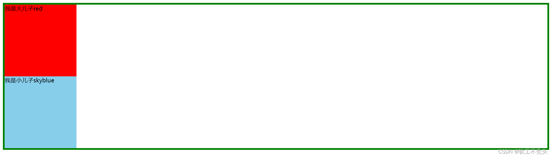
而当子盒子脱离文档流时,父盒子的高度就为0了
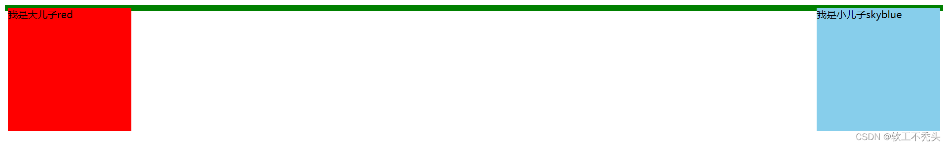
这里给子元素添加了浮动
.box1{
float: left;
width: 200px;
height: 200px;
background-color: red;
}
.box2 {
float: right;
width: 200px;
height: 200px;
background-color: skyblue;
}
不仅仅是浮动,只要子元素脱离了文档流,就会造成父元素高度塌陷
父元素高度塌陷后,父元素以下的元素都会向上移动,导致布局混乱,所以我们要解决高度塌陷的问题。
解决方案
1.直接给父元素添加高度
这种方法虽然简单,但是不能自适应布局,直接写死了页面.
2.给父元素也添加float,让父元素也浮动起来
这种方法因为父元素也脱离了文档流也可能造成页面布局混乱
3.给所有的浮动元素后面加一个空的标签。给添加的这个空标签添加声明 clear: both;
例:
<div class="box">
<div class="box1">我是大儿子red</div>
<div class="box2">我是小儿子skyblue</div>
<div style="clear: both;"></div>
</div>
也可以加上overflow:hidden
<div style ="clear:both;" overflow:hidden></div>
4.给高度塌陷的元素添加如下after伪类(通用方法)
例:
.box::after {
content: '';
clear: both;
display: block;
clear:both;
overflow: hidden;
visibility: hidden;
}
在实际情况中最容易碰见的情况
例:
.box1{
width: 200px;
height: 200px;
background-color: red;
}
.box2 {
width: 200px;
height: 200px;
background-color: skyblue;
}
.box3 {
width: 100px;
height: 100px;
background-color: yellowgreen;
}
<div class="box1"> 我是大哥red </div>
<div class="box2">
<div class="box3">
我是box2的儿子
</div>
</div>

当给box3(绿色的方块)添加外边距,正常情况来说,外边距的距离应该是绿色方块到蓝色方块的距离,那情况是这样吗?如下所示
.box3 {
width: 100px;
height: 100px;
background-color: yellowgreen;
margin-top: 20px;
}

我们发现实际上,是box2蓝色方块与box1红色方块产生了20px的外边距.可我们是给box3设置的外边距,按理说应该是绿色方块距离蓝色方块20px.此时,就是发生了高度塌陷
解决方案
1.给父元素开启相对定位,子元素开启绝对定位
例:
.box2 {
position: relative;
width: 200px;
height: 200px;
background-color: skyblue;
}
.box3 {
position: absolute;
width: 100px;
height: 100px;
background-color: yellowgreen;
margin-top: 20px;
}
2.给父元素设置overflow:hidden
.box2 {
overflow: hidden;
width: 200px;
height: 200px;
background-color: skyblue;
}
3. 给子元素用行内块级元素表示
.box3 {
display: inline-block;
width: 100px;
height: 100px;
background-color: yellowgreen;
margin-top: 20px;
}
4.给子元素开启相对定位,用top,right,left,botton来调整布局
.box3 {
position: relative;
top: 20px; (top与margin-top达到的效果是一样的)
left: 0;
width: 100px;
height: 100px;
background-color: yellowgreen;
}
本文到这就结束了.希望有所收获


 5134
5134


 被折叠的 条评论
为什么被折叠?
被折叠的 条评论
为什么被折叠?
 到【灌水乐园】发言


