


表格自定义表头的方式
多选框表头换文字
请查看上篇博客:http://t.csdn.cn/69De2
文字换按钮 render-header
render-header方法详情
| 参数 | 说明 | 类型 | 可选值 | 默认值 |
| render-header | 列标题 Label 区域渲染使用的 Function | Function(h, { column, $index }) | — | — |
代码
<template>
    <div class="Box">
        <div>
            <!-- :header-cell-class-name="cellClass" -->
            <el-table ref="multipleTable" :data="tableData" :header-cell-class-name="cellClass" tooltip-effect="dark"
                style="width: 500px" @selection-change="handleSelectionChange">
                <el-table-column type="selection" width="55">

                </el-table-column>
                <el-table-column label="日期" width="120">
                    <template slot-scope="scope">{{ scope.row.date }}</template>
                </el-table-column>
                <el-table-column label="姓名" prop="name" :render-header="(h, obj) => renderHeader(h, obj, '你的参数')"
                    width="120">
                    <el-button size="mini" @click="handleEdit(scope.$index, scope.row)">修改姓名</el-button>
                </el-table-column>
                <el-table-column prop="address" label="地址" show-overflow-tooltip>
                </el-table-column>
            </el-table>
        </div>
    </div>
</template>

<script>
export default {
    name: "list",
    data () {
        return {
            tableData: [{
                date: '2023-09-03',
                name: 'bug天选之子',
                address: 'https://blog.csdn.net/weixin_70245286?spm=1000.2115.3001.5343'
            }, {
                date: '2023-09-03',
                name: 'bug天选之子',
                address: 'https://blog.csdn.net/weixin_70245286?spm=1000.2115.3001.5343'
            }, {
                date: '2023-09-03',
                name: 'bug天选之子',
                address: 'https://blog.csdn.net/weixin_70245286?spm=1000.2115.3001.5343'
            }, {
                date: '2023-09-03',
                name: 'bug天选之子',
                address: 'https://blog.csdn.net/weixin_70245286?spm=1000.2115.3001.5343'
            },],
            multipleSelection: [],
        }
    },


    methods: {
        // 选中的项
        handleSelectionChange (val) {
            this.multipleSelection = val;
            console.log("选中的项:", this.multipleSelection);
        },
        // 修改多选框表头
        cellClass (row) {
            // 判断第几列
            if (row.columnIndex === 0) {
                return "disableSelection";
            }
        },
        // 自定义表头
        renderHeader (h, { column, $index }, type) {
            // console.log('列表加载就会触发', h, { column, $index }, type)
            console.log(column.label);
            let that = this
            // 逻辑是 h() 括号里包裹标签 第一个参数是标签名 第二个是属性  第三个是标签内容  如果是多个标签需要包裹数组
            return h(
                'div', [
                // 列名称
                // h('span', column.label),
                // 按钮
                h('el-button', {
                    props: {
                        type: 'primary',
                        size: 'small',
                    },
                    style: 'color:#fff;',
                    // class: "{ active: showSelectMore }",
                    // class: 'className',
                    on: {
                        // 各种事件触发
                        click: function () {
                            that.clickButton(type)
                        }
                    }
                }, '姓名')
            ],
            )


        },
        // 按钮点击事件
        clickButton (type) {
            console.log('我点击了' + type + '的列')
            // this.downLoad()
        },
        handleEdit (row) {

        }


    },
    mounted () {

    }
}
</script>

<style scoped>
.Box {
    display: flex;
    justify-content: center;
    align-items: center;
}

::v-deep.el-table .disableSelection .cell .el-checkbox__inner {
    display: none;
    position: relative;
}

::v-deep.el-table .disableSelection .cell::before {
    content: "选项";
    position: absolute;
    right: 15px;
}

::v-deep.el-table {
    border: 1px solid blue;
}
</style>
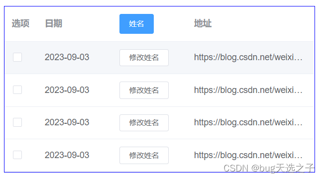
效果图
关键代码总结
// 在要修改的那一列加render-header属性
<el-table-column label="姓名" prop="name" :render-header="(h, obj) => renderHeader(h, obj, '你的参数')"

</el-table-column>
// methods中写方法
renderHeader (h, { column, $index }, type) {
            // console.log('列表加载就会触发', h, { column, $index }, type)
            console.log(column.label);
            let that = this
            // 逻辑是 h() 括号里包裹标签 第一个参数是标签名 第二个是属性  第三个是标签内容  如果是多个标签需要包裹数组
            return h(
                'div', [
                // 列名称
                // h('span', column.label),
                // 按钮
                h('el-button', {
                    props: {
                        type: 'primary',
                        size: 'small',
                    },
                    style: 'color:#fff;',
                    // class: "{ active: showSelectMore }",
                    // class: 'className',
                    on: {
                        // 各种事件触发
                        click: function () {
                            that.clickButton(type)
                        }
                    }
                }, '姓名')
            ],
            )


        },


 6768
6768


 被折叠的 条评论
为什么被折叠?
被折叠的 条评论
为什么被折叠?
 到【灌水乐园】发言


