365锦鲤助手修改版,砍价小程序

砍价小程序源码,超强裂变, 快速吸引用户,低成本高裂变,留存率高;

商品快速丰富产品内容满足广大用户需求;流量矩阵让流量都进你的圈子飞起来

任务系统 通过任务系统提高用户的使用频率,增加粘性。

导航自定义 拒绝千篇一律,彰显个性;0元拿商品(砍价、道具、互助) 极大的增强了互动,挺好了日活

新增抽奖模块.奶粉裂变更强劲,变现能力更强,营收能力更好。
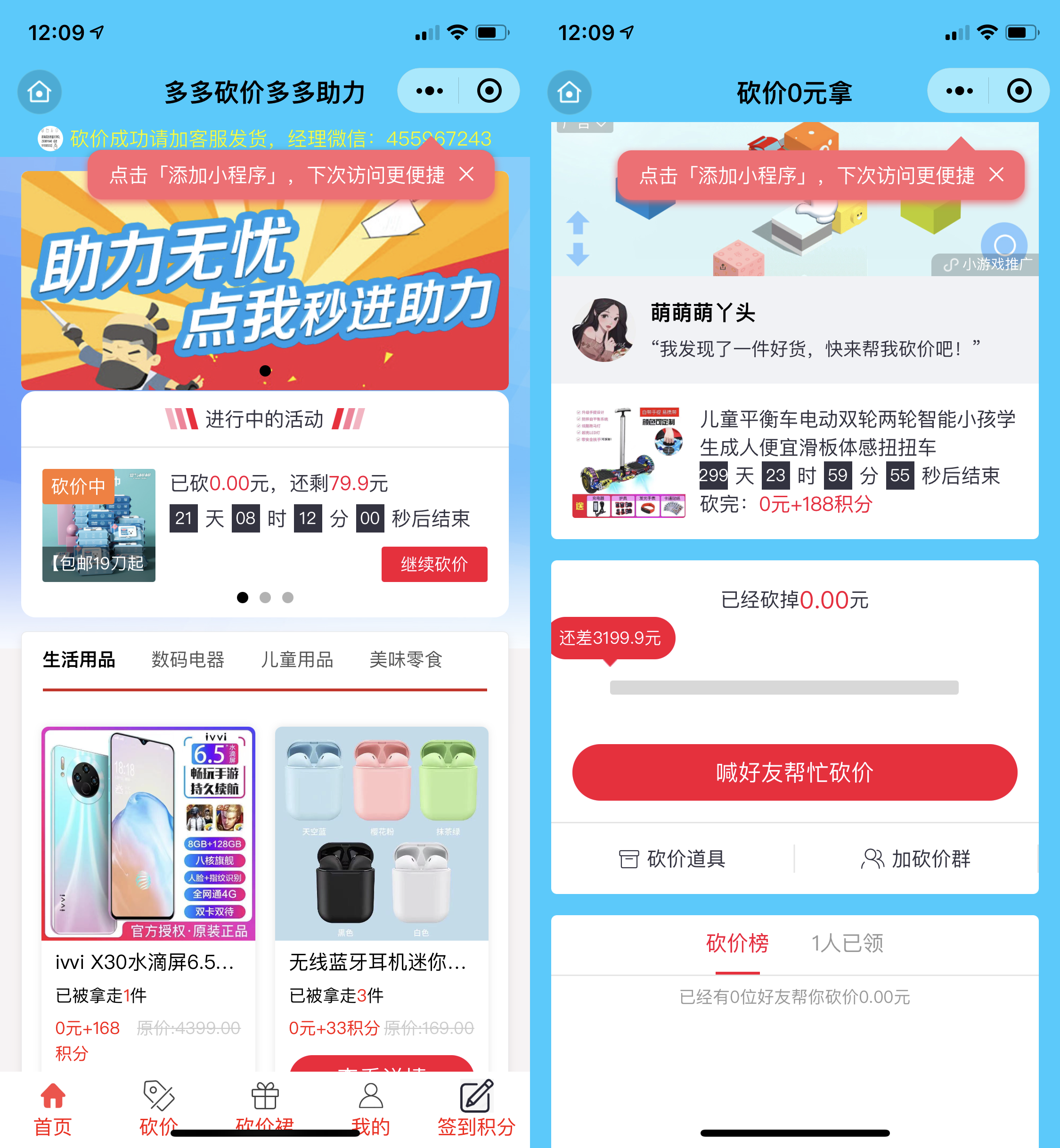
下方是小编测试演

小程序源码下载地址:(已更新)365锦鲤助手修改版,砍价小程序-小程序文档类资源-CSDN下载砍价小程序源码,超强裂变,快速吸引用户,低成本高裂变,留存率高;商品快速丰富产品内容满足广大用更多下载资源、学习资料请访问CSDN下载频道.https://download.csdn.net/download/weixin_70437515/85557126

  • 0
    点赞
  • 3
    收藏
    觉得还不错? 一键收藏
  • 打赏
    打赏
  • 1
    评论
以下是一个简单的实现锦鲤的前端代码: ```html <!DOCTYPE html> <html> <head> <title>锦鲤</title> <style> body { background-color: #F7F7F7; display: flex; align-items: center; justify-content: center; height: 100vh; margin: 0; } .koi { width: 200px; height: 100px; position: relative; } .koi .body { width: 150px; height: 100px; background-color: #FFC300; border-radius: 50% 50% 50% 50% / 60% 60% 40% 40%; position: absolute; top: 0; left: 25px; transform-origin: center right; animation: swim 2s ease-in-out infinite; } .koi .tail { width: 0; height: 0; border-top: 50px solid transparent; border-right: 50px solid #FFC300; border-bottom: 50px solid transparent; position: absolute; top: 25px; left: -50px; transform-origin: center right; animation: swish 2s ease-in-out infinite; } .koi .head { width: 50px; height: 50px; background-color: #FFC300; border-radius: 50%; position: absolute; top: 25px; left: 130px; transform-origin: center left; animation: nod 2s ease-in-out infinite; } .koi .eye { width: 20px; height: 20px; background-color: white; border-radius: 50%; position: absolute; top: 10px; left: 120px; transform-origin: center; animation: blink 2s ease-in-out infinite; } .koi .eye::before { content: ""; display: block; width: 10px; height: 10px; background-color: black; border-radius: 50%; position: absolute; top: 5px; left: 5px; } @keyframes swim { 0% { transform: rotate(0); } 50% { transform: rotate(30deg); } 100% { transform: rotate(0); } } @keyframes swish { 0% { transform: rotate(0); } 50% { transform: rotate(10deg); } 100% { transform: rotate(0); } } @keyframes nod { 0% { transform: rotate(0); } 50% { transform: rotate(10deg); } 100% { transform: rotate(0); } } @keyframes blink { 0%, 50%, 100% { transform: scale(1); } 25%, 75% { transform: scale(0.5); } } </style> </head> <body> <div class="koi"> <div class="tail"></div> <div class="body"></div> <div class="head"> <div class="eye"></div> </div> </div> </body> </html> ``` 这段代码使用了 HTML 和 CSS 实现了一个简单的锦鲤动画。在浏览器中打开这个 HTML 文件,你就可以看到一个游动的锦鲤了。

“相关推荐”对你有帮助么?

  • 非常没帮助
  • 没帮助
  • 一般
  • 有帮助
  • 非常有帮助
提交
评论 1
添加红包

请填写红包祝福语或标题

红包个数最小为10个

红包金额最低5元

当前余额3.43前往充值 >
需支付:10.00
成就一亿技术人!
领取后你会自动成为博主和红包主的粉丝 规则
hope_wisdom
发出的红包

打赏作者

岚舟渡

你的鼓励将是我创作的最大动力

¥1 ¥2 ¥4 ¥6 ¥10 ¥20
扫码支付:¥1
获取中
扫码支付

您的余额不足,请更换扫码支付或充值

打赏作者

实付
使用余额支付
点击重新获取
扫码支付
钱包余额 0

抵扣说明:

1.余额是钱包充值的虚拟货币,按照1:1的比例进行支付金额的抵扣。
2.余额无法直接购买下载,可以购买VIP、付费专栏及课程。

余额充值