


margin-top的穿透问题:
我们再给子元素设置margin-top,但是却作用到父元素身上,这种现象被称之为margin-top的穿透问题:

解决方案:
1. 给父元素添加border 弊端:border会占据空间
2. 给父元素添加overflow:hidden 弊端:元素内容溢出会隐藏,设计一些定位展示的效果时,没办法显示。
3. 使用padding-top代替margin-top,使用父元素的padding-top代替子元素的margin-top,父元素的高度减去相应的padding-top的值
4. 给父元素添加float
<!DOCTYPE html>
<html lang="en">
<head>
    <meta charset="UTF-8">
    <meta name="viewport" content="width=device-width, initial-scale=1.0">
    <title>Document</title>
    <style>
        .one{
            width: 500px;
            height: 500px;
            background-color: aqua;
            /* border: 1px solid #f00; */
            margin-top: 100px;
        }
        .two{
            width: 300px;
            height: 300px;
            background-color: rgb(196, 33, 133);
            margin-top: 100px;
        }
    </style>
</head>
<body>
    <!--
    情况2:
    当两个盒子是嵌套关系的时候,给外层的盒子添加外边距,并且给里面的盒子添加外边距,这时候两个外边距就会合并

    解决:
        1. 给父元素添加边框
        2. 给父元素添加float
    -->
    <div class="one">
        <div class="two"></div>
    </div>

</body>
</html>
上下margin-top|bottom的重叠问题:
a和b两个紧邻的元素,a元素在上边,b元素在下边,a元素设置的margin-bottom b元素设置的margin-top,此时a,b元素之间的距离以两个值较大的为准:

解决方案:
1. 只给其中的一个元素设置margin值
2. 给其中一个元素添加父元素,并且给父元素添加overflow:hidden
3. 给两个盒子都添加float
<!DOCTYPE html>
<html lang="en">
<head>
    <meta charset="UTF-8">
    <meta name="viewport" content="width=device-width, initial-scale=1.0">
    <title>Document</title>
    <style>
        div{
            width: 300px;
            height: 300px;
            /* 浮动是为了让元素在一行显示 */
            /* float: left; */
        }
        .one{
            background-color: aqua;
            margin-bottom: 50px;
        }
        .two{
            background-color: rgb(196, 33, 133);
            margin-top: 50px;
        }
    </style>
</head>
<body>
    <!--
    情况1:
    在垂直方向上,给上面的盒子添加底部的外边距,给下面的盒子添加顶部的外边距,就会发生合并

    解决:
        给两个盒子都添加float
    -->
    <div class="one"></div>
    <div class="two"></div>
</body>
</html>
假设有一个空元素,它有外边距,但是没有边框或填充。在这种情况下,上外边距与下外边距就碰到了一起,它们会发生合并
<!DOCTYPE html>
<html lang="en">
<head>
    <meta charset="UTF-8">
    <meta name="viewport" content="width=device-width, initial-scale=1.0">
    <title>Document</title>
    <style>
        .one{
            padding: 1px;
            background-color: aqua;
            /* margin: 50px 0 50px 0; */
            margin-top: 50px;
            margin-bottom: 50px;
        }
        .two{
            width: 300px;
            height: 300px;
            background-color: rgb(196, 33, 133);
        }
    </style>
</head>
<body>
    <!--
    情况3:
    假设有一个空元素,它有外边距,但是没有边框或填充。在这种情况下,上外边距与下外边距就碰到了一起,它们会发生合并

    解决:
        1. 给空元素添加边框
        2. 给空元素添加padding
        3. 给空元素添加height
    -->
    <div class="one"></div>
    <div class="two"></div>
</body>
</html>
outline案例:
<!DOCTYPE html>
<html lang="en">
<head>
    <meta charset="UTF-8">
    <meta name="viewport" content="width=device-width, initial-scale=1.0">
    <title>Document</title>
    <style>
        input{
            width: 300px;
            height: 30px;
            border: 2px solid #4569ff;
            border-radius: 8px 0 0 8px;
            outline: 0;
            text-indent: 15px;
            padding: 0;
            float: left;
        }
        input:focus{
            border: 2px solid #4569ff;
        }
        button{
            width: 80px;
            height: 30px;
            background-color: #4569ff;
            border: 2px solid #4569ff;
            /* border: 0; */
            color: #fff;
            padding: 0;
            /* 把怪异盒子变成标准盒子 */
            box-sizing: content-box;
            float: left;
       }
    </style>
</head>
<body>
    <!--
    outline 外边线,只有input有,默认为黑色

    input框: 内容+边框+padding
    按钮:内容(边框和padding)
    -->
    <input type="text" autofocus><button>百度一下</button>
</body>
</html>
怪异盒子
<!DOCTYPE html>
<html lang="en">
<head>
    <meta charset="UTF-8">
    <meta name="viewport" content="width=device-width, initial-scale=1.0">
    <title>Document</title>
    <style>
        .box{
            width: 200px;
            height: 200px;
            padding: 50px;
            border: 20px solid #f00;
            margin: 50px;
            /*
            怪异盒子
            内容高度(内容+padding+border)
            */
            /* box-sizing: border-box; */
            box-sizing: content-box;
        }
    </style>
</head>
<body>

    <div class="box">百度一下百度一下百度一下百度一下百度一下百度一下</div>
</body>
</html>
心形案例:
<!DOCTYPE html>
<html lang="en">
<head>
    <meta charset="UTF-8">
    <meta name="viewport" content="width=device-width, initial-scale=1.0">
    <title>Document</title>
    <style>
        .heart{
            width: 200px;
            height: 200px;
            background-color: red;
            margin: 200px;
            /* css3旋转 */
            rotate: 45deg;
            /*  */
            /* 圆角 */
            /* border-radius: 100px; */
            /* 过度,all所有的css都有过度变化; 1s过度时间 */
            transition: all 1s;
        }
        .heart::before{
            content: '';
            width: 200px;
            height: 200px;
            display: inline-block;
            /* 定位 */
            position: absolute;
            /* 移动定位 */
            left: -100px;
            /* 背景颜色 */
            background-color: red;
            /* 圆角 */
            border-radius: 100px;
        }
        .heart::after{
            content: '';
            width: 200px;
            height: 200px;
            display: inline-block;
            /* 定位 */
            position: absolute;
            /* 移动定位 */
            top: -100px;
            background-color: red;
            border-radius: 100px;
        }
        .heart:hover{
            /* 缩放 1没有任何变化,》1放大,《1缩小 */
            scale: 1.5;
        }
    </style>
</head>
<body>
    <div class="heart"></div>
</body>
</html>
文本裁切案例:
<!DOCTYPE html>
<html lang="en">
<head>
    <meta charset="UTF-8">
    <meta name="viewport" content="width=device-width, initial-scale=1.0">
    <title>Document</title>
    <style>
        body{
            background-color: #000;
        }
        .box{
            width: 1000px;
            height: 400px;
            font: bold 120px/400px '微软雅黑';
            border: 50px  solid #ccc;
            text-align: center;
            background: url('./案例/bg.jpg');
            background-clip: text;
            color: transparent;
            transition: all 2s linear;
        }
        .box:hover{
            background-position: 1000px 0;
        }
    </style>
</head>
<body>
    <div class="box">一起去有风的地方</div>
</body>
</html>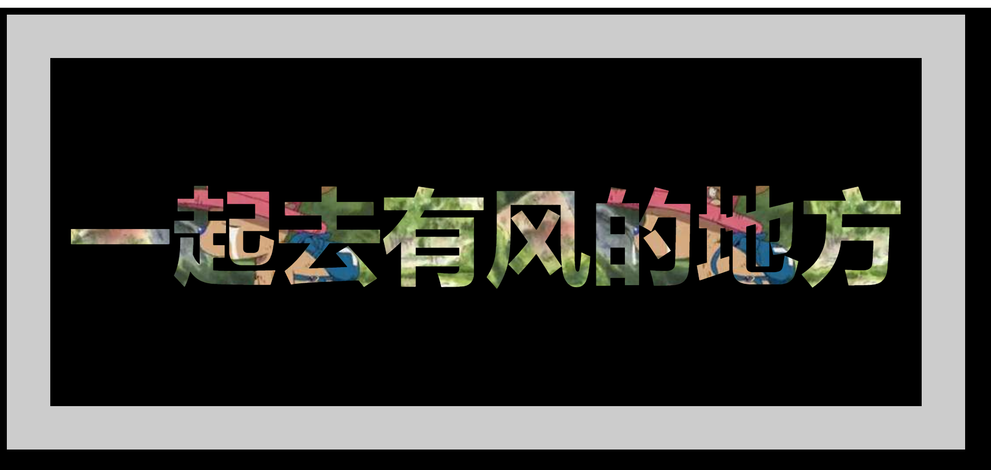


 7624
7624

 被折叠的 条评论
为什么被折叠?
被折叠的 条评论
为什么被折叠?
 到【灌水乐园】发言


