


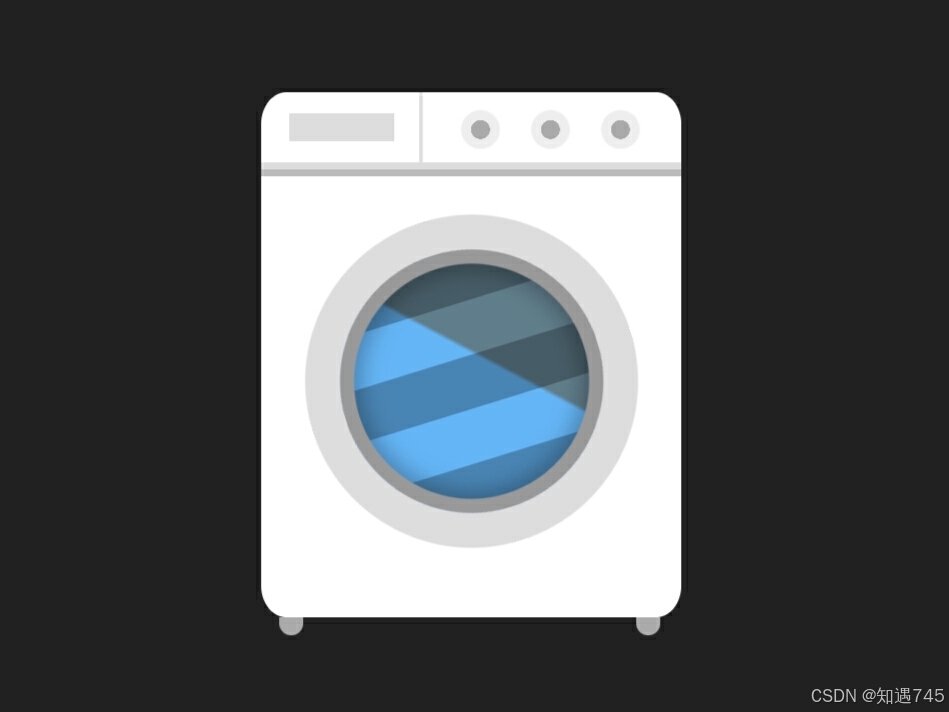
1、效果图
2、查看效果
微信小程序搜索“知遇工具箱”,可查看具体效果和更多内容。

3、全部代码
html
<div class="loader"></div>css
	.loader {
		width: 120px;
		height: 150px;
		background-color: #fff;
		background-repeat: no-repeat;
		background-image: linear-gradient(#ddd 50%, #bbb 51%),
			linear-gradient(#ddd, #ddd), linear-gradient(#ddd, #ddd),
			radial-gradient(ellipse at center, #aaa 25%, #eee 26%, #eee 50%, #0000 55%),
			radial-gradient(ellipse at center, #aaa 25%, #eee 26%, #eee 50%, #0000 55%),
			radial-gradient(ellipse at center, #aaa 25%, #eee 26%, #eee 50%, #0000 55%);
		background-position: 0 20px, 45px 0, 8px 6px, 55px 3px, 75px 3px, 95px 3px;
		background-size: 100% 4px, 1px 23px, 30px 8px, 15px 15px, 15px 15px, 15px 15px;
		position: relative;
		border-radius: 6%;
		animation: shake 3s ease-in-out infinite;
		transform-origin: 60px 180px;
	}

	.loader:before {
		content: "";
		position: absolute;
		left: 5px;
		top: 100%;
		width: 7px;
		height: 5px;
		background: #aaa;
		border-radius: 0 0 4px 4px;
		box-shadow: 102px 0 #aaa;
	}

	.loader:after {
		content: "";
		position: absolute;
		width: 95px;
		height: 95px;
		left: 0;
		right: 0;
		margin: auto;
		bottom: 20px;
		background-color: #bbdefb;
		background-image: linear-gradient(to right, #0004 0%, #0004 49%, #0000 50%, #0000 100%),
			linear-gradient(135deg, #64b5f6 50%, #607d8b 51%);
		background-size: 30px 100%, 90px 80px;
		border-radius: 50%;
		background-repeat: repeat, no-repeat;
		background-position: 0 0;
		box-sizing: border-box;
		border: 10px solid #DDD;
		box-shadow: 0 0 0 4px #999 inset, 0 0 6px 6px #0004 inset;
		animation: spin 3s ease-in-out infinite;
	}

	@keyframes spin {
		0% {
			transform: rotate(0deg)
		}

		50% {
			transform: rotate(360deg)
		}

		75% {
			transform: rotate(750deg)
		}

		100% {
			transform: rotate(1800deg)
		}
	}

	@keyframes shake {

		65%,
		80%,
		88%,
		96% {
			transform: rotate(0.5deg)
		}

		50%,
		75%,
		84%,
		92% {
			transform: rotate(-0.5deg)
		}

		0%,
		50%,
		100% {
			transform: rotate(0)
		}
	}


 扫一扫
扫一扫


 1万+
1万+

 被折叠的 条评论
为什么被折叠?
被折叠的 条评论
为什么被折叠?
 到【灌水乐园】发言


