1. 读取数据
trade_data3 <- read.csv("C:\\Users\\86138\\Desktop\\undata1988-2023\\undata1988-2023\\(qingxibingtu)1988-1992TradeData_11_22_2024_15_35_21.csv")
trade_data4 <- read_excel("C:\\Users\\86138\\Desktop\\undata1988-2023\\undata1988-2023\\1988-1992.xlsx")
• 作用:
o read.csv():从指定路径读取 CSV 文件到 trade_data3。
o read_excel():从指定路径读取 Excel 文件到 trade_data4。
• 注意:
o 确保路径有效,文件格式正确。
o 如果路径中包含中文字符,可能会导致读取失败,可以尝试使用 RStudio 的路径粘贴功能。
o 安装并加载 readxl 包(library(readxl))来使用 read_excel()。
________________________________________
2. 数据处理:计算饼图所需数据
pie_data1 <- trade_data4 %>%
group_by(source_country, sourcelong, sourcelat) %>%
summarise(
import = sum(ifelse(flowDesc == "Import", net_weight, 0), na.rm = TRUE),
export = sum(ifelse(flowDesc == "Export", net_weight, 0), na.rm = TRUE)
) %>%
pivot_longer(cols = c(import, export), names_to = "flowDesc", values_to = "value") %>%
group_by(source_country) %>%
mutate(
total = sum(value),
proportion = value / total,
proportion = proportion / sum(proportion), # 严格归一化,确保比例和为 1
start = lag(cumsum(proportion), default = 0), # 扇区的起点比例
end = cumsum(proportion), # 扇区的终点比例
end = if_else(row_number() == n(), 1, end) # 修正最后一个段的终点
) %>%
filter(proportion > 1e-6) %>% # 过滤掉占比过小的部分
ungroup() %>%
arrange(source_country, start)
作用:
1. 按 source_country 分组并计算总的进口(import)和出口(export)值。
2. 将 import 和 export 转为长格式,便于后续绘图。
3. 计算总量 total 和比例 proportion,并确保比例的总和为 1。
4. 生成每个扇区的起点 start 和终点 end,用于绘制饼图。
5. 过滤掉占比过小的部分(小于 1e-6,即 0.000001)。
6. 排序以确保绘图数据的顺序。
________________________________________
3. 生成饼图扇区的坐标
pie_coords <- pie_data1 %>%
group_by(source_country) %>%
rowwise() %>%
mutate(
radius = sqrt(total) / 10, # 动态调整饼图半径,根据 total 平方根压缩变化范围
x1 = list(cos(seq(2 * pi * start, 2 * pi * end, length.out = 1000)) * radius + sourcelong),
y1 = list(sin(seq(2 * pi * start, 2 * pi * end, length.out = 1000)) * radius + sourcelat)
) %>%
unnest(cols = c(x1, y1))
作用:
1. 按 source_country 分组,为每个国家的饼图计算圆弧的坐标点。
2. radius 动态调整饼图的大小,使用平方根缩放总量。
3. x1 和 y1:
o 通过三角函数计算每个圆弧的坐标点。
o 扇区的中心点是 sourcelong 和 sourcelat。
4. unnest() 将坐标点展开为单独的行,便于 ggplot 使用。
________________________________________
4. 绘制基础地图
world_map1 <- map_data("world")
base_map1 <- ggplot() +
geom_polygon(data = world_map1, aes(x = long, y = lat, group = group), fill = "gray95", color = "white") +
coord_fixed(ratio = 1.1, xlim = c(-180, 180), ylim = c(-90, 90)) +
theme_minimal() +
theme(panel.grid = element_blank(),
plot.margin = margin(10, 10, 10, 10),
axis.text = element_blank(),
axis.ticks = element_blank(),
axis.title.x = element_blank(),
axis.title.y = element_blank())
作用:
1. 使用 map_data("world") 加载世界地图数据。
2. 绘制地图轮廓:
o 使用 geom_polygon() 绘制每个国家的边界。
o 填充颜色为浅灰色 (fill = "gray95"),边界颜色为白色。
3. 设置地图比例和显示范围。
4. 美化地图主题:移除网格线、坐标轴标签、刻度等。
________________________________________
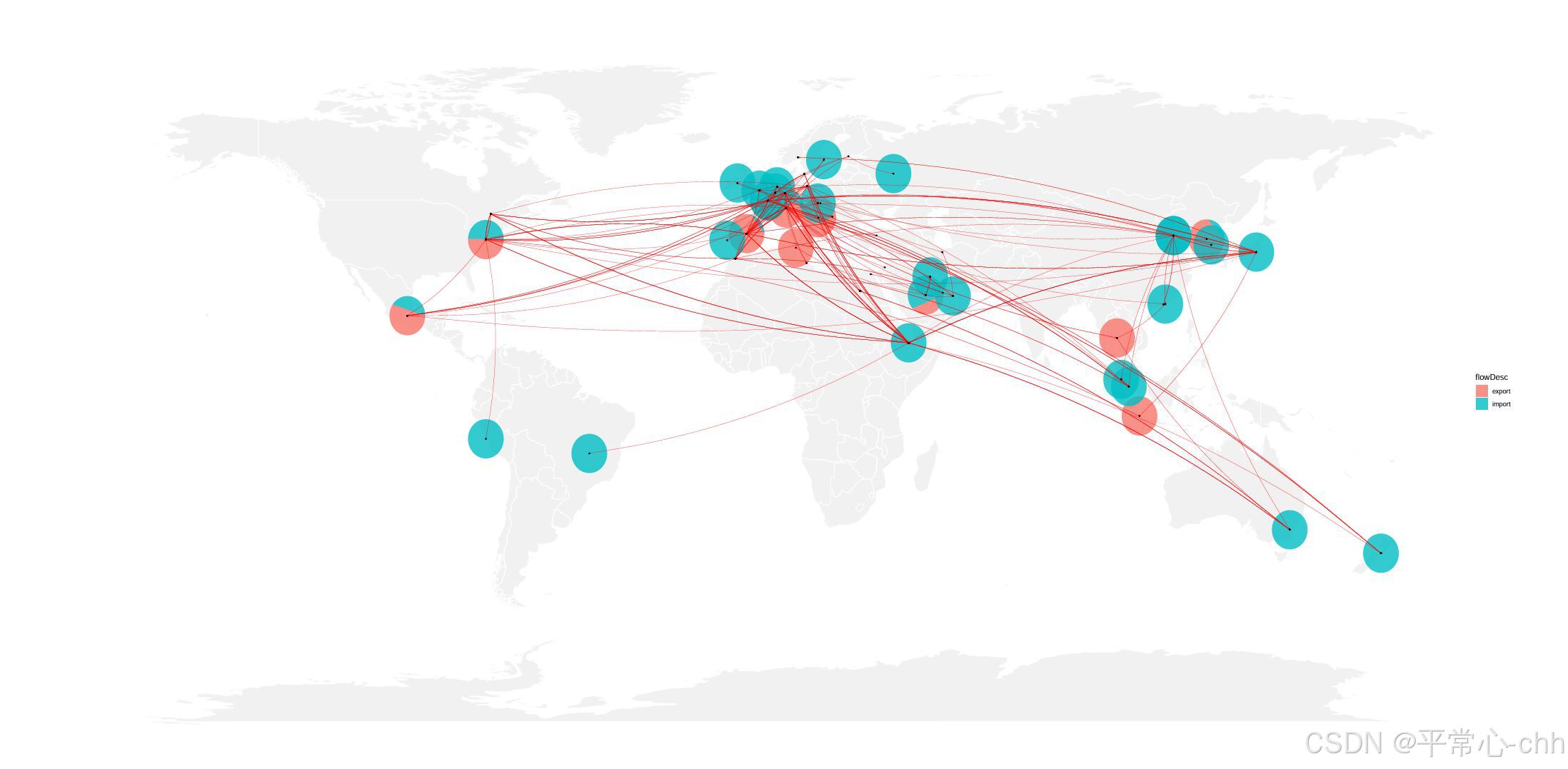
5. 绘制饼图和连接线
pie_layer <- geom_polygon(
data = pie_coords,
aes(x = x1, y = y1, group = interaction(source_country, flowDesc), fill = flowDesc),
alpha = 0.8
)
作用:
• 绘制每个 source_country 的进出口比例饼图。
• 使用 interaction(source_country, flowDesc) 确保每个扇区作为单独的绘图组。
• 设置透明度为 0.8。
________________________________________
6. 添加弧线和点
trade_map1 <- base_map1 +
pie_layer +
geom_curve(data = trade_data3,
aes(x = sourcelong, y = sourcelat,
xend = target_long, yend = target_lat,
size = net_weight), color = "red",
curvature = 0.1, alpha = 0.7,
show.legend = FALSE,
arrow = arrow(angle = 15, length = unit(0.1, "cm"))) +
geom_point(data = trade_data3,
aes(x = sourcelong, y = sourcelat),
color = "black", size = 0.5) +
geom_point(data = trade_data3,
aes(x = target_long, y = target_lat),
color = "black", size = 0.5) +
scale_size_continuous(range = c(0.2, 0.5))
作用:
1. geom_curve():绘制弧线,表示起点和终点的贸易流动。
2. geom_point():标记贸易流动的起点和终点。
3. scale_size_continuous():调整弧线粗细,范围从 0.2 到 0.5。
________________________________________
7. 保存图形
ggsave(trade_map1, file = "空间联系图.pdf", width = 30, height = 15, dpi = 800, path = "C:\\Users\\86138\\Desktop")
作用:
• 保存图形为 PDF 文件,路径为 "C:\\Users\\86138\\Desktop"。
• 图形宽度为 30 英寸,高度为 15 英寸,分辨率为 800 DPI。


 被折叠的 条评论
为什么被折叠?
被折叠的 条评论
为什么被折叠?
 到【灌水乐园】发言


