


相关知识点见:CSS动画
HTML部分:
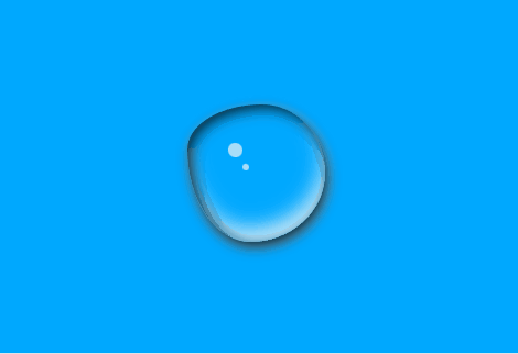
<div class="water"></div>CSS部分:
* {
            margin: 0;
            padding: 0;
        }

        body {
            background-color: #00a8ff;
            height: 100vh;
            display: flex;
            justify-content: center;
            align-items: center;
        }

        .water {
            width: 100px;
            height: 100px;
            position: relative;
            border-radius: 50% 50% 48% 52% / 31% 46% 54% 69%;
            opacity: 0.8;
            box-shadow: 2px 4px 9px #000, 2px 3px 8px #fff, 3px 3px 10px #000 inset, -2px -10px 14px #fff inset;
            animation: aa 4s linear alternate infinite;
        }

        .water::before {
            content: "";
            width: 10px;
            height: 10px;
            position: absolute;
            top: 30%;
            left: 30%;
            background: rgba(255, 255, 255, 0.8);
            border-radius: 47% 53% 47% 53% / 49% 51% 49% 51%;
            animation: bb 3s linear alternate infinite;
        }

        .water::after {
            content: "";
            width: 5px;
            height: 5px;
            position: absolute;
            top: 45%;
            left: 40%;
            background: rgba(255, 255, 255, 0.8);
            border-radius: 47% 53% 47% 53% / 49% 51% 49% 51%;
            animation: cc 3s linear alternate infinite;
        }

        @keyframes aa {
            25% {
                border-radius: 41% 59% 38% 62% / 54% 58% 42% 46%;
            }

            50% {
                border-radius: 33% 67% 22% 78% / 56% 40% 60% 44%;
            }

            75% {
                border-radius: 52% 48% 57% 43% / 25% 60% 40% 75%;
            }

            100% {
                border-radius: 58% 42% 49% 51% / 46% 32% 68% 54%;
            }
        }

        @keyframes bb {
            25% {
                top: 29%;
                left: 30%;
            }

            50% {
                top: 28%;
                left: 30%;
            }

            75% {
                top: 27%;
                left: 30%;
            }

            100% {
                top: 26%;
                left: 30%;
            }
        }

        @keyframes cc {
            25% {
                top: 44%;
                left: 40%;
            }

            50% {
                top: 43%;
                left: 40%;
            }

            75% {
                top: 42%;
                left: 40%;
            }

            100% {
                top: 41%;
                left: 40%;
            }
        }
实际效果图:


 51
51


 被折叠的 条评论
为什么被折叠?
被折叠的 条评论
为什么被折叠?
 到【灌水乐园】发言


