


一、引入
- 会使用transform 2D变形设置网页元素样式
- 会使用transition制作过渡动画
- 会使用animation制作网页动画
二、CSS变形transform

变形函数:
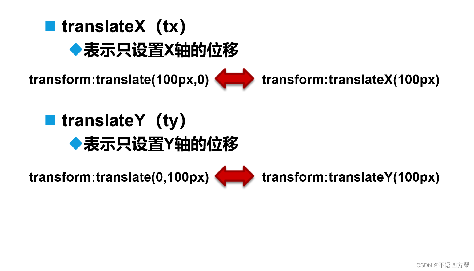
translate():平移函数,基于X、Y坐标重新定位元素的位置
			li a:hover{
				background-color: aqua;
				border-radius: 6px;
				/* transform: translate(5px,5px); *//*平移函数*/
				/* transform: scale(2); *//*缩放函数*/
				/* transform: translate(5px,5px) scale(2); */
			}
scale():缩放函数,可以使任意元素对象尺寸发生变化

			li a:hover{
				background-color: aqua;
				border-radius: 6px;
				/* transform: translate(5px,5px); *//*平移函数*/
				/* transform: scale(2); *//*以两倍大小缩放函数*/
				/* transform: translate(5px,5px) scale(2); */
			}
rotate():旋转函数,取值是一个度数值
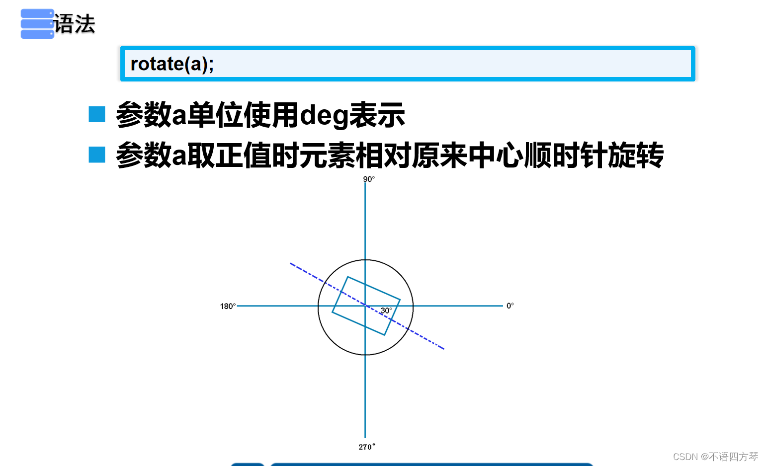
			img:hover{
				transform: rotate(-90deg) scale(1.5);
                /*逆时针旋转90度,并放大2倍**/
			}
skew():倾斜函数,取值是一个度数值

			li a:hover{
				background-color: aqua;
				border-radius: 6px;
				transform: skew(40deg,40deg);
                /*沿x轴倾斜40度,沿y轴倾斜40度**/
			}
练习:

<!DOCTYPE html>
<html>
	<head>
		<meta charset="utf-8">
		<title></title>
		<style type="text/css">
			div img:nth-child(even){/*even奇数照片设置宽度**/
				width: 200px;
			}
			div img:nth-child(odd){/*odd偶数照片设置宽度**/
				width:300px;
			}
			.box{
				width: 960px;
				margin: 200px auto;
				position: relative;		/*给父级盒子设置相对位置**/
			}
			.box img{
				border: 1px solid #ddd;
				padding: 10px;
				position: absolute;		/*给照片设置绝对位置**/
				background-color: #fff;
				z-index: 1;				/*设置统一层级**/
				transition: all 1s ease-in-out 0s;
			}
			/*将照片旋转并铺开(进行绝对位置的摆放),打造照片墙**/
			  .box img:nth-child(1){
			    top: 0px;
			    left: 300px;
			    transform: rotate(-15deg);
			}
			.box img:nth-child(2) {
				top:-50px;
				left: 600px;
				transform: rotate(-20deg);
			}

			.box img:nth-child(3) {
				bottom: 0;
				right: 0;
				transform: rotate(15deg);
			}

			.box img:nth-child(4) {
				bottom: 0;
				left: 400px;
				transform: rotate(-20deg);
			}

			.box img:nth-child(5) {
				bottom: 0;
				left: 0;
				transform: rotate(-30deg);
			}

			.box img:nth-child(6) {
				top: 0;
				left: 0;
				transform: rotate(20deg);
			}

			.box img:nth-child(7) {
				top: 0;
				left: 700px;
				transform: rotate(20deg);
			}

			.box img:nth-child(8) {
				bottom: -20px;
				right: 500px;
				transform: rotate(30deg);
			}

			.box img:nth-child(9) {
				top: 90px;
				left: 550px;
				transform: rotate(15deg);
			}
			.box img:nth-child(10) {
				left: 180px;
				top: 20px;
				transform: rotate(-10deg);
			}

			.box img:hover{		/*照片被鼠标悬停时发生一些什么变化的设置**/
				z-index: 2;
				box-shadow: 5px 5px 5px #ddd;
				transform: rotate(0deg) scale(1.5);
			}
		</style>
	</head>
	<body>
		<div class="box" id="box">
		    <img src="image/1.jpg" alt=""/>
		    <img src="image/2.jpg" alt=""/>
		    <img src="image/3.jpg" alt=""/>
		    <img src="image/4.jpg" alt=""/>
		    <img src="image/5.jpg" alt=""/>
		    <img src="image/6.jpg" alt=""/>
		    <img src="image/7.jpg" alt=""/>
		    <img src="image/8.jpg" alt=""/>
		    <img src="image/9.jpg" alt=""/>
		    <img src="image/10.jpg" alt=""/>
		</div>
	</body>
</html>
三、CSS过渡transition
1、过渡属性:
- transition呈现的是一种过渡,是一种动画转换的过程,如渐现、渐弱、动画快慢等
- CSS3 transition的过渡功能更像是一种“黄油”,通过一些CSS的简单动作触发样式平滑过渡
2、过渡语法:

注意:这四个属性值有非常严格的顺序
3、实列:
<!DOCTYPE html>
<html>
	<head>
		<meta charset="utf-8">
		<title></title>
		<style type="text/css">
			div{
				margin: 200px;
			}
			#d1{
				width: 500px;
				height: 500px;
				background-color: red;
				transition: background-color 2s ease-in-out 0s;
				/*指定针对属性 过渡所需时长 过渡函数 延迟时间**/
			}
			#d1:hover{
				background-color: blue;
			}
			#d2{
				width: 400px;
				margin: 0px auto;
			}
			img{
				transition: transform 1s ease-in-out 0s;
                /*对img图片的旋转,缩放进行过渡**/
                /*可以将针对的属性换成all,这样就可以同时进行多个属性的过渡**/
			}
			img:hover{
				transform: rotate(-90deg) scale(1.5);
				box-shadow: 5px 5px 5px red;
			}
		</style>
	</head>
	<body>
		<div id="d1"></div>
		<div id="d2">
			<img src="image/ytxwz.jpg" width="300px" height="300px"/>
		</div>
</body>可以将针对的属性换成all,这样可以将该元素的多个属性同时过渡
------>
------>
------>
4、过渡属性的使用:
4.1、过渡属性的指定

4.2、过渡所需要的时间

4.3、过渡动画函数

4.4、过渡的延迟时间

5、过渡触发机制:

6、过渡动画的使用步骤:
- 在默认样式中声明元素的初始状态样式
- 声明过渡元素最终状态样式,如悬浮状态
- 在默认样式中通过添加过渡函数,添加一些不同的样式
四、CSS动画animation、
1、设置关键帧

理论上来说帧数越多,动画越连贯
2、注意兼容性
3、调用关键帧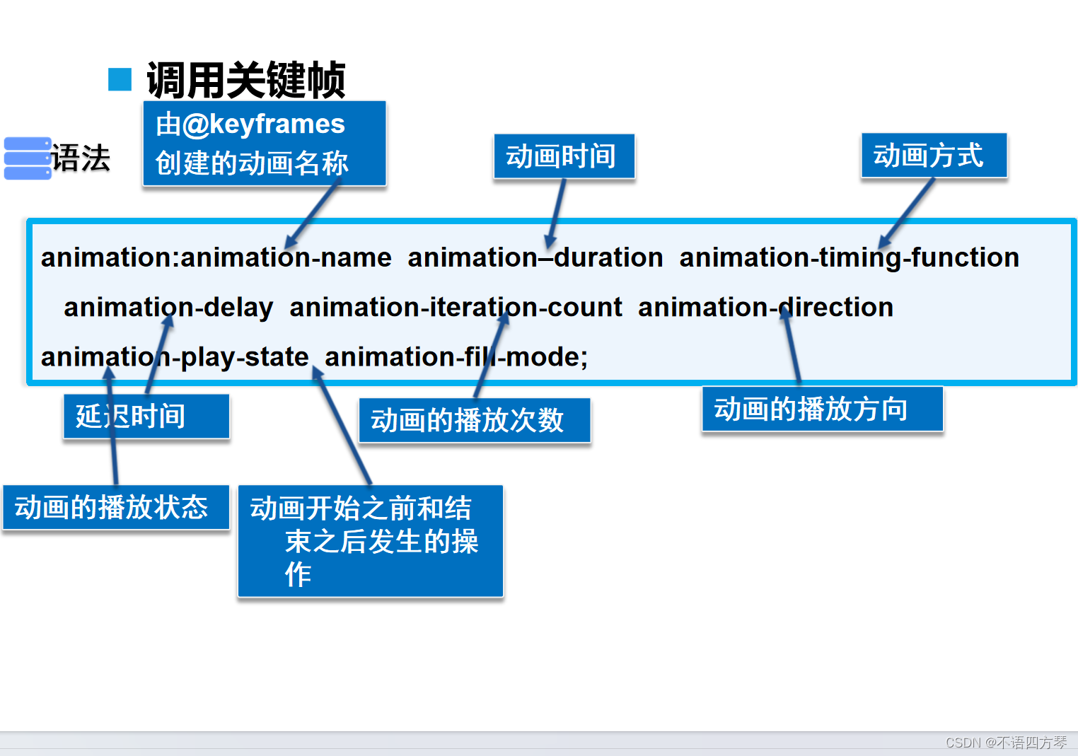
4、动画播放过程设置
4.1、动画的播放次数(animation-iteration-count)
- 值通常为整数,默认值为1
- 特殊值infinite,表示动画无限次播放
4.2、动画的播放方向(animation-direction)
- normal,动画每次都是循环向前播放
- alternate,动画播放为偶数次则向前播放
4.3、动画的播放状态(animation-play-state)
- running将暂停的动画重新播放
- paused将正在播放的元素动画停下来
4.4、动画发生的操作(animation-fill-mode)
- forwards表示动画在结束后继续应用最后关键帧的位置
- backwards表示会在向元素应用动画样式时迅速应用动画的初始帧
- both表示元素动画同时具有forwards和backwards的效果
5、示列
<!DOCTYPE html>
<html>
	<head>
		<meta charset="utf-8">
		<title></title>
		<style type="text/css">
			/**创建关键帧1*/
			@keyframes spread1{
				0%{
					width: 0px;
					transform: translate(100px,0px);
				}
				25%{
					width: 20px;
					transform: translate(200px,0px);
				}
				50%{
					width: 50px;
					transform: translate(300px,0px);
				}
				75%{
					width: 20px;
					transform: translate(200px,0px);
				}
				100%{
					width: 0px;
					transform: translate(100px,0px);
				}
			}
			/**创建关键帧2*/
			@keyframes spread2{
				0%{
					width: 20px;
					transform: translate(0px,0px);
				}
				25%{
					width: 20px;
					transform: translate(300px,0px);
				}
				50%{
					width: 20px;
					transform: translate(300px,300px);
				}
				75%{
					width: 20px;
					transform: translate(0px,300px);
				}
				100%{
					width: 20px;
					transform: translate(0px,0px);
				}
			}
			div{
				width: 100px;
				height: 100px;
				background-color: red;
				/**调用动画*/
				animation: spread2 2s linear infinite;
			}/*指定调用的关键帧的名称 动画时间 匀速播放 播放次数**/
		</style>
	</head>
	<body>
		<div></div>
	</body>
</html>
五、总结


 2683
2683


 被折叠的 条评论
为什么被折叠?
被折叠的 条评论
为什么被折叠?
 到【灌水乐园】发言


