


选择器
基础选择器
通配符选择器(*)、元素选择器、类选择器(.)、id选择器(#)
<style>
    #pink {
        color: pink;
    }
</style>
<body>
    <div id="pink">杰克逊</div>
</body>
复杂选择器
后代选择器(包含选择器)(空格)
子元素选择器(子选择器)(>)
并集选择器(,)
链接伪类选择器(:)
<style>
    /* 伪类选择器 */
    /* 链接伪类选择器 */
    /* LVHA顺序不能更改 */
    /* 未访问过的链接 */
    a:link {
        color: #333;
    }

    /* 已被访问过的链接 */
    a:visited {
        color: orange;
    }

    /* 鼠标经过的链接 */
    a:hover {
        color: skyblue;
        text-decoration: overline;
    }

    /* 鼠标正在按下还没有弹起的 */
    a:active {
        color: green;
    }
</style>

<body>
    <a href="#">小猪佩奇</a>
</body>
focus伪类选择器
<style>
    /* focus伪类选择器 */
    /* 这个选择器主要针对于表单元素来说 */
    input:focus {
        background-color: pink;
        color: red;
    }
</style>
</head>

<body>
    <input type="text">
</body>
伪元素选择器
- :first-letter 为第一个字符的样式
- :first-line 为第一行添加样式
- :before 在元素内容的最前面添加的内容,需要配合content属性使用
- :after 在元素内容的最后面添加的内容,需要配合content属性使用
<!DOCTYPE html>
<html lang="en">
<head>
	<meta charset="UTF-8">
	<title>Document</title>
	<style>
		p:first-letter{
			color:red;
			font-size:30px;
		}
		p:first-line{
			background:pink;
		}
		p:before{
			content:"嘿嘿";
		}
		p:after{
			content:"哈哈";
		}
	</style>
</head>
<body>
	<p>hello world!</p>
	<hr>
	<p>
		hello world! <br>
		welcome to css!
	</p>
</body>
</html>
样式:
字体属性
font-size
取值:
- inherited继承,默认从父标签继承字体大小(默认值),所有CSS属性的默认值都是inherited
- px像素 pixel
- %百分比,相对父标签字体大小的百分比
- em倍数,相对于父标签字体大小的倍数
- HTML根元素默认字体的大小为16px,也称为基础字体大小
font-weight
取值:
- normal普通(默认)(400)
- bold粗体(700)
font-family
- 要求系统中要安装指定的字体
- 一般建议写3种字体:首选、其次、备用,以英文状态下的逗号隔开。
font-style
取值:
- normal普通
- italic斜体
font
- 简写属性:font:font-style font-weight font-size/line-height font-family
- 顺序不能改变,并且必须保留font-size和font-family属性,否则不起作用。
注意:
<style>
    body {
            font-size: 20px;
        }

        /*标题标签比较特殊,要单独设置。*/
        h2 {
            font-size: 20px;
        }
</style>

<body>
    <h2>她的睫毛 弯的嘴角</h2>
</body>
文本属性
| 属性 | 含义 | 说明 |
|---|---|---|
| color | 颜色 | |
| line-height | 行高 | 行之间的高度(行间距=上间距+文本高度+下间距) |
| text-align | 水平对齐方式 | 取值:left(默认)、center、right |
| vertical-align | 垂直对齐方式 | 取值:top、middle、bottom可以用于图片和文字的对齐方式 |
| text-indent | 首行缩进 | |
| text-decoration | 文本修饰 | 取值:none(默认)、underline、overline、line-through |
| text-transform | 字母大小写转换 | 取值:lowercase、uppercase、capitalize首字母大写 |
| letter-spacing | 字符间距 | |
| word-spacing | 单词间距 | 只对英文有效 |
| white-space | 空白的处理方式 | 文本超出后是否换行,取值:nowrap |
首行缩进
<style>
    .suojin {
        text-indent: 2em;
        /* 表示缩进当前元素两个文字大小的距离。 */
        /* em是一个相对单位,就是当前元素(font-size)1个文字的大小,如果当前元素没有设置大小,则会按照父元素的1个文字大小。 */
        text-indent: -50px;
        /* 可以取负值。 */
    }
</style>

<body>
    <p class="suojin">hahaha</p>
</body>
颜色取值
-
颜色名称:使用英文单词
-
16进制的RGB值:#RRGGBB
-
特定情况下可以缩写
#FFFFFF--->#FFF 白色
#000000--->#000 黑色
#FF0000--->#F00 红色
#00FF00--->#0F0 绿色
#0000FF--->#00F 蓝色
#CCCCCC--->#CCC 灰色
#FF7300--->无法简写
注意:不区分大小写
- rgb函数:rgb(red,green,blue)
每种颜色的取值范围,[0,255]
rgb(255,0,0)----->红
rgb(0,255,0)----->绿
rgb(0,0,255)----->蓝- rgba函数:rbga(red,green,blue,alpha)
可以设置透明度,alpha取值范围:[0,1] 0表示完全透明 1表示完全不透明
rgba(255,0,0,1)----->纯红
rgba(255,0,0,0.5)---->红色半透明
样式表
- 内部样式表
- 外部样式表
<link rel="stylesheet" href="style.css">- 行内样式表
<p style="color:red;font-size:12px;">竟然先对我示好</p>背景属性
background-color(背景颜色)
- 默认:透明色(transparent)
background-image(背景图片)
-
取值:none(默认)、url(url)(使用相对或绝对地址指定背景图像。如果是在css样式文件中使用相对路径,此时是相对于css文件,不是相对html文件)
background-repeat(背景图片的重复方式)
-
取值:repeat(默认情况)|no-repeat|repeat-x|repeat-y;
background-position(背景图片的显示位置)
- 单个方位词:第二个默认为center。
- 两个方位词:没有前后顺序。
- 单个精确值:表示x,y默认为center。
- 两个精确值:第一个x,第二个y。
- 混合:第一个x,第二个y。
background-attachment(背景图片是否跟随滚动)
- 取值:scroll(默认,图片随着滚动)|fixed(图片固定不动)
background(简写)
- 没有固定顺序
补充:背景的半透明写法
background: rgba(0, 0, 0, 0.3);
/* 也可以是background: rgba(0, 0, 0, .3); */
/* 第四个数字取0-1之间,0指百分之百的透明,1指百分之百的不透明。 */
列表属性
| 属性 | 含义 | 说明 |
|---|---|---|
| list-style-type | 设置列表前的标记 | 取值:none、disc、circle、square、decimal 此时不再区分有序列表还是无序列表,只要设置列表前的标记就可以了 |
| list-style-image | 将图像作为列表前的标记 | |
| list-style-position | 设置标记的位置 | 取值:outside(默认)、inside |
| list-style | 简写 | 书写顺序没有要求 |
举例
<!DOCTYPE html>
<html lang="en">
<head>
	<meta charset="UTF-8">
	<title>Document</title>
	<style>
    /*  li{
			list-style-type:decimal;
		} */
		.first{
			list-style-type:circle;
		}
		.second{
			list-style-image:url(../images/male.gif);
		}
		.third{
			list-style-type:circle;
			list-style-position:inside;
		}
		.fourth{
			list-style:circle url(../images/female.gif)inside;
			/* list-style:none; */
		}
		.nav{
			/* list-style:none;
			float:left; */
		}
		.nav li{
			list-style:none;
			float:left;
			width:70px;
		}
	</style>
</head>
<body>
	<ul>
		<li class="first">hello</li>
		<li class="second">hello</li>
		<li class="third">hello</li>
		<li class="fourth">hello</li>
	</ul>
	<hr>
	<nav>
		<ul class="nav">
			<li>新闻</li>
			<li>小说</li>
			<li>艾瑞蒂</li>
			<li>政治</li>
			<li>学习</li>
		</ul>
	</nav>
</body>
</html>
盒子模型
边框border
四个方向:上下左右
三个样式:color、width、style(取值:solid实线、dashed虚线、dotted点线、double双线、inset内嵌的3D线、outset外嵌的3D线)
简写:
- 按方向简写:
border-top、border-right、border-bottom、border-left
border-方向:width style color
- 按样式简写:
border-color、border-width、border-style
border-样式:top right bottom left
必须按顺时针方向书写,同时可以缩写:
border-width:2px;--------->四个边框的宽度均为2px
border-width:1px 2px;
border-width:1px 2px 4px;
规则:如果省略,则认为上下一样,左右一样
- 终级简写:
如果四个边框样式完全相同,border:width style color;
圆角边框
border-radius: 10px 20px 30px 40px;(左上 右上 右下 左下)
如果只有两个值,则分别表示左上和右下,右上和左下
或者单独设置,如border-top-left-radius,border-bottom-right-radius
内边距padding
分开写法:padding-left: 20px;padding-top: 40px;
复合写法:
- padding:5px;上下左右
- padding:5px 10px;上下,左右
- padding:5px 10px 15px;上,左右,下
- padding:5px 10px 15px 12px;上,右,下,左
注意
- padding会影响盒子实际大小
- 如果盒子本身没有指定width/height属性,则此时padding不会撑开盒子大小
- 只指定了height,那么设置padding-left或padding-right盒子不会被撑开
- 只指定了width,那么设置padding-top或padding-bottom盒子不会被撑开
外边距margin
外边距的合并
第一种情况:
- 相邻块元素垂直外边距的合并,是说它们的垂直间距不是margin-bottom和margin-top的和,而是取它们之间的较大值,解决方式是只设置上盒子的margin-bottom或下盒子的margin-top。
第二种情况:
- 嵌套块元素垂直外边距的塌陷,是说父元素有上外边距同时子元素也有上外边距,此时父元素会塌陷较大的外边距值
- 解决方法:可以为父元素定义上边框;可以为父元素定义内边距;可以为父元素添加overflow:hidden(这种方式不会使盒子变大);还有其他方法如浮动、固定、绝对定位。
盒子阴影
box-shadow: 10px 10px 10px 10px rgba(0, 0, 0, .3);五个参数分别表示:
h-shadow水平阴影距离(必需。允许负值)
v-shadow垂直阴影距离(必需。允许负值)
blur(模糊距离),spread(阴影的尺寸)
color
inset(inset为内部阴影,outset为外部阴影,默认为外部,但不能标明outset,否则阴影无效)
注意: 阴影不会占空间!!!
文字阴影
<style>
    div {
        font-size: 50px;
        text-shadow: 5px 5px 6px rgba(0, 0, 0, .3);
        /* 四个参数分别是h-shadow水平阴影距离(必需。允许负值)
        v-shadow垂直阴影距离(必需。允许负值)
        blur(模糊距离)
        color */
    }
</style>

<body>
    <div>文字阴影</div>
</body>
浮动
- 多个块级元素纵向排列找标准流,多个块级元素横向排列找浮动
- 如果多个块级元素横向排列找标准流,可以将块级元素模式转化为行内块元素,但盒子之间会有空隙
- 用法是:选择器{float:属性值;}属性可以为none(默认)、left、right
- float 属性用于创建浮动框,将其移动到一边,直到左边缘或右边缘触及包含块或另一个浮动框的边缘
- 如果多个盒子都设置了浮动,则它们会按照属性值一行内显示并且顶端对齐排列
- 任何元素都可以浮动。不管原先是什么模式的元素,添加浮动之后具有行内块元素相似的特性
- 如果块级盒子没有设置宽度,默认宽度和父级一样宽,但是添加浮动后,它的大小根据内容来决定
- 浮动的盒子只会影响(压住)浮动盒子后面的标准流,不会影响前面的标准流
清除浮动
-
额外标签法
在最后一个浮动的元素后面添加一个空的块级元素,并设置其clear属性为非none
<!DOCTYPE html>
<html lang="en">

<head>
    <meta charset="UTF-8">
    <meta http-equiv="X-UA-Compatible" content="IE=edge">
    <meta name="viewport" content="width=device-width, initial-scale=1.0">
    <title>浮动5(清除浮动之额外标签法)</title>
    <style>
        .box {
            width: 800px;
            border: 1px solid blue;
            margin: 0 auto;
        }

        .damao {
            float: left;
            width: 200px;
            height: 200px;
            background-color: pink;
        }

        .ermao {
            float: left;
            width: 200px;
            height: 200px;
            background-color: purple;
        }

        .footer {
            height: 200px;
            background-color: black;
        }

        .clear {
            clear: both;
            /* 属性值可以是left(清楚左侧浮动的影响)、right、both */
        }
    </style>
</head>

<body>
    <!-- 浮动的盒子只会影响(压住)浮动盒子后面的标准流,不会影响前面的标准流 -->
    <div class="box">
        <div class="damao">111</div>
        <div class="ermao">222</div>
        <!-- 方法:在最后一个浮动的元素后面添加一个空的块级元素,并设置其clear属性为非none-->
        <div class="clear"></div>
    </div>
    <div class="footer"></div>
    <!-- 为什么需要清除浮动?
    父级没高度
    子盒子浮动了
    影响下面布局了 -->
</body>

</html>-
双伪元素清除浮动
<!DOCTYPE html>
<html lang="en">

<head>
    <meta charset="UTF-8">
    <meta http-equiv="X-UA-Compatible" content="IE=edge">
    <meta name="viewport" content="width=device-width, initial-scale=1.0">
    <title>浮动5(清除浮动之双伪元素清除浮动)</title>
    <style>
        .clearfix:before,
        .clearfix:after {
            content: "";
            display: table;
            /* 转换成表格模式 */
        }

        .clearfix:after {
            clear: both;
        }

        .clearfix {
            *zoom: 1;
        }

        .box {
            width: 800px;
            border: 1px solid blue;
            margin: 0 auto;
        }

        .damao {
            float: left;
            width: 200px;
            height: 200px;
            background-color: pink;
        }

        .ermao {
            float: left;
            width: 200px;
            height: 200px;
            background-color: purple;
        }

        .footer {
            height: 200px;
            background-color: black;
        }
    </style>
</head>

<body>
    <div class="box clearfix">
        <!-- 给需要清除浮动的元素的父元素添加 -->
        <div class="damao">111</div>
        <div class="ermao">222</div>
    </div>
    <div class="footer"></div>
</body>

</html>-
after伪元素法
<!DOCTYPE html>
<html lang="en">

<head>
    <meta charset="UTF-8">
    <meta http-equiv="X-UA-Compatible" content="IE=edge">
    <meta name="viewport" content="width=device-width, initial-scale=1.0">
    <title>浮动5(清除浮动之after伪元素法)</title>
    <style>
        .clearfix:after {
            content: "";
            /* after伪元素里必须有content这个属性 */
            display: block;
            /* 因为伪元素默认的是行内元素,所以要转为块级元素 */
            height: 0;
            clear: both;
            visibility: hidden;
        }

        .clearfix {
            /* IE6、7专有 */
            *zoom: 1;
        }


        .box {
            width: 800px;
            border: 1px solid blue;
            margin: 0 auto;
        }

        .damao {
            float: left;
            width: 200px;
            height: 200px;
            background-color: pink;
        }

        .ermao {
            float: left;
            width: 200px;
            height: 200px;
            background-color: purple;
        }

        .footer {
            height: 200px;
            background-color: black;
        }
    </style>
</head>

<body>
    <div class="box clearfix">
        <!-- 给需要清除浮动的元素的父元素添加 -->
        <div class="damao">111</div>
        <div class="ermao">222</div>
    </div>
    <div class="footer"></div>
</body>

</html>-
overflow属性
<!DOCTYPE html>
<html lang="en">

<head>
    <meta charset="UTF-8">
    <meta http-equiv="X-UA-Compatible" content="IE=edge">
    <meta name="viewport" content="width=device-width, initial-scale=1.0">
    <title>浮动5(清除浮动之overflow属性)</title>
    <style>
        .box {
            overflow: hidden;
            /* 上面这行代码的缺点:无法显示溢出的部分 */
            /* 属性也可以是auto、scroll */
            width: 800px;
            border: 1px solid blue;
            margin: 0 auto;
        }

        .damao {
            float: left;
            width: 200px;
            height: 200px;
            background-color: pink;
        }

        .ermao {
            float: left;
            width: 200px;
            height: 200px;
            background-color: purple;
        }

        .footer {
            height: 200px;
            background-color: black;
        }
    </style>
</head>

<body>
    <div class="box">
        <div class="damao">111</div>
        <div class="ermao">222</div>
    </div>
    <div class="footer"></div>
</body>

</html>
元素显示模式
定位
静态定位
- position:static
- 默认
相对定位
- position:relative
- 相对于自己原本的位置移动
- 保留原本位置
绝对定位
- position:absolute
- 不保留原本位置,脱标
-
绝对定位是元素在移动位置的时候,是相对于它祖先元素来说的。如果没有祖先元素或者祖先元素没有非static定位,则以浏览器为准定位。如果祖先元素有非static定位(相对、绝对、固定定位),则以最近一级的有定位祖先元素为参考点移动位置。
-
绝对定位的盒子居中
<style>
    .box {
        position: absolute;
        /* 绝对定位 */
        /* 1. left 走 50%  父容器宽度的一半 */
        left: 50%;
        /* 2. margin 负值 往左边走 自己盒子宽度的一半 */
        margin-left: -100px;
        top: 50%;
        margin-top: -100px;
        width: 200px;
        height: 200px;
        background-color: pink;
    }
</style>

<body>
    <div class="box"></div>
</body>
固定定位
- position:fixed
- 不保留原先位置,脱标
- 以浏览器的可视窗口为参照点移动元素
<!DOCTYPE html>
<html lang="en">

<head>
    <meta charset="UTF-8">
    <meta http-equiv="X-UA-Compatible" content="IE=edge">
    <meta name="viewport" content="width=device-width, initial-scale=1.0">
    <title>固定定位fixed</title>
    <style>
        .w {
            width: 800px;
            height: 1400px;
            background-color: pink;
            margin: 0 auto;
        }

        .fixed {
            position: fixed;
            /* 第一步:走浏览器宽度的一半 */
            top: 20%;
            left: 50%;
            /* 第二步:利用margin走版心盒子宽度的一半 */
            margin-left: 400px;
            width: 50px;
            height: 150px;
            background-color: aqua;
        }

        * {
            padding: 0px;
            margin: 0px;
        }
    </style>
</head>

<body>
    <!-- 以下只展示一种特殊情形,即将盒子固定在版心的右侧位置-->
    <!-- 不保留原先位置 -->
    <div class="fixed"></div>
    <div class="w">版心盒子 800px</div>
</body>

</html>
粘性定位
- position:sticky
- 保留原先位置
<!DOCTYPE html>
<html lang="en">

<head>
    <meta charset="UTF-8">
    <meta http-equiv="X-UA-Compatible" content="IE=edge">
    <meta name="viewport" content="width=device-width, initial-scale=1.0">
    <title>粘性定位sticky</title>
    <style>
        body {
            height: 3000px;
        }

        .nav {
            position: sticky;
            top: 0px;
            width: 800px;
            height: 50px;
            background-color: pink;
            margin: 100px auto;
        }
    </style>
</head>

<body>
    <!-- 粘性定位保留原先位置(相对定位的特点) -->
    <!-- 以浏览器的可视窗口为参照点移动元素(固定定位的特点) -->
    <!-- 必须添加top、left、right、bottom 其中的一个才有效 -->
    <div class="nav">我是导航栏</div>
</body>

</html>
z-index
- 数值可以是正整数、负整数或0,默认是auto(大多数浏览器默认为0),数值越大,盒子越靠上
- 如果属性值相同,则按照书写顺序,后来居上
- 数字后面不能加单位
- 只有定位的盒子(非static)才有z-index属性
定位的拓展
-
脱标的盒子不会触发外边距塌陷
浮动元素、绝对定位(固定定位)元素的都不会触发外边距合并的问题。
-
绝对定位(固定定位)会完全压住盒子
浮动元素不同,只会压住它下面标准流的盒子,但是不会压住下面标准流盒子里面的文字(图片)但是绝对定位(固定定位)会压住下面标准流所有的内容。
-
如果一个盒子既有left属性也有right属性,则默认会执行left属性;同理,top和bottom中会执行top。
元素的显示与隐藏
display属性
- display:none ;隐藏对象,不再占有位置
- display:block;除了转换为块级元素之外,同时还有显示元素的意思
- display隐藏元素后,不再占有原来的位置
visibility可见性
- visibility:visible;元素可视
- visibility:hidden;元素隐藏
- visibility隐藏元素后,继续占有原来的位置
overflow溢出
| 属性值 | 描述 |
|---|---|
| visible | 不剪切内容也不添加滚动条 |
| hidden | 不显示超过对象尺寸的内容,超出的部分隐藏掉 |
| scroll | 不管超出内容否,总是显示滚动条 |
| auto | 超出自动显示滚动条,不超出不显示滚动条 |
一般情况下,我们都不想让溢出的内容显示出来,因为溢出的部分会影响布局。但是如果有定位的盒子,请慎用overflow:hidden 因为它会隐藏多余的部分。
单行文本溢出显示省略号
<!DOCTYPE html>
<html lang="en">

<head>
    <meta charset="UTF-8">
    <meta http-equiv="X-UA-Compatible" content="IE=edge">
    <meta name="viewport" content="width=device-width, initial-scale=1.0">
    <title>单行文本溢出显示省略号</title>
    <style>
        div {
            width: 150px;
            height: 80px;
            background-color: pink;
            margin: 100px auto;
            /* 这个单词的意思是如果文字显示不开自动换行 */
            /* white-space: normal; */
            /* 1.这个单词的意思是如果文字显示不开也必须强制一行内显示 */
            white-space: nowrap;
            /* 2.溢出的部分隐藏起来 */
            overflow: hidden;
            /* 3. 文字溢出的时候用省略号来显示 */
            text-overflow: ellipsis;
        }
    </style>
</head>

<body>
    <div>
        啥也不说,此处省略一万字
    </div>
</body>

</html>
多行文本溢出显示省略号
<!DOCTYPE html>
<html lang="en">

<head>
    <meta charset="UTF-8">
    <meta http-equiv="X-UA-Compatible" content="IE=edge">
    <meta name="viewport" content="width=device-width, initial-scale=1.0">
    <title>多行文本溢出显示省略号</title>
    <style>
        div {
            /* 这种方式兼容性较差 */
            width: 150px;
            height: 65px;
            background-color: pink;
            margin: 100px auto;
            overflow: hidden;
            text-overflow: ellipsis;
            /* 弹性伸缩盒子模型显示 */
            display: -webkit-box;
            /* 限制在一个块元素显示的文本的行数 */
            -webkit-line-clamp: 3;
            /* 设置或检索伸缩盒对象的子元素的排列方式 */
            -webkit-box-orient: vertical;
        }
    </style>
</head>

<body>
    <div>
        啥也不说,此处省略一万字,啥也不说,此处省略一万字此处省略一万字
    </div>
</body>

</html>
字体图标
精灵图
选择器的权重
| 选择器 | 权重 |
|---|---|
| 继承 或者 * | 0,0,0,0 |
| 元素选择器 | 0,0,0,1 |
| 类选择器 伪类选择器 | 0,0,1,0 |
| id选择器 | 0,1,0,0 |
| 行内样式style="" | 1,0,0,0 |
| !important | 无穷大 |
用户界面样式——鼠标
- style="cursor:default"默认的小白鼠标样式
- style="cursor:pointer"小手样式
- style="cursor:help"帮助样式
- style="cursor:move"移动样式
- style="cursor:text"文本样式
- style="cursor:not-allowed"禁止样式
用户界面样式——表单轮廓和防止拖拽文本域
<!DOCTYPE html>
<html lang="en">

<head>
    <meta charset="UTF-8">
    <meta http-equiv="X-UA-Compatible" content="IE=edge">
    <meta name="viewport" content="width=device-width, initial-scale=1.0">
    <title>用户界面样式——表单轮廓和防止拖拽文本域</title>
    <style>
        .one {
            outline: none;
            /* 或者写成outline:0; */
        }

        .two {
            resize: none;
            outline: 0;
        }
    </style>
</head>

<body>
    <input type="text">
    <input class="one" type="text">
    <textarea name="" id="" cols="30" rows="10"></textarea>
    <textarea class="two" name="" id="" cols="30" rows="10">这个文本域最前面没有空格</textarea>
    <textarea name="" id="" cols="30" rows="10">

    这样写的话里面有
    </textarea>
</body>

</html>
轮廓
在浏览器中,当鼠标单击或使用TAB键让一个表单或链接获得焦点时,该元素会有一个轮廓outline。
图片、表单和文字对齐
- vertical-align用于设置一个元素的垂直对齐方式,但是它只针对于行内元素或者行内块元素有效。经常用于设置图片或者表单和文字垂直对齐
- vertical-align : baseline(默认) | top | middle | bottom
<!DOCTYPE html>
<html lang="en">

<head>
    <meta charset="UTF-8">
    <meta http-equiv="X-UA-Compatible" content="IE=edge">
    <meta name="viewport" content="width=device-width, initial-scale=1.0">
    <title>图片、表单和文字对齐</title>
    <style>
        img {
            width: 110px;
        }

        div,
        .a {
            border: 3px solid red;
        }

        .aa {
            vertical-align: middle;
            /* 或者设置成其他值,只要不是baseline */
        }
    </style>
</head>

<body>
    <textarea name="" id="" cols="30" rows="10" style="vertical-align: middle;"></textarea>请您留言ppaa
    <div>
        <img src="img1.jpg" />
    </div>
    <br>
    <div>
        <img src="img1.jpg" />pink老师。这里图片会和下边框有一定的距离,因为vertical-align默认baseline,即基线对齐。
    </div>
    <br>
    <div>
        <img class="aa" src="img1.jpg" />这里是解决后的,第一种解决方法是给图片添加vertical-align: middle或其他
    </div>
    <br>
    <div>
        <img src="img1.jpg" style="display:block" />
    </div>第二种方法是把图片转换成块级元素,因为vertical-align属性是针对于行内元素或行内块元素的
    <br>
    <img class="a" src="img1.jpg" />
</body>

</html>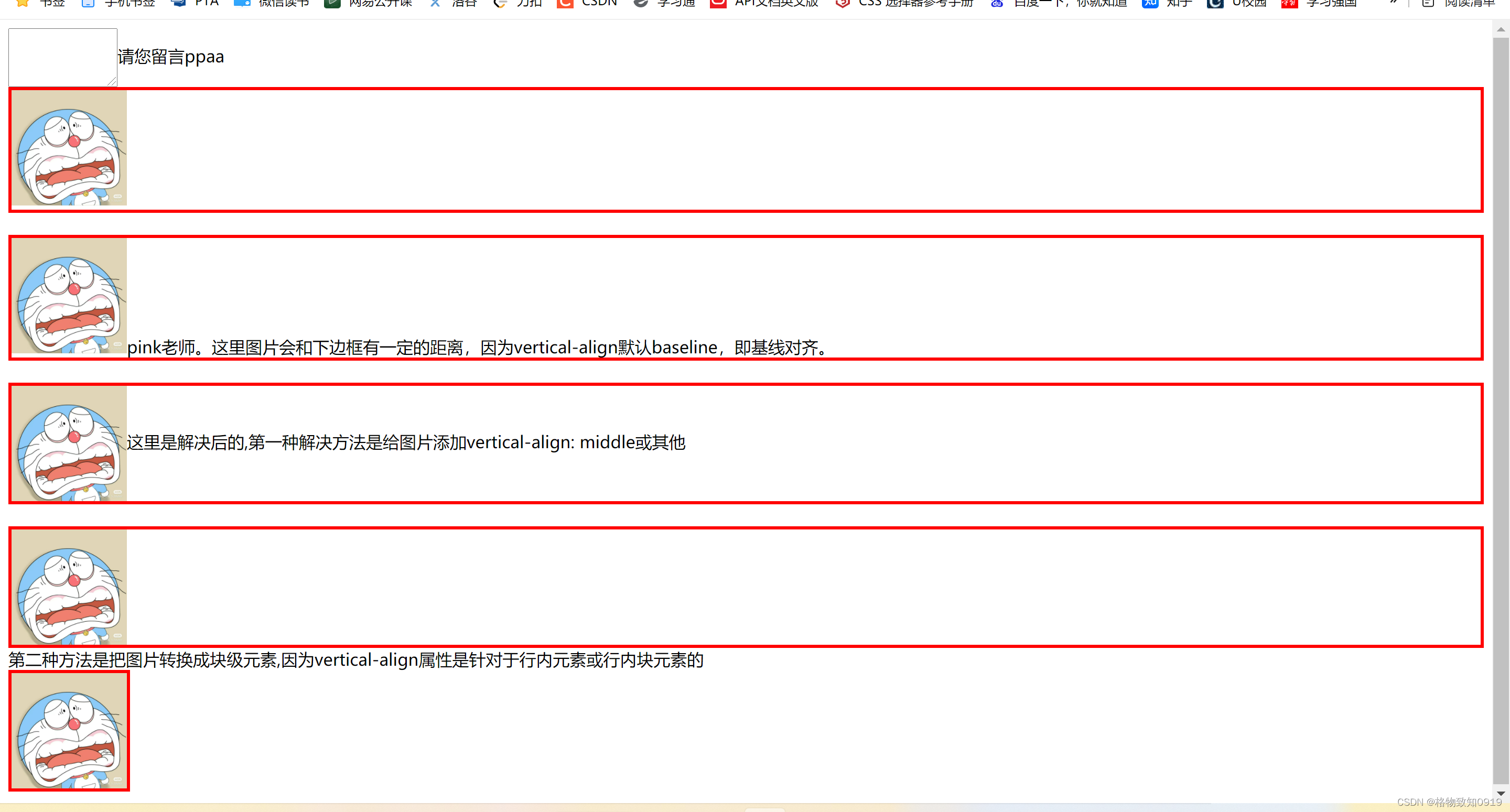


 3733
3733


 被折叠的 条评论
为什么被折叠?
被折叠的 条评论
为什么被折叠?
 到【灌水乐园】发言


