


Matplotlib入门
1. Matplotlib的基本使用
1. 什么是Matplotlib?
Matplotlib是一个专门用于开发2D图表(包括3D图表)的库,可以以渐进和交互式的方式,来实现数据可视化。
2. 图形绘制流程:
1)导入matplotlib.pyplot模块。
import matplotlib.pyplot as plt
2)创建画布:plt.figure(figsize=(), dpi=)。
figsize:设置长宽比;dpi:设置图像清晰度。
3)绘制图像:plt.plot(x, y)。
- 第一个参数传x轴对应的值,第二个参数传y轴对应的值。
4)显示图像:plt.show()。
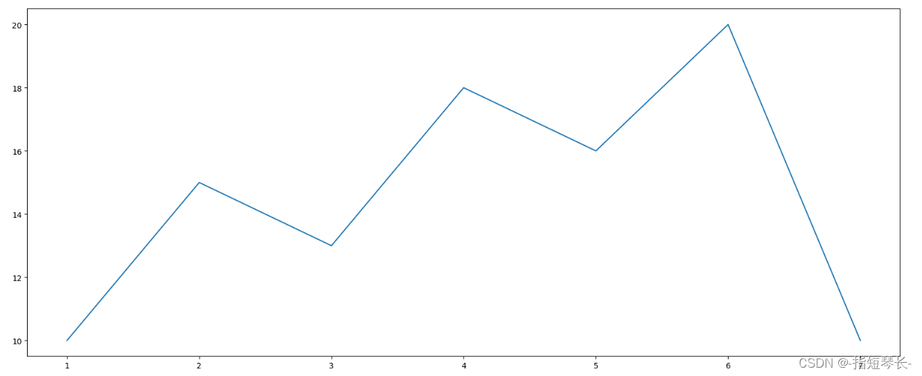
3. 实现一个简单的Matplotlib画图 – 以折线图为例:
需求:绘制河南一周的气温折线图。
1)导入Matplotlib.pytplot模块:
In [1]: import matplotlib.pyplot as plt
2)绘制图像:
In [2]: # 1.创建画布
		# figure设置长宽比,dpi设置图像清晰度
		plt.figure(figsize=(20,8), dpi=100)

		# 2.绘制图像
		# 第一个参数是x轴的数值,第二个参数是y轴的数值
		plt.plot([1,2,3,4,5,6,7], [10,15,13,18,16,20,10])

		# 3.图像显示
		plt.show()
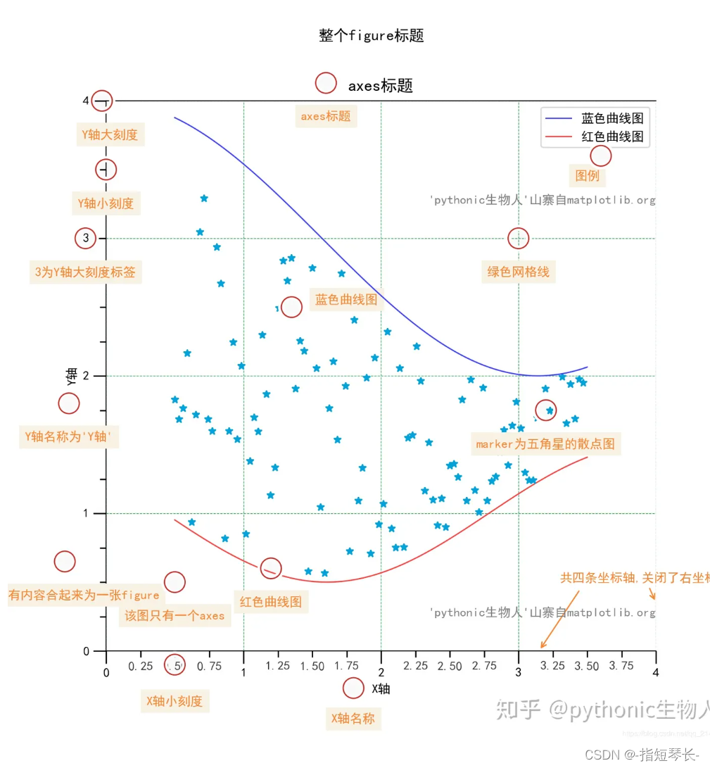
4. 认识Matplotlib的图像结构:
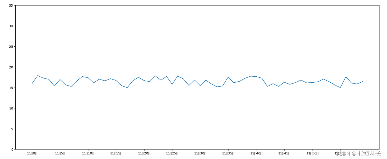
2. 绘制某城市的气温折线图,如下图(以折线图为例)
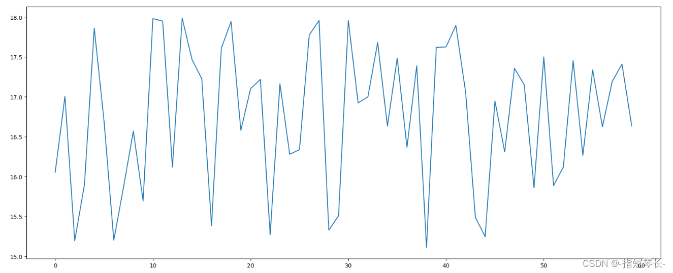
2.1 基础绘图功能
In [1]: import matplotlib.pyplot as plt
		import random

In [2]: # 0. 准备数据
		x = range(60)
		y_henan = [random.uniform(15, 18) for i in x]

		# 1. 创建画布
		plt.figure(figsize=(20, 8), dpi=100)

		# 2. 绘制图像
		plt.plot(x, y_henan)

		# 3. 图像显示
		plt.show()
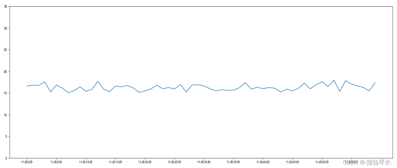
2.2 自定义x,y轴刻度
In [3]: # 0. 准备数据
		x = range(60)
		y_henan = [random.uniform(15, 18) for i in x]

		# 1. 创建画布
		plt.figure(figsize=(20, 8), dpi=100)

		# 2. 绘制图像
		plt.plot(x, y_henan)

		# 2.1 添加x,y轴刻度
		x_ticks_label = ["11点{}分".format(i) for i in x]
		y_ticks = range(40)

		# 修改x,y坐标刻度显示
		# 想打印字符不能直接打印,要先打印数字然后再替换成字符串
		# plt.xticks(x_ticks_label[::5]) 报错,不能用字符串直接修改
		plt.xticks(x[::5], x_ticks_label[::5]) # 横坐标显示间隔为5,第一个参数是数字,第二个是要替换的字符
		plt.yticks(y_ticks[::5]) # 纵坐标显示间隔为5

		# 3. 图像显示
		plt.show()
上图中并没有打印出汉字,下面我们来解决一下这个问题:
在Python脚本中动态设置matplotlibrc,具体代码如下:
from pylab import mpl
# 设置显示中文字体
mpl.rcParams["font.sans-serif"] = ["SimHei"]
有时,字体更改后,会导致坐标轴中的部分字符无法正常显示,此时需要修改axes.unicode_minus参数:
# 设置正常显示符号
mpl.rcParams["axes.unicode_minus"] = False
我们来实际演示一下:
In [1]: import matplotlib.pyplot as plt
		import random

		from pylab import mpl
		# 设置显示中文字体
		mpl.rcParams["font.sans-serif"] = ["SimHei"]

In [2]: # 0. 准备数据
		x = range(60)
		y_henan = [random.uniform(15, 18) for i in x]

		# 1. 创建画布
		plt.figure(figsize=(20, 8), dpi=100)

		# 2. 绘制图像
		plt.plot(x, y_henan)

		# 2.1 添加x,y轴刻度
		x_ticks_label = ["11点{}分".format(i) for i in x]
		y_ticks = range(40)

		# 修改x,y坐标刻度显示
		plt.xticks(x[::5], x_ticks_label[::5]) # 坐标间隔为5
		plt.yticks(y_ticks[::5]) # 坐标间隔为5

		# 3. 图像显示
		plt.show()
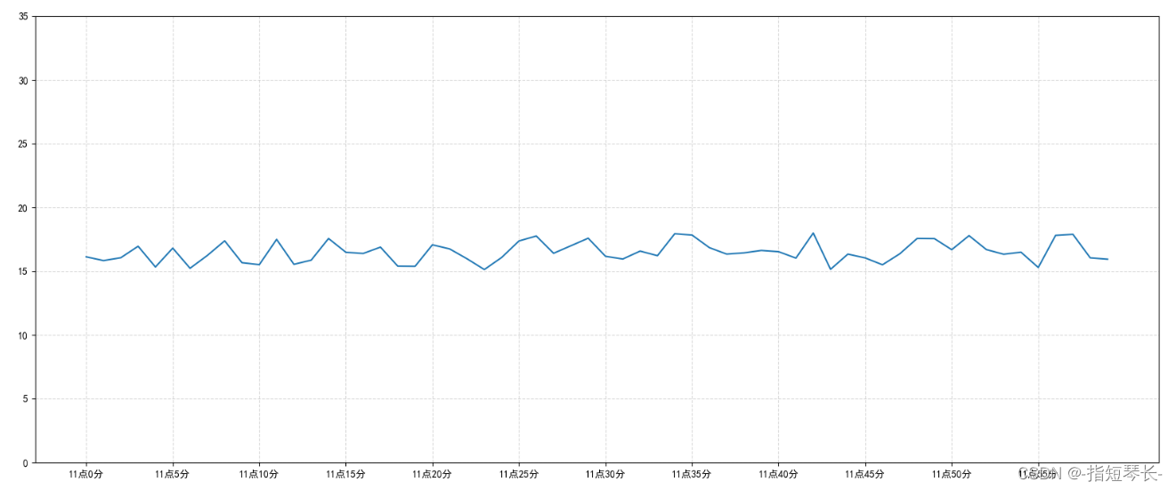
2.3 添加网格显示
1. 添加网格显示的方法:
plt.grid(True, linestyle='--', alpha=0.5)
True表示显示;linestyle用来设置网格线的格式,'--'是虚线;alpha为透明度。
2. 实际运用一下:
IN [3]: # 0. 准备数据
		x = range(60)
		y_henan = [random.uniform(15, 18) for i in x]

		# 1. 创建画布
		plt.figure(figsize=(20, 8), dpi=100)

		# 2. 绘制图像
		plt.plot(x, y_henan)

		# 2.1 添加x,y轴刻度
		x_ticks_label = ["11点{}分".format(i) for i in x]
		y_ticks = range(40)

		# 修改x,y坐标刻度显示
		plt.xticks(x[::5], x_ticks_label[::5]) # 坐标间隔为5
		plt.yticks(y_ticks[::5]) # 坐标间隔为5

		# 2.2 添加网格显示
		plt.grid(True, linestyle='--', alpha=0.5)

		# 3. 图像显示
		plt.show()
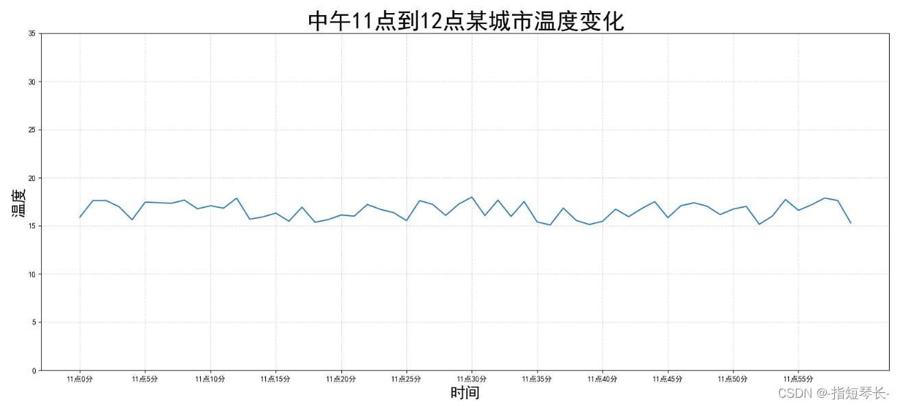
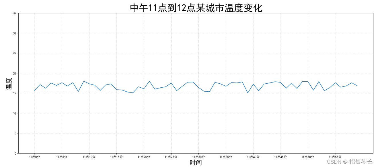
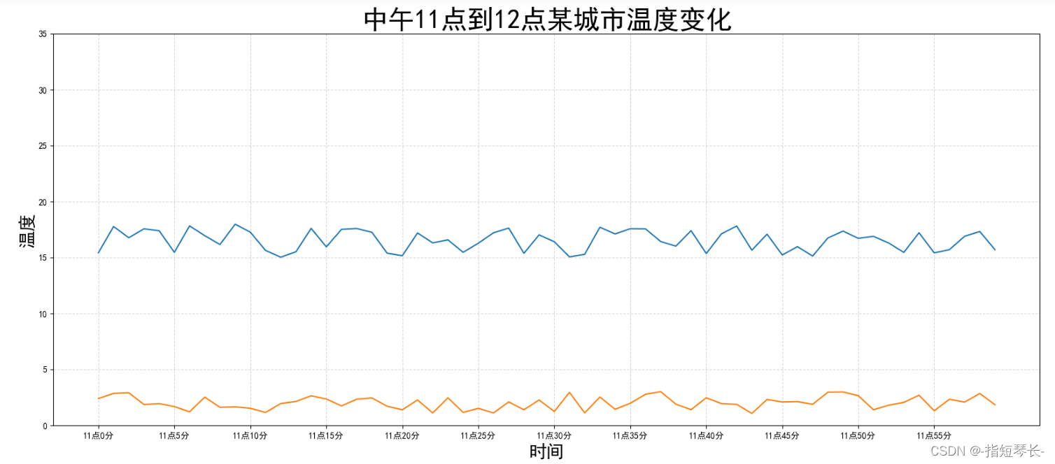
2.4 添加描述信息
添加X轴Y轴描述信息及标题,可以通过fontsize参数修改图像中字体的大小。
plt.xlabel:设置X轴描述信息;plt.ylabel:设置Y轴描述信息;plt.title:设置标题信息。
In [4]: # 0. 准备数据
		x = range(60)
		y_henan = [random.uniform(15, 18) for i in x]

		# 1. 创建画布
		plt.figure(figsize=(20, 8), dpi=100)

		# 2. 绘制图像
		plt.plot(x, y_henan)

		# 2.1 添加x,y轴刻度
		x_ticks_label = ["11点{}分".format(i) for i in x]
		y_ticks = range(40)

		# 修改x,y坐标刻度显示
		plt.xticks(x[::5], x_ticks_label[::5]) # 坐标间隔为5
		plt.yticks(y_ticks[::5]) # 坐标间隔为5

		# 2.2 添加网格显示
		plt.grid(True, linestyle='--', alpha=0.5)

		# 2.3 添加描述信息
		plt.xlabel('时间', fontsize=20)
		plt.ylabel('温度', fontsize=20)
		plt.title('中午11点到12点某城市温度变化', fontsize=30)

		# 3. 图像显示
		plt.show()
2.5 图像保存
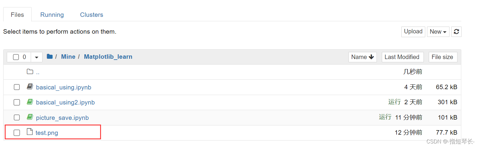
保存图片到指定路径:plt.savefig("test.png")
注意:plt.show()会释放figure资源,如果在显示图像之后保存图片将只能保存空图片。
完整代码:
In [1]: import matplotlib.pyplot as plt
		import random
		from pylab import mpl

		# 设置显示中文字体
		mpl.rcParams["font.sans-serif"] = ["SimHei"]

In [2]: # 0. 准备数据
		x = range(60)
		y_henan = [random.uniform(15, 18) for i in x]

		# 1. 创建画布
		plt.figure(figsize=(20, 8), dpi=100)

		# 2. 绘制图像
		plt.plot(x, y_henan)

		# 2.1 添加x,y轴刻度
		x_ticks_label = ["11点{}分".format(i) for i in x]
		y_ticks = range(40)

		# 修改x,y坐标刻度显示
		plt.xticks(x[::5], x_ticks_label[::5]) # 坐标间隔为5
		plt.yticks(y_ticks[::5]) # 坐标间隔为5

		# 2.2 添加网格显示
		plt.grid(True, linestyle='--', alpha=0.5)

		# 2.3 添加描述信息
		plt.xlabel('时间', fontsize=20)
		plt.ylabel('温度', fontsize=20)
		plt.title('中午11点到12点某城市温度变化', fontsize=30)

		# 2.4 图像保存
		plt.savefig("./test.png")

		# 3. 图像显示
		plt.show()
执行后查看test.png文件是否产生:
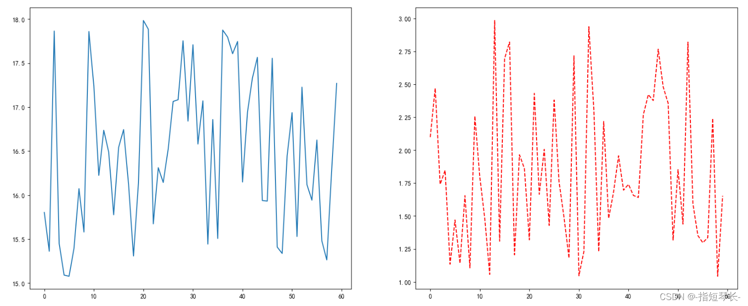
3. 在一个坐标系中绘制多个图像
3.1 多次plot
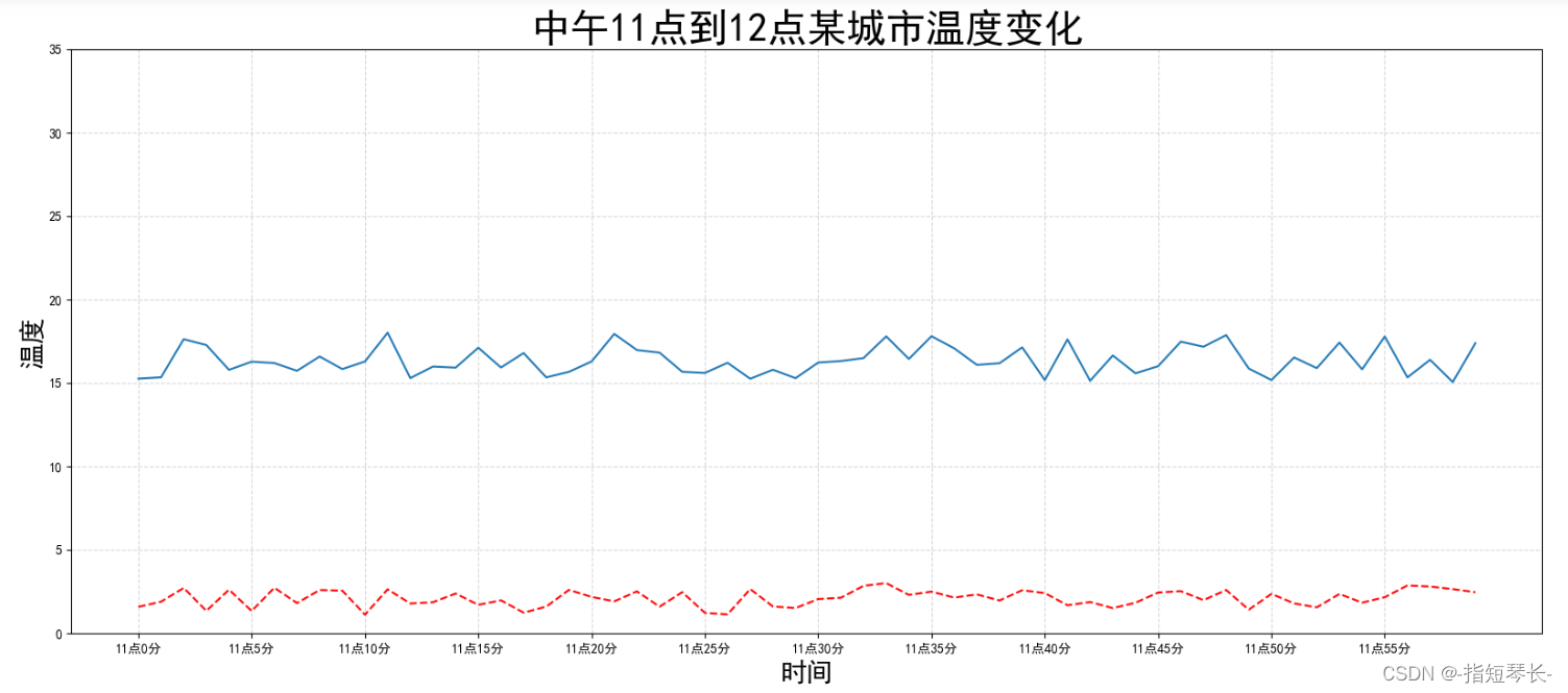
需求:再增加一个城市的温度变化。
收集到北京当天温度变化情况,温度在1度到3度。怎么去添加另一个在同一坐标系当中的不同图形,其实很简单,只需要再次plot即可,但是区分线条,如下显示:
# 增加北京的温度数据
y_beijing = [random.uniform(1, 3) for i in x]

# 绘制折线图
plt.plot(x, y_henan)
# 使用多次plot可以画多个折线
plt.plot(x, y_beijing)
3.2 设置图像风格
| 颜色字符 | 风格字符 |
|---|---|
| r红色 | - 实线 |
| g 绿色 | -- 虚线 |
| b 蓝色 | -. 点划线 |
| w 白色 | : 点虚线 |
| c 青色 | `` 留空、空格 |
| m 洋红 | |
| y 黄色 | |
| k 黑色 |
演示一下:
In [3]: # 0. 准备数据
		x = range(60)
		y_henan = [random.uniform(15, 18) for i in x]
		y_beijing = [random.uniform(1, 3) for i in x]

		# 1. 创建画布
		plt.figure(figsize=(20, 8), dpi=100)

		# 2. 绘制图像
		plt.plot(x, y_henan)
		plt.plot(x, y_beijing, color='r', linestyle='--') # 红色虚线

		# 2.1 添加x,y轴刻度
		x_ticks_label = ["11点{}分".format(i) for i in x]
		y_ticks = range(40)

		# 修改x,y坐标刻度显示
		plt.xticks(x[::5], x_ticks_label[::5]) # 坐标间隔为5
		plt.yticks(y_ticks[::5]) # 坐标间隔为5

		# 2.2 添加网格显示
		plt.grid(True, linestyle='--', alpha=0.5)

		# 2.3 添加描述信息
		plt.xlabel('时间', fontsize=20)
		plt.ylabel('温度', fontsize=20)
		plt.title('中午11点到12点某城市温度变化', fontsize=30)

		# 2.4 图像保存
		plt.savefig("./test.png")

		# 3. 图像显示
		plt.show()
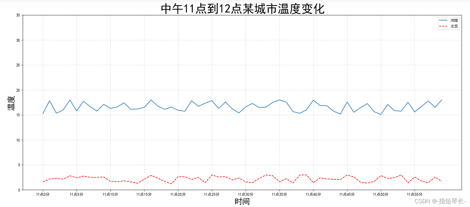
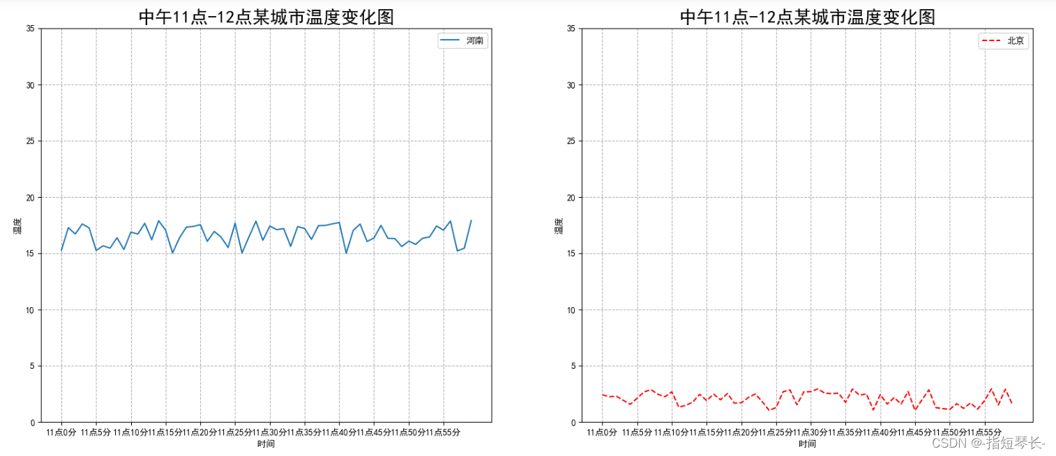
3.3 显示图例
- 注意:如果只在
plt.plot()中设置label还不能最终显示出图例,还需要通过plt.legend()将图例显示出来。
# 绘制折线图
plt.plot(x, y_henan, label='河南')
# 使用多次plot可以画多个折线
plt.plot(x, y_beijing, color='r', linestyle='--', label='北京')

# 显示图例
plt.legend(loc='best')
| Location String | Location Code |
|---|---|
| ‘best’ | 0 |
| ‘upper right’ | 1 |
| ‘upper left’ | 2 |
| ‘lower right’ | 3 |
| ‘lower right’ | 4 |
| ‘right’ | 5 |
| ‘center left’ | 6 |
| ‘center right’ | 7 |
| ‘lower center’ | 8 |
| ‘upper center’ | 9 |
| ‘center’ | 10 |
完整代码:
In [4]: # 0. 准备数据
		x = range(60)
		y_henan = [random.uniform(15, 18) for i in x]
		y_beijing = [random.uniform(1, 3) for i in x]

		# 1. 创建画布
		plt.figure(figsize=(20, 8), dpi=100)

		# 2. 绘制图像
		plt.plot(x, y_henan, label='河南')
		plt.plot(x, y_beijing, color='r', linestyle='--', label='北京') # 红色虚线

		# 2.1 添加x,y轴刻度
		x_ticks_label = ["11点{}分".format(i) for i in x]
		y_ticks = range(40)

		# 修改x,y坐标刻度显示
		plt.xticks(x[::5], x_ticks_label[::5]) # 坐标间隔为5
		plt.yticks(y_ticks[::5]) # 坐标间隔为5

		# 2.2 添加网格显示
		plt.grid(True, linestyle='--', alpha=0.5)

		# 2.3 添加描述信息
		plt.xlabel('时间', fontsize=20)
		plt.ylabel('温度', fontsize=20)
		plt.title('中午11点到12点某城市温度变化', fontsize=30)

		# 2.4 图像保存
		plt.savefig("./test.png")

		# 2.5 显示图例
		plt.legend(loc='best')

		# 3. 图像显示
		plt.show()
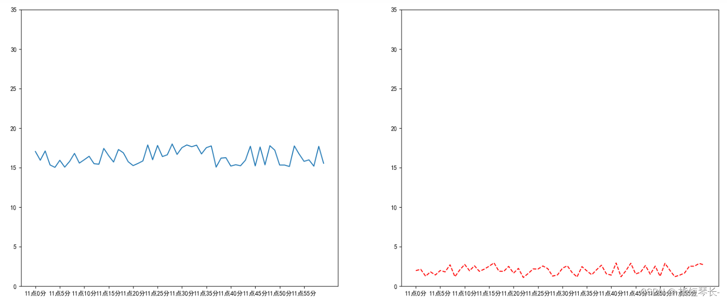
4. 在多个坐标系下绘制图形——plt.subplots(面向对象的画图方法)
如果我们想让河南和北京的天气显示在一张图的不同坐标系中,效果如下:
可以通过subplots函数实现。
4.1 基本绘图
1)matplotlib.pyplot.subplots(nrows=1, ncols=1, **fig_kw)创建一个带有多个axes(坐标系/绘图区)的图。
参数:
nrows,nclos:设置有几行几列坐标系。
返回值(有两个):
fig:图对象;axes:返回相应数量的坐标系。
2)plt.函数名()相当于面向过程的画图方法,axes.set_方法名()相当于面向对象的画图方法。
In [1]: import matplotlib.pyplot as plt
		import random
		from pylab import mpl

		# 设置显示中文字体
		mpl.rcParams["font.sans-serif"] = ["SimHei"]

In [2]: # 0. 准备数据
		x = range(60)
		y_henan = [random.uniform(15, 18) for i in x]
		y_beijing = [random.uniform(1, 3) for i in x]

		# 1. 创建画布
		fig, axes = plt.subplots(nrows=1, ncols=2, figsize=(20, 8), dpi=100) # 用两个对象承接

		# 2. 绘制图像
		axes[0].plot(x, y_henan, label = '河南')
		axes[1].plot(x, y_beijing, color = 'r', linestyle = '--', label = '北京')

		# 3. 显示图像
		plt.show()
4.2 自定义x,y轴刻度
In [3]: # 0. 准备数据
		x = range(60)
		y_henan = [random.uniform(15, 18) for i in x]
		y_beijing = [random.uniform(1, 3) for i in x]

		# 1. 创建画布
		fig, axes = plt.subplots(nrows=1, ncols=2, figsize=(20, 8), dpi=100) # 用两个对象承接

		# 2. 绘制图像
		axes[0].plot(x, y_henan, label = '河南')
		axes[1].plot(x, y_beijing, color = 'r', linestyle = '--', label = '北京')

		# 2.1 添加x,y轴刻度
		# 设置x, y轴刻度
		x_ticks_label = ['11点{}分'.format(i) for i in x]
		y_ticks = range(40)

		# 修改x, y轴坐标刻度显示
		axes[0].set_xticks(x[::5])
		axes[0].set_yticks(y_ticks[::5])
		axes[0].set_xticklabels(x_ticks_label[::5])
		axes[1].set_xticks(x[::5])
		axes[1].set_yticks(y_ticks[::5])
		axes[1].set_xticklabels(x_ticks_label[::5])

		# 3. 显示图像
		plt.show()
4.3 添加网格显示,添加描述信息,图像保存
In [4]: # 0. 准备数据
		x = range(60)
		y_henan = [random.uniform(15, 18) for i in x]
		y_beijing = [random.uniform(1, 3) for i in x]

		# 1. 创建画布
		fig, axes = plt.subplots(nrows=1, ncols=2, figsize=(20, 8), dpi=100) # 用两个对象承接

		# 2. 绘制图像
		axes[0].plot(x, y_henan, label = '河南')
		axes[1].plot(x, y_beijing, color = 'r', linestyle = '--', label = '北京')

		# 2.1 添加x,y轴刻度
		# 设置x, y轴刻度
		x_ticks_label = ['11点{}分'.format(i) for i in x]
		y_ticks = range(40)

		# 修改x, y轴坐标刻度显示
		axes[0].set_xticks(x[::5])
		axes[0].set_yticks(y_ticks[::5])
		axes[0].set_xticklabels(x_ticks_label[::5])
		axes[1].set_xticks(x[::5])
		axes[1].set_yticks(y_ticks[::5])
		axes[1].set_xticklabels(x_ticks_label[::5])

		# 2.2 添加网格显示
		axes[0].grid(True, linestyle='--', alpha=1)
		axes[1].grid(True, linestyle='--', alpha=1)

		# 2.3 添加描述信息
		axes[0].set_xlabel('时间')
		axes[0].set_ylabel('温度')
		axes[0].set_title('中午11点-12点某城市温度变化图', fontsize=20)
		axes[1].set_xlabel('时间')
		axes[1].set_ylabel('温度')
		axes[1].set_title('中午11点-12点某城市温度变化图', fontsize=20)

		# 2.4 图像保存
		plt.savefig('./test.png')

		# 2.5 显示图例
		axes[0].legend(loc=0)
		axes[1].legend(loc=0)

		# 3. 显示图像
		plt.show()

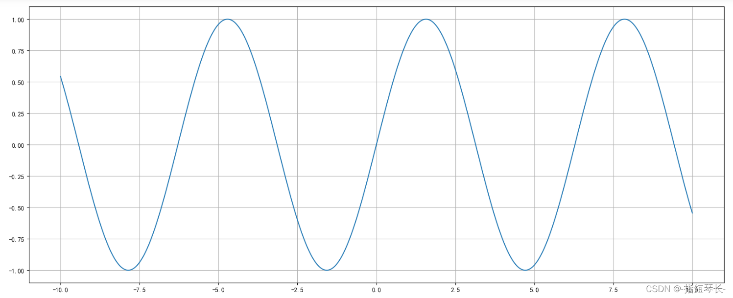
5. 使用plot画数学图像
plt.plot()出了可以画折线图,也可以用于画各种数学图像。
IN [1]: import matplotlib.pyplot as plt
		import random
		from pylab import mpl

		# 设置显示中文字体
		mpl.rcParams["font.sans-serif"] = ["SimHei"]
		# 设置正常显示符号
		mpl.rcParams["axes.unicode_minus"] = False

In [2]: import numpy as np
		# 0. 准备数据
		x = np.linspace(-10, 10, 1000)
		y = np.sin(x)

		# 1. 创建画布
		plt.figure(figsize=(20, 8), dpi=100)

		# 2. 绘制函数图像
		plt.plot(x, y)
		# 2.1 添加网格显示
		plt.grid()

		# 3. 显示图像
		plt.show()
6. 常见图形绘制
6.1 折线图
特点:能够显示数据的变化趋势,反应事物的变化情况。
具体细节前面已经讲的很详细了,这里就不再赘述了。
6.2 散点图
1. 定义:用两组数据构成多个坐标点,考察坐标点的分布,判断两变量之间是否存在某种关联或总结坐标点的分布模式。
2. 特点:判断变量之间是否存在数量关联趋势,展示分布规律。
3. 绘图函数:plt.scatter(x, y)
需求:探究房屋面积和房屋价格的关系。
In [1]: import matplotlib.pyplot as plt
		import random
		from pylab import mpl

		# 设置显示中文字体
		mpl.rcParams["font.sans-serif"] = ["SimHei"]
		# 设置正常显示符号
		mpl.rcParams["axes.unicode_minus"] = False

In [2]: # 0. 准备数据
		# 房屋面积数据
		x = [225.98, 247, 253.14, 457.85, 241.58, 301.01, 20.67, 288.64,
     		163.56, 120.06, 207.06, 342.75, 147.9, 53.06, 224.72, 29.51,
     		21.61, 483.21, 245.25, 399.25, 343.35]
		# 房屋价格数据
		y = [196.63, 203.88, 210.75, 372.74, 202.41, 247.61, 24.9, 239.34,
     		140.32, 104.15, 176.84, 288.23, 128.79, 49.64, 191.74, 33.1,
     		30.74, 400.02, 205.35, 330.64, 283.45]

		# 1. 创建画布
		plt.figure(figsize=(20, 8), dpi=100)

		# 2. 绘制散点图
		plt.scatter(x, y)

		# 3. 显示图像
		plt.show()
6.3 柱状图
1. 特点:能够一眼看出各个数据的大小,比较数据之间的差别。(统计/对比)
2. 绘图函数:plt.bar(x, y, width, align='center', **kwargs)
x, y:需要传递的数据;width:柱状图的宽度;align:每个柱状图的位置对齐方式;**kwargs:color选择柱状图的颜色。
In [3]: # 0. 准备数据
		# 电影名字
		movie_name = ['雷神3:诸神黄昏', '正义联盟', '东方快车谋杀案', '寻梦环游记', '全球风暴', '降魔传', '追捕', '七十七天', '密战', '狂兽', '其他']
		# 横坐标
		x = range(len(movie_name))
		# 票房数据
		y = [73853, 57767, 22354, 15969, 14839, 8725, 8716, 8318, 7916, 6764, 52222]

		# 1. 创建画布
		plt.figure(figsize=(20,8), dpi=100)

		# 2. 绘制图像
		plt.bar(x, y, color=['b', 'r', 'g', 'y', 'c', 'm', 'y', 'k', 'c', 'g', 'b'], width=0.7)

		# 2.1 修改x轴显示
		plt.xticks(x, movie_name)

		# 2.2 添加网格显示,添加标题
		plt.grid(linestyle='--', alpha=0.8)

		# 2.3 添加标题
		plt.title('电影票房收入对比', fontsize=30)

		# 3. 图像显示
		plt.show()
6.4 直方图
1. 定义:由一系列高度不等的纵向条纹或线段表示数据分布的情况。一般用横轴表示数据范围,纵轴表示分布情况。
2. 特点:绘制连续性的数据,展示一组或者多组数据的分布状况(统计)。
3. 绘图函数:plt.hist(x, bins=None)
参数:
x:需要传递的数据;bins:组距。
In [4]: # 0. 准备数据
		x = [225.98, 247, 253.14, 457.85, 241.58, 301.01, 20.67, 288.64,
     		163.56, 120.06, 207.06, 342.75, 147.9, 53.06, 224.72, 29.51,
     		21.61, 483.21, 245.25, 399.25, 343.35]

		# 1. 创建画布
		plt.figure(figsize=(20, 8), dpi=100)

		# 2. 绘制直方图
		plt.hist(x, bins=30)

		# 3. 显示图像
		plt.show()
6.5 饼图
1. 定义:用于表示不同分类的占比情况,通过弧度大小来对比各种分类。
2. 特点:反映分类数据的占比情况。
3. 绘图函数:plt.pie(x, labels=, autopct=, colors)
参数:
x:数量,自动算百分比;labels:每部分名称;autopct:占比显示指定;colors:每部分颜色。
In [5]: # 0. 准备数据
		x = [10, 20, 30, 5, 44, 8, 9]

		# 1. 创建画布
		plt.figure(figsize=(20, 8), dpi=100)

		# 2. 绘制直方图
		plt.pie(x)

		# 3. 显示图像
		plt.show()


 4907
4907

 被折叠的 条评论
为什么被折叠?
被折叠的 条评论
为什么被折叠?
 到【灌水乐园】发言


