


项目实现
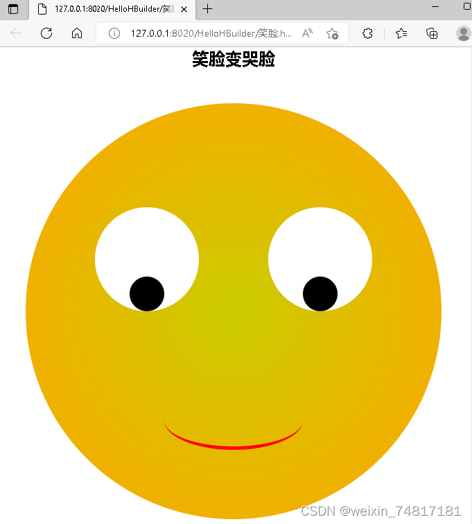
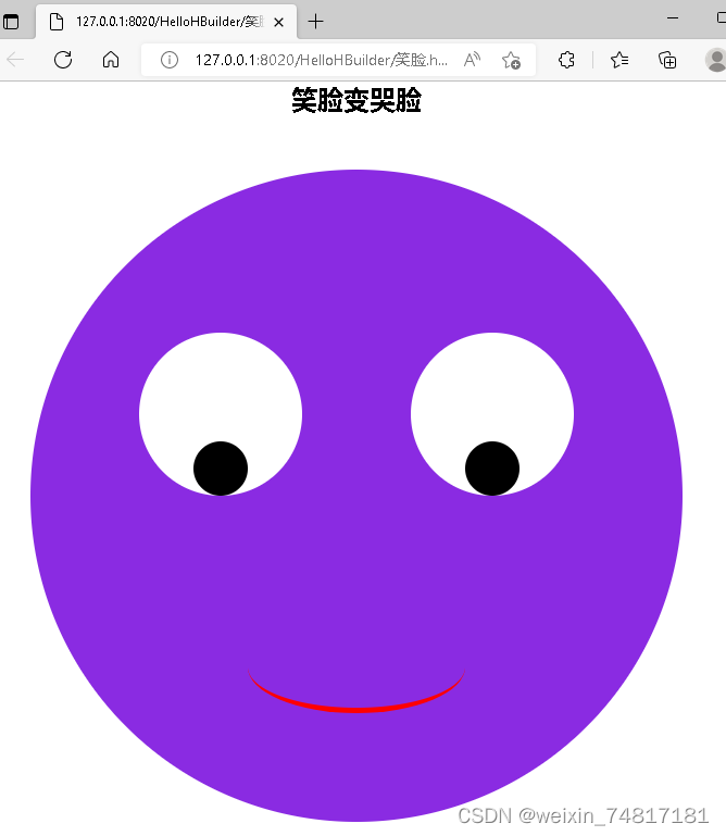
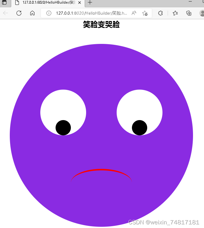
通过代码实现笑脸哭脸的转变,先建立div块,分别命名为脸,左眼,右眼,眼球,嘴巴,再依次确定他们的位置,整张脸处于页面中间的位置,通过css设置样式,脸的大小,背景颜色和位置,眼睛的大小和在脸部的位置,嘴巴的位大小,位置和弯曲方向,当鼠标放置在脸部时候脸部背景颜色改变,当鼠标放在嘴巴上的时候嘴巴的弯曲方向改变,从而实现笑脸到哭脸的转变。
代码
<!DOCTYPE html>
<html>
<head>
<meta charset="UTF-8">
<title></title>
<style type="text/css">
*{
margin: 0;
padding: 0;
}
.face {
width: 600px;
height: 600px;
background-image: radial-gradient(#cc0,orange);
border-radius: 50%;
margin: 50px auto;
position: relative;
}
.face:hover {
background: blueviolet;
}
.eye {
width: 150px;
height: 150px;
background-color: #fff;
border-radius: 50%;
position: absolute;
top: 150px;
}
.left {
left: 100px;
}
.right {
right: 100px;
}
.ball {
width: 50px;
height: 50px;
background-color: #000;
border-radius: 50%;
position: absolute;
top: 100px;
left: 50px;
bottom: 0;
}
.mouth {
width: 200px;
height: 80px;
border-radius: 50%;
border-bottom: 5px solid red;
position: absolute;
left: 200px;
bottom: 100px;
}
.mouth:hover {
border-bottom: 5px solid blueviolet;
border-top: 5px solid red;
}
</style>
</head>
<body>
<h2 align="middle">笑脸变哭脸</h2>
<div class="face">
<div class="eye left">
<div class="ball"></div>
</div>
<div class="eye right">
<div class="ball"></div>
</div>
<div class="mouth"></div>
</div>
</body>
</html>


 4615
4615


 被折叠的 条评论
为什么被折叠?
被折叠的 条评论
为什么被折叠?
 到【灌水乐园】发言


