


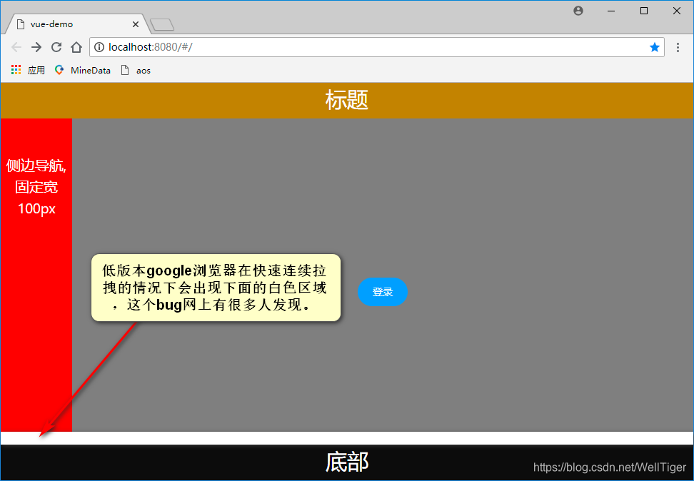
vue框架界面 clientWidth在一些低版本google浏览器下拉伸自适应的问题
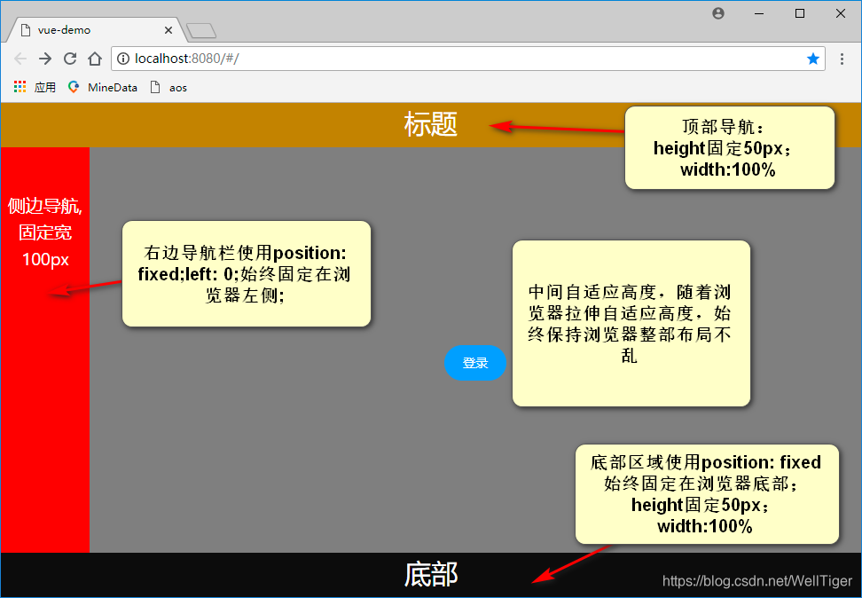
很多大的项目在框架设计中依然会采用传统布局方式,尤其是复杂平板、移动端项目;我公司200人设计开发一个复杂的多业务支持平板、手机、桌面的项目;但在低版本google浏览器下出现了拉伸不铺满的情况;
例子场景如下:
1.假设框架
<template>
  <div style=";width:100%;height: 100%;">
    <div style="height:50px;background-color: darkgoldenrod;width: 100%;color: white;font-size: 30px;text-align: center">
      标题
    </div>
    <div style="width: 100%;">
      <div :style="{minHeight:minHeight+'px'}"
           style="z-index: 2;position: fixed;left: 0;background-color: red;width: 100px;color: white;font-size: 20px;text-align: center">
        <label style="margin-top: 50%">侧边导航,<br>固定宽100px</label>
      </div>
      <div id="app"
           :style="{minHeight:minHeight+'px',minWidth:minWidth+'px'}"
           style="position: absolute;margin-left:100px;background-color: grey;padding: 0px">
        <router-view/>
      </div>
    </div>
    <div
      style="z-index: 2;position: fixed;bottom: 0;height: 50px;width: 100%;background-color: #0a0a0a;color: white;font-size: 30px;text-align: center">
      底部
    </div>
  </div>
</template>

<script>
  export default {
    name: 'App',
    data() {
      return {
        minHeight: 0,
        minWidth: 0,
      }
    },
    mounted() {
      this.init();
    },
    methods: {
      init: function () {
        this.minHeight = document.documentElement.clientHeight - 100;
        this.minWidth = document.documentElement.clientWidth - 100;
        var that = this;
        window.onresize = function () {
          that.minHeight = document.documentElement.clientHeight - 100;
          that.minWidth = document.documentElement.clientWidth - 100;
        }
      },
    },
  }
</script>

<style scoped>
  #app {
    margin: 0;
    padding: 0;
  }
</style>
2.解决方法
简单的加了一个定时器用于浏览器拉伸时window.onresize生效的问题
<template>
  <div style=";width:100%;height: 100%;">
    <div style="height:50px;background-color: darkgoldenrod;width: 100%;color: white;font-size: 30px;text-align: center">
      标题
    </div>
    <div style="width: 100%;">
      <div :style="{minHeight:minHeight+'px'}"
           style="z-index: 2;position: fixed;left: 0;background-color: red;width: 100px;color: white;font-size: 20px;text-align: center">
        <label style="margin-top: 50%">侧边导航,<br>固定宽100px</label>
      </div>
      <div id="app"
           :style="{minHeight:minHeight+'px',minWidth:minWidth+'px'}"
           style="position: absolute;margin-left:100px;background-color: grey;padding: 0px">
        <router-view/>
      </div>
    </div>
    <div
      style="z-index: 2;position: fixed;bottom: 0;height: 50px;width: 100%;background-color: #0a0a0a;color: white;font-size: 30px;text-align: center">
      底部
    </div>
  </div>
</template>

<script>
  export default {
    name: 'App',
    data() {
      return {
        minHeight: 0,
        minWidth: 0,
      }
    },
    mounted() {
      this.init();
    },
    methods: {
      init: function () {
        this.minHeight = document.documentElement.clientHeight - 100;
        this.minWidth = document.documentElement.clientWidth - 100;
        var that = this;
        window.onresize = function () {
          that.minHeight = document.documentElement.clientHeight - 100;
          that.minWidth = document.documentElement.clientWidth - 100;

          setTimeout(function () {
            that.minHeight = document.documentElement.clientHeight - 100;
            that.minWidth = document.documentElement.clientWidth - 100;
          }, 10)
        }
      },
    },
  }
</script>

<style scoped>
  #app {
    margin: 0;
    padding: 0;
  }
</style>


 2280
2280


 被折叠的 条评论
为什么被折叠?
被折叠的 条评论
为什么被折叠?
 到【灌水乐园】发言


