


1、Viewport:
viewport 是用户网页的可视区域。
一个常用的针对移动网页优化过的页面的 viewport meta 标签大致如下:
<meta name="viewport" content="width=device-width,height=device-height,inital-scale=1.0,maximum-scale=1.0,user-scalable=no;" />2、网格视图:
响应式网格视图通常是 12 列,宽度为100%,在浏览器窗口大小调整时会自动伸缩。
创建响应式网格视图:
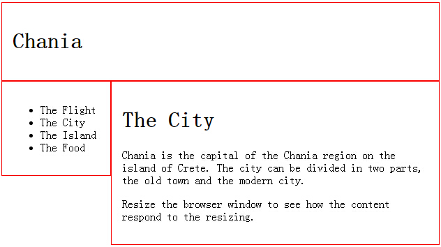
首先确保所有的 HTML 元素都有 box-sizing 属性且设置为 border-box:
<!DOCTYPE html>
<html>
<head>
<meta name="viewport" content="width=device-width, initial-scale=1.0">
<style>
* {
    box-sizing: border-box;
}
.header {
    border: 1px solid red;
    padding: 15px;
}
.menu {
    width: 25%;
    float: left;
    padding: 15px;
    border: 1px solid red;
}
.main {
    width: 75%;
    float: left;
    padding: 15px;
    border: 1px solid red;
}
</style>
</head>
<body>

<div class="header">
<h1>Chania</h1>
</div>

<div class="menu">
<ul>
<li>The Flight</li>
<li>The City</li>
<li>The Island</li>
<li>The Food</li>
</ul>
</div>

<div class="main">
<h1>The City</h1>
<p>Chania is the capital of the Chania region on the island of Crete. The city can be divided in two parts, the old town and the modern city.</p>
<p>Resize the browser window to see how the content respond to the resizing.</p>
</div>

</body>
</html>
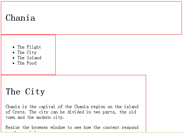
如果去掉 box-sizing: border-box;的话,效果如下:
每一行使用 <div> 包裹。所有列数加起来应为 12:
<div class="row">
  <div class="col-3">...</div>
  <div class="col-9">...</div>
</div>
3、媒体查询:
如果浏览器窗口小于500px,背景将变为浅蓝色:
@media only screen and (max-width: 500px) {
    body {
        background-color: lightblue;
    }
}
为移动端优先设计,添加断点:
/* For mobile phones: */
[class*="col-"] {
    width: 100%;
}
@media only screen and (min-width: 600px) {
    /* For tablets: */
    .col-m-1 {width: 8.33%;}
    .col-m-2 {width: 16.66%;}
    .col-m-3 {width: 25%;}
    .col-m-4 {width: 33.33%;}
    .col-m-5 {width: 41.66%;}
    .col-m-6 {width: 50%;}
    .col-m-7 {width: 58.33%;}
    .col-m-8 {width: 66.66%;}
    .col-m-9 {width: 75%;}
    .col-m-10 {width: 83.33%;}
    .col-m-11 {width: 91.66%;}
    .col-m-12 {width: 100%;}
}
@media only screen and (min-width: 768px) {
    /* For desktop: */
    .col-1 {width: 8.33%;}
    .col-2 {width: 16.66%;}
    .col-3 {width: 25%;}
    .col-4 {width: 33.33%;}
    .col-5 {width: 41.66%;}
    .col-6 {width: 50%;}
    .col-7 {width: 58.33%;}
    .col-8 {width: 66.66%;}
    .col-9 {width: 75%;}
    .col-10 {width: 83.33%;}
    .col-11 {width: 91.66%;}
    .col-12 {width: 100%;}
}
一个实例:
<div class="row">
<div class="col-3 col-m-3">...</div>
<div class="col-6 col-m-9">...</div>
<div class="col-3 col-m-12">...</div>
</div>
其中,针对桌面设备(col),为3-6-3的比例设计
针对平板设备(col-m),为3-9-12的比例设计
4、响应式图片:
/* For width smaller than 400px: */
body {
    background-image: url('img_smallflower.jpg');
}

/* For width 400px and larger: */
@media only screen and (min-device-width: 400px) {
    body {
        background-image: url('img_flowers.jpg');
    }
}
div {
    width: 100%;
    height: 400px;
    background-image: url('img_flowers.jpg');
    background-size: 100% 100%;
    border: 1px solid red;
}


 1794
1794


 被折叠的 条评论
为什么被折叠?
被折叠的 条评论
为什么被折叠?
 到【灌水乐园】发言


