


响应式开发
1.响应式开发原理
就是使用媒体查询针对不同宽度的设备进行布局和样式设置,从而适配不同设备
响应式布局容器
响应式需要一个父级作为布局容器,来配合子级元素来实现变化
原理就是在不同屏幕下,通过媒体查询来改变布局容器的大小,再改变里面子元素的排列方式和大小,从而实现不同屏幕下,看到不同的页面布局和样式变化。
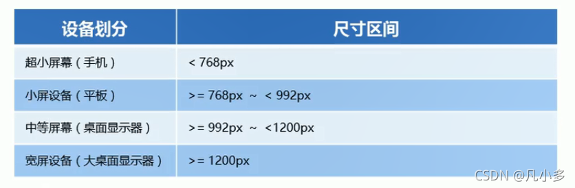
平时响应式尺寸的划分
- 超小屏幕(手机,小于768px):设置宽度100%
- 小屏幕(平板,大于等于768px):设置宽度750px
- 中等屏幕(桌面显示器,大于等于992px):设置宽度970px
- 大屏幕(大桌面显示器,大于等于1200px):设置宽度1170px
<!DOCTYPE html>
<html lang="en">
<head>
    <meta charset="UTF-8">
    <meta http-equiv="X-UA-Compatible" content="IE=edge">
    <meta name="viewport" content="width=device-width, initial-scale=1.0">
    <title>Document</title>
    <style>
        .container {
            height: 150px;
            margin: 0 auto;
            background-color: orangered;
        }
        /* 1. 超小屏幕 小于768px 宽度为100% */
        @media screen and (min-width: 767px) {
            .container {
                width: 100%;
            }
        }
        /* 2. 小屏幕 大于等于768px 宽度为750px */
        @media screen and (min-width: 768px) {
            .container {
                width: 750px;
            }
        }
        /* 3. 中等屏幕 大于等于992px 宽度为970px */
        @media screen and (min-width: 992px) {
            .container {
                width: 970px;
            }
        }
        /* 4. 大屏幕 大于等于1200px 宽度为1170px */
        @media screen and (min-width: 1200px) {
            .container {
                width: 1170px;
            }
        }
    </style>
</head>
<body>
    <div class="container"></div>
</body>
</html>
【案例:响应式导航】
<!DOCTYPE html>
<html lang="en">
<head>
    <meta charset="UTF-8">
    <meta http-equiv="X-UA-Compatible" content="IE=edge">
    <meta name="viewport" content="width=device-width, initial-scale=1.0">
    <title>Document</title>
    <style>
        * {
            margin: 0;
            padding: 0;
        }
        ul {
            list-style: none;
        }
        .container {
            width: 750px;
            margin: 0 auto;
        }
        .container ul li {
            float: left;
            width: 93.75px;
            height: 30px;
            background-color: orangered;
        }
        @media screen and (max-width: 767px) {
            .container {
                width: 100%;
            }
            .container ul li {
                width: 33.33%;
            }
        }
    </style>
</head>
<body>
    <div class="container">
        <ul>
            <li>导航栏</li>
            <li>导航栏</li>
            <li>导航栏</li>
            <li>导航栏</li>
            <li>导航栏</li>
            <li>导航栏</li>
            <li>导航栏</li>
            <li>导航栏</li>
        </ul>
    </div>
</body>
</html>
Bootstrap 快速开发
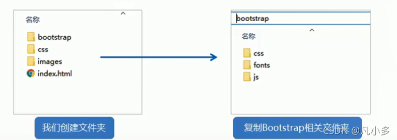
Bootstrp 使用步骤
-
创建文件夹结构
bootstrap文件夹用来放下载的bootstrap文件
-
创建html骨架
<!-- 要求当前网页使用IE浏览器最高版本的内核来渲染 -->
<meta http-equiv="X-UA-Compatible" content="IE=edge">
<!-- 视口的设置:视口的宽度和设备一致,默认的缩放比例和PC端一致,用户不能自行缩放 -->
<meta name="viewport" content="width=device-width, initial-scale=1, user-scalable=0">

<!-- 第一个js文件:解决ie9以下浏览器对html5新增标签的不识别,并导致CSS不起作用 -->
<!-- 第二个js文件:解决ie9以下浏览器对css3 媒体查询的不识别 -->
<!--[if lt IE 9]>
<script src="https://cdn.jsdelivr.net/npm/html5shiv@3.7.3/dist/html5shiv.min.js"></script>
<script src="https://cdn.jsdelivr.net/npm/respond.js@1.4.2/dest/respond.min.js"></script>
<![endif]-->
-
引入相关样式文件
-
书写内容
使用bootstrap预先定义好的样式
修改bootstrap原来的样式注意权重
布局容器
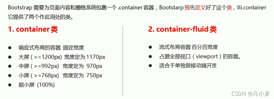
Bootstrap栅格系统
栅格系统是指将页面布局划分为等宽的列,然后通过列数的定义来模块化页面布局
Bottstrap 提供了一套响应式、移动设备优先的流式栅格系统,随着屏幕或视口尺寸的增加,系统会自动分为最多12列
Bottstrap里面 container 宽度是固定的,但在不同屏幕下,container的宽度不同,再把container分为12等份
栅格选项参数
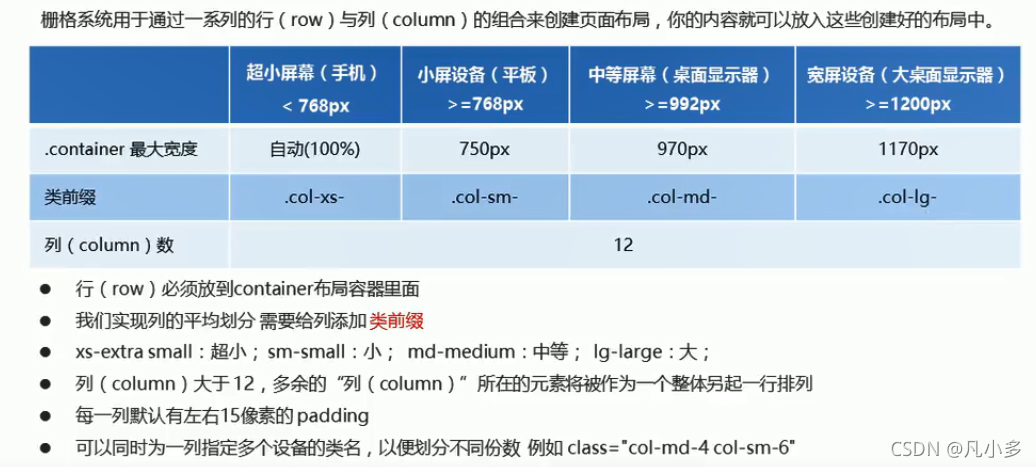
注意:等于12份,占满整个container的宽度;不足12份,占不满且有空白;多余12份,换行显示

列嵌套
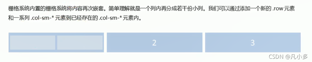
<div class="col-sm-4">
    <!-- 列嵌套最好加一个行 row 这样可以取消父元素的 padding值而且高度自动和父级一样 -->
    <div class="row">
        <div class="col-sm-6">小列</div>
        <div class="col-sm-6">小列</div>
    </div>
</div>
列偏移
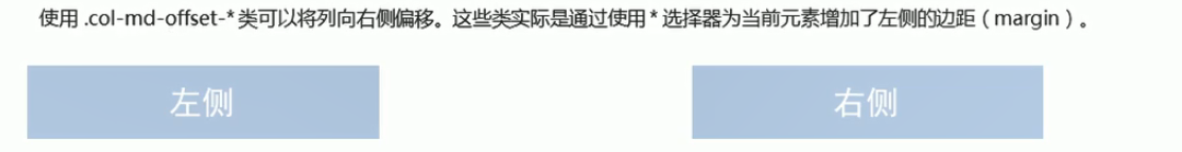
<div class="container">
    <div class="row">
        <div class="col-md-3">左侧</div>
        <!-- 两个盒子:偏移份数 = 12 - 两个盒子的份数 = 6 -->
        <div class="col-md-3 col-md-offset-6">右侧</div>
    </div>
    <div class="row">
        <!-- 一个盒子居中:偏移份数 = (12 - 盒子的份数)/2 = 2 -->
        <div class="col-md-8 col-md-offset-2">中间</div>
    </div>
</div>
列排序
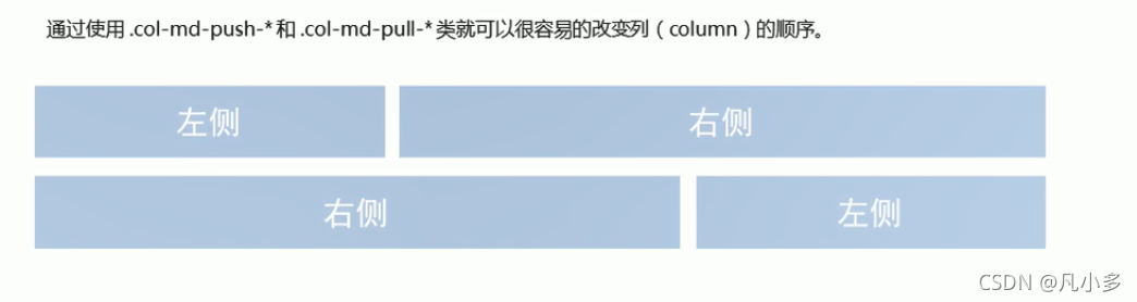
右pull 拉 左push 推
<div class="container">
    <div class="row">
        <div class="col-md-4 col-md-push-8">左侧</div>
        <div class="col-md-8 col-md-pill-4">右侧</div>
    </div>
</div>
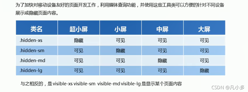
响应式工具
【案例:bootstrap响应式布局】
index.html
<!DOCTYPE html>
<html lang="en">

<head>
    <meta charset="UTF-8">
    <meta http-equiv="X-UA-Compatible" content="IE=edge">
    <meta name="viewport" content="width=device-width, initial-scale=1.0">
    <title>alibaixiu</title>
    <!--[if lt IE 9]>
      <script src="https://oss.maxcdn.com/html5shiv/3.7.2/html5shiv.min.js"></script>
      <script src="https://oss.maxcdn.com/respond/1.4.2/respond.min.js"></script>
    <![endif]-->
    <!-- 引入bootstrap样式文件 -->
    <link rel="stylesheet" href="./bootstrap/css/bootstrap.min.css">
    <!-- 引入自定义首页样式文件 -->
    <link rel="stylesheet" href="./css/index.css">
</head>

<body>
    <div class="container">
        <!-- 在container布局容器中添加row,可以抵消container的padding值 -->
        <div class="row">
            <!-- 左侧---begin -->
            <header class="col-md-2">
                <div class="logo">
                    <a href="#">
                        <img class="hidden-xs" src="http://xi-weidong.gitee.io/alibaixiu/images/logo.png" alt="">
                        <span class="visible-xs">阿里百秀</span>
                    </a>
                </div>
                <nav class="nav">
                    <ul>
                        <li>
                            <a href="#">
                                <span class="glyphicon glyphicon-camera" aria-hidden="true"></span> 生活馆
                            </a>
                        </li>
                        <li>
                            <a href="#">
                                <span class="glyphicon glyphicon-picture" aria-hidden="true"></span> 自然汇
                            </a>
                        </li>
                        <li>
                            <a href="#">
                                <span class="glyphicon glyphicon-phone" aria-hidden="true"></span> 科技潮
                            </a>
                        </li>
                        <li>
                            <a href="#">
                                <span class="glyphicon glyphicon-th-large" aria-hidden="true"></span> 奇趣事
                            </a>
                        </li>
                        <li>
                            <a href="#">
                                <span class="glyphicon glyphicon-glass" aria-hidden="true"></span> 美食杰
                            </a>
                        </li>
                    </ul>
                </nav>
            </header>
            <!-- 左侧---end -->

            <!-- 中间---begin -->
            <article class="col-md-7">
                <div class="news clearfix">
                    <ul>
                        <li>
                            <a href="#"><img src="https://img2.baidu.com/it/u=3666548066,2508071679&fm=26&fmt=auto" alt="">
                                <p>阿里百秀</p>
                            </a>
                        </li>
                        <li>
                            <a href="#"><img src="https://img2.baidu.com/it/u=3666548066,2508071679&fm=26&fmt=auto" alt="">
                                <p>图片介绍,图片介绍,图片介绍,图片介绍,图片介绍,图片介绍,图片介绍</p>
                            </a>
                        </li>
                        <li>
                            <a href="#"><img src="https://img2.baidu.com/it/u=3666548066,2508071679&fm=26&fmt=auto" alt="">
                                <p>图片介绍,图片介绍,图片介绍,图片介绍,图片介绍,图片介绍,图片介绍</p>
                            </a>
                        </li>
                        <li>
                            <a href="#"><img src="https://img2.baidu.com/it/u=3666548066,2508071679&fm=26&fmt=auto" alt="">
                                <p>图片介绍,图片介绍,图片介绍,图片介绍,图片介绍,图片介绍,图片介绍</p>
                            </a>
                        </li>
                        <li>
                            <a href="#"><img src="https://img2.baidu.com/it/u=3666548066,2508071679&fm=26&fmt=auto" alt="">
                                <p>图片介绍,图片介绍,图片介绍,图片介绍,图片介绍,图片介绍,图片介绍</p>
                            </a>
                        </li>
                    </ul>
                </div>
                <div class="publish">
                    <div class="row">
                        <div class="col-sm-9">
                            <h3>标题1</h3>
                            <p class="text-muted hidden-xs">alibaixiu 发布于2015-11-23</p>
                            <p class="hidden-xs">简介</p>
                            <p class="text-muted">阅读(2417) 评论(1) 赞(18) </p>
                            <span class="hidden-xs">标签:1/2/3</span>
                        </div>
                        <div class="col-sm-3 pic hidden-xs">
                            <img src="https://img2.baidu.com/it/u=3246628741,3439955235&fm=26&fmt=auto" alt="">
                        </div>
                    </div>
                    <div class="row">
                        <div class="col-sm-9">
                            <h3>标题2</h3>
                            <p class="text-muted hidden-xs">alibaixiu 发布于2015-11-23</p>
                            <p class="hidden-xs">简介</p>
                            <p class="text-muted">阅读(4227) 评论(19) 赞(118) </p>
                            <span class="hidden-xs">标签:1/2/3</span>
                        </div>
                        <div class="col-sm-3 pic hidden-xs">
                            <img src="https://img2.baidu.com/it/u=3246628741,3439955235&fm=26&fmt=auto" alt="">
                        </div>
                    </div>
                </div>
            </article>
            <!-- 中间--end -->

            <!-- 右侧---begin -->
            <aside class="col-md-3">
                <a href="#" class="banner">
                    <img src="http://xi-weidong.gitee.io/alibaixiu/upload/zgboke.jpg" alt="">
                </a>
                <a href="#" class="hot">
                    <span class="btn btn-primary">热搜</span>
                    <h4 class="text-primary">欢迎加入中国博客联盟</h4>
                    <p class="text-muted">这里收录国内各个领域的优秀博客,是一个全人工编辑的开放式博客联盟交流和展示平台......</p>
                </a>
            </aside>
            <!-- 右侧---end -->

        </div>
    </div>
</body>

</html>
index.css
@media screen and (min-width:1280px) {
    /* 修改container的最大宽度为1280px,以满足设计稿需求 */
    .container {
        width: 1280px;
    }
}

body {
    background-color: #f5f5f5;
}

.container {
    background-color: #fff;
}

ul {
    list-style: none;
    margin: 0;
    padding: 0;
}

a {
    color: #666;
    text-decoration: none;
}

a:hover {
    text-decoration: none;
}

/* header---begin */
header {
    /* 去掉左边的padding值 */
    padding-left: 0px!important;
}

.logo {
    background-color: #429ad9;
}

.logo img {
    display: block;
    margin: 0 auto;
    /* width: 100%; */
    max-width: 100%;
}


/* 进入超小屏幕下,logo下的img隐藏 */
.logo span {
    display: block;
    height: 50px;
    line-height: 50px;
    color: #fff;
    font-size: 18px;
    text-align: center;
}

.nav {
    background-color: #eee;
    border-bottom: 1px solid #ccc;
}

@media screen and (max-width:991px) {
    /* 当进入小屏幕&超小屏幕时,使得nav中的li浮动(自动转为inline-block元素),并且宽度为20% */
    .nav li {
        float: left;
        width: 20%;
    }
    article {
        margin-top: 10px;
    }
}

@media screen and (max-width:767px) {
    /* 当进入超小屏幕时,使得nav中的li中的文字变为14px */
    .nav li a {
        /* 提高权重 */
        font-size: 14px!important;
        padding-left: 3px!important;
    }
    /* 当进入超小屏幕,第一个li宽度占100%,剩下的为25% */
    .news li:nth-child(1) {
        width: 100%!important;
    }
    .news li:nth-child(n+2) {
        width: 50%;
    }
    /* 修改publish中的h3字体为14 */
    .publish h3 {
        font-size: 14px;
    }
}

.nav li a {
    display: block;
    height: 50px;
    line-height: 50px;
    padding-left: 30px;
    font-size: 16px;
}

.nav li a:hover {
    background-color: #fff;
}
/* header---end */

/* middle---begin */
.news li {
    float: left;
    margin-bottom: 10px;
    padding-right: 10px;
    width: 25%;
    height: 128px;
}

.news li:nth-child(1) {
    width: 50%;
    height: 266px;
}

.news li a {
    position: relative;
    display: block;
    width: 100%;
    height: 100%;
}

.news li a img {
    width: 100%;
    height: 100%;
}

.news li a p {
    position: absolute;
    bottom: 0;
    left: 0;
    width: 100%;
    height: 41px;
    background-color: rgba(0, 0, 0, 0.5);
    font-size: 12px;
    color: #fff;
    margin-bottom: 0px;
    padding: 5px 10px;
}

.news li:nth-child(1) p {
    padding: 0 10px;
    line-height: 41px;
    font-size: 20px;
}

.publish {
    border-top: 1px solid #ccc;
}

.publish .pic {
    margin-top: 10px;
}

.publish .pic img {
    width: 100%;
}

.publish .row {
    border-bottom: 1px solid #ccc;
    padding: 10px 0px;
}
/* middle---end */


/* right---begin */
.banner img {
    width: 100%;
}

.hot {
    display: block;
    margin-top: 20px;
    padding: 0px 20px 20px;
    border: 1px solid #ccc;
}

.hot span {
    border-radius: 0px;
    margin-bottom: 20px;
}

.hot p {
    font-size: 12px;
}
/* right---end */


 1787
1787


 被折叠的 条评论
为什么被折叠?
被折叠的 条评论
为什么被折叠?
 到【灌水乐园】发言


