


 本文展示了如何使用HTML和CSS创建一个包含梯形和正方形的动态效果,通过CSS3的`clip-path`属性来实现不规则图形的切割。
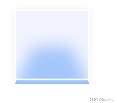
效果图
代码
<!DOCTYPE html>
<html lang="en">
<head>
<meta charset="UTF-8">
<meta name="viewport" content="width=device-width, initial-scale=1.0">
<title>梯形与正方形示例</title>
<style>
  .container {
    position: relative;
    width: 200px;
    height: 200px;
    margin: 50px;
  }

  .trapezoid {
    position: absolute;
    width: 100%;
    height: 100%;
    background-color: rgb(130, 183, 249);
    clip-path: polygon(0% 100%, 25% 50%, 75% 50%, 100% 100%);
  }

  .square {
    position: absolute;
    top: 0;
    left: 0;
    width: 100%;
    height: 95%;
    background: rgb(218 223 255 / 38%);
    border: 4px solid #fefefe;
    backdrop-filter: blur(20px);
    box-sizing: border-box;
    box-shadow: 0px 0px 20px 0px #eee;
    border-radius: 5px;
  }

</style>
</head>
<body>

<div class="container">
  <div class="trapezoid"></div>
  <div class="square"></div>
</div>

</body>
</html>


 1万+
1万+

 被折叠的 条评论
为什么被折叠?
被折叠的 条评论
为什么被折叠?
 到【灌水乐园】发言


